-
-
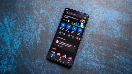
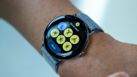
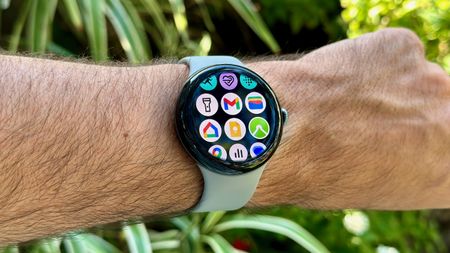
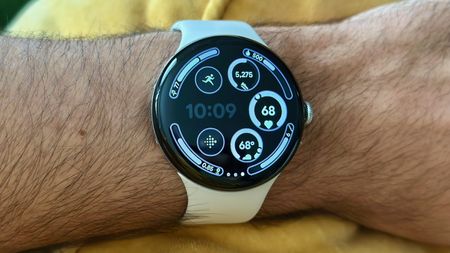
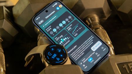
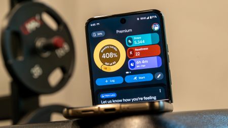 Editor's DeskI actually don't hate the new Google Health app, but it could still use some work. Here are my highlights after testing the revamped Fitbit app, and how I think Google can improve
 -
 Feedback heardComplaints worked: Google is already addressing Gemini's new usage limits2 Comments
 -
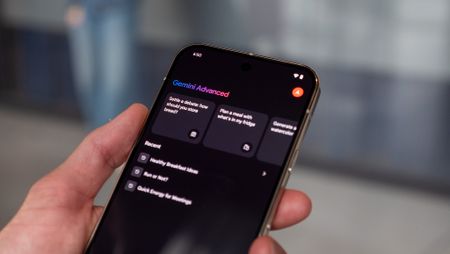
 Save 'n' SplitHow to use Gemini to track and split group expenses — for FREE!
 -
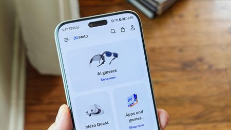
 Subscriptions aplentyMeta unveils app subscriptions: 'Plus' plans precede 'Meta One' tests for AI and creators
 -
 Real-world frictionSamsung Wallet’s new digital passport sounds convenient, but the internet isn’t sold
 -
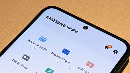
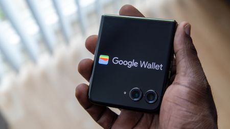 VersusSamsung Wallet vs. Google Wallet: the battle for your pocket's loyalty
 -
 Circle to... identify?3 ways you can use Circle to Search to identify songs on any Android phone
-


-
-
Feedback heardComplaints worked: Google is already addressing Gemini's new usage limits2 Comments
-
 AI backlash growsFormer Google CEO Eric Schmidt booed after AI remarks at the University of Arizona2 Comments
 -
 Quiet downgradeThe Google AI Pro plan just got a quiet downgrade, here is the new deal2 Comments
 -
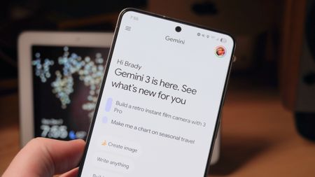
 Gemini takeover5 important Gemini updates from Google I/O that could genuinely save you time
 -
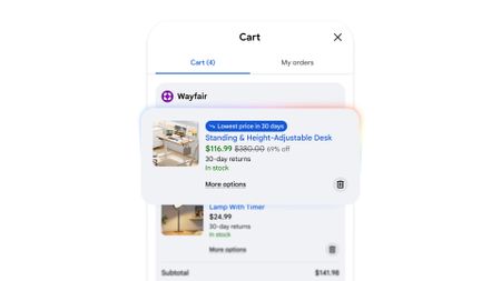 AI x online shoppingForget CamelCamelCamel: Google's new Universal Cart will track prices and find deals for you
 -
 Genie "magic"Dreaming of Project Genie? Google I/O unveils 'Street View,' putting imaginary worlds into ours
 -
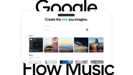 AI crazyGoogle I/O gets into a Flow: preps Flow Music app and generative editing for on-the-go
 -
 Let AI handle itGoogle's new Gemini features will take all the annoying busywork off your plate
 -
 Assistant rebootPlanning a wedding? Google's new Gemini Spark AI agents might actually help
-


-
-
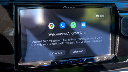
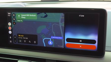
 Take a driveAndroid Auto gets a fresh take on Google Maps navigation, teases more Gemini at the Android Show
 -
 Smarter driving5 Android Auto settings I always change on any new Android phone
 -
 Android Auto bug is making the signal icon vanish for some users2 Comments
 -
 Finally fixedAndroid's Driving Mode is finally smarter about when it turns on3 Comments
 -
 Where'd it go?Something's missing: Android Auto users report a jarring bug in Google Maps
 -
It might finally happenAndroid Auto may finally let you cast media from your phone
-
Gemini-fiedGemini transforms Android Auto with new AI features for a smarter drive
-
 Bye, Assistant!Gemini for Android Auto is starting to replace Google Assistant
 -
 Eyes on the RoadGoogle starts quietly rolling out an essential button on Android Auto
-


-
-
Circle to... identify?3 ways you can use Circle to Search to identify songs on any Android phone
-
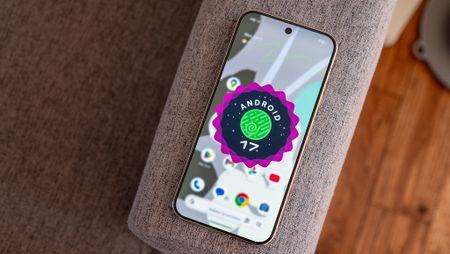
 Ecosystem handoffAndroid 17 catches up to Apple with a long-overdue cross-device upgrade
 -
 Visuals take center stageAndroid 17 QPR1 Beta 3 is here, and it’s all about the boring fixes you actually wanted
 -
 Emojis leakHere's your first look at more of Google's new 3D emojis for Android 17
 -
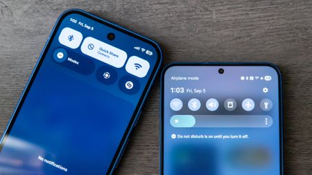 Sharing gets easierQuick Share is getting a useful upgrade for sharing files with iPhones
 -
 What's nextAndroid 17: Everything you need to know2 Comments
 -
 Big Android reveals5 huge Android 17 upgrades are coming this year — Here are the best new features announced at The Android Show
 -
 Stay safeYour Android security and privacy got huge upgrades—The Android Show reveals all
 -
 Magic PointerI didn't think the desktop cursor needed reinventing — Googlebooks are proving me wrong6 Comments
-


-
-
 Gmail inside ProtonThis secure email service just gave me a real reason to ditch Gmail
 -
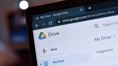
A fresh coat of paintGoogle's new gradient icons for Gmail, Calendar, Drive and more are finally rolling out
-
 That's a big cutGoogle may be cutting free Gmail storage for new accounts down to 5GB
 -
 Useful parroting?Gmail's 'Help me write' can now mimic how you speak to create emails for you
 -
New address, same inboxI changed my embarrassing Gmail username without losing anything, and you can too2 Comments
-
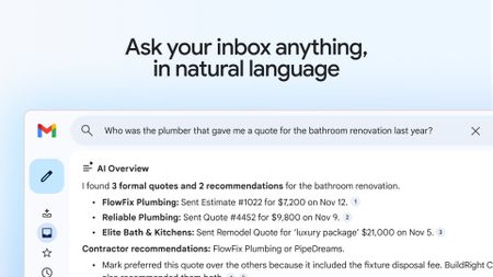 That's a steep priceGmail's new AI Inbox is here, but it'll cost you $250 a month
 -
 Gemini takes overGmail is getting a new AI inbox as Google brings Gemini front and center2 Comments
 -
A long-awaited featureGmail might finally let you switch to a new address without starting over
-
Get a previewGmail gives Android users a window into email attachments with this update
-


-
-
 Bye, AssistantGoogle Assistant could shut down for Android Auto in March 2026
 -
 New look!Google's song search evolves with a modern Gemini-inspired UI on Android
 -
 New look!Google's voice and song search gets a major overhaul on Android after years
 -
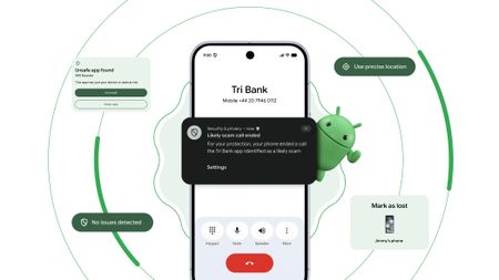
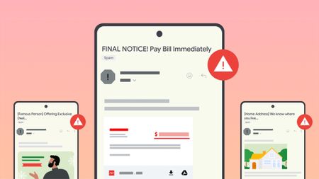 Stay in the knowGoogle introduces new tools to help users fight against evolving phishing scams effectively
 -
 Google OutageGoogle, Gmail, and Meet hit by widespread outage, causing login issues
 -
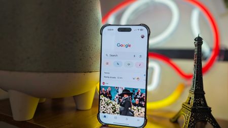 New voicesGoogle is spicing up its voice list on Search, according to a new leak
 -
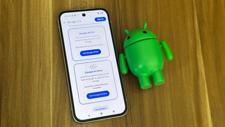
 New Google AI plansNew Google AI Pro and $249/month Ultra subscription announced at I/O
 -
Easy-peesyGoogle app on iOS gets a new feature that will 'Simplify' text online
-
 ByeGoogle officially killed Driving Mode after stripping most of its features in 2024
-


-
-
Don't stressGet in: Android Auto EVs see AI battery predictions in Google Maps for stress-free plans
-
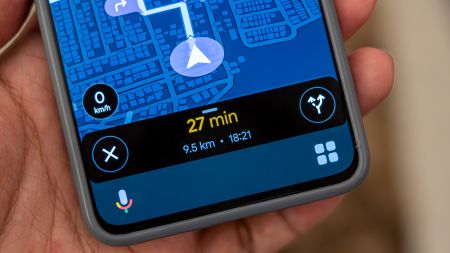
 It's just like new'Immersive Navigation' in Google Maps is like opening a new app for the modern era of driving
 -
Limiting features?Google Maps might keep things from you if you don't sign in to an account
-
 Test runGoogle Maps might get a trial space for new features, and 'Ask Maps' could headline
 -
 Out on a walkMy walks just got a lot better, as Google says 'Gemini in Navigation' supports more
 -
 Better battery lifeHow to enable and use Google Maps power saving mode
 -
Let's go thereGoogle Maps gets a major upgrade with Gemini for smooth navigation on Android and iOS
-
Let's go thereGoogle Maps gets a Gemini boost to help you navigate the roads like a pro
-
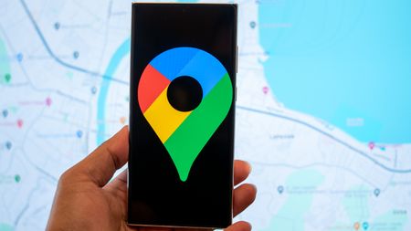 Double RainbowHere's what the redesigned Google Photos and Maps icons look like
-


-
-
 How ToThis is the best Google Pay feature you're not using in India
 -
 How ToI used this hidden Google Pay feature to automate credit card bill payments
 -
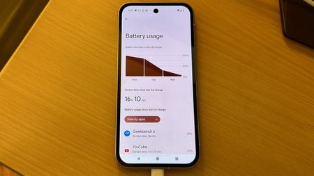 No more drainAndroid’s next update is finally addressing your phone’s biggest battery hogs
 -
On TimeGoogle Wallet is helping Android users effortlessly catch their plane or train
-
 Quick TapsGoogle Pay's fresh updates will unlock better shopping rewards for Chrome users
 -
 Pay Your WayAndroid users get another option to pay later with Klarna on Google Pay
 -
 Easier accessGoogle Wallet brings digital ID support to UK, more US states
 -
Now arriving at...Google Wallet brings real-time train status alerts to Android, and teases I/O 2025
-
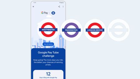 Next stop is...Londoners can join the Google Pay 'Tube Challenge' for badges and city lore
-


-
-
 Keeping you awareWarnings about removed or unsupported Play Store apps could head to Android
 -
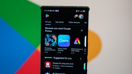
 Play gets smarterGoogle Play is getting a huge AI upgrade with Ask Play and Play Shorts
 -
 Create appsThis Google AI tool can now build Android apps from text prompts
 -
 It's a problemGoogle puts apps that'll drain your battery on blast in updated Play Store listings
 -
A downgrade to downgradingGoogle just made uninstalling system app updates more complicated
-
Free cashHere's when Google Play Store users will get an automatic cash settlement payout3 Comments
-
 You win!Focus Friend and Pokémon TCG Pocket shine in Google Play's Best of 2025 awards
 -
Find it fasterGoogle Play enhances search with new 'Where to watch' streaming feature
-
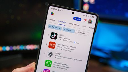
 No more siftingGoogle's upcoming review search feature might soon help you save time on the Play Store
-


-
-
Subscriptions aplentyMeta unveils app subscriptions: 'Plus' plans precede 'Meta One' tests for AI and creators
-
 Protecting privacyI protect my privacy while using Meta smart glasses with these 3 settings — and you can too
 -
 Another chunk... goneMeta chops 8,000 in May layoff spree, and it's only getting worse
 -
 AI everywhereMeta's Muse Spark arrives on AI Glasses Gen 1, Ray-Ban Display waits for now
 -
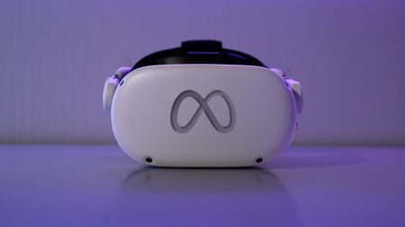 AI, VR, AI, VRMeta Connect 2026 confirmed for September, and we're thinking AI and Quest
 -
 Per your requestMeta's AI plans look agentic with a potential Instagram bot that shops for you
 -
 Encryption is goneMeta can see your Instagram messages now, and it's time to stop using it
 -
 AI AI AI AI AI AI AIMeta's Q1 2026 earnings are in, and it looks like Zuckerberg's blank check for AI spending is raising some eyebrows
 -
 new oversightMeta gives parents a way to see what their teens are asking its AI
-


-
-
 Spotify drives engagement the right way, expands into 'Fitness' with Peloton
 -
 A worthy upgradeSpotify looks brand new on tablets with a design rework that makes total sense
 -
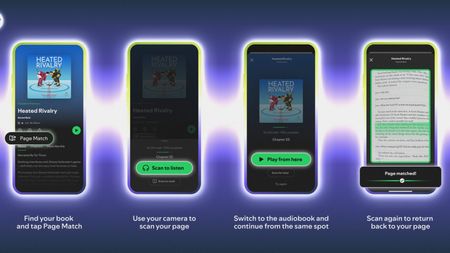 Reading is goodSpotify, Bookshop expand to US, and 'Page Match' gets huge language support
 -
 Podcasts this timePodcasts meet Spotify's Prompted Playlists for curious Premium US beta testers
 -
 A vast webIt's in the SongDNA: an 'immersive' Spotify test that lets you discover everyone involved
 -
 Your tasteAll to your liking: Spotify's 'Taste Profile' beta puts you in charge of the music you find
 -
 InspiredSpotify's 'About the Song' beta lets you into the stories behind the artist's creation
 -
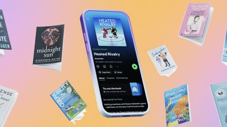 Turn the pageI'll never stop reading with Spotify, Bookshop's partnership and 'Page Match' on Android
 -
 I can show you the...This Spotify update lets us take our lyrics offline, and there's more for users globally
-


-
-
 X is down againX faces major outage as 78K users report disruption this morning
 -
Where are you?X's new 'transparent' location labels for accounts have people questioning everything
-
 Partial outageFacing trouble logging into X? You're not alone — here’s the scoop!
 -
 Twitter is downIt wasn't just you — X (Twitter) resolved a major outage today
 -
 Whistleblower calls out Twitter for spambots and mishandling user data
 -
 What is free speech?
 -
 Twitter makes it easier to search for Communities on the web
 -
 Massive Twitter outage ends after about 90 minutes
 -
 House committee summons Meta, Alphabet, Twitter and Reddit over Capitol riot
-


-
-
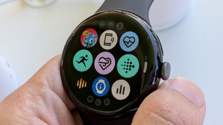 Wear OS updateWear OS 7 officially revealed: Here are the biggest new features
 -
 About timeGoogle just announced Wear OS 6.1, and it adds a time zone feature I've wanted for years
 -
 A proper upgradeSpotify on Wear OS just got a big redesign that makes it much easier to use
 -
 Standalone protectionWear OS can now send life-saving earthquake alerts without your phone
 -
 Wear thisThe best Wear OS watch
 -
 Visual messA major Wear OS 6 bug is ruining custom watch faces on Pixel and Galaxy Watches
 -
 Wearables WeeklyWhat I expect and want to see from Android smartwatches in 2026
 -
 Wearables WeeklyWear OS in 2025: How Pixel, Galaxy, and OnePlus smartwatches fared against our expectations2 Comments
 -
 You're green!Androidify for Wear OS: turn yourself into an Android bot for your Pixel Watch
-


-
-
 More AI slopGoogle's new YouTube AI tools could make AI slop impossible to escape
 -
 The Premium pressureYouTube on mobile makes livestream ads way less annoying, but there's a caveat
 -
 Half off YouTubeYou can now get YouTube Premium for half price with Google AI Pro
 -
 Shorts, gone (almost)YouTube now lets you turn off Shorts
 -
 Premium gets pricierYouTube Premium just got a price hike, and it's not a small one3 Comments
 -
Trying something newYouTube tests a couple of speedy, 'on-the-go' features for busy Android viewers
-
 Sort of supportedYouTube now works with Android Auto, but not in the way you'd expect
 -
 Check it outDiscovering YouTube videos with 'Previews' is a change it wants to see if you like
 -
 Take this, but make it thisA twist like no other: YouTube Shorts lets you 'Reimagine' with Gemini and Veo
-


