
What you need to know
- Google's song search revamped with a modernized Gemini-like redesign for enhanced user experience.
- New centered 'G' logo and improved sound enhance the intuitive search feature for Android users.
- Gradual rollout of redesigned interface links with recent Material 3 updates for consistent Google visuals.
Enjoy our content? Make sure to set Android Central as a preferred source in Google Search, and find out why you should so that you can stay up-to-date on the latest news, reviews, features, and more.
Google is unveiling a sleek redesign of its song search feature for Android, integrating a Gemini-like UI that enhances user interaction. This update, gradually rolling out across devices, promises a more intuitive and cohesive search experience for music enthusiasts everywhere.
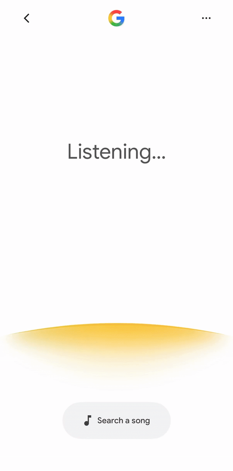
What was once four multicolored dots is now going to look a lot like its Live Search UI, but with some changes to animation and the overall response from the Search bot (as reported by 9to5 Google).

As you can see in the GIF below, the ‘G’ logo is a lot more centered now, and the “What’s on your mind?” prompt transitions into the transcript. The earlier compact waveform has been replaced by an arc that vibrates with speech. The "search a song" prompt remains at the bottom of the screen, and once users click on it, the words "Play, Sing, Hum" take over the center part of the screen as opposed to the circular orb that would move based on your voice.

Additionally, Google has also changed the sound associated with the search feature. The sound for an active microphone, which used to be a "ping," has been changed to match the sound used for voice search on AI Mode.
The tech giant seems to be aiming at keeping the UI more consistent and easier to understand. This update shows a focus on refining the user interface, making even small details contribute to a more unified Google experience.
The newly redesigned interface for the Google app is being rolled out gradually to Android and iOS users alike. According to Web Pro News, posts from social media confirm sightings of the new UI. This phased rollout could mean Google is watching closely for potential bugs or issues within the app.
That said, Google has been tweaking the overall UI, making it more intuitive and user-friendly, including the recent Material 3 Expressive redesign that landed on Chrome for Android, bringing it in line with Google’s newer app visuals.

