YouTube TV’s new Live Guide wants to look cleaner, but one change may annoy mobile users
YouTube TV's new Live Guide is finally good, but a clunky preview kills the vibe on the mobile app.

What you need to know
- YouTube TV refreshed its Live tab on mobile, giving the interface a cleaner, cable-style layout with new info bubbles and a relocated Sort button.
- Its mobile Live tab update replaces the instant auto-play preview with a mandatory long-press gesture.
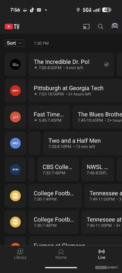
- The updated guide presents more useful data upfront, including clear start/end times and a timer indicating how much of the program is left.
Enjoy our content? Make sure to set Android Central as a preferred source in Google Search, and find out why you should so that you can stay up-to-date on the latest news, reviews, features, and more.
YouTube TV is rolling out a noticeable refresh to its Live tab on mobile, and while the layout tweak feels familiar enough, one change may be rubbing people the wrong way.
The quick-preview feature now requires a long-press, and the whole experience suddenly feels slower, as reported by Android Authority. The redesign itself isn’t generally the problem. Everything’s boxed into new bubbles, with the channel name and logo on the left, program details inside, and a Sort button in the upper left. It’s cleaner, more structured, and honestly pretty reminiscent of a cable-style guide.
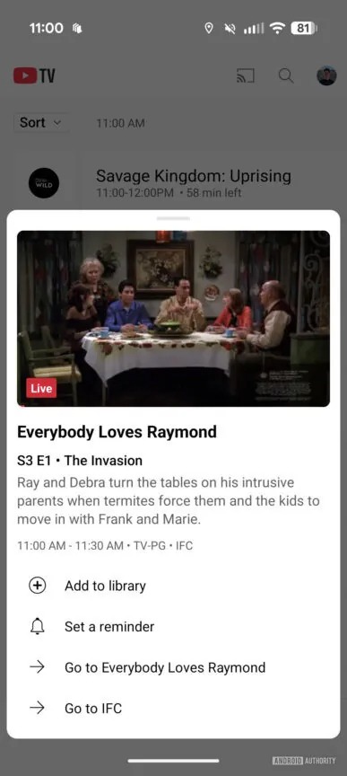
But the preview change is probably the sticking point. Previously, YouTube TV would auto-play a glimpse of whatever was airing at the top of the list. Now, auto-play is gone. To get a preview, you need to long-press on a channel and wait for a card with description, episode information, and shortcuts. Oddly enough, it takes nearly the same amount of time as just opening the channel.
Article continues below

Preview defeats its purpose
That’s where the friction lies. A preview is only useful when it’s faster than watching the full stream, and this new flow doesn’t deliver on that. For casual browsers, it almost defeats the purpose of having a preview at all, Android Authority notes. You’re doing the same number of taps and waiting the same amount of time, so you may as well just jump into the program.
Still, for most people, this update won’t be a deal-breaker. The redesigned Live Guide is basically a cleaner version of the menu system TV viewers have known for decades. It presents more info upfront — such as start/end times and how much is left in a program — and those additions actually help when you’re hopping around looking for something worth watching.
If you mainly scroll the grid, pick a channel, and move on, the preview change probably won’t matter much. This is a server-side rollout, so not everyone has it yet. And since YouTube TV has been steadily revamping its Home, Library, and Live views, this likely isn’t the last UI experiment we’ll see.
Get the latest news from Android Central, your trusted companion in the world of Android

Jay Bonggolto always keeps a nose for news. He has been writing about consumer tech and apps for as long as he can remember, and he has used a variety of Android phones since falling in love with Jelly Bean. Send him a direct message via X or LinkedIn.
You must confirm your public display name before commenting
Please logout and then login again, you will then be prompted to enter your display name.
