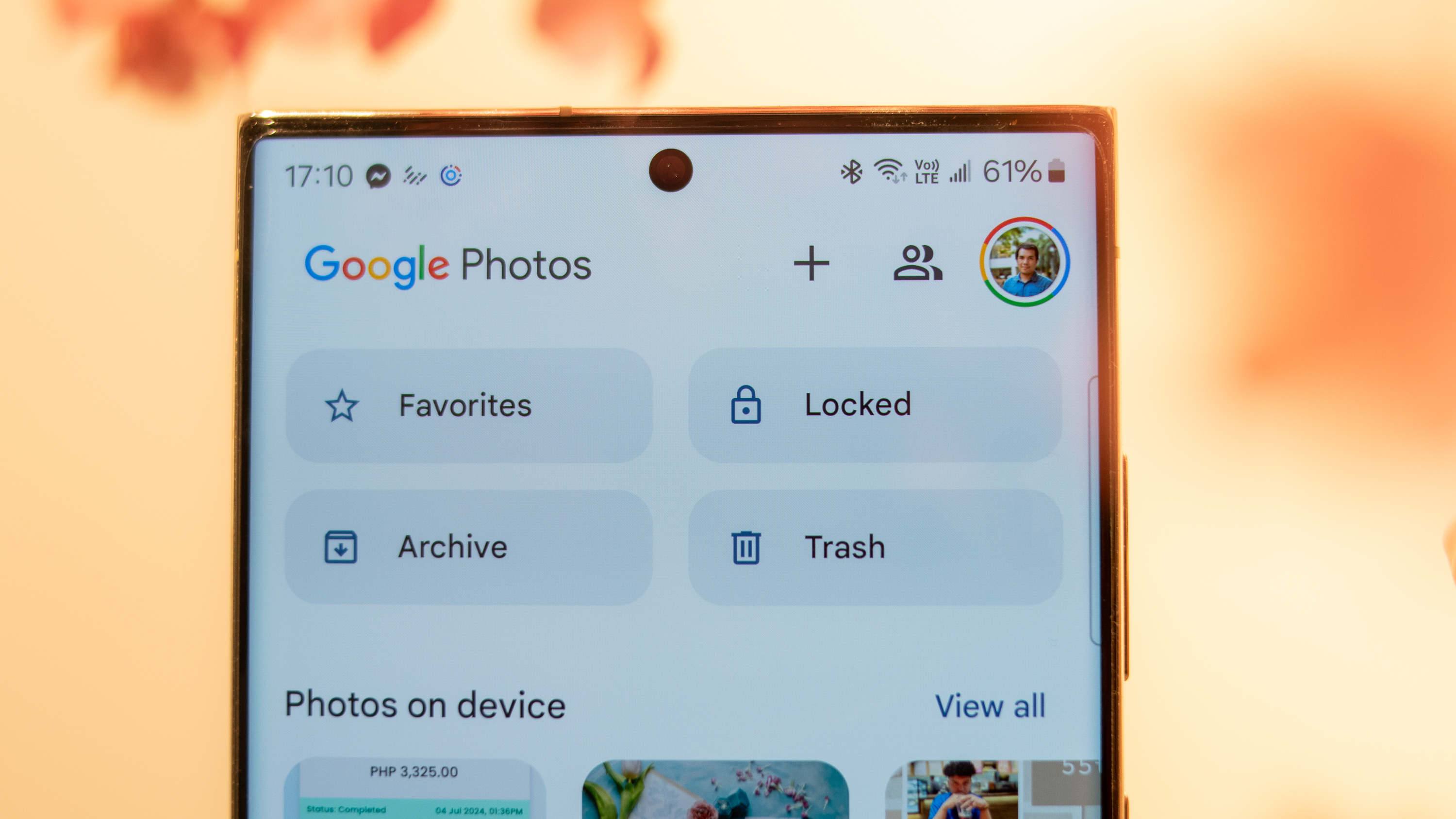
Users slam Google Photos for 'less functional' editing UI and cluttered design
The changes Google's brought in aren't sitting too pretty with end-users.

What you need to know
- Users on the Google Pixel subreddit have reported troubling times with the company's new Photos app editor UI.
- Reports state the UI is "far too cluttered" and that simple ways of making "rapid edits" no longer exist as issues with the new sliders and crop corners are highlighted.
- Google celebrated 10 years of the Photos app in May, which brought about this new editor UI and QR codes for sharing albums.
Google's new photo editing UI in the Photos app has started appearing for users, and the verdict is anything but positive.
User Smoke-away on the Google Pixel subreddit posted an in-depth personal review of the latest Photos app editor UI changes. Overall, the user claims the new photo editor is "unusable" and even "less functional" when compared to the app's previous design. One of the user's gripes was that the "display image" when editing a photo is much smaller, which doesn't make things better when the UI is already "far too cluttered."
To explain, the user states several UI elements, such as the editor's sliders, feel a little too tedious. The update makes it so users are forced to "tap in and out" of sliders in order to move between each one. If a user has changed an aspect of their photo using a slider, the post states "the button doesn't stay highlighted to let you know it was adjusted."
Article continues belowQuickly toggling sliders isn't occurring as it used to with the editor update; swiping through sliders takes more rotations as they've been enlarged. More importantly, the user states the core of the editor's old UI, which enabled them to do "rapid edits" on one panel with the tap of a button, no longer exists.
The user states the previous Photos editor was more "minimal," which worked better for fixing up their photography, rather than what's rolled in recently. Other users chimed in, agreeing with the OP (original poster), stating the UI has become cluttered/a mess and that "losing visual space" with the changes done to the crop corners is "pointless."
Once a celebration, now an issue
The new Google Photos editor is terrible. Please revert. from r/GooglePixel
In May, Google Photos celebrated its 10th anniversary as the gallery and editor for users and their memories. While it was momentous for Google, the company wanted to gift its users two updates, and one of those updates was this new editor UI. At the time, Google said its editor UI updates would offer "AI-powered suggestions" while fixing your captures. Additionally, Google said that the changes would further encourage "quick edits."
In contrast to what Google's said, end-users aren't finding these changes so favorable. Some, like the OP, would like to roll back instead of keeping what Google's brought.
Get the latest news from Android Central, your trusted companion in the world of Android
Google's May update informed users that they could also tap on a specific part of their photo to receive AI suggestions on how to fix it. The second update brought a patch to sharing in Google Photos. Now, users can retrieve a QR code and let their loved ones scan it to see the album on their phones.
A more recent update from July for the Photos app dropped a fresh look for photo view. Users on iOS are able to view "glanceable" photo information, as well as a refined action menu. The update was listed as "coming soon" for Android.

Nickolas is always excited about tech and getting his hands on it. Writing for him can vary from delivering the latest tech story to scribbling in his journal. When Nickolas isn't hitting a story, he's often grinding away at a game or chilling with a book in his hand.
You must confirm your public display name before commenting
Please logout and then login again, you will then be prompted to enter your display name.
