Talon reimagines how Twitter's timeline should look

Get the latest news from Android Central, your trusted companion in the world of Android
You are now subscribed
Your newsletter sign-up was successful
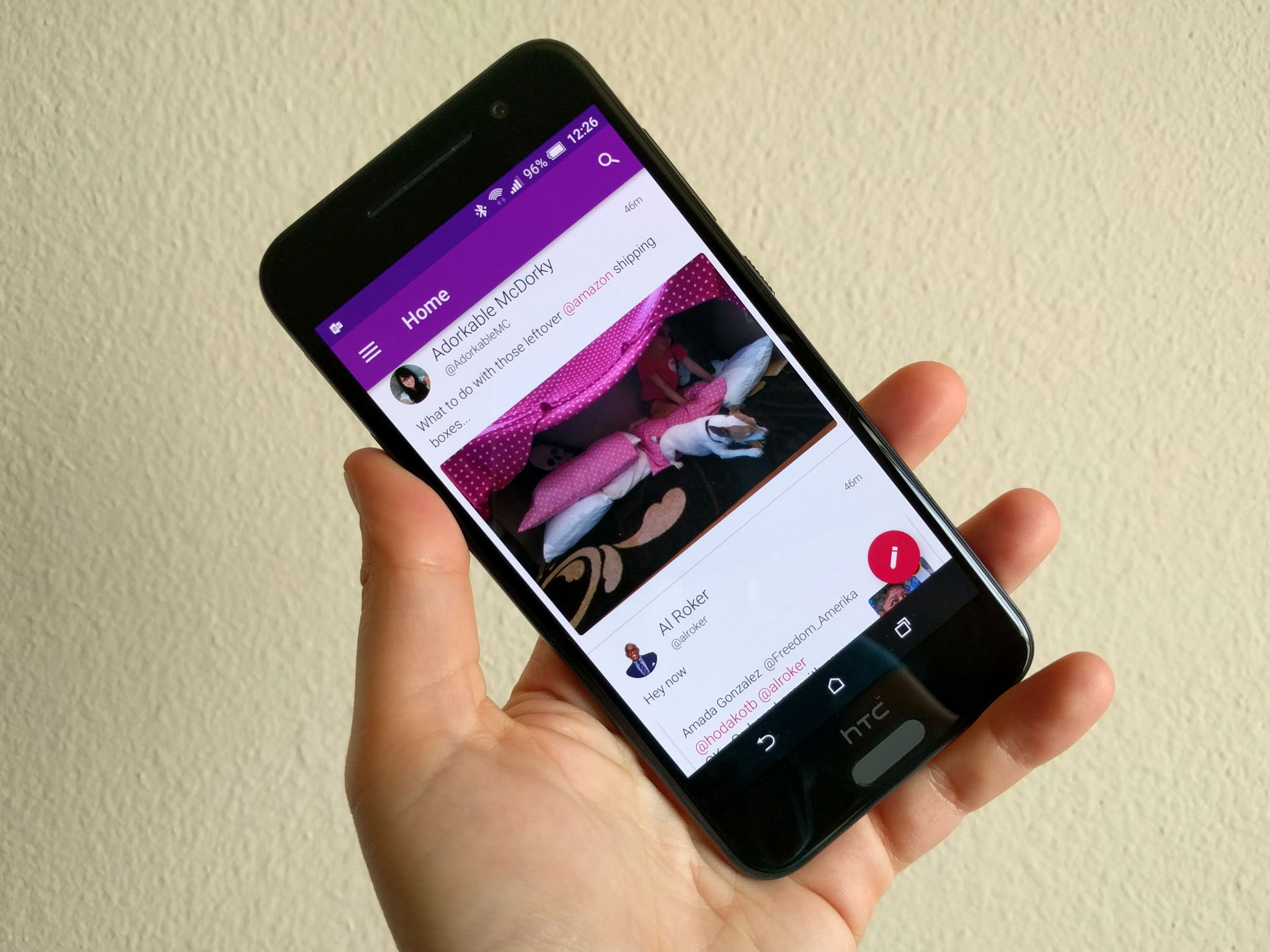
The stock Twitter app has received some greatly-needed updates over the past couple years, but for those that still feel like it's missing that something special, there's no shortage of third-party clients to choose from. Talon is one of the more popular Twitter clients around, and it's getting a new UI for your timeline that admittedly looks really nice.
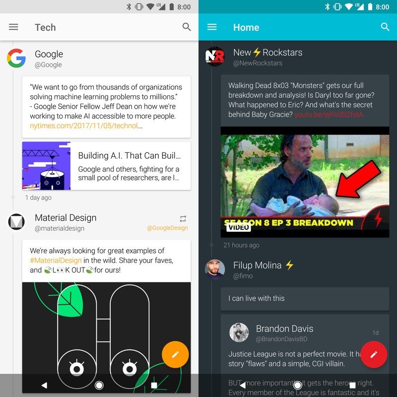
Called "Timeline Style", this new layout showcases tweets as their own cards and places the metadata around them so it's still easy to find but doesn't get in the way of tweets themselves. The developer of Talon, Luke Klinker, says that Timeline Style works best on larger phones and allows you to better focus on the content that matters.
Any images, videos, website links, GIFs, or quoted tweets are placed below the main tweet as their own card, and everything is connected by a never-ending line on the left. As the name suggests, it helps make Twitter's timeline look more like an actual timeline.
Article continues below 
You can enable the new look by opening up Talon and going to Settings -> App Style -> Timeline Style Tweet Layout, and before applying it to the app, you'll now see a quick preview of how it'll change things so you can decide whether or not it's something you'll like.
Timeline Style won't be replacing the default layout for Talon anytime soon, but if you want to check it out for yourself, it's available now as part of the latest update to the app.
Get the latest news from Android Central, your trusted companion in the world of Android

Joe Maring was a Senior Editor for Android Central between 2017 and 2021. You can reach him on Twitter at @JoeMaring1.
