
Late last month, Google started rolling out one of the biggest redesigns we've ever seen for the Gmail desktop site. Just a couple of weeks later, Google Drive is now getting similar treatment.
Announced in the G Suite Updates blog, Drive is getting this new look to better align itself with the visual changes we've been seeing in a bunch of Google's apps, such as Gmail, News, and Tasks.
The "New" button near the top left has been rounded and gains a colorful "+" icon, the Drive logo has also been added in that area to replace the generic "Drive" text, and the background for the site is now white instead of gray.
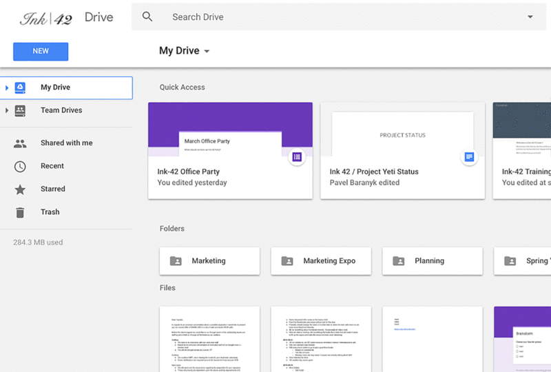
Other changes include an updated font for headers and the Settings and Help Center icons being moved so that they're in-line with Drive's search bar. Functionally, everything else about Drive works exactly the same.
Google's rolling out this new look for all users now and it should be available to everyone within the coming days.
Gmail's massive redesign is now live: Here's a look at the new features

