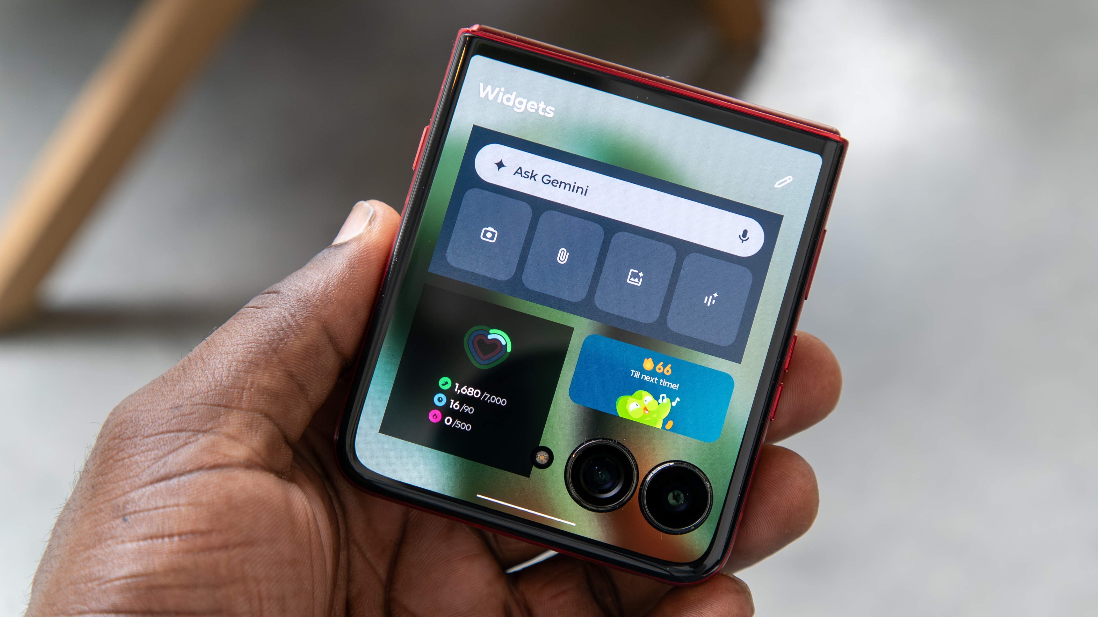
Android 16 on the Pixel 10 is a step in the right direction, but there are still changes I wanna see
I love the changes Google brought to the Pixel with Android 16, but it can and should go further.
Enjoy our content? Make sure to set Android Central as a preferred source in Google Search so you can stay up-to-date on the latest news, reviews, features, and more.
Android Central's Editor's Desk is a weekly column discussing the latest news, trends, and happenings in the Android and mobile tech space.
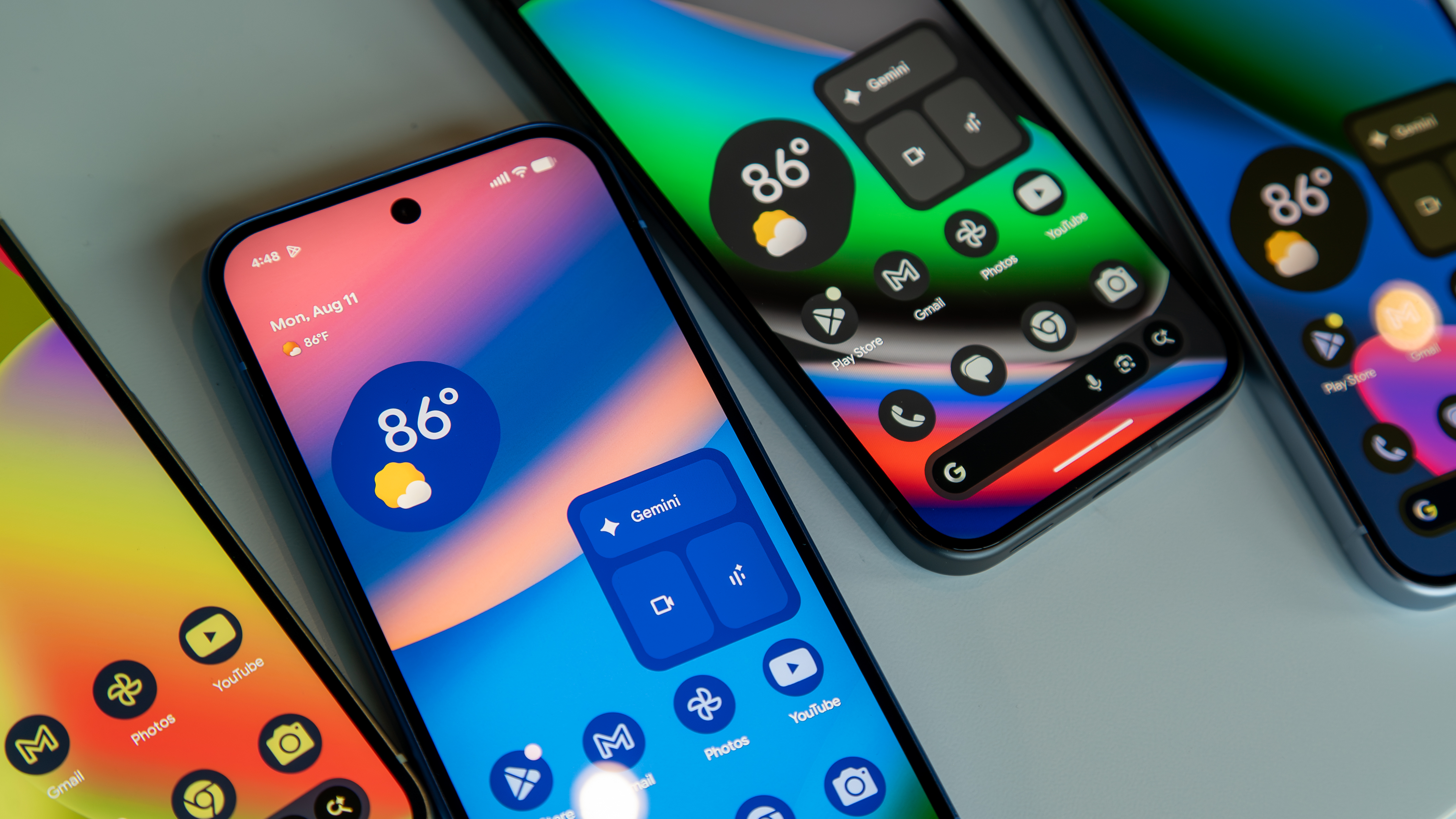
I've been testing the Pixel 10 for a few weeks now, and there's a lot to like about the phone, from the cameras to the built-in magnetic Qi2 charging. However, what I didn't expect to like as much as I did is Google's flavor of Android 16. It's vibrant, responsive, and it brings some welcome changes that I've been hoping to see on Pixel software.
That said, the Pixel UI has never been my favorite, and while I like the changes Google has made with Android 16 and Material 3 Expressive, there are still some things I would like to see Google implement in future versions of Android. In fact, many of these features feel so commonplace on other Android phones, I'm surprised Google hasn't implemented them on Pixels.
Quick Settings
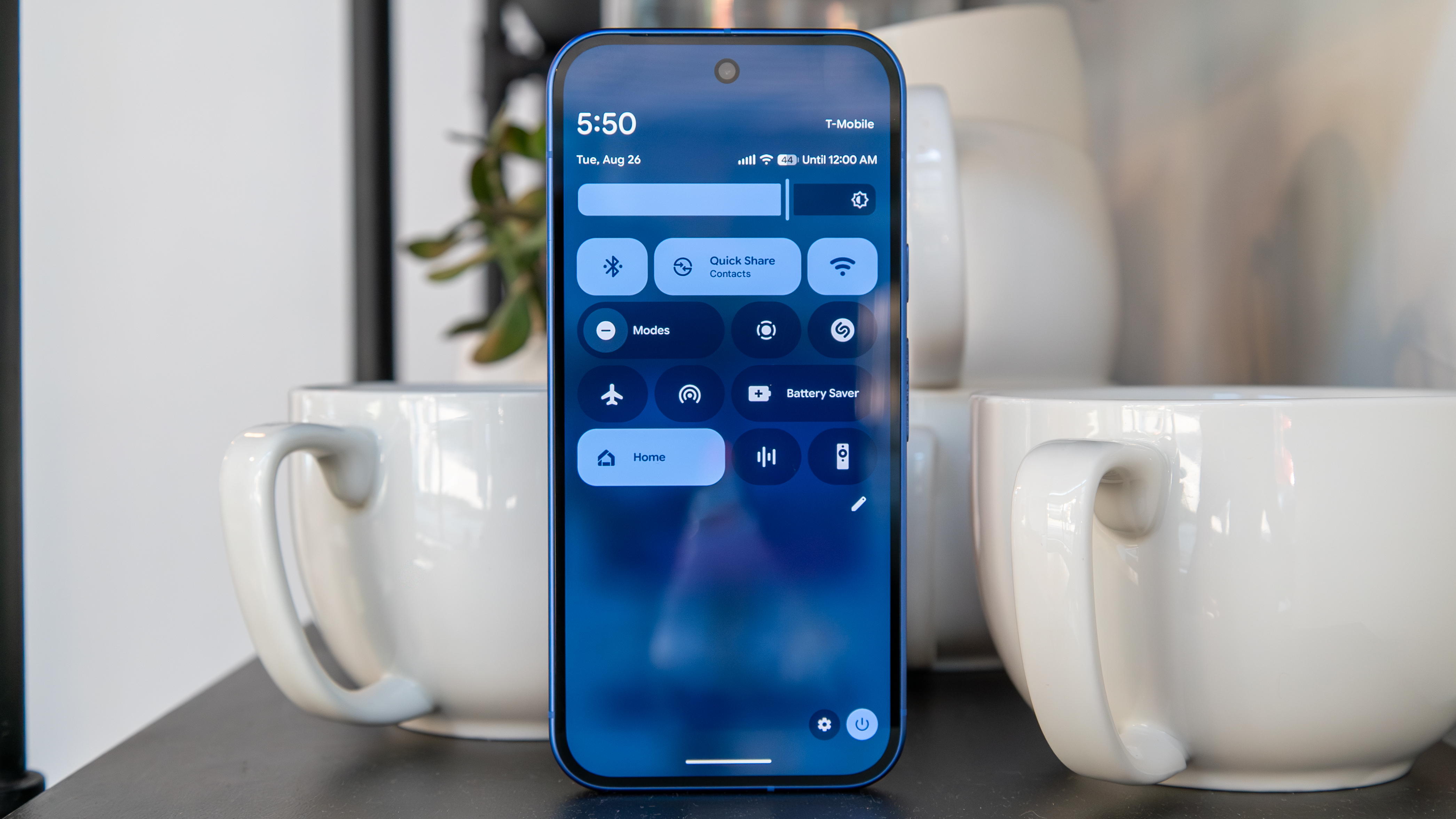
Perhaps my favorite change to Pixel UI is with the Quick settings. I wasn't a huge fan of the unnecessarily large tiles in previous versions, which limited the number of tiles you could view at a time compared to One UI. But now, Google lets you customize the Quick Settings panel more than I thought it would ever allow.
Article continues belowYou can now resize any tile simply by long-pressing it. You only get two choices, which are essentially 1x1 or 2x1, but it allows you to fit more tiles onto the panel and provide it with more personality, letting you highlight the most important tiles if you so choose.
That said, there still are some annoying quirks that haven't been addressed with Android 16.
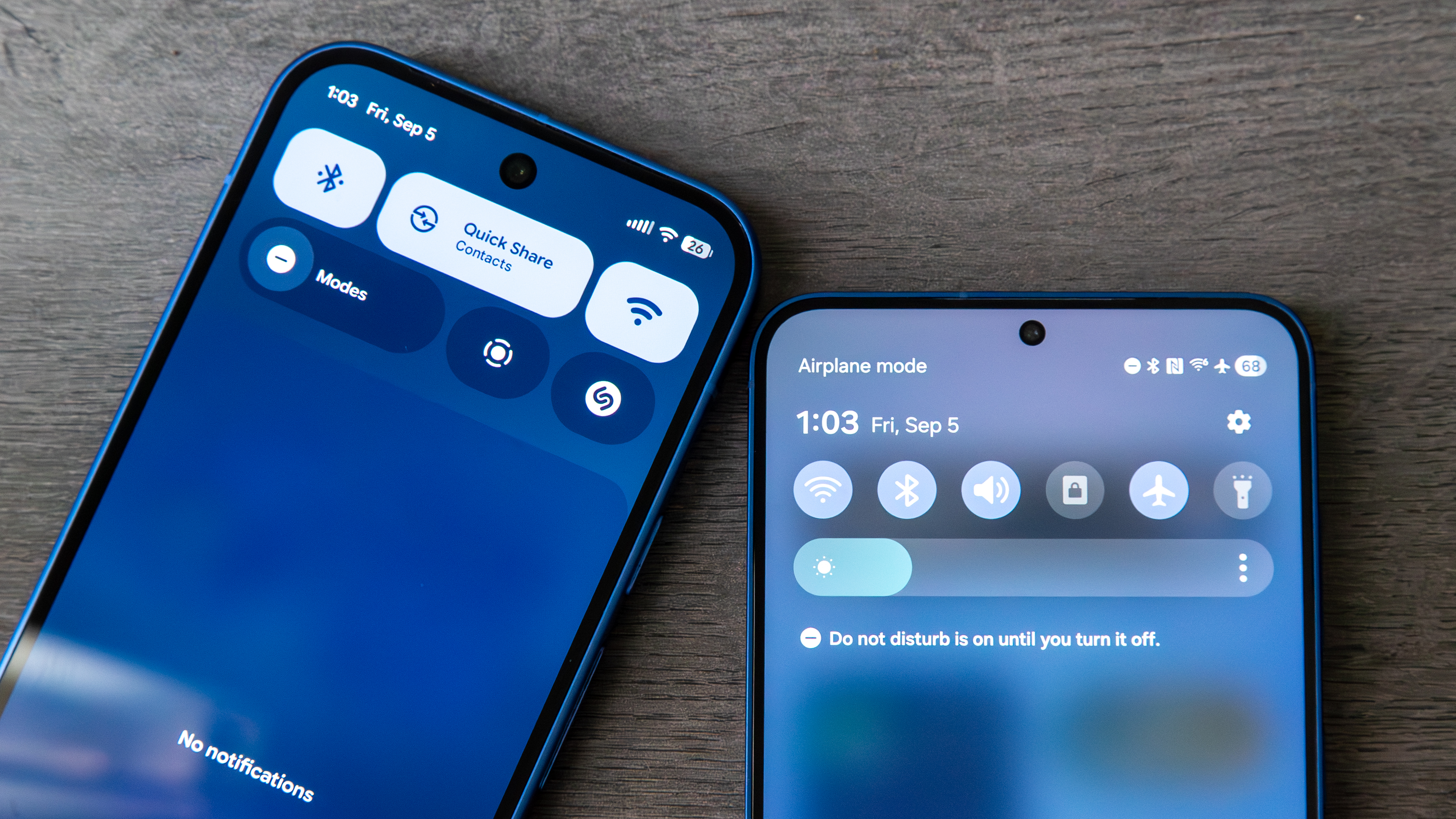
For a feature called "Quick Settings," I feel like it's not that great at actually offering quick access to some essential settings. For some reason, it takes two swipes of the panel in order to access the brightness slider, which is annoying when I want to quickly adjust it beyond the auto brightness.
Additionally, the actual Settings button is also inaccessible until the second swipe. Sure, I could have an icon on the home screen or swipe through the app drawer, but I prefer not to clutter my home screen with apps/widgets. I may just be spoiled by Samsung's Quick Settings, which gives you immediate access to the Settings icon after one swipe down.
Get the latest news from Android Central, your trusted companion in the world of Android
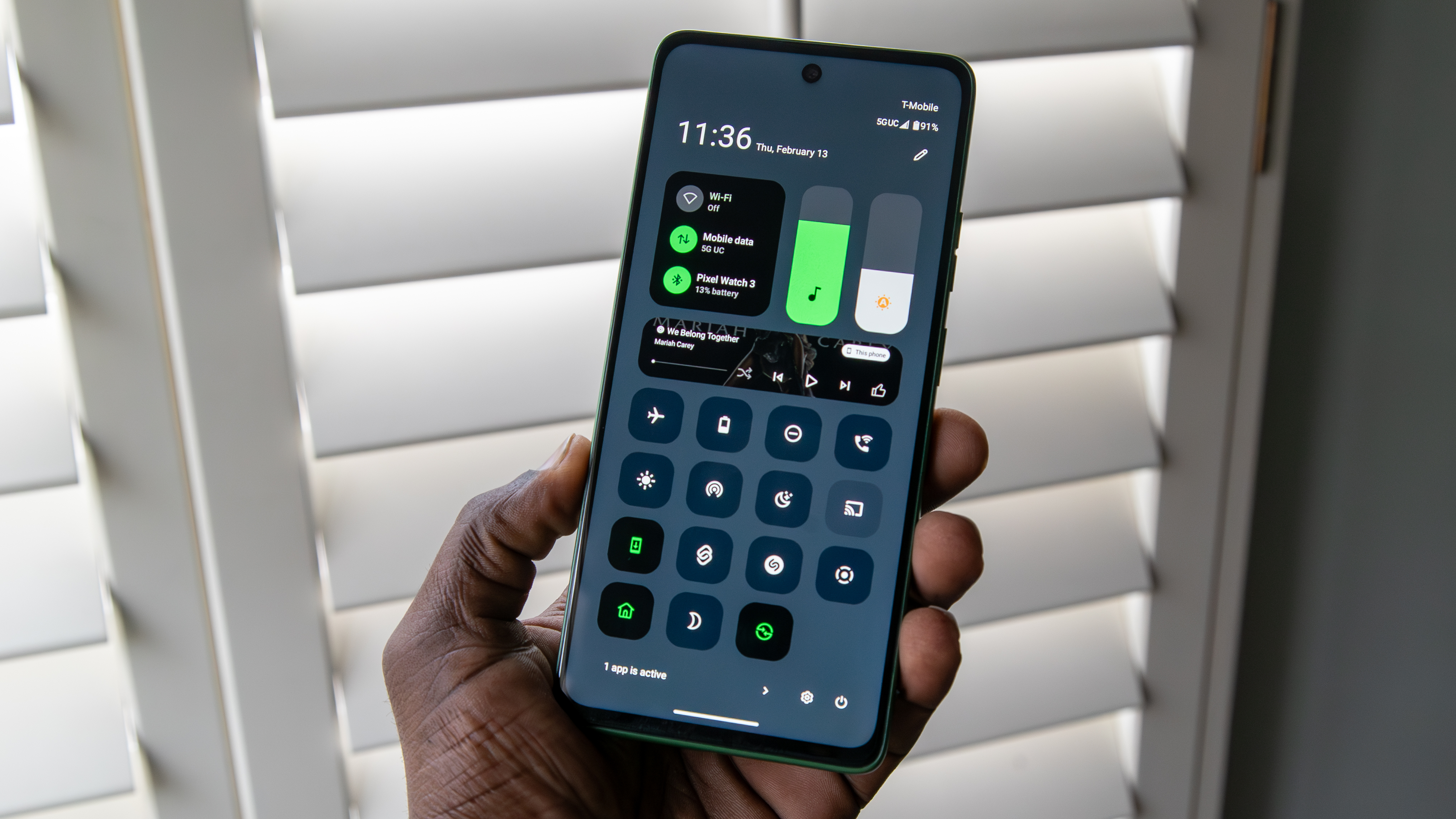
Finally, I would love to see Google add an option to separate the notification panel and Quick Settings menu. I've gotten used to this on Samsung and Motorola phones, and I have started to prefer it since it shows more tiles or notifications at once, and I can easily swipe between the two panels.
Multitasking
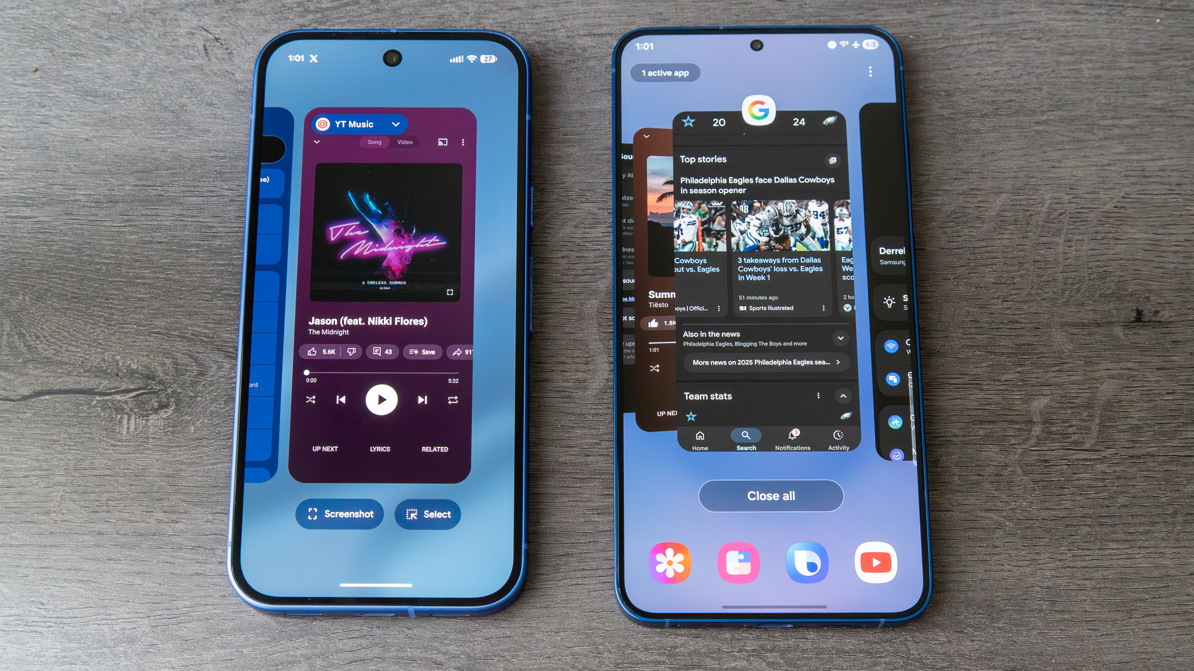
While Google is focused on improving the multitasking experience on foldables like the Pixel 10 Pro Fold, the experience on its traditional phones feels a bit lacking.
The Open Apps view simply displays large cards side by side, which doesn't offer a particularly helpful view of your apps. This isn't a huge deal, but it doesn't feel as useful as the Open Apps view from other OEMs. Furthermore, while access to features like Screenshot and the text selector are useful, I would like the option to see recommended apps to quickly jump into one.
Also, it doesn't make sense to me that I have to swipe all the way to the right in order to find the Clear All button. Even Motorola allows me to open the view and tap Clear All without swiping. I can also lock an app to the Open Apps view so that it stays open when I clear the rest, which is helpful when I'm streaming YouTube Music, for example.
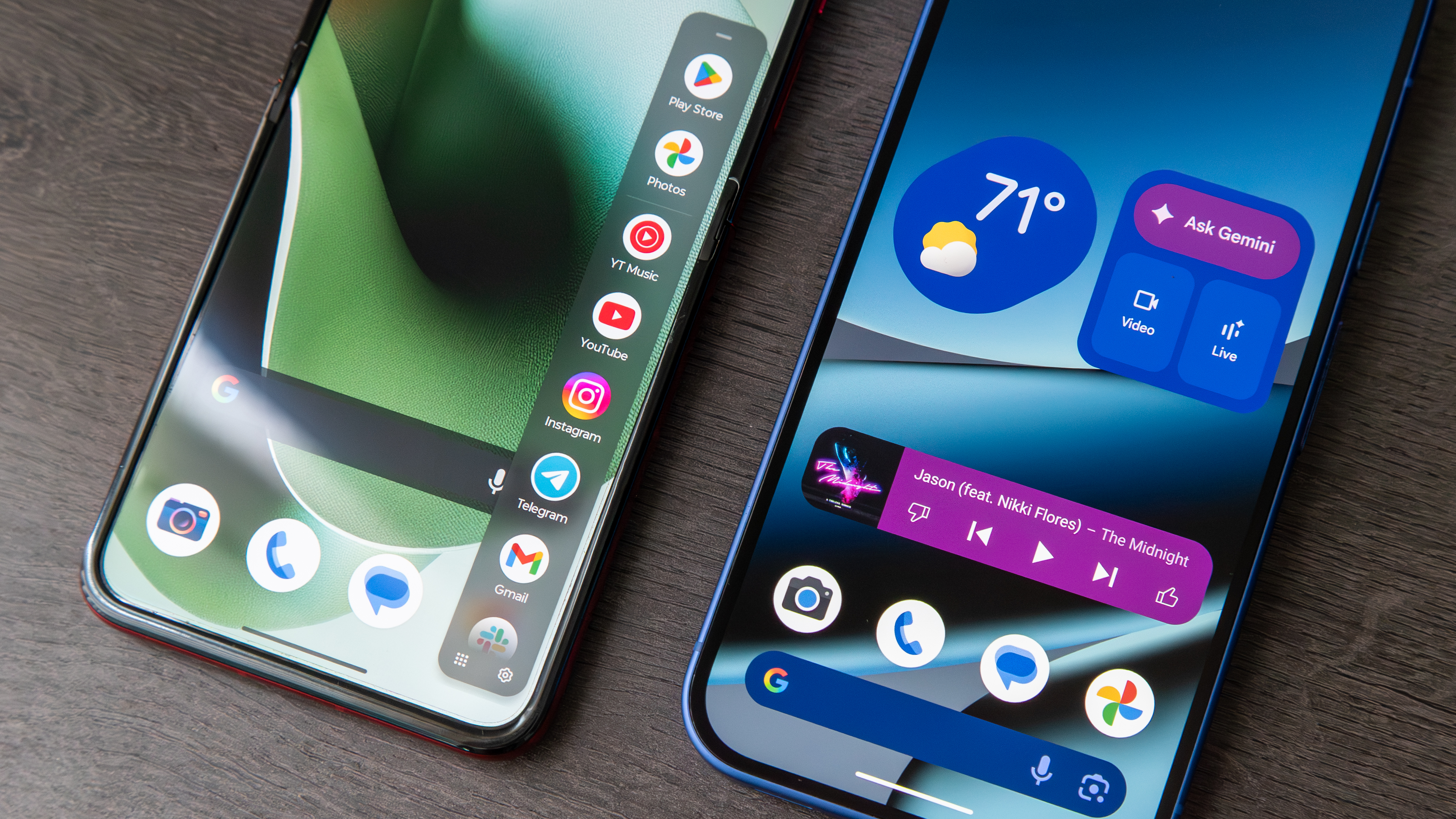
One feature I've been begging to see on Pixels is a native side panel. This is a space to quickly access your favorite or most-used apps simply by swiping from the side of the display on nearly any screen. It's incredibly useful, and usually the first thing I set up when using a new phone. It's also available on just about every other smartphone I've tested, from Samsung to TECNO, so it's odd that Google still hasn't included an option for it, despite giving us a taskbar on foldables.
More customization
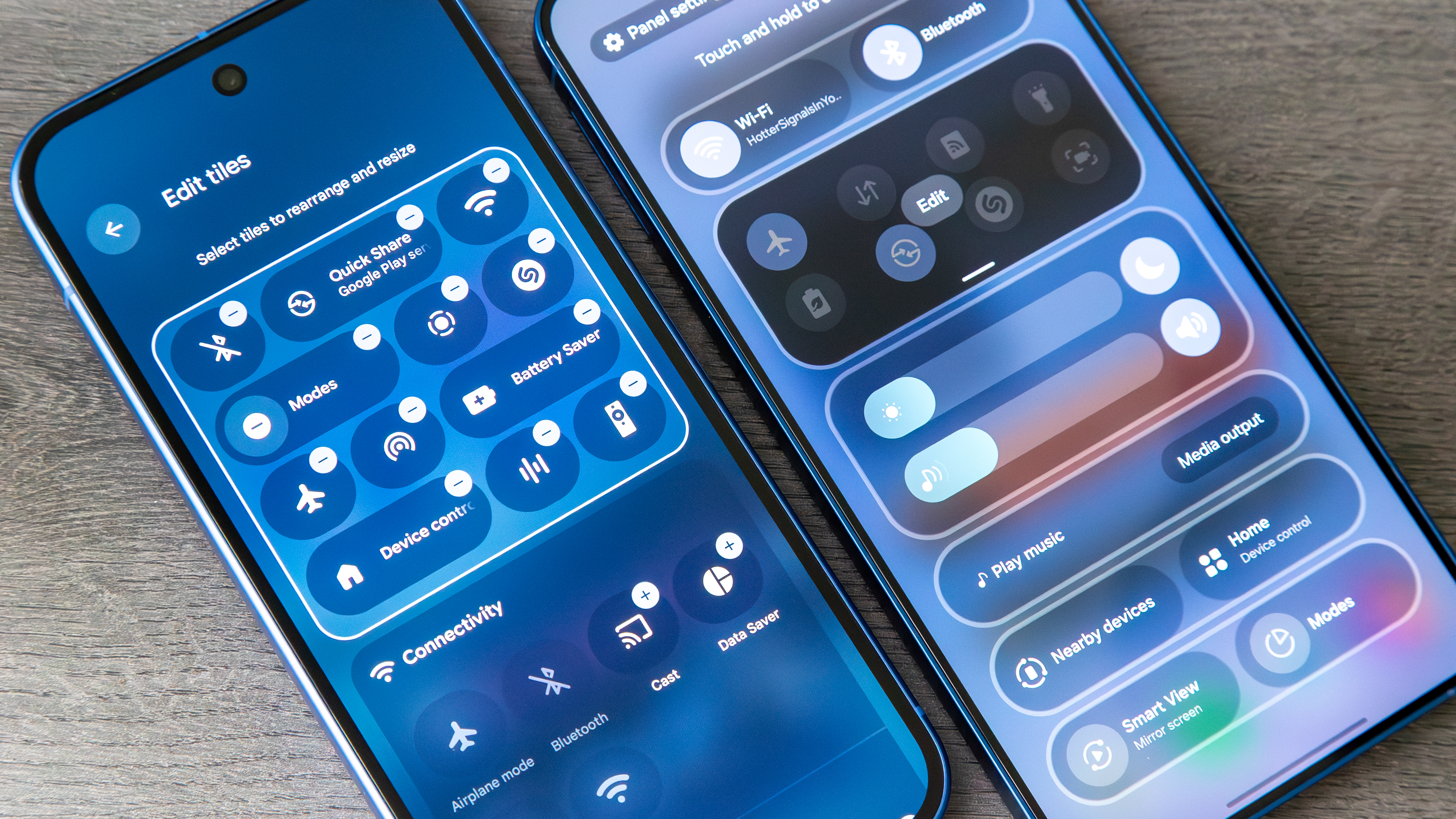
Most Android phones come with some level of customization, and the Pixel UI has improved on this front, especially with the aforementioned Quick Settings. That said, while there is a decent amount of customization, I would like to see more.
The Open Apps view is just one example; Google should let us choose the style in which apps are presented. Same with the Quick Settings menu; we should be able to further rearrange, resize, and change the style of the tiles and panel. Samsung does a great job of letting you rearrange the different elements on Quick Settings, and that would be a great starting point.
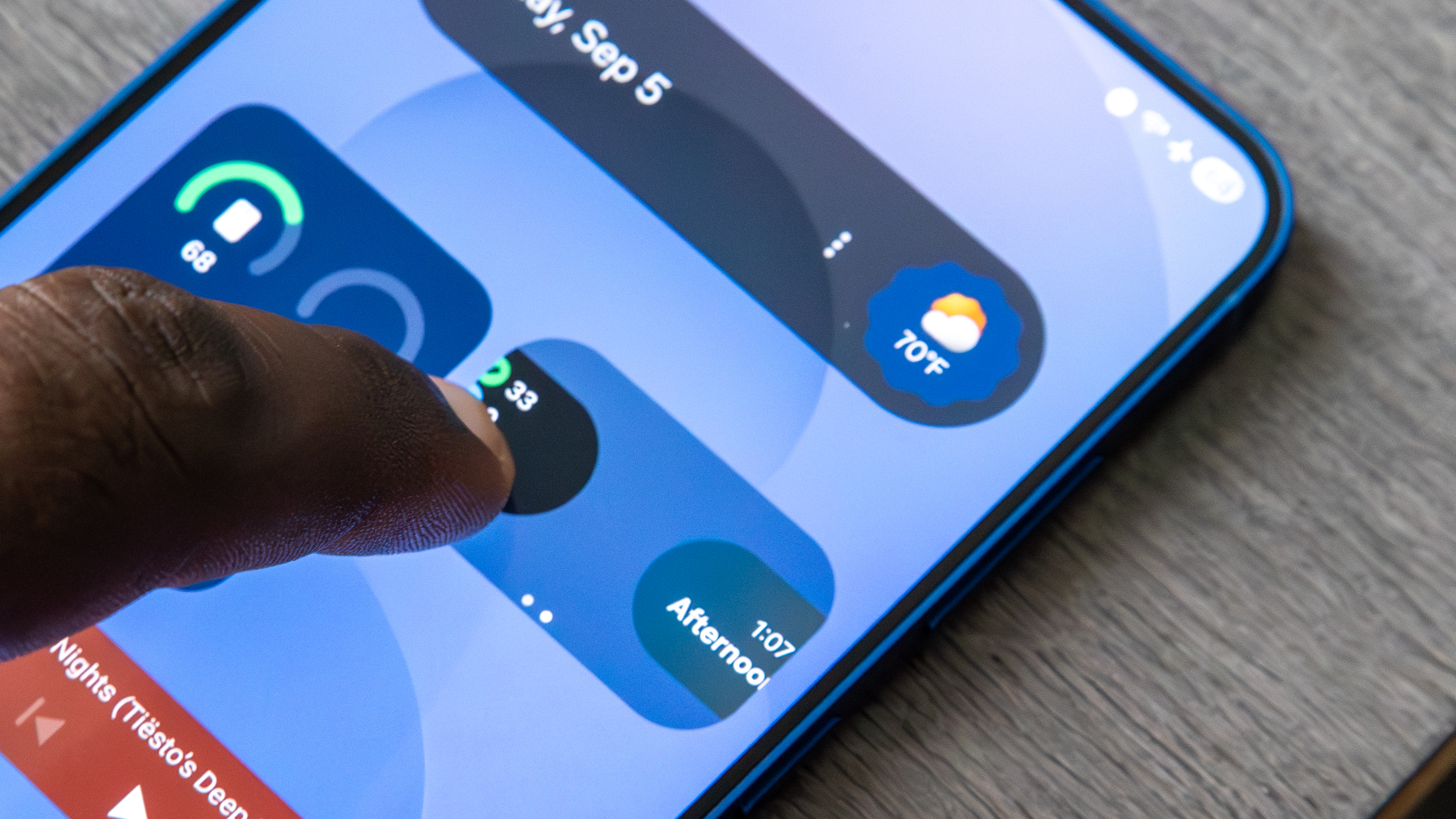
But even more than that, Google should let us customize other aspects of the Pixel UI, such as the shape of app icons and content shown on the status bar, allowing us to choose which icons we want presented and how. OnePlus offers this on its phones, and I always appreciated this as a way to declutter the top of my screen.
And as someone who prefers a cleaner home screen, I would also love to be able to stack widgets.
Best of both worlds?
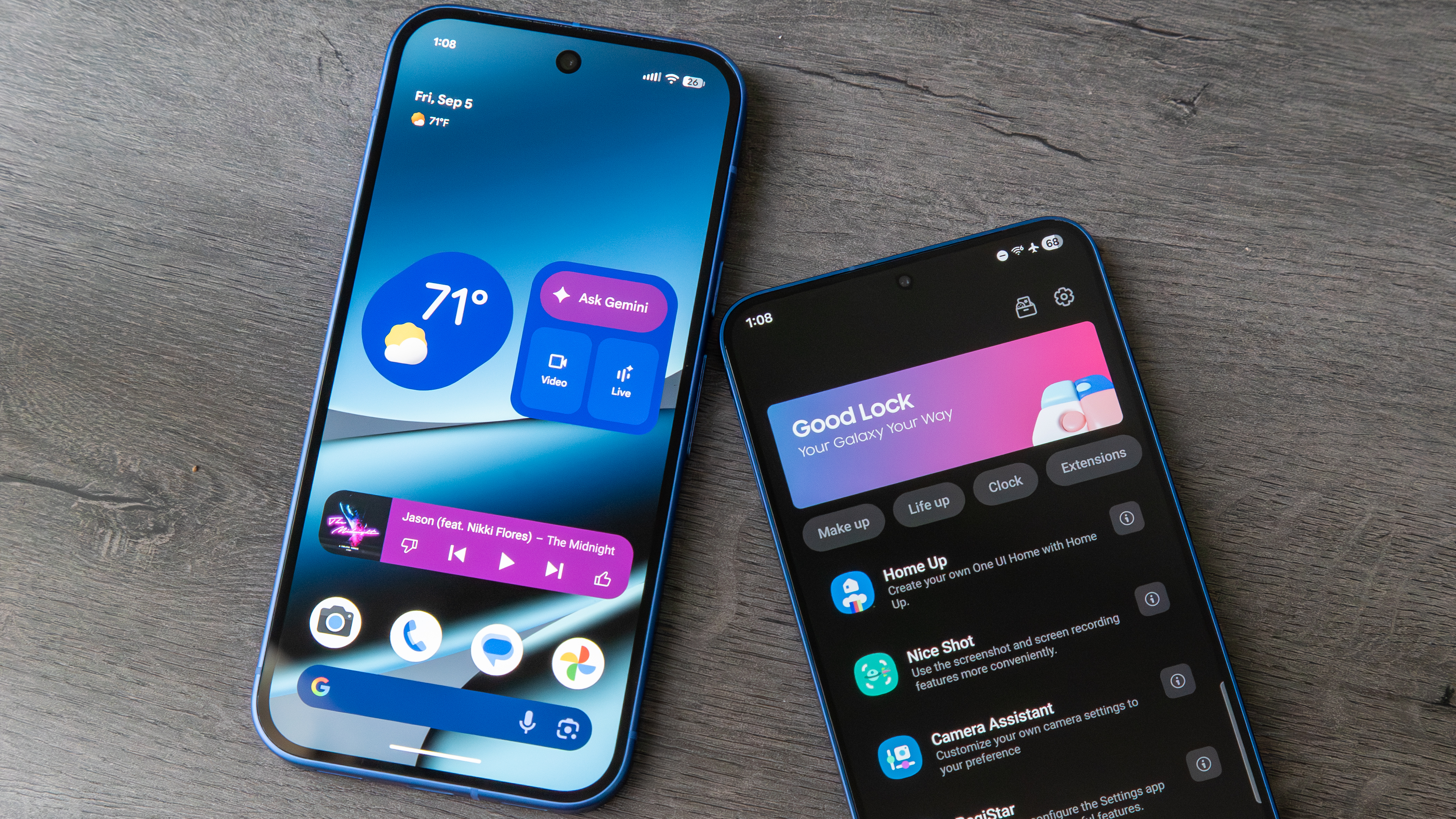
There are plenty of smaller things, too, which could add up to some pretty granular customization options. However, Android has always been about providing its users with options, and while many like the Pixel UI for what it is, offering the option for deeper customization could go a long way.
Maybe Google could launch a Good Lock-style app (perhaps called "Pixelate"), which gives users more ways to customize their phones without Google needing to mess with the core Pixel experience. It would give us the best of both worlds.
What Pixel UI changes would you like to see? Sound off in the comments below!

Derrek is the managing editor of Android Central, helping to guide the site's editorial content and direction to reach and resonate with readers, old and new, who are just as passionate about tech as we are. He's been obsessed with mobile technology since he was 12, when he discovered the Nokia N90, and his love of flip phones and new form factors continues to this day. As a fitness enthusiast, he has always been curious about the intersection of tech and fitness. When he's not working, he's probably working out.
You must confirm your public display name before commenting
Please logout and then login again, you will then be prompted to enter your display name.
