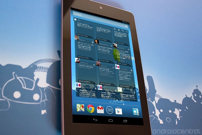
Falcon is a really great homescreen widget for Twitter. It follows closely in line with the Android design guidelines while still having its own distinct style. The widget is fully resizable and offers a handful of solid color choices and layouts. It still carries a beta tag, so Falcon is totally free, but still a work-in-progress.
The full complement of standard functions are available, including replying, retweeting (both native and quoted), favoriting, and sharing tweets via the system-wide menu. Conversations are threaded, though the tweets within the thread don’t have in-line reply/retweet/favorite controls, which is occasionally an issue.
Style

Falcon provides and excellent Twitter experience on the homescreen with smooth scrolling animation, simple and recognizable icons, and clean layout. All of the important functions are large and easily identifiable at a glance. There are a few nuances of navigation that take some getting used to. For instance, holding down on the the widget for too long when scrolling through your Twitter feed will put it into the reposition mode. It sounds obvious, but I hadn’t realized how often I left a finger floating while reading tweets. Also, the icon for switching between timeline and mention view isn’t entirely intuitive to use; toggle-style icon it uses is ambiguous as to whether it indicates the current view or the view that it allows users to toggle to. A switch would be more clear.
Article continues belowIn terms of sheer looks, Falcon is very sharp. Its various windows slide in quickly, and there are a bunch of different transparency, color and layout options. On that front, I don’t think it will be hard for Falcon to trump the widgets included with many big-name Twitter clients out there.
Function

Falcon has an embedded browser that allows users to quickly see links in tweets without having to tap anything but the tweet. You can launch links out into a full browser by tapping the link itself, though it would be helpful if there was a more visible icon somewhere around Falcon’s embedded browser to do it since links within tweets are pretty tiny targets. On the flip side, the embedded browser could use a few extra tools, such as a full-screen view and some standard navigation buttons in the off-chance that you want to stay within Falcon.
Though there isn’t any support for more advanced stuff, like search or lists, Falcon doesn’t pretend to be your one and only Twitter client; instead, tapping the main icon launches into your default Twitter app for more involved social networking. It would be nice to have this icon available everywhere, so that you wouldn’t have to navigate from the home screen of your Twitter app after finding something interesting on Falcon; for example, if you wanted to add a Twitter user to a list, the Falcon icon should be visible so you can launch right into that profile in your Twitter app, instead of having to back out to the Falcon home screen, then launching your Twitter client from scratch.
In any case, Falcon is still in beta, so there’s lots of time for those kinds of tweaks.
Pro
- Sharp, customizable interface
Con
- Still in beta
Bottom line
Falcon is coming at the Twitter game from an interesting angle by trying to cooperate with full-bodied apps while carving out a name for itself in the widget space. I could easily see myself using Falcon in conjunction with another app, provided a few small tweaks to make sure that it provides a clear, snappy transition from one to the other. If you’re unhappy with your current Twitter widget, definitely give this one a shot; even in beta, I think you’ll be pleased with Falcon.

