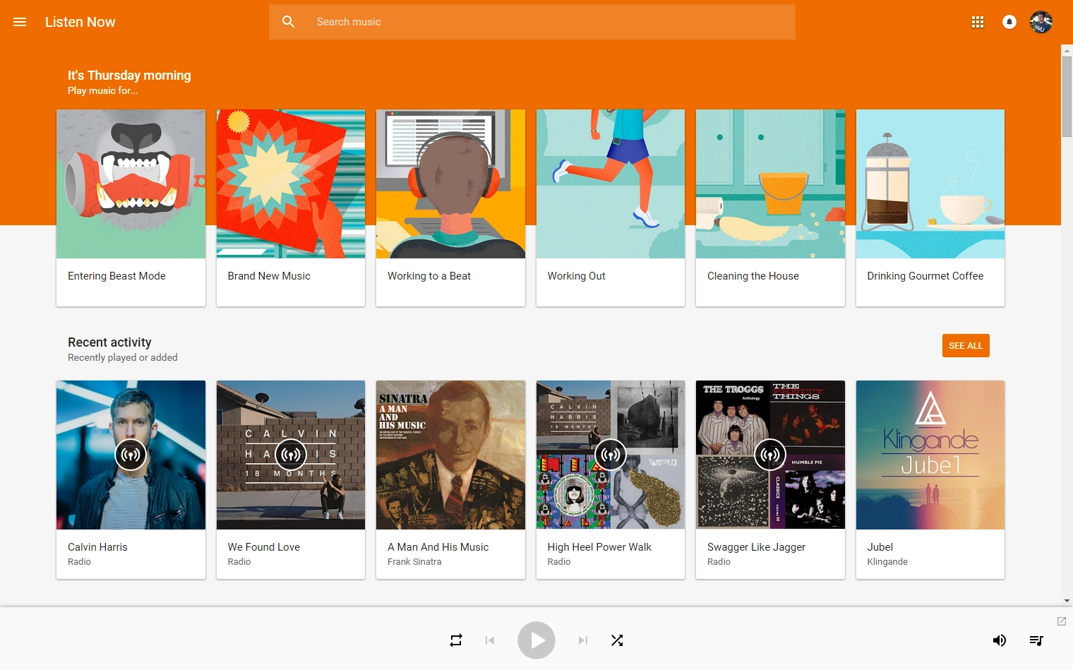
If you fire up Google Play Music on the web today you're likely to be greeted by a refreshed interface, pulling it closer in line with what you'd find on an Android phone or tablet. The new look is very familiar to the landscape layout you're already used to seeing on a large tablet today, with a deeper orange color and large cards taking up the entire screen. The left-side panel is now hidden by default, exposed by clicking a hamburger menu button just as you'd see on mobile devices, and there's a more prominent giant search box at the top of the screen.
When viewing your library individual artists now have circular avatar windows, just like you'd see on Google+ and elsewhere. And your upcoming music queue is no longer a full page affair — you access it from the music note button in the bottom-right corner of the screen and it pops up for quick rearranging. The pop-out mini player also looks nearly identical to the large widget you get on Android. Topping it all off is a new browser favicon that matches the new Android icon.


The interface takes a little getting used to if you were familiar with the more information-dense design of old, and we do notice a little interface slowdown and a few stutters here and there. Chances are those issues will be ironed out as Google rolls this to all Google Music users.

There's nothing you can do to force yourself onto the new interface, but considering how Google rolls out things like this you should have it soon enough. And unlike some major feature releases, this time around you're simply waiting for a redesign. So put on some of your favorite music in the old interface and wait it out — maybe the next time you refresh the page you'll be brough into the Material Play Music future.

