New mail categories make their way over from the web; updated design sheds an action bar for a cleaner look
Google is currently in the process of rolling out a newly redesigned Gmail app -- version 4.5 if you're counting -- that is the first major redesign in some time, bringing with it a few new features to improve your mobile email experience. It's a necessary update in many ways, bringing the design up to speed with the latest UI elements introduced at Google I/O as well as falling in-line with the latest features being added to the Gmail web interface. And let's face it, the previous Gmail app has had the same basic design for far too long.
While it was extremely functional, there wasn't a whole lot to be excited about with Gmail until this week. Things are changing though, so let's take a look at some of these new features and try to make sense of it all. Stick around with us after the break and see what's new.

The new interface and features
When opening the new Gmail app for the first time, the differences will be subtle rather than striking. You're still greeted by the same inbox, a primarily white and grey color scheme, and an action bar at the top of the app. There are still changes here though, touching many small parts of the interface. In the main email view, you'll notice that contact images have been added to the left side of emails (replacing checkboxes for multi-select) and that the bottom action bar has been removed. You can now tap a contact's image (or a letter representing the first letter of the first name of the person emailing you) to multi-select messages, and all secondary actions once selecting emails will show up as a change in the top action bar, rather than the bottom. There are also subtle tweaks to the way labels, stars and "important" markers are displayed on messages, but that's just cosmetics. The one truly hidden feature of the new redesign is the inclusion of pull-to-refresh, which is seemingly natural in mobile design nowadays and has the added bonus of saving one more spot on the action bar for other icons.


Interface changes continue as you slide in the new navigation panel, which in modern Google design guidelines takes place of the now deprecated slide-in drawer. Swiping in from the left edge reveals a pretty standard-looking navigation area where you can select between your different accounts and switch between different inboxes and labels. Your most recently accessed labels are pulled up underneath your inbox, but a full list can always be accessed from the bottom of the panel. If you choose to enable the new Mail Categories feature for Gmail the tabs will show in the drawer as well, but we'll get into that below.
This update is an overall tightening of the screws and polishing of the previous Gmail interface. Things aren't so far out of place that it will feel unfamiliar, but enough has changed to make it feel as though Google is actively working to improve the app. You'd be hard-pressed to find anything "wrong" with the previous version, so we're not surprised that this update brought a solid collection of subtle but useful changes.
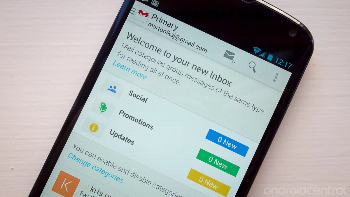
Mail categories
Google seems to have a grand plan to change the way you filter through your email, and following a gradual release of a new "tab" option for the web view of Gmail the Android app is following suit. The most interesting part about this is that you wouldn't know anything about the new tab (aka "Mail Categories") option just by opening the app. At least at this point, unless you explicitly enable the new view from the web first, you won't have the option to set things up from the app.


If you do choose to stick with the Mail Categories option, the tabs you selected will be synced to your device and show up in the slide-in panel underneath the "Inbox" subhead and above the "Recent Labels" section. They will have the same color-coded tabs and order as the web as well, naturally. By default the tabs are set to not sync or notify for any messages -- as is the case with all new labels and folders -- but that can quickly be turned on with a tap to the menu button. Turned on by default instead are small notification reminders that pop up at the top of your main inbox indicating that there are unread emails in the other tabs.
We're not entirely sold on the idea of the new tabbed interface, but at least it can be turned off completely if you aren't thrilled with it. Any settings change you make on the web will be reflected in the app, so just make your selection there and let it sync up on your other devices.
Tweaking and learning
The new version of Gmail has introduced a few new settings, but has also surfaced the importance of others that were added in previous versions. We covered how to turn on and off the new Mail Categories feature, but all of the other new options can be toggled from within the Gmail app's main settings menu. To turn on and off contact images, head to Menu > Settings > General settings and toggle "Sender image". (If you do choose to remove the images, you'll have to long-press on emails to then select multiple images.) Another important pair of settings -- and ones that build on the importance of previous updates -- are those to select what happens when you swipe and delete items in your inbox. Again under the "General settings" menu, you can choose whether Archive, Delete, or Archive & Delete options show in the action bar, as well as whether or not these message actions show in different views of the app. The rest of the settings menu should be a standard layout mostly unchanged from the previous version.
But no matter how many times you go through the settings and think you know where everything is, it's going to take some time to get used to the new layout. If you receive even a fraction of the email we do (and you should be happy about that), you spend a good amount of your day in and out of the Gmail app dealing with it. Once you get everything set up how you like it to fit in with your workflow, we think you'll feel right at home in the new interface. We've given it a few days and it's already growing on us as a worthy update to the headline Google app.

