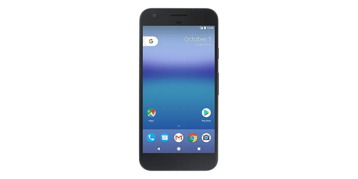
So the first proper render of one of the new Google Pixel phones has leaked out, and with it we're getting a look at some new UI tweaks in that device's software. The Pixel phones put the Google brand front and center, and so we're seeing some significant UI tweaks — not least of which is in Android's soft keys.
The new key layout uses a solid triangle, circle and square for the three main Android keys, with the home key having a white border around it. It's not a huge departure from the outlined icons of old, but it is a significant change to a part of the Android UI you'll be looking at an awful lot.
The new-style home button is a big visual differentiator from other Android phones.
There's no suggestion that these new-style buttons will come to other Android devices, Nexus or otherwise, with the arrival of the first Nougat maintenance release (Android 7.1). Indeed, our money would be on this style of button being unique to Google's Pixel devices. We'll have to wait and see on that, though.

We'll also have to hold out on whether there'll be any animation changes accompanying the new button style. Right now on Android 7.0, there's a familiar glowing effect when you tap the on-screen buttons, and Screen Search (formerly Google Now) expands to form a border around the screen when you long-press the home key. With Google (and its services) taking a more central role in the software, it'll be interesting to see whether the visuals of Screen Search — or simple button taps, for that matter — are also changed.
The new keys also raise a few concerns over possible image burn-in on phones with AMOLED screens, as the Pixel and Pixel XL are rumored to have. Since you're you're lighting up more pixels more often compared to the old hollowed-out icons, any burn-in could be more noticeable. (That's almost certainly something Google's factored into its design process, though.)
Android's on-screen keys: A brief history
Android 3.x Honeycomb — Tron-style

Honeycomb was weird — a tablet-only release of Android in 2011 that never really took off, with an oddball sci-fi UI. And that extended to glowing blue soft keys — a first for Android at the time — with sharp edges and bold outlines.
Android 4.0 Ice Cream Sandwich - 4.4 KitKat — Holo-style

In late 2011, Ice Cream Sandwich toned down the overtly futuristic visual style of Android, bringing a cleaner button layout with more consistent lines and a curvy back arrow. This button style would stick around through to KitKat in 2013.
Android 5.0 Lollipop - 7.0 Nougat — Material-style

Lollipop introduced Material Design, a major design overhaul for the whole of Android, and other Google properties. And with it, Android's on-screen keys became simpler and more geometric, with small outlined shapes for each key.
Pixel phones (Android 7.1 Nougat) — Google-style

The new Pixel phones are more Google-focused than ever before. So it's only natural to see this reflected in the devices' new button layout, with solid shapes extra prominence given to the home key, which is used to activate Screen Search (formerly Google Now).
Love 'em? Hate 'em? Share your thoughts on the Pixel's new-style soft keys in the comments below!

