Google Play Store gets a splash of color with Material 3 Expressive
Google's visual overhaul sneaks into the Play Store, bringing a vibrant new look.

Get the latest news from Android Central, your trusted companion in the world of Android
You are now subscribed
Your newsletter sign-up was successful
What you need to know
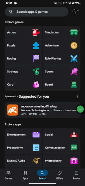
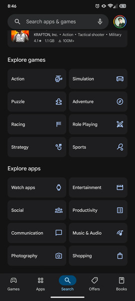
- Google Play Store is seen adopting Material 3 Expressive, featuring vibrant colors for category icons in the search tab.
- This server-side update (version 46.5.19) enhances the visual distinction of sections like Explore apps and Explore games.
- Previously, the Material 3 Expressive design has also started appearing in other Google apps like Gmail, hinting at a wider visual refresh across Google's ecosystem, coinciding with the Android 16 rollout.
Google's Material 3 Expressive is the most visually advanced design makeover coming with Android 16. While it is being incorporated across the interface, new findings reveal how Google Play Store is taking advantage of it.
The latest version of the Play Store app was seen bringing the Material 3 Expressive in the search tab, spotted by Android Authority. It appears to be a server-side update, which brings some colorful elements through the tab icons on the Google Play Store app.


Per the shared screenshots by the publication, it is pretty evident how the icons across categories look after the latest update. The icons across Popular apps, Explore apps, and Explore games are much easier to spot, thanks to Material 3 Expressive's vibrant color design elements. While the icons now pop up in colors, the outline still remains intact as in the previous version.
Article continues belowSuch subtle design changes are expected to spread across all Google apps as we progress, with the rollout of Android 16 anticipated in the coming months, potentially aligning with the launch of the Pixel 10 series.
As for this update, as told, it is a server-side one and was seen on the Google Play Store running version 46.5.19.
Gmail gains Material 3 Expressive look
Like the Google Play Store, the bold Material 3 Expressive look has also been witnessed in the search giant's Gmail app. The changes were prominent when it comes to the search bar, bottom navigation bar, and compose button — all of which had their own accent colors popping up.
The compose button now has a glowing look with the new update next to the chunkier font, and the accompanying pencil icon also has a bolder look. When the rollout happens broadly, Gmail users can experience a major revamp with new colors all over the place, and a new card-style layout is also expected.
Get the latest news from Android Central, your trusted companion in the world of Android

Vishnu is a freelance news writer for Android Central. Since 2018, he has written about consumer technology, especially smartphones, computers, and every other gizmo connected to the internet. When he is not at the keyboard, you can find him on a long drive or lounging on the couch binge-watching a crime series.
You must confirm your public display name before commenting
Please logout and then login again, you will then be prompted to enter your display name.
