Google Messages is about to get a whole lot more animated with this Material 3 Expressive tweak
Your Google Messages profile could score fresh Material 3 Expressive buttons.

What you need to know
- Google Messages is going full-on Material 3 Expressive, and the makeover seems to be creeping beyond just your chats.
- A deep dive into the app's beta version uncovers pill-shaped buttons replacing the old circular ones on the contact profile page.
- The new look targets the four go-to buttons—Call, Video, Contact Info, and Search.
Google Messages recently got a style upgrade, fully embracing the bold and colorful vibes of Material 3 Expressive. But it’s not stopping at the chat screen, as this fresh new look could be starting to spread its wings across more parts of the app.
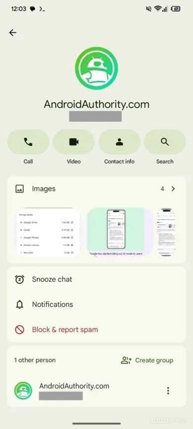
Android Authority dug up something interesting in the Google Messages v20250701 beta, suggesting that Material 3 Expressive buttons are heading to the profile page. You’ll spot the update when you tap a contact’s name at the top of a chat or hit their profile picture in the conversation list and tap the “i” icon.
The potential redesign zeroes in on the four main buttons under a contact’s number—Call, Video, Contact info, and Search. Instead of the usual round icons, they’re getting stretched into pill-shaped buttons.
Article continues belowButtons with personality
Additionally, they react when you tap them, gently expanding in width, then snapping back once you let go. It’s a small touch, but it adds a nice bit of flair and polish.
The new buttons are noticeably bigger, and they're totally in step with the Material 3 Expressive look that has been popping up across other Google apps lately.
It's worth noting that this feature only showed up after some manual tinkering by the folks at Android Authority. So, sideloading the Google Messages beta APK alone won’t flip the switch on its own.
Last month, Google was spotted working on changing the tabs for emoji, Photomoji, GIFs, and sticker panel in Messages. Instead of sitting side-by-side like before, they’re grouped in a neat, pill-shaped layout that makes each option stand out more. Tap one, and it pops with a richer color that matches your Material 3 theme.
Get the latest news from Android Central, your trusted companion in the world of Android
Even the “plus” icon got some love, meaning the menu it opens now has slightly bigger, rounder buttons with a bit more breathing room.
There's no word yet on when this revamped contact page will hit the stable version since it’s still tucked away in the beta at the moment. But with Google going all-in on Material 3 Expressive at present, it's a safe bet that this update will make its way to everyone soon.

Jay Bonggolto always keeps a nose for news. He has been writing about consumer tech and apps for as long as he can remember, and he has used a variety of Android phones since falling in love with Jelly Bean. Send him a direct message via X or LinkedIn.
You must confirm your public display name before commenting
Please logout and then login again, you will then be prompted to enter your display name.

