What is this white stuff on my icons and how do I get rid of it?
Get the latest news from Android Central, your trusted companion in the world of Android
You are now subscribed
Your newsletter sign-up was successful
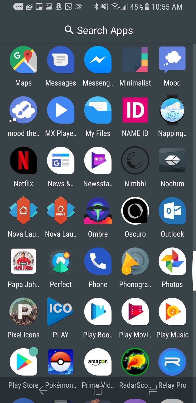
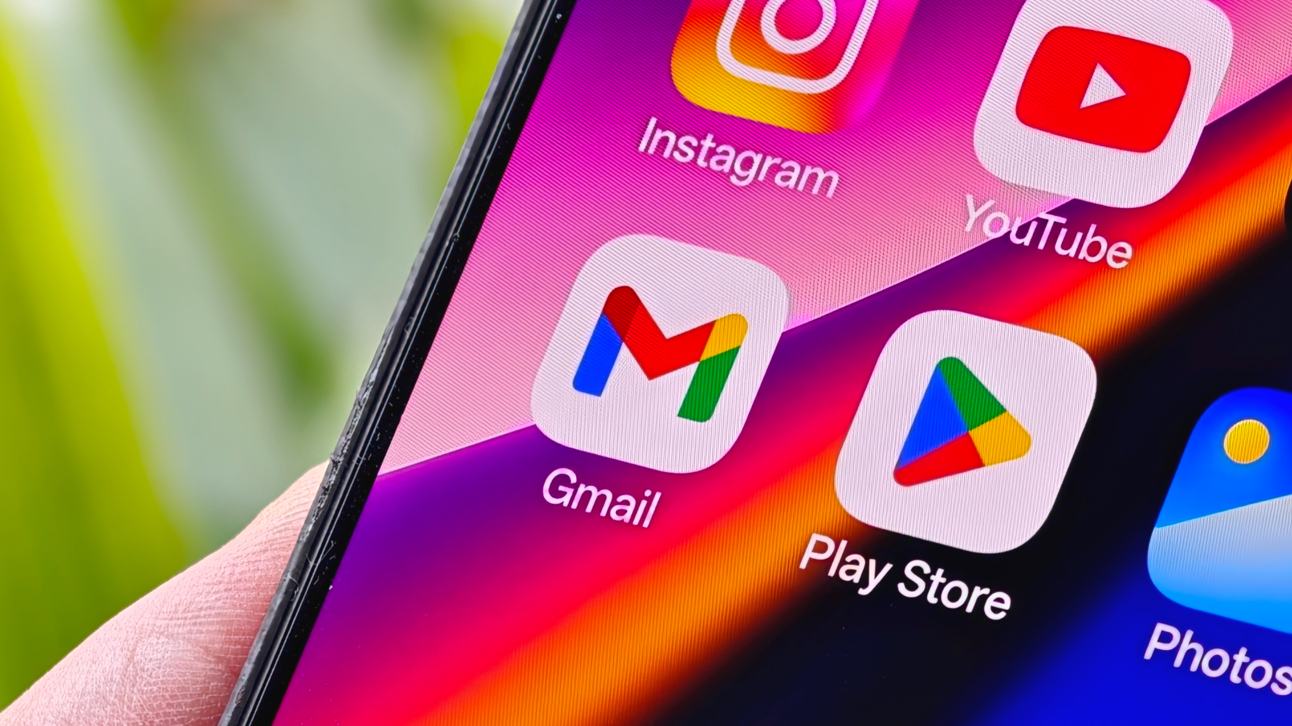
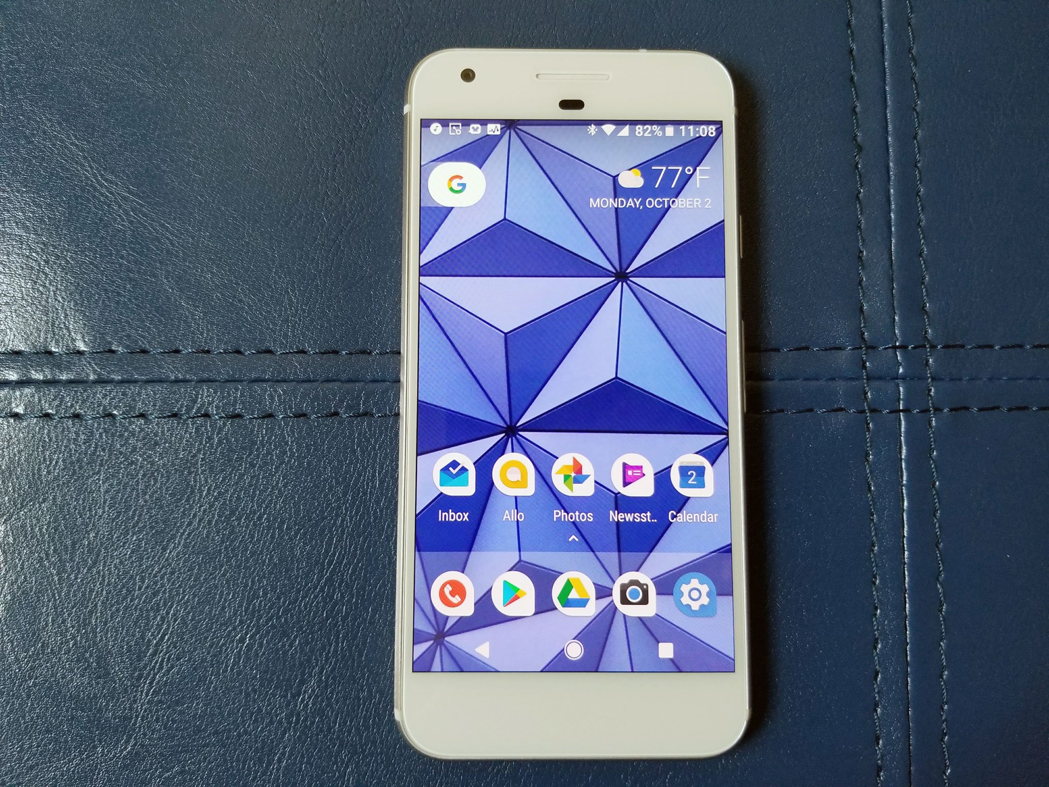
What's the most noticable change when you jump from Android Nougat to Android Oreo? It's not the emoji, and it's not the not the snazzy new notifications. It's all the white space that invades your app drawer with Adaptive icons. Adaptive icons have a lot of potential to jazz up our app drawers while keeping things consistent and beautiful, but that's not happening until app developers update their icons to the new standards. That includes a lot of Google apps, which are currently legacy icons on white backgrounds, or just plain legacy icons.
Until that happens, though, we don't have to be stuck with a bunch of white on our app icons. This is Android, after all. When we don't like an app icon, we change it!
Now, there's a few ways to go about getting rid of this white space. Unfortunately, they all start the same way: switching to another launcher. Switching to a launcher that doesn't support Adaptive icons, does support icon packs, or features flexibility in deploying Adaptive icons gives us options to get rid of that white space.
Article continues belowFind a new home screen with our Best Launchers guide
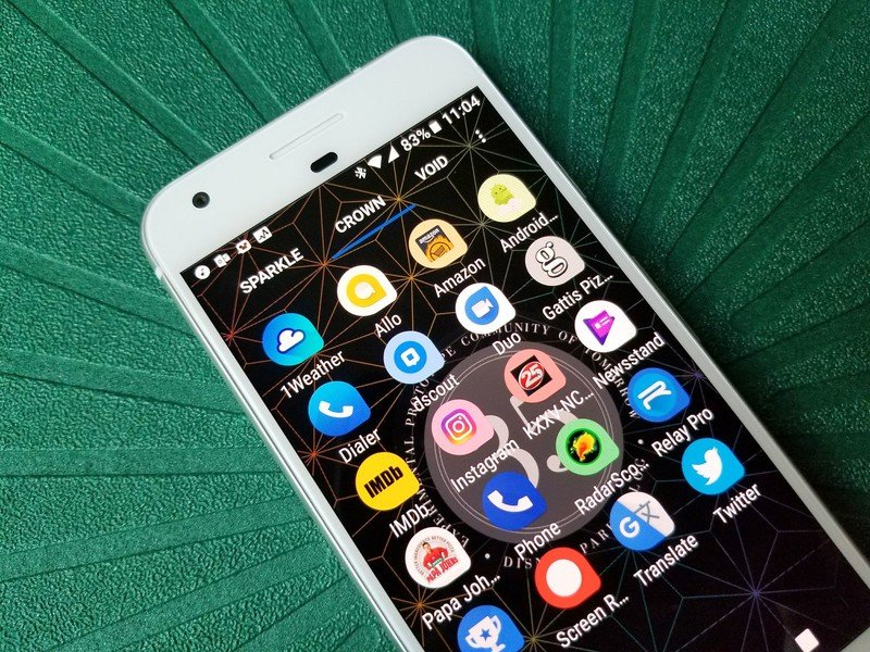
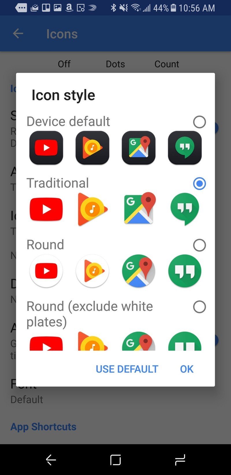
Nova Launcher uses the same method behind their color-matching notification badges to tint the background of legacy icons to better match their icons, and for some large square icons, Nova will simply enlarge the icon to fill the Adaptive icon mask entirely. This is a good method if you want the uniform shape that Adaptive icons provide while getting rid of the garish white. It is worth noting that this will not work for all apps, as a number of Google apps use Adaptive icons that are their traditional logo on a white background.
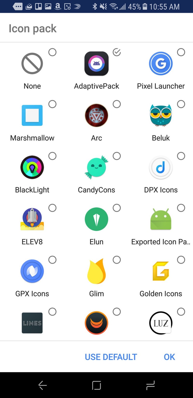
Some launchers allow you to disable adaptive icon masks for the entire app drawer, or at least for unthemed icons. Action Launcher currently does this best, allowing you to keep adaptive icons that work properly while stripping your white backgrounds. They also have their own proprietary Adaptive icon pack just for their launcher that adds Adaptive icons for the most popular third-party apps. The pack, called AdaptivePack is still very young, but it's growing.
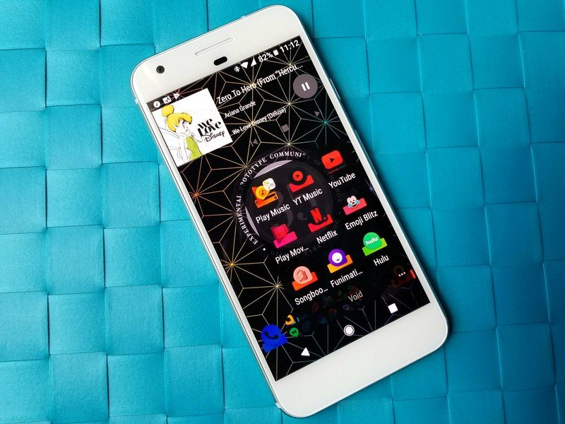
Forgoing adaptive Icons completely, you can instead turn to what we used before Adaptive icons came about this year: icon packs. There are plenty of icon packs out there that will make all your icons the same shape, be it a circle, square, or even unique shapes like the docked icons in Ombre. Icon packs are compatible with more launchers than Adaptive icons right now and compatible with more versions of Android, too. Icon packs with good masks, good icon selection, and most importantly good taste are some of the easiest purchases I make on Android, and I come back to them time and time again.
Get the latest news from Android Central, your trusted companion in the world of Android
Will Adaptive icons improve with time? Well, we can only hope. Until they do, however, there's nothing wrong with finding ways to get ugly white adaptive icon backgrounds out of our app drawers and our home screens.
Ara Wagoner was a staff writer at Android Central. She themes phones and pokes YouTube Music with a stick. When she's not writing about cases, Chromebooks, or customization, she's wandering around Walt Disney World. If you see her without headphones, RUN. You can follow her on Twitter at @arawagco.
