
Android 12 is here, and we’ve seen how all the OEMs are putting their own spin on the OS. Companies like Samsung, OnePlus, and others have slapped their UI over Android 12 to make it look, feel, and act how they want. Meanwhile, Google had made a pretty drastic change to the Pixel UI with the latest version, focusing on more colors, unique widgets, and big buttons. I had not owned a Pixel smartphone until very recently, and I have to say that trying out Android 12 on a Pixel is what makes me want to stick with Samsung and One UI.
I'll start by saying that it was hard not to get excited about Google's Android 12 UI when it was first unveiled. Thanks to Material You, it represented such a massive overhaul of the OS from what we’ve seen on previous Google phones, one that mirrored the new Pixel 6 hardware. It’s much more colorful, more personal, and, dare I say it, fun. But as time went on, I became more and more concerned about some of the questionable choices that Google made with its UI and, frankly, hoped with all my might that other OEMs wouldn’t adopt them.
Bigger isn't always better
My main complaint? Everything is so damn big on the Pixel UI, to the point that I feel like the Pixel has turned into a caricature of Android. Why in the world does Google have four big-ass buttons on the Quick Settings menu for my Pixel 6 Pro, which opens up to show me only eight in the pull-down menu? Compare that to the six toggles that I have access to on the Galaxy S22 pull-down menu, letting me view up to 12 toggles before having to swipe over for more.


The UI for notifications is also unnecessarily large on the Pixel. I keep going back to my Samsung because everything is just so compact, to the point that Samsung can fit the brightness bar in the pull-down menu and still take up less space than the Pixel, while still giving me quick access to the Settings app without making me swipe down again like I have to on the Pixel. Samsung also makes its UI more reachable by including a huge banner for different screens throughout its UI and apps, which pushes everything down. This is probably the only instance where it makes sense to waste space.
On the one hand, it's easy enough to go into Pixel settings to make the display smaller, so some of those UI elements aren't as in-your-face, but the problem is that it makes everything else in the UI smaller, like app icons and text, and things end up looking strange and way too small. Plus, it's not like that solves my problem with having fewer accessible Quick Settings toggles
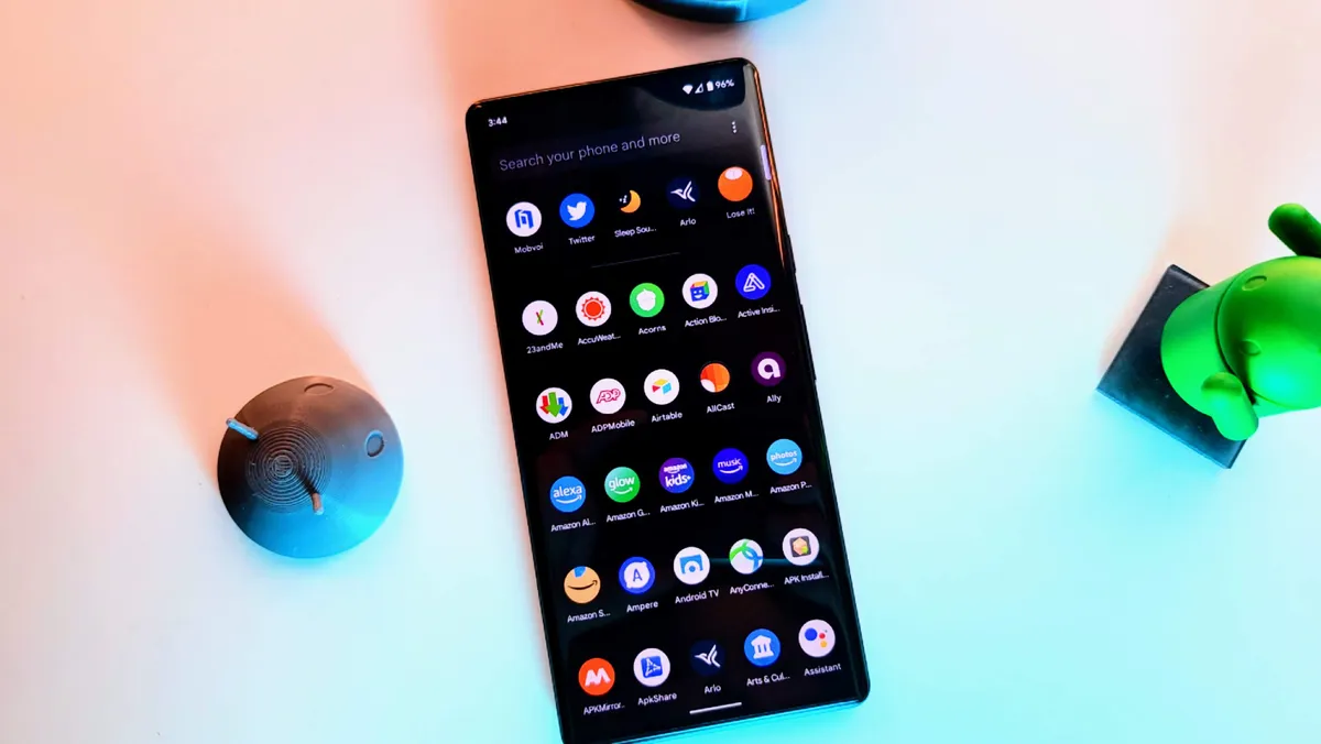
Pixel's UI makes notifications unnecessarily large.
Speaking of settings, the layout of the Settings app is another thing I just prefer on One UI. Everything is laid out in a way that appears to make sense. On the Pixel, Google combines Wi-Fi and data for the new Internet tile, which I'm also not a fan of, but decides to give us a separate "Connected devices" option in Settings for Bluetooth and other connections. Samsung puts all of these into a "Connections" option in the settings menu. Plus, Samsung nicely sections things off so they're less cluttered, and you can have a general sense of where a particular setting is. Google appears to just throw caution to the wind and splatter its settings all over the place.

I also love love love Samsung' Edge Panels, which essentially gives me another Quick Settings menu but for apps and other functions. Unfortunately, I've yet to find a native equivalent on the Pixel (but if there is one, please point it out).
If it ain't broke...
My colleague, Nick Sutrich, notes how Google made such a drastic change with the UI on its Pixel phones, but the switch from One UI 3 to One UI 4 on Galaxy devices hasn't been as dramatic. He argues that Google is likely doing what it can to differentiate itself while trying to compete with the iPhone with a visual (and unique) hardware and software overhaul. After all, the Pixel 6 series is probably the first true flagship Google has made. Previous Pixels have barely made much of a dent in terms of sales, but that's slowly starting to change as Google makes a huge push for these phones.
On the other hand, Samsung is one of the most successful Android OEMs in the world and constantly churns out many of the best Android phones around. It didn't need some massive visual overhaul for One UI 4 to help make it successful; it just is. And as someone who now uses both, I can see why. Samsung's UI is clean, compact, and consistent, something it has gone out of its way to ensure on all its devices, from the Galaxy Watch 4 to its Windows laptops.
Samsung doesn't need a massive visual overhaul for One UI 4 to help make it successful, it just is.
Mishaal Rahman, the senior technical editor at Esper and former editor-in-chief of XDA Developers, says he doesn't think it's a coincidence that Google made Android 12 such a big update for the Pixel. He notes how Google dictates the changes that go into the Android Open Source Project (AOSP), developing Android "mostly in secret" before they "push out the source code over the walled garden they've constructed to AOSP."
"The reason this is important to note is that it explains the decision-making that goes into a lot of the features and UI changes you see in Android 12, both in AOSP and on Pixel," Rahman explains in an interview. "Google does develop a lot of its own proprietary software additions, but what isn't fully proprietary and is in AOSP was still likely influenced by what the Pixel team needs. For example, Android 12 in AOSP added a UI for setting up and using an under-display fingerprint sensor because the Pixel team needed it for the Pixel 6."
In a blog post in January, Rahman also noted that this likely led to more problems for the Pixel series. "Android 12 was Google's biggest OS update in years, and given the approximately one-year turnaround for its development, it's no surprise that the initial release had a lot of bugs and unresolved issues." Meanwhile, Samsung's Android 12 update has gone mostly smooth, again, likely due to the fact that Samsung didn't need to make such a drastic overhaul to its UI.
That's not to say there aren't plenty of things to like about Google's Pixel UI. On the Pixel, it's smooth, simple, and free of bloatware, which is sadly still a win in 2022. Vertical scrolling in the app drawer is a personal favorite and something my colleague Chris Wedel points out as a reason he prefers the Pixel UI. Unfortunately, you can only achieve this on the Galaxy when using Good Lock, but it's easy enough, even if it's an imperfect solution. Plus, the Pixel's exclusive apps and services like At a Glance definitely add to the experience. Unfortunately, it's just not enough for me, and I have a hard time taking the Pixel seriously with this UI. My annoyances are why I often find myself recommending Samsung smartphones to my friends that are looking to upgrade from their older Pixel phones.
Be together. Not the same.
Yes, I spent this article nitpicking at the Pixel UI (and I could go on, but there's only so much space on the internet), but part of buying a phone is the experience and the feeling you get when using it. I can't help but feel like Google just wastes a lot of space with its UI choices by making everything comically large. But while the Pixel may not be my favorite phone, that's okay because plenty of other people like what Google has done with Android 12 on the Pixel.
I may try to convince my friends to go Galaxy, but some decided to upgrade to a newer Pixel because it's familiar, and they've learned to love the new UI. Just like I've become accustomed to Samsung's — arguably better — UI, other Android users like what they like from various OEMs. As our Jerry Hildenbrand points out, Android's best feature is choice, so find a phone that makes you happy. For me, I'll keep standing on my soapbox telling everyone to stay away from the Pixel's oversized buttons. But then again, it's not like Samsung needs my help selling phones.

