
For years, as fans of Android smartphones, we have loved and maybe hated the visual differences between each manufacturer's user interface (UI) or skin. Though Google develops Android, what consumers see on Pixel phones is a whole different thing. With Android 12 and the Pixel 6 series, Google gave us the Material You skin. Samsung has its own skin too, and with the latest version of Android, it's reached One UI 4.1.
Google made a significant shift in its design language with Material You and it has mostly been well-received. On the other hand, Samsung stayed true to its UI style by making very few changes in One UI 4.1 from the design language that began in 2018. The decision to stick with what works isn't necessarily a bad thing, but it's coming up on four years, and the new Material You from Google is helping One UI show its age.
Setting the stage for my comparison here, I use the Pixel 6 Pro and the Samsung Galaxy Z Fold 3 to inform my opinions. With that said, my Z Fold 3 has yet to update to the new One UI 4.1. While there are a few small visual differences, they won't affect the points I'll make below. Here are four ways that Pixel's UI is better than Samsung's.
Overall, Material You feels fresher

When the Pixel 6 series with Android 12 was finally released last October, it ushered in an entirely new feel to Google's UI. Before the latest version of Android, the UI was known simply as Material Design — and the addition of You makes all the difference. Given that One UI has primarily stayed the same since 2018, with only small visual changes showing since then, it's no wonder that Google's new Material You just feels fresher.
While Samsung has long been one of the best Android phone manufacturers, their UI wasn't always popular. The change to One UI was a big one, and overall a very choice. However, the skin is starting to show its age and that could be in part because Samsung found one that worked after years of getting skewered because it used to be so bad.
Though the Pixel's UI was due for an overhaul, Samsung's One UI is overdue for its update.
Material You has taken on the idea that bigger is better for much of the UI. The quick toggles in the notification shade are oblong circles in two columns from the three columns of circles, similar to the current One UI in previous versions of Android. Samsung did adopt much of the Material You color palette, which is a more muted pastel rather than the bolder colors used before. However, with Samsung, the palette change had much less of an impact.
When I asked Jitesh Ubrani, research manager for IDC's worldwide device tracker, why Google made such a big change to the Pixel UI, he told me, "in many ways, the Pixel 6 series is a rebirth of the Pixel line, and what better way to make consumers see that than by offering a brand new and highly customizable UI to go with it."
Explaining a feeling can be difficult, but when using Android 12 on a Pixel — it just feels new. The change to Android 12 for Google displays a major shift in UI design, and maybe that's part of what makes it feel fresher. Because even though Samsung picked up the new version of Android, its skin, One UI, still feels stale.
Material You feels more personable

When something is personable, it is not about showing personal information or how it physically fits you. It's about being approachable or even comforting. By making elements within the Pixel's Material You theme larger overall, it makes using the interface seem easier and less complex. If you think of one thing that iOS users say about Apple's UI, it's that iPhones are just easier to use.
When I asked what he felt were the benefits of the Pixel's UI in comparison to what Samsung has in One UI, Ubrani said, "Pixel appears to have a simpler interface and often puts the Google Assistant front and center which allows Pixel phones to do things that others cannot."
While some smartphone users prefer a more compact layout that shows more app icons and toggles, many find that to be overwhelming. Google went so far as to introduce a new system font that is a bit bolder to make the text easier to read throughout the interface. Buttons within Google apps that sport the new Material You theme, quick toggles in the navigation shade, and even the settings menu all have larger icons, touchpoints, and fonts — for better overall ease of use.
If anything should be personable, it should be the phone you use all day.
Android 12 and Material You on a Pixel adapts to make the phone more, well, you. As Google would want you to believe, the new UI comes across as more personable due to the inclusion of the important You in Material You. This is primarily due to how the interface is designed around how you use your Pixel. This includes your Google Assistant interactions, the apps you frequently use, the wallpaper that you set, and more.
Yes, some of these features are in One UI or something similar, but the way the interface displays the information and how it's shown is just a little on the sterile side.
Widgets are more adaptive in Material You

In Google's UI design overhaul with Android 12, it took a shot at improving widgets, and though there wasn't anything inherently wrong before — the changes are nice. Suppose there was one area of using widgets on a Pixel device that wasn't great before: it was the flexibility for resizing them. With Material You, not only has this been improved, but Google added some really unique features.
When picking a widget for your home screen, there will be some numbers indicating the original size of the widget — 2x3, 4x1, 2x2, etc. That size stays true if you place it onto a blank home page. The cool part about Pixel's Material You is that if you have other widgets or apps already on your home screen, it will automatically resize the widget if possible.
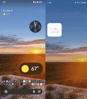
Let's start with the dynamic colors. Part of Material You is that the system will interpret colors from within your phone's wallpaper and give options to set the system colors to match via a few color palettes. Those colors extend to widgets too. When you place a widget onto your home screen, the colors within it will shift depending on where it's placed and the colors of the background.
Vertical scrolling app drawer
Lastly, this one may seem like a nitpicky type of thing and not necessarily new to Material You, but the Pixel's vertically scrolling app drawer is so much better than what Samsung forces on users. The side-by-side paginated syle in One UI is just not great to use.
Yes, I know that a vertically scrolling app drawer isn't exclusive to Pixel devices, but when picking up my Pixel 6 Pro and Galaxy Z Fold 3, the last thing I want to do is swipe multiple times to get to the app I want. Sure, on both UIs there is the option to search within the app drawer. However, when you don't have both hands free or can't shuffle your phone in your hand so you can start typing — you don't want to have to swipe to find your app.
When talking about ease of use, a paginated side-scrolling app drawer isn't it.
If I need to open an app that I maybe don't use so often that it needs to reside on my home screen, I want to be able to get to it in my app drawer quickly and, with a flick of my finger, fly through 100 apps or 20 apps and stop right where I need so I can open the app I need. Quick, easy, done.

I'm sorry if this strikes a nerve with some of you — but it's true. I say this lightheartedly because I'm all for everyone having a choice and using what they like — and that extends to your preference of app drawer style. Personally, I would like for each UI to offer both options.
Android's best feature is choice
Though many older phones will get updated to Android 12 and new ones released in the future certainly will, we won't see the Pixel's version of the OS on them. However, this doesn't mean that some OEMs will not incorporate the feel of Material You onto their devices. Ubrani said, "Smaller brands like Nokia, Moto, and maybe OnePlus have had success in offering a similar UI to Pixel or stock Android — and again that strategy has worked well for them. That's probably why OnePlus recently said it would once again try to appeal to long-time users with the next OxygenOS."
Don't get me wrong. Material You isn't perfect and Samsung's One UI 4.1 isn't terrible. In fact, I find things to love and hate in both interfaces — and isn't that what we love about Android? The ability to use various devices from different manufacturers, each with the opportunity to find what you like: choice. So, whether you are Team Pixel or Team Samsung, we're all Team Android.

The Google Pixel 6 brings even more impressive photography chops than before, with the help of new sensors and Google's own Tensor Chip processor — and making it all feel effortlessly yours is the Material You user interface.

