Android 16 Material 3 Expressive vs. iOS 26 Liquid Glass: Imperfect polar opposites
Android users aren't missing out one bit by not having Liquid Glass, at least for now.
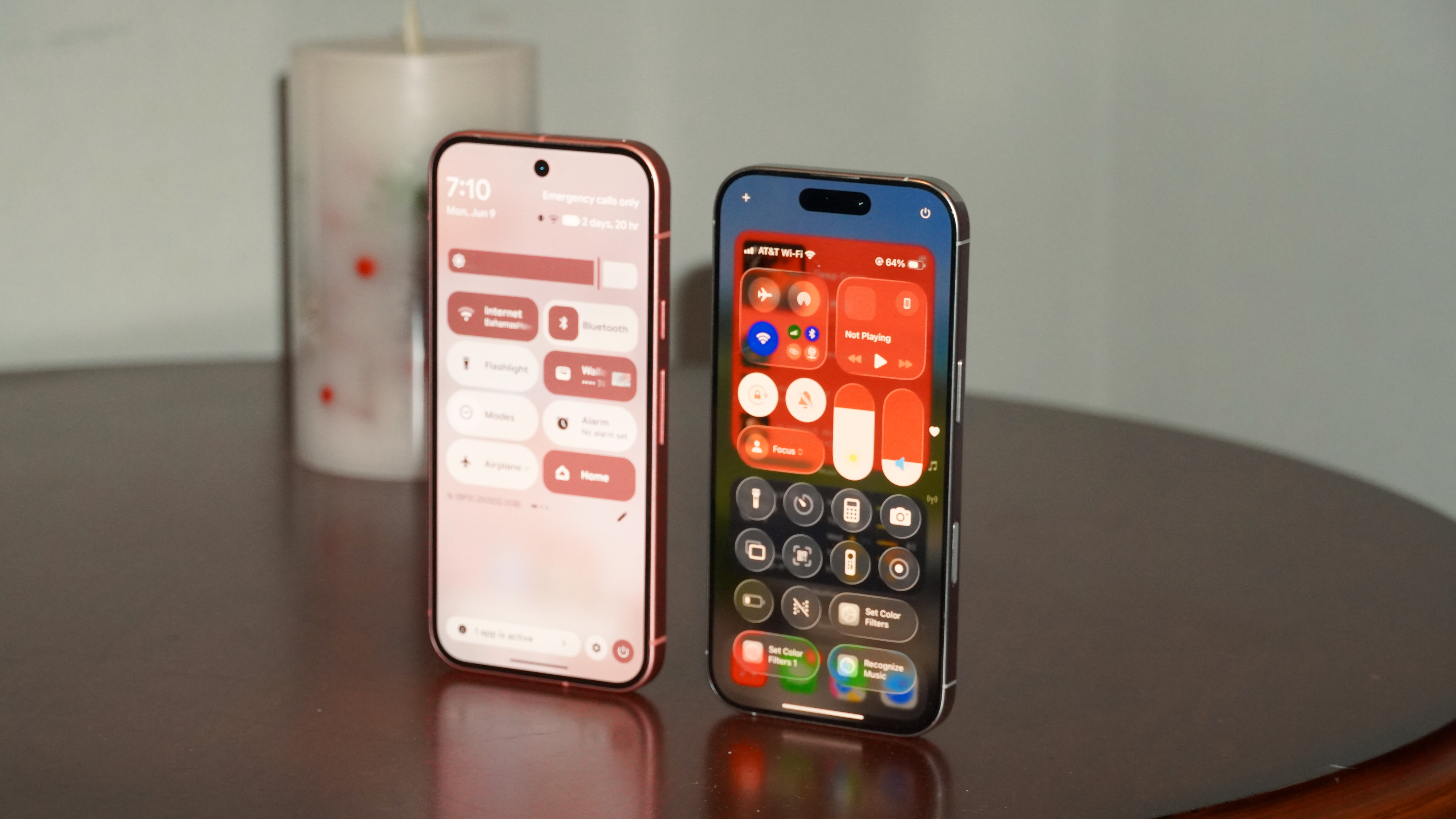
When smartphone users load up Android 16 QPR1 or the newly announced iOS 26 for the first time, they'll be in for a major shock. Apple and Google both decided that now is the time to shake up their mobile operating systems with a new look and a new user interface.
The first quarterly Android 16 update will introduce Material 3 Expressive, a fun and colorful design language that builds upon existing Material You theming. Meanwhile, iOS 26 will add Liquid Glass, a translucent and reflective design interface that takes heavy cues from visionOS. Google is bringing bold color back with Material 3 Expressive, while Apple is taking a step back somewhat, instead emphasizing the content below the glass-like apps, buttons, and toggles.
I've spent a day comparing Material 3 Expressive to Liquid Glass, and neither is perfect. One seems better today, but the other could have more long-term potential.
Article continues belowLiquid Glass is a way bigger design overhaul than Material 3 Expressive
For better or worse, one thing seems immediately clear after testing Liquid Glass and Material 3 Expressive side by side — the former is the bigger design shift. Apple didn't just introduce some translucent elements to iOS; it overhauled the entire operating system. If you remember the old-school translucent desktop operating systems, like Mac OS X Snow Leopard or Windows Vista, Liquid Glass is that, but on steroids.
Everything, and I really mean everything, is different.
There are new media controls, toggles, context menus, floating action buttons, and system prompts. Individual apps like iMessage, Camera, and Settings are completely different, matching the Liquid Glass aesthetic while also bringing new interfaces. The appearance of iOS mainstays like the notification center and control center has an all-new look.
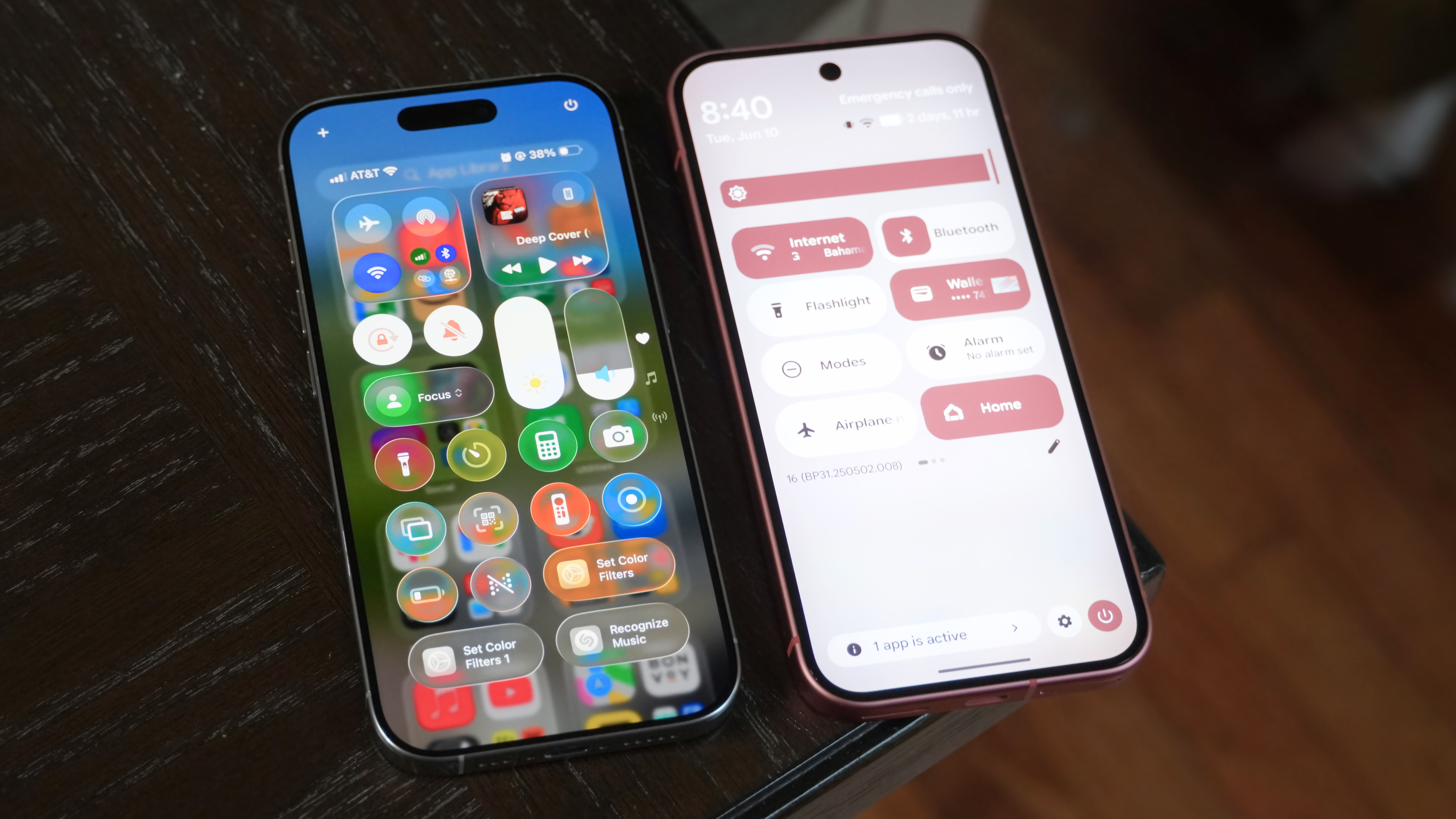
The thing is, Liquid Glass isn't the reason everything is different. I suspect that many iPhone users will enjoy Liquid Glass in iOS 26 not for the design language, but for the long-overdue refreshes to individual apps and elements.
Get the latest news from Android Central, your trusted companion in the world of Android
There are a surprising number of aspects of the current iOS 18 operating system that haven't been materially refreshed since the last major overhaul to the platform, which happened with iOS 7.
Meanwhile, Material 3 Expressive won't feel like as big of a change as Liquid Glass because Google tends to ship updates and tweaks on a more regular basis than Apple. Material You laid the groundwork for Material 3 Expressive, and it arrived nearly four years ago. Additionally, individual apps like Gmail, Pixel Camera, or Google Photos get UI tweaks and improvements all the time.
By comparison, it feels like Apple waited to bring all its major default apps and system elements to the present until now, when it would coincide with the Liquid Glass visual update.
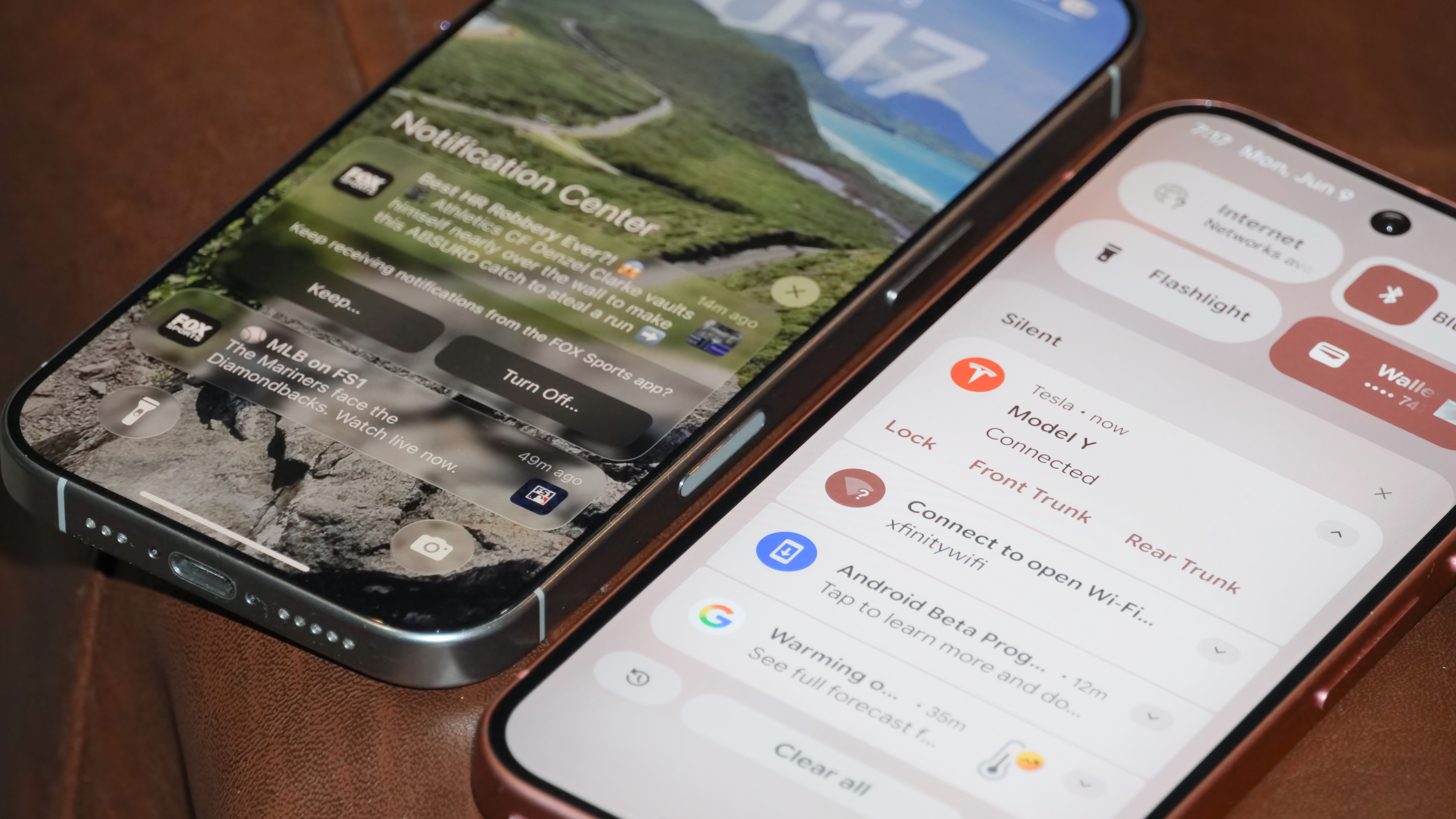
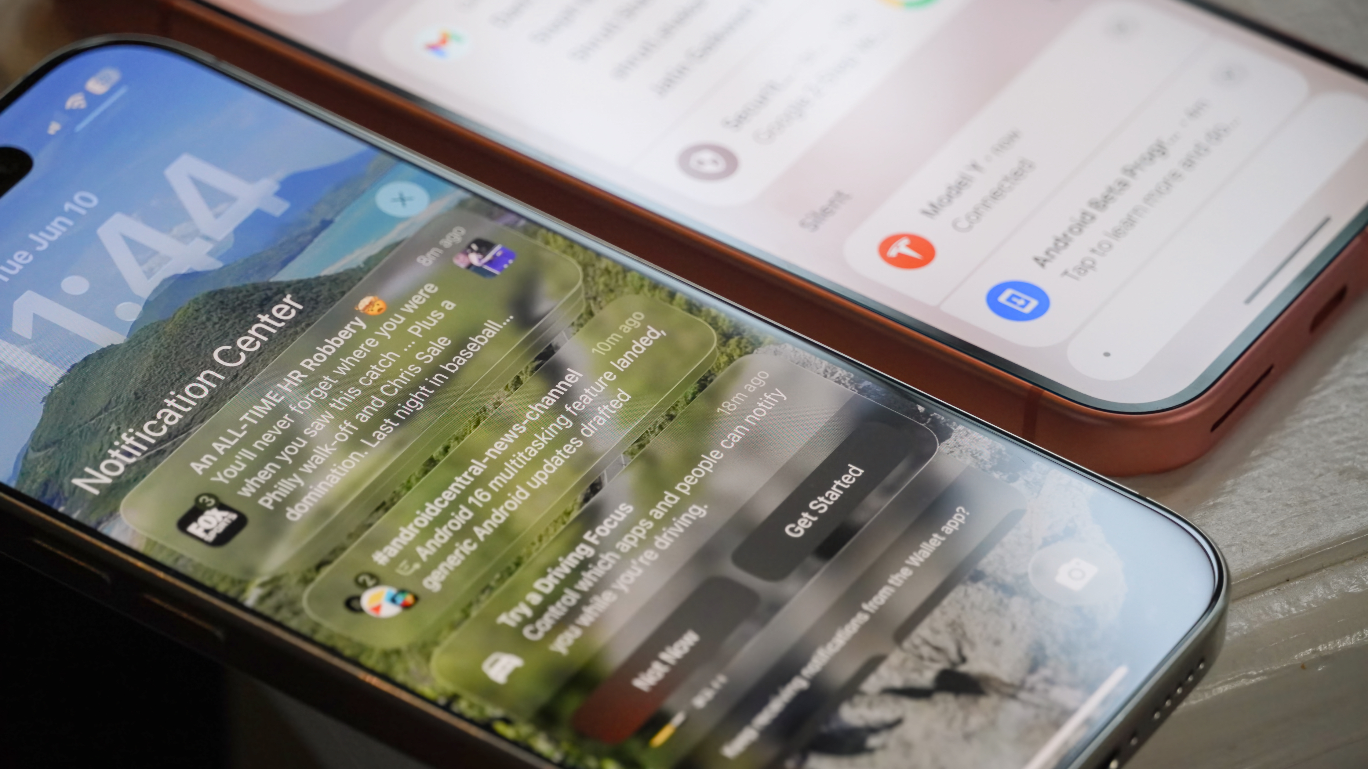
All of these factors help iOS 26's Liquid Glass bring a much bigger design refresh than Android 16's Material 3 Expressive. The consistent and thorough design tweaks create "wow" moments for even longtime Apple users, such as how pulling down the notification center will cause content underneath to reflect and refract — as if the notification center is a piece of glass itself.
There's nothing quite like this in Material 3 Expressive, but that isn't necessarily a bad thing. iOS 26's Liquid Glass design language has real flaws, like how things can get really tricky to see when multiple translucent elements are piled on top of each other. Pulling down the control center while the App Library is open, for instance, can make your head spin.
Material 3 Expressive includes more UI changes than Liquid Glass
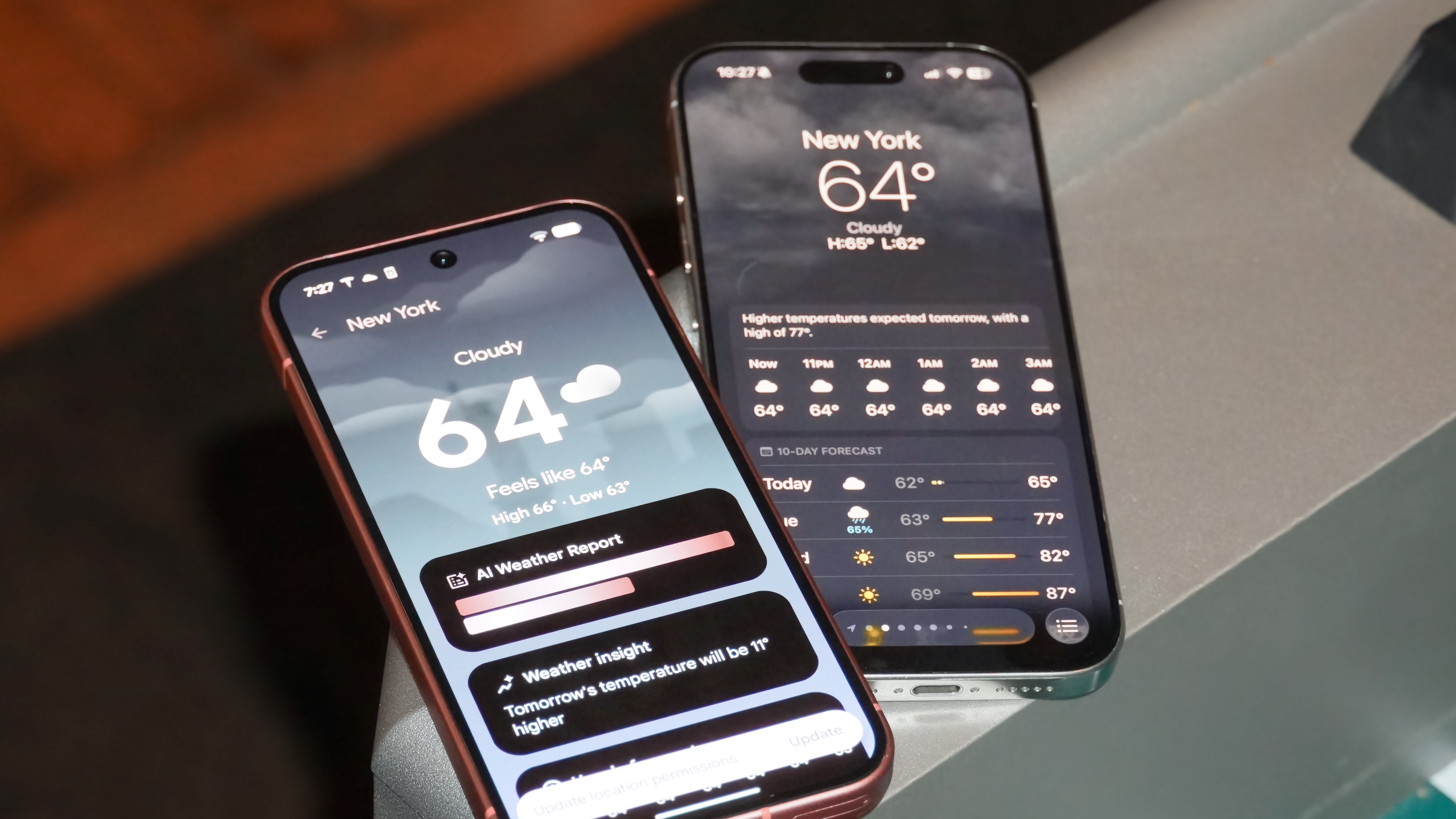
While Liquid Glass is the major visual interface upgrade, I'd argue that Material 3 Expressive is the larger user-interface upgrade. iOS 26 effectively gives the iPhone a fresh coat of paint, but it doesn't significantly change the way you use your smartphone. On the other hand, with Android 16, Material 3 Expressive introduces visual changes and correlating behavior changes that should help user actions feel more natural and responsive.
Google is using a combination of visual cues and haptic feedback to achieve this with Material 3 Expressive. For example, when you try to dismiss a notification on Android 16 QPR1, you'll feel the entire group of notifications spring out of place, as if they're all moving together. Continue to pull, and you'll see and feel a snap when the notification you're dismissing breaks away from the group.
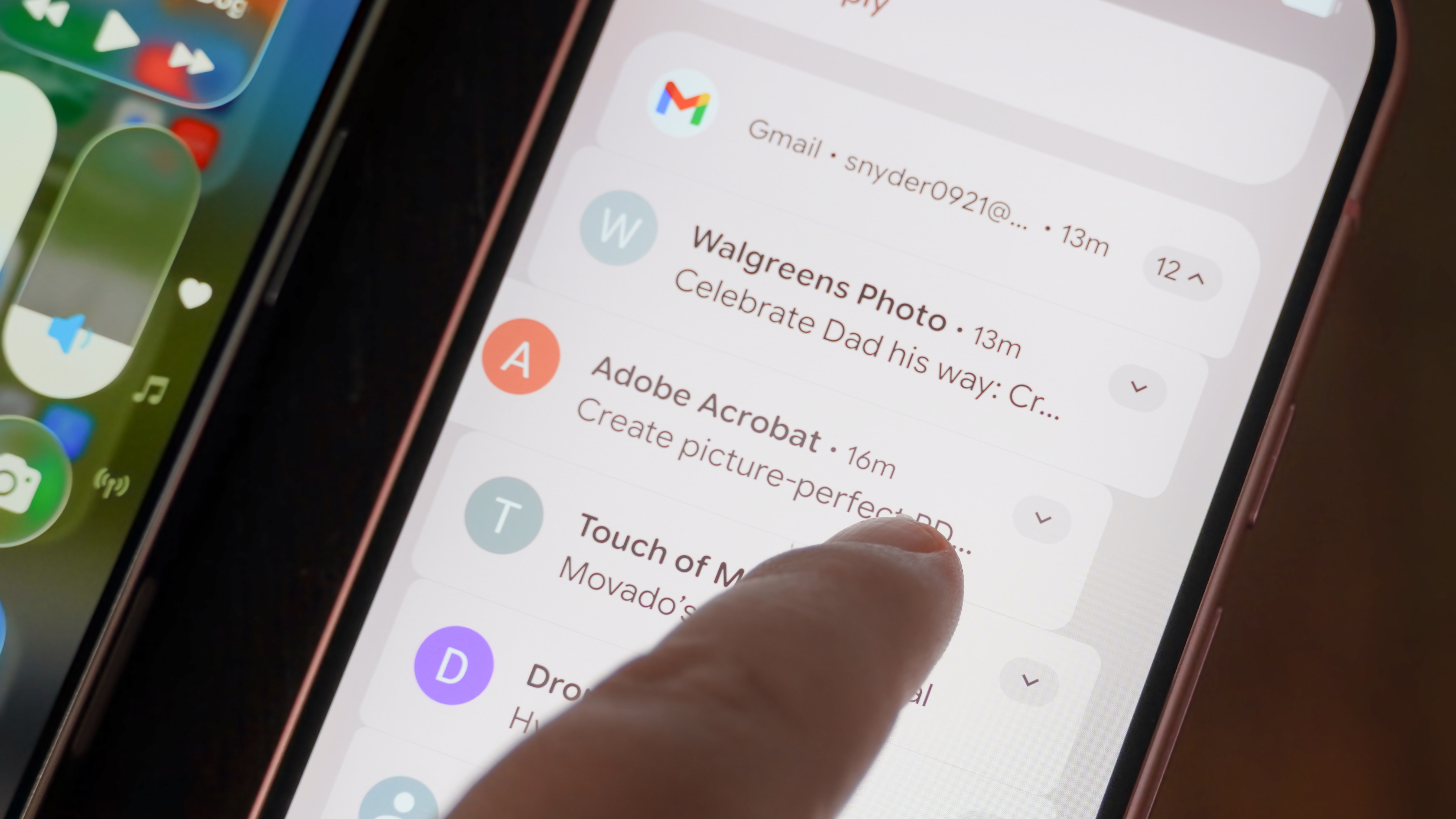
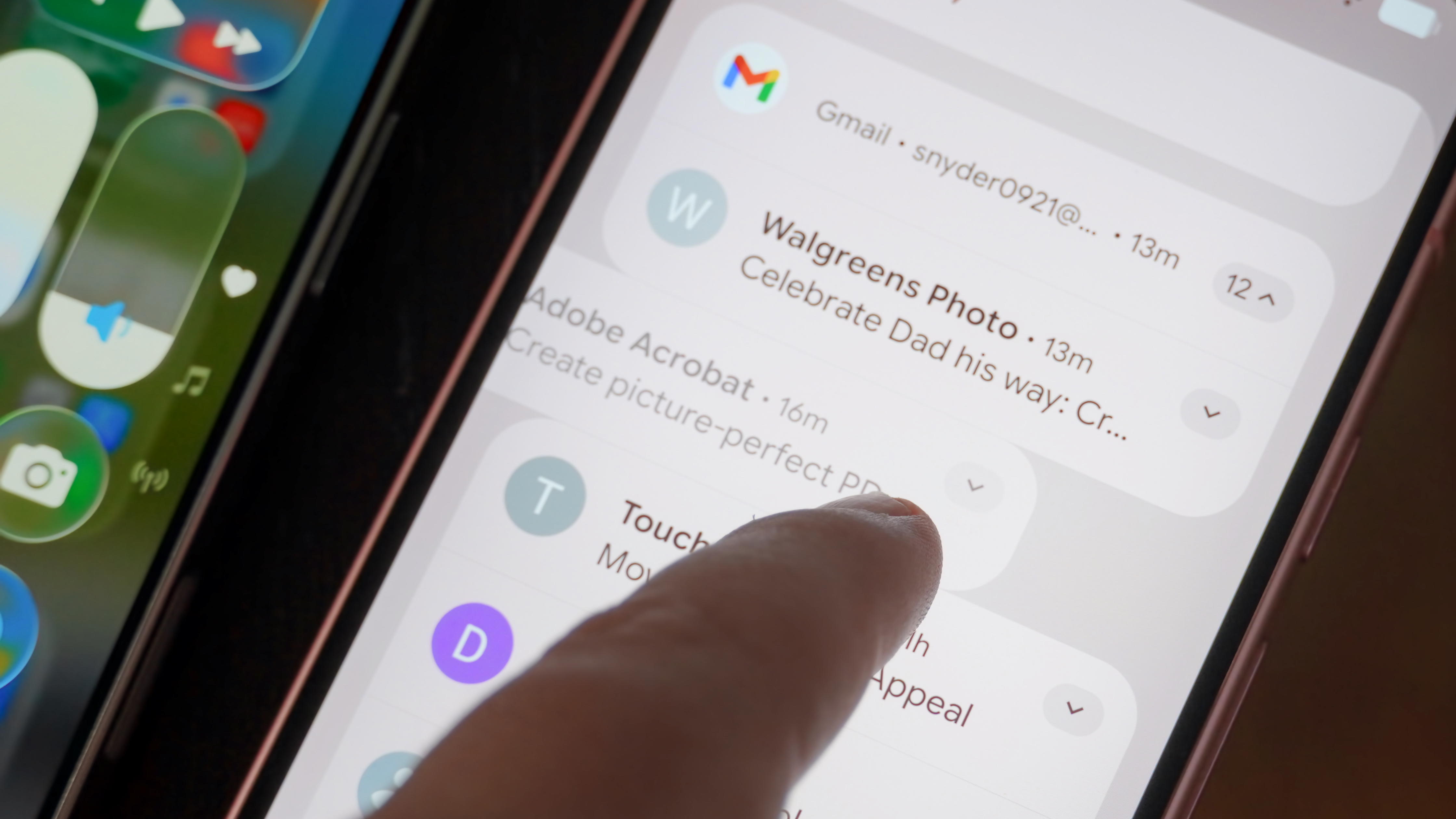
This experience helps you both see and feel smartphone actions differently, and it's the intent behind Material 3 Expressive. The new design language aims to use bold and colorful UI elements in tandem with haptic feedback to not only look different but also feel different. You'll see these types of changes when playing with sliders or calling upon the notification shade.
They're available throughout Android 16 QPR1 in many more places, just like the changes in iOS 26's Liquid Glass. The difference is that Google seems to have placed equally as much emphasis on UI changes and haptic feedback tweaks as it did on visual updates.
Material 3 Expressive gets one big thing right compared to Liquid Glass, and that's background blur. There are semi-translucent elements within Material 3 Expressive, but it utilizes heavy blur to create depth while letting users peek at what's underneath. By comparison, the clear appearance of Liquid Glass can be visually distracting. In all the places where iOS 26 looks like glass, Material 3 Expressive uses bright and bold colors instead.
iOS 26 and Android 16 agree on a whole lot
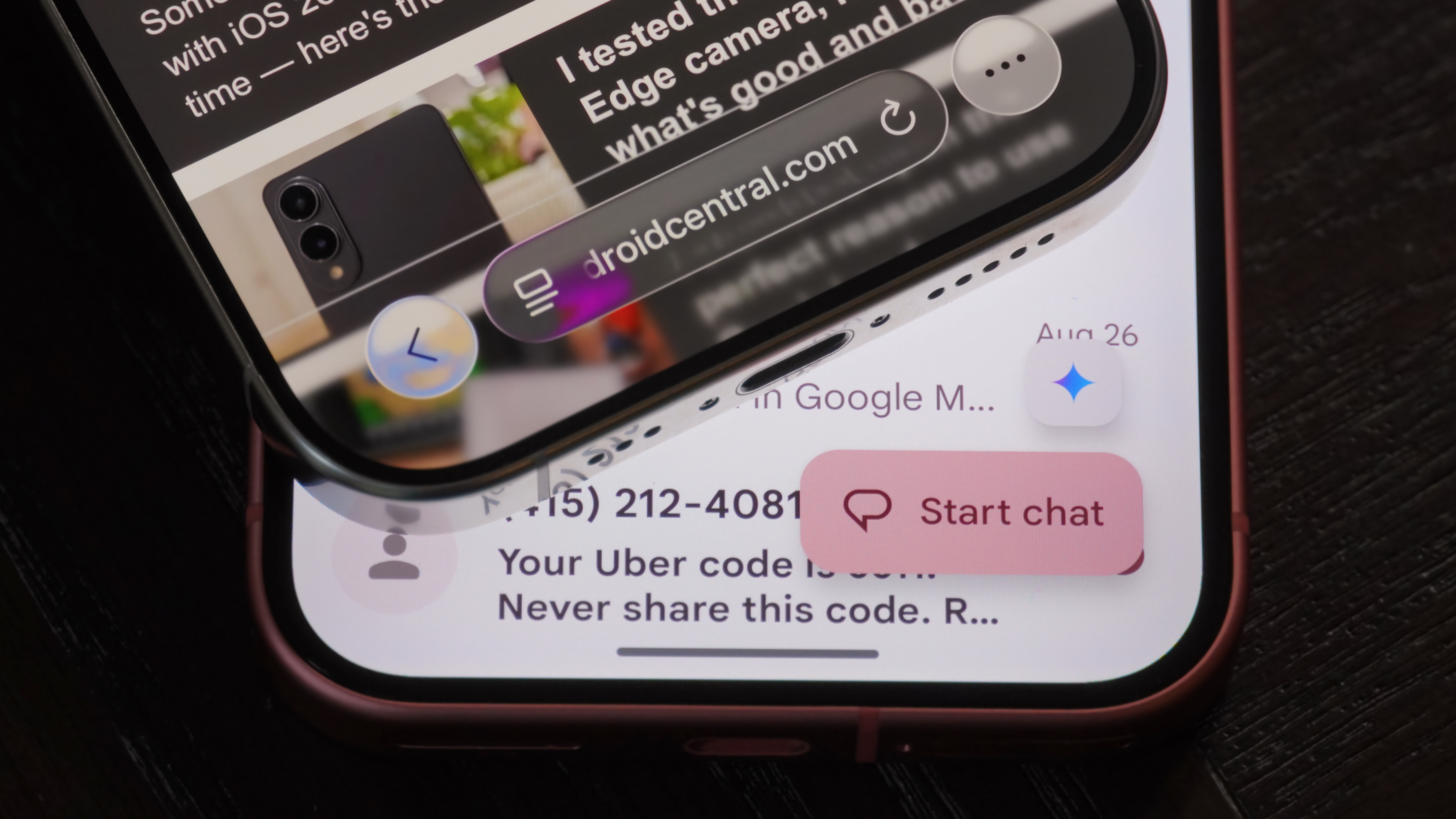
Behind their opposite takes on "expressive" design, iOS 26 and Android 16 QPR1 have a lot in common. Apple's thorough app updates make iOS feel a lot more like Android, following recent UI trends. For instance, iOS 26 largely ditches unified toolbars in favor of floating action buttons and vertical context menus. These are elements that have been a key part of Android for a while.
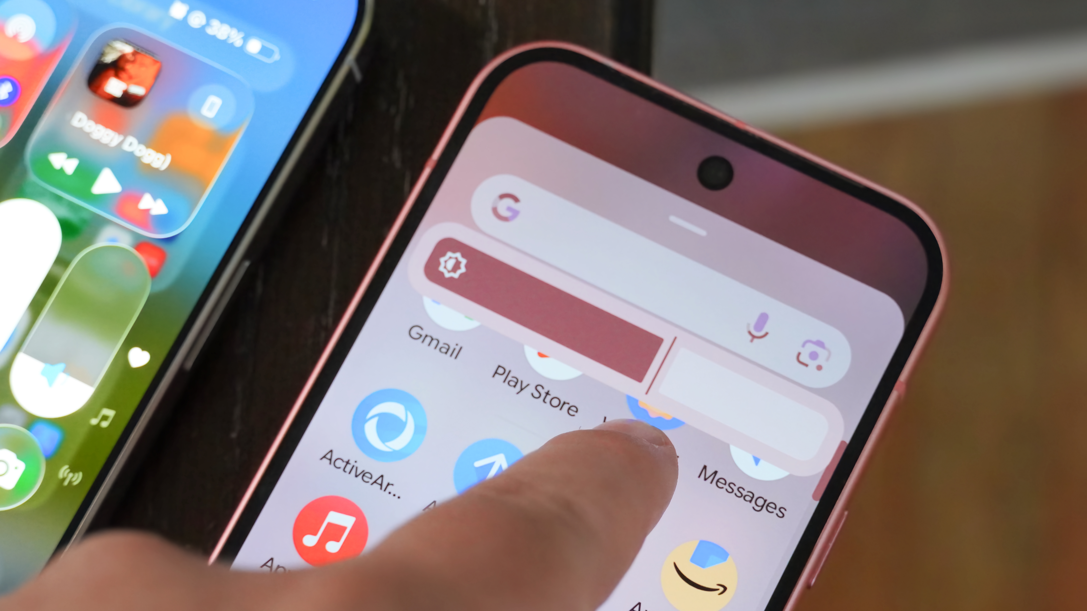
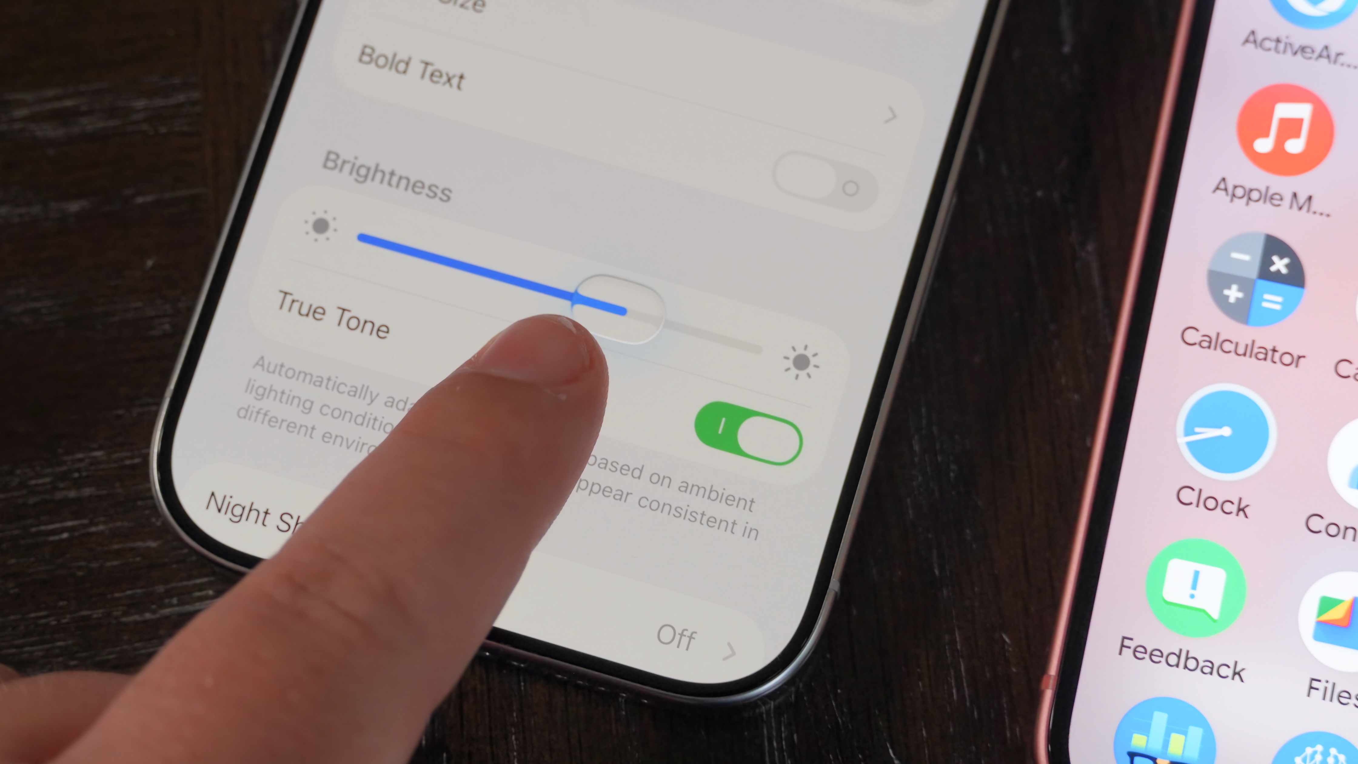
Similarly, both Apple and Google felt the need to change certain interactive parts of their mobile operating systems, like sliders. You can see in the gallery below that tweaked Material 3 Expressive and Liquid Glass sliders have different styles, but major similarities.
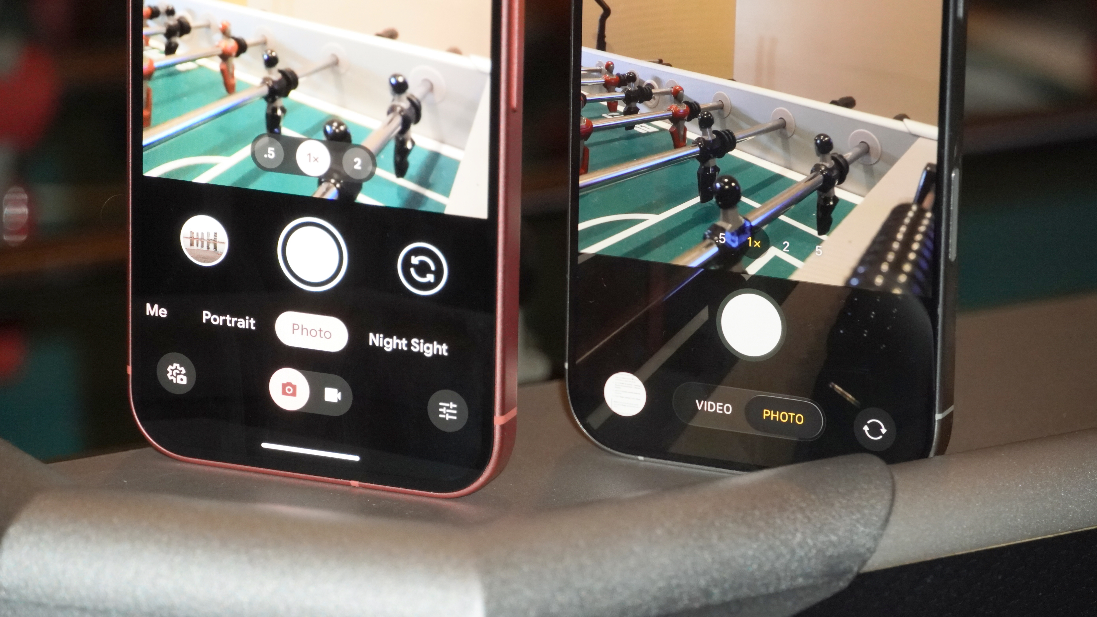
It even transcends standalone features and elements, as some apps are reimagined to match Android. The iOS 26 Camera app, for example, is a near carbon copy of the Pixel Camera app.
I do want to emphasize that many of these system and app-wide updates included in iOS 26 aren't directly correlated to the Liquid Glass design language. They're simply UI and behavior changes that Android has comparatively rolled out gradually over the span of years. Instead, Apple waited to change nearly everything at once with Liquid Glass in iOS 26.
M3E is better today, but Liquid Glass could be better tomorrow
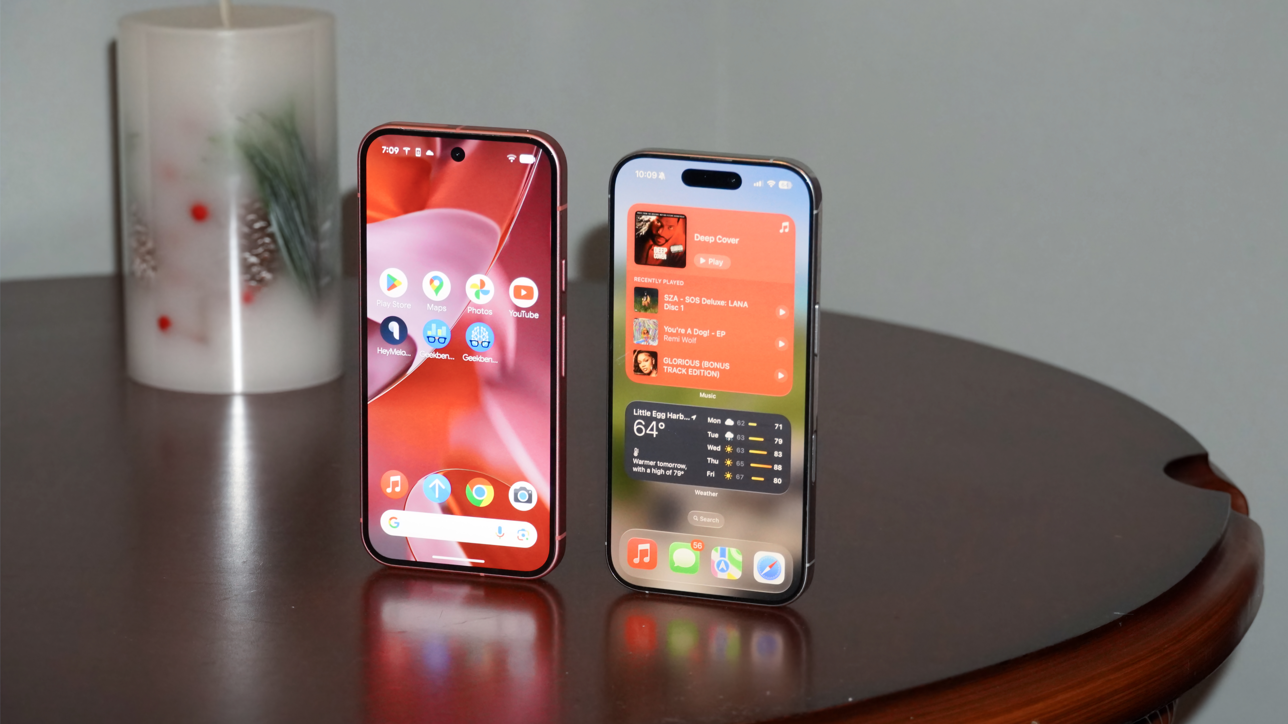
After spending time with Material 3 Expressive and Liquid Glass, I'd rather use Android 16 QPR1 than iOS 26 as they currently stand. Both are in the developer beta stage, and both are going to improve before they are ultimately released.
You can install the developer beta of Android 16 QPR1 or iOS 26 on your device, but you probably shouldn't — both are recommended only for developer testing and could cause major bugs and issues for your device. They could even brick your phone entirely, so it's best to wait for the official release, or at least the public beta.
However, it's clear to me that Material 3 Expressive's design puts the emphasis on user actions and simplicity. In contrast, Liquid Glass looks really nice in photos and press releases, but appears to make daily use of an iPhone more difficult.
With that being said, I think Liquid Glass has more potential to be an operating system of the future. It's clearly designed for an augmented-reality world, with products like Apple Vision Pro or future smart glasses in mind. Apple says as much in its press release, with Apple’s vice president of Human Interface Design Alan Dye writing that "it lays the foundation for new experiences in the future."
In other words, Material 3 Expressive is designed to run on phones, whereas Liquid Glass is made for what might replace them.

Brady is a tech journalist for Android Central, with a focus on news, phones, tablets, audio, wearables, and software. He has spent the last three years reporting and commenting on all things related to consumer technology for various publications. Brady graduated from St. John's University with a bachelor's degree in journalism. His work has been published in XDA, Android Police, Tech Advisor, iMore, Screen Rant, and Android Headlines. When he isn't experimenting with the latest tech, you can find Brady running or watching Big East basketball.
You must confirm your public display name before commenting
Please logout and then login again, you will then be prompted to enter your display name.
