The Android launcher experience on tablets is still terrible
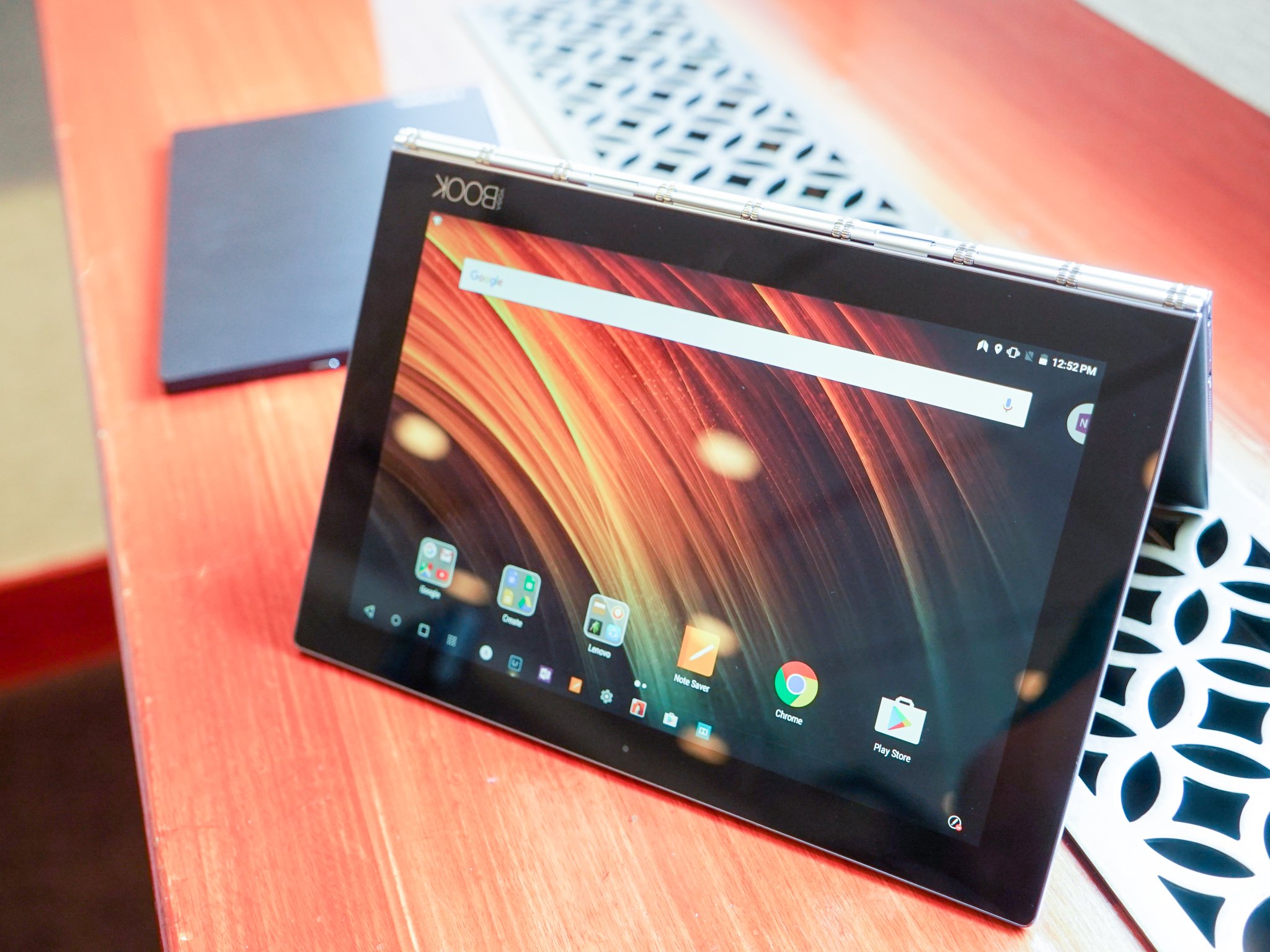
The Android tablet experience is often awkward and awful, and that goes double for the launchers, which are inconsistent, inconvenient, and often times ugly. From third-party launchers to manufacturer versions of tablet layouts, there's a lot to be desired, and while part of that blame falls on developers, it also falls to Google, which has still not quite figured out how tablets should behave.
And it falls on us. Because we just don't know what we want.
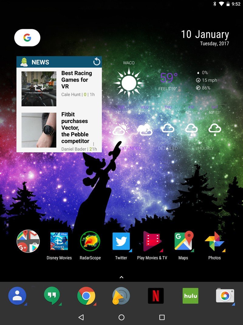
Look at this screen. What do you see? I see a lot of wasted space. I see ridiculously oversized grids and laughably scaled widgets. Icons are huge, widget text is small, and there is no real happy medium. Long story short, tablet launchers are phone launchers blown up. That's not always a bad thing, as good launchers make tablets tolerable. The problem is that even good launchers don't make the tablet UI enjoyable.
Article continues belowEven good launchers don't make the tablet UI enjoyable.
Tablets have always been an in-between category. Not quite a laptop, not quite a phone. Phones being covered with grids of icons are fine, as everything's within easy reach of a thumb. Desktop layouts, with a larger grid and a larger flexibility, have a mouse to minimize the impact of reaching across the screen. Tablets are too big for the classic phone grid, and reaching past the bottom third of the screen takes a second hand — though if you can use a tablet one-handed at all, good on you, giant v
It doesn't help that just as phone launchers seem determined to have five icons on the dock, launchers on tablets seem to think the magic number is seven, which leaves gaps in smaller tablets and black holes in larger ones. Icons are often comically oversized to compensate for this, which only reinforces the bloated phone look.
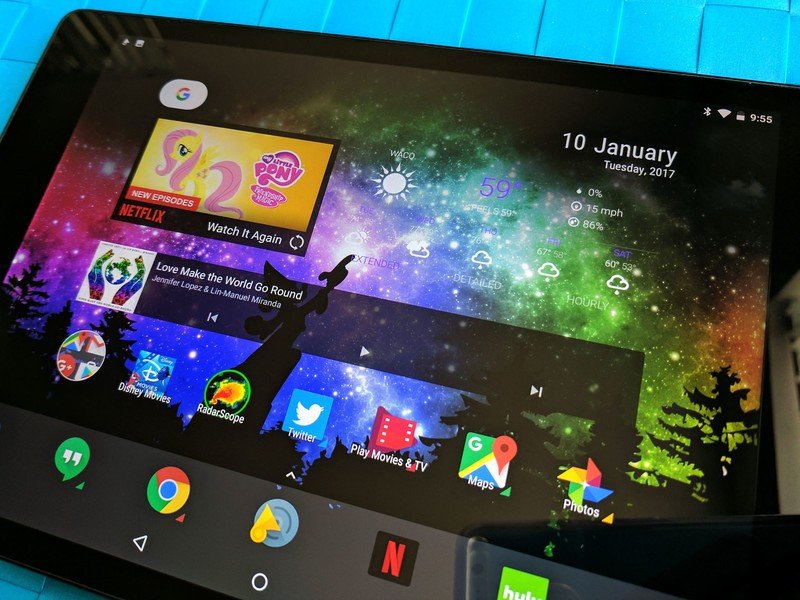
Then we have widgets. Widgets, which are already often overlooked on phones, are completely forgotten for tablets. Most widgets are designed to be 4x1 or 4x2. They're not designed for a 7x7 grid, or a 12x12, as I often use on large slates. Try stretching a 4x1 widget across a 10-inch tablet screen, even a good widget like 1Weather. They all look horrible, but widgets only look as good as developers design them to be, and tablet-optimized widgets are too low on the totem pole for most developers.
So where do we go from here?
So, where do we go from here? Well, it's hard to get launcher developers and widget developers to focus on improving the tablet experience when we keep calling tablets dead. If we're not vocal, nothing will change, either. Ask developers of apps you like if they've considered how their widgets look on larger screens. Get into launcher betas like Nova Launcher's and give feedback on how to make the tablet launcher experience feel less hobbled. The first part of asking for what we want is to figure it out, though, and that's easier said than done.
Get the latest news from Android Central, your trusted companion in the world of Android
Ara Wagoner was a staff writer at Android Central. She themes phones and pokes YouTube Music with a stick. When she's not writing about cases, Chromebooks, or customization, she's wandering around Walt Disney World. If you see her without headphones, RUN. You can follow her on Twitter at @arawagco.
