Galaxy S8 home screen goes ultra-minimal

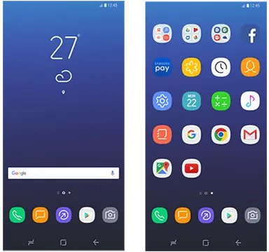
We've seen plenty of the Galaxy S8's outside form, but what about the inside? I don't mean the heart — we know that, too — but the software, presumably based on Android 7.1.x, though judging from these leaks launcher screenshots, the resemblance is passing at best.
Thanks to screenshots retrieved from a leaked version of Samsung's upcoming Smart Switch app that will make it easy for old Galaxy owners to transition their contacts, calendars, apps, documents and photos to the new GS8, we now know basically what the Galaxy S8 home screen will look like.
What you see above is not exactly what users will be interacting with when the Galaxy S8 is released in April, since the icons lack context-specific text underneath, but it's a good approximation. Very sparse icon art, with broken or abstract lines depicting things like a phone or a camera, along with some other designs that are a bit harder to suss out. The contrast with Google's own set of much more well-defined and colorful app icons is stark, to say the least.
Broken lines and minimal colors comprise Samsung's vision of the home screen's future.
Finally — and we're not going to read anything into this until we know for sure — there is no app drawer on the home screen. This could mean that Samsung, like Huawei and LG before it, could forgo the traditional app launcher in favor of a more iOS-like Springboard design, where icons, folders and widgets live together on various home screens. Obviously, given that the second set of the screenshots depict an app drawer, the GS8 will support one, but it may have to be enabled after the fact. Update: Or, as smartly suggested in the comments, Samsung could mimic Google's Pixel Launcher and offer a swipe-up-to-access app drawer.
It's also worth pointing out that Samsung's on-screen navigation pictograph for 'home' is nearly identical to the one Google uses, and suggests vendors use, for multitasking. Not confusing at all.
Life (Companion) moves pretty fast pic.twitter.com/eITSzku96CLife (Companion) moves pretty fast pic.twitter.com/eITSzku96C— Alex Dobie (@alexdobie) March 13, 2017March 13, 2017
Of course, everything evolves, and Samsung's updated launcher looks quite different to just five years ago when the company was gearing up to launch the Galaxy S3.
Do you see anything else new in these launcher screenshots? Let us know in the comments below!
Get the Android Central Newsletter
Instant access to breaking news, the hottest reviews, great deals and helpful tips.
Daniel Bader was a former Android Central Editor-in-Chief and Executive Editor for iMore and Windows Central.
-
It's a swipe up like the pixel launcher
-
My thoughts exactly
-
Hope so
-
It is
-
Not to imply you're lying, but what's your source?
-
It's either swipe up, like on the pixel launcher, or it's all apps on home screen, as was previewed in Galaxy Labs, on S7 Marshmallow.
-
Good call!
-
Definitely not a fan of the icons.
-
Agreed
-
To each their own, I guess. I like them *so* much more than Samsung's previous icon sets.
-
I agree. I much prefer the minimalist, understated look versus Google's--for me--overly colorful, flat, and blocky aesthetic. Personally, I have never been a fan of the stock Android look or stock Android launcher at all.
-
That's the beauty of the theme store. Make it yours
-
I love the minimal look. Why no app drawer? :/
-
Me too. Supposedly a swipe up like the Pixel launcher
-
Swipe up is definitely the way to go in my opinion... makes room for another icon and it's way easy to use... at least that's been my experience on the Pixel.
-
I still switch back to the Google Now Launcher
-
Just get Nova Launcher if you like swipe up on a Samsung. I've been using this feature for a while on my S7 even with MM. Not a fan of Samsung stock launcher. Wife has the Pixel and user experience is very similar although personalization is easier on SS w the themes.
-
Yeah, I use Nova, but I switched the a swipe-up launch a while ago and haven't changed back. I expected it to take a while to get used to, but it didn't at all.
-
Hope you're right
-
I'm fine with not having a App Drawer, for their "Easy Mode". Having icons on the main screen and app drawer just confused my family members that aren't Android literate. And Samsung's 'Easy Mode' was never the best approach.
-
There's no way I could stand not having an app drawer... it's just another reason why I don't like apple. I know what you are saying about people not understanding icons on the main screen and in the app drawer... this no different than All Programs in the Start Menu and on the desktop on a PC... working in IT most users I've supported don't think a program is installed unless the Icon is on their desktop, even though there's an icon for it in All Programs. Just because some people don't understand what the app drawer is and how to use it doesn't mean it's a good idea to get rid of it. Having rarely used or unused apps clutter your home screens is just stupid... yes, you can create a folder for them and then move them all in there one by one... but why should you have to when you can have a app drawer where you can always find all of your apps in alphabetical order (no moving required).
-
Yep. Many people who uses Windows wants the icons on their desktop but don't know how to get it there. And don't get pinning it to their taskbar. Also, I didn't want to get rid of the app drawer. Just use this for Samsung's Easy Mode. Not sure if you have a Samsung to know what I'm talking about.
-
Yeah I've had the S3, S4, Note 3, and Note 4... That easy mode on previous phones was dumb but I understand what they're trying to do. I see what you were trying to say now... make an Easy Mode without the app drawer... Makes sense to me.
-
It probably wouldn't be as confusing for people if the Play Store wasn't set to add new apps to the home screen by default. It doesn't make sense for every app to be added on your home screen when you have an app drawer.
-
This. I'm annoyed by Google play adding icons to my home screen when I just want the app installed.
-
So disable it in the settings
-
Not 'minimal' if heaped & cluttered with icons...
-
Does it come with a built in waffle maker?
-
One of the worst parts of iOS is no app drawer forcing you to have endless home screens for the 80% of apps you need but only use sparingly. Not sure why Android vendors want to copy that.
-
It might be just a trend that they're experimenting with with the phone for right now. If you don't like the minimalist outtake it has, there's always a seemingly endless amount of third party launchers to choose from.
-
That's how it is on BB10. I never noticed it before my first Android device, but playing with my Passport a few days ago, I found it a real pain in the a$$ looking at all those apps all over the place.
-
If I can't swap the back and multitasking software buttons in settings (the way Android is intended to function) then it's a nonstarter anyway.
-
Hopefully icon pack support comes out of the box. Also not a fan of Milk music or FB being preloaded
-
I thought milk music was discontinued by Samsung last year.
-
Looks like thats that music app. Unless they renamed it
-
Will the Galaxy S7 get the updated UI I wonder? I hope so.
-
Not a chance in hell. This is Samsung we are talking about.
-
S6 got a refreshed UI with the Nougat update so I don't see why not.
-
And the S7 got features from the Note 7 Grace UX as well.
-
S7 already has the updated UI, the only thing it or any other previous Samsung phones cannot get is the on screen navigation buttons. The updated icon pack might be coming in the 7.1.x update.
-
Oh for God's sake, Android OEMs: Just use an app drawer. It's the only thing that separates us from the animals (or iPhones).
-
Drawer continues to exist. But now, you have to swipe it up, just like Google Pixel.
-
Lots of whining babies showing up here. App drawer is still available, likely by swiping up which is what others are doing. Gawd you would think all of a sudden all your icons had to be held on the home screen like an animal.
-
Launcher From the looks of the launcher on the S8, it reminds me why I use the Nova Launcher. It seems that with each iteration of Samsung Galaxy S, the launcher becomes more and more useless. It seems that you can do less and less with it. From the looks of the design of the icons, it looks cartoonish and just downright "fugly." I'll leave the quote to your imagination.
-
There is an app drawer you can tell by looking at the search app bar at the top. It will most likely be open by swiping up. I'm ok with that, I have my S7 set up like that with Nova Launcher, it's quite convenient. Also swipe down - search for an app instantly.
-
I really hope that it's a "Swipe Up" App Drawer. I'm not really understanding why manufacturers are suddenly going for launchers without App Drawers.
-
Guess it's because the Chinese don't like them.
-
Wow looks hot. Personally don't care about app drawer being present or not. I do my app search by swipe down and bringing up app search (Nova gesture). It works awesome and same on iOS. That's one thing I hate on pixel launcher, no gesture support.
Also, they will have an option to enable app drawer in settings if needed. -
Haha just listening to all the ******** and complaining....Guys it's Samsung, you'll be able to change all of it, this is not apple ...Whats the problem if you don't like the look CHANGE IT ....... Gezz
-
It's not Samsung, it's Android.
-
It's Samsung's software and feature implementations don't get it twisted. Android is only the bug infested glitchy operating system unfortunately
-
He's specifically talking about Samsung, not Android. Samsung's UX's are known for their configurability amongst Android OEMs... *especially* compared to the stock Android UX.
-
Oh yes the Infamous stock Android. That no one but true geeks want . Beating badly in every speed test ive ever seen vs the s7 edge in opening games and memory management
-
Haha when most folks think of Android....They think there all Samsung's sorry
-
Will the Galaxy S7 receive this?
-
Haha damn the s7 just got the grace UX . You'll have to wait I'm sure
-
If I wanted a scaled-down, usability-limited UI like iOS I'd buy a freakin' iPhone. Stop taking away the distinguishing advantages of Android! It wasn't enough to take away removable batteries, MicroSD slot, and headphone jack... so now manufacturers are destroying the software. It a fscking race to the bottom.
-
The S8 will have a MicroSD slot and headphone jack
-
Huh ??! Have you been paying attention.....The s8 will not be loosing any of that
-
I KNOW the S8 will have headphone and MicroSD, my point is that other Android manufacturers are following Apple's footsteps and Samsung will too soon. They've already experimented with removing the MicroSD option with past models. And Ducati: if the S8 has a removable battery, then I AM missing something. Show me where that is the case. But once Apple demonstrated that it was possible to screw over users by gluing the battery in and making it a PITA or nigh-impossible to remove, then other manufactures followed suit and added this extra planned-obsolescence and revenue stream. Until the iPhone, however, removable batteries were standard, and continued even with Samsung up until the S5 (which is why I retain my S5).
-
Well if your still rocking a s5 then no your not the intended recipient of the s8 you've stopped buying phones a long time ago hehe . Let you in on a lil secret the j7 is twice the phone the s5 is for less than $200 has every thing you want
-
The only reason I'm still on my S5 is that no one is making a phone that is a decent upgrade without compromising critical features. Samsung doesn't apparently want my money anymore. Price really isn't a factor for me. The J7 has a lower resolution than my S5 and is not waterproof. The S5 is also faster (2.5GHz vs. 1.5GHz) and has more RAM (2GB vs. 1.5GB). It also lacks the fingerprint reader, which is really handy. On top of all that, the J7 is heavier than the S5, and the S5 has a MUCH better camera and many more sensors. I don't really get how you could consider the J7 an upgrade/improvement. It's 2 steps forward and 10 steps back.
-
You obviously haven't had the pleasure of testing a j7 it doesn't need to have more ram . That phone is way more optimization then the s5 every had . It's much faster . I've owned all the Galaxy by now your s5 is a buggy and slow hot mess as any of the first generation galaxies . One thing we agree on... Your not the target customer anymore the world an Samsung has moved on . What ever edge the s5 have in features there speed and implementations of those features are slow and buggy as hell
-
What about that purple app button what is it if not an app drawer button?
-
Samsung internet, and it's very good, especially with ad blocking I used it on my S7EDGE and loved it.
I'm using the Samsung internet beta on my Pixel XL now, with ad blocking, and still love it. I was very pleasantly surprised when they made their internet beta available to Pixels a few weeks ago. -
Samsung Internet browser ***** on chrome and has been since 2013. Chrome is useless and battery draining.
-
+1 For the Samsung browser. I have no idea how they've been able to make it so much faster than Chrome... I mean, it's literally a bit ridiculous how much faster and smoother it is. Maybe they use native code in it or something.
-
I'm not a big fan of squircle icons, so I would be using a different launcher and adding my own icons regardless. If I had to choose one, I would say the icons for Phone and E-mail on the S7 were ugly, so any change is an improvement. But overall, I dislike losing the labels below the icons. I also think these push too far into the minimalistic abstract in their design for my taste. But, that's just me.
-
The story says the lack of labels isn't how the actual launcher will look.
-
It may be an option like Nova launcher has. It would make sense to have that option if they're really trying to go for a truly 'minimal' look.
-
Swipe up is how I enable Samsung Pay though
-
Swipe up app drawers can be swiped from the middle of the screen
-
Nova FTW
-
Will this run on WebOS ? I just got an update on my PreTV
-
I find this leak to be fake, there is no visible edge panel pull out
-
These aren't actual screenshots. From the article: "Thanks to screenshots retrieved from a leaked version of Samsung's upcoming Smart Switch app...we now know basically what the Galaxy S8 home screen will look like " "What you see above is not exactly what users will be interacting with when the Galaxy S8 is released in April, since the icons lack context-specific text underneath, but it's a good approximation." Aside from that, there's no visible pull out on my S7 Edge. You can make it completely transparent.
-
Screen is so tall and narrow. 😲
-
Every new Samsung phones touts the cleaner, better Touchwiz (now known as Samsung Experience,) But when I was troubleshooting my mom's S7, I couldn't stand it. It's still garbage. I use a Nexus 6P - far superior OS. SAMSUNG STOP USING YOUR UGLY BS OS - NO ONE LIKES IT.
-
No one likes it ???Except for the almost 60 million s7 sold so far making it the most successful Galaxy todate . The introductory of a new galaxy has a way of bringing out all the hater, you sound triggered...
-
Every.Single.Year.
-
Ugh, I will be so glad when this "squircle" trend (that every UX designer for every major phone brand seems to be all about right now) goes away. Shoe-horning every app and program logo into a universal shape is not good design, it's just lazy. Why are we striving for complete icon uniformity? It's boring, and when icons in an interface are too uniform, it actually makes navigation more difficult for your brain because at first glance, everything just looks the same. I understand design standards, but let designers do their jobs and think outside the box... or squircle, as it is. Bleh...