
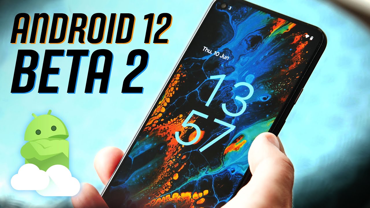
Android 12 Beta 2 launched today, and we immediately got our hooks into Google's latest mobile OS release to bring you everything that's new with Android. Android 12 Beta 2 brings us the Privacy Dashboard for the first time — the center for how users will control privacy on Pixels for the foreseeable future — as well as a more fleshed-out Material You theming engine, brand new ways to connect to Wi-Fi quickly, a new location to access Google Pay and control your smart home, and much more.
Quite a bit has changed since we got our hands on Android 12 Beta 1, as you can see from the list above. Our Android 12 Beta 2 hands-on is just below and, if you like what you see and have a supported device like a Pixel 5, you can install Android 12 and give it a shot.
Android 12 Beta 2 Privacy at the forefront

There's no doubt that privacy is the new tech buzzword of 2021. While Apple is going all-in on privacy with iOS 15, Google is focusing in on providing ways to easily see which permissions apps are using in an easy to digest view. Privacy Dashboard — although it's hidden three layers deep in the settings menu right now — is the private key to your digital kingdom and will, undoubtedly, help more users better control their privacy than ever.

Google has been honing in on better privacy and app permissions over the past several revisions of Android, and this new dashboard is the most powerful yet. Upon opening it, you'll find a pie graph with a quick breakdown of all the permissions recently used by any apps you have on your phone. If you want to see system-level apps, you'll need to toggle the setting in the overflow menu on the top right.

Right now, three main permissions are broken down in a detailed timeline format: location, camera, and microphone. Clicking any of these will bring up a full screen view of every time that permission was used, including the specific time and app that used it. Clicking any app in this list will take you to its full permissions list, with each permission giving you an incredibly detailed look at the last time each permission was used.
Privacy Dashboard showed that my location was last accessed at 3:04 PM, microphone at 11:24 AM, and nearby devices permission was used sometime in the past 24 hours.
Looking at my Ring app, for instance, shows that my location was last accessed at 3:04 PM, microphone at 11:24 AM, and nearby devices sometime in the past 24 hours. All other permissions are listed in a less detailed view that will simply tell you if an app has used them in the past 24 hours.
But users won't have to manually go into this new dashboard regularly to see which apps are using what Google seems the most private permissions. Again, that's location, camera, and microphone. Any time an app is using any of these permissions, a small icon will appear on the status bar for a moment. After that moment, you'll just see a little green dot in the top-right corner next to your persistent icons — for me, that' the battery percentage icon.

The new pop-up notifications help quantify the elusive usage of microphone, camera, and location permissions.
Pulling down the notification shade will populate any of these three permissions icons being used, and a quick click on the icon will tell you all the apps currently requesting those permissions. That will then take you back to the Privacy Dashboard, where you can disable any permissions that aren't needed. Similarly, a quick toast notification will appear at the bottom of your screen any time an app accesses your clipboard — but don't worry, this won't happen constantly if you're copying and pasting in the same app.
It's incredibly handy and gives a significantly greater insight into how apps are using permissions and exactly when they do so. Given that some apps requests for permissions are a bit nebulous, this is an important step into understanding exactly why your music app needs location permission, for instance.
Android 12 Beta 2 Material You takes shape

Material You was introduced as Google's latest design language change, and boy is it ever beautiful. While we got the initial glimpse of Material You in Android 12 Beta 1, one of the most magical aspects was missing from that release: automatic color theming. In Android 12 Beta 2 and going forward, Android's UI changes colors based on the wallpaper you've picked.
The simple act of changing the wallpaper completely rethemes your entire device in a significant and beautiful way.
This is done automatically, although parts of the UI appear to accept custom colors that you set in the theme picker. It's possible that this partial manual theming is a bug — this is a beta, after all — but my Pixel 4 XL no longer allows me to set a system-wide color as it did in Android 12 Beta 1.
While Google is likely tweaking the existing manual theme engine to work with Material You'd automated one, it's the automated process that's the real draw here. Right in line with expectation, the simple act of changing the wallpaper completely rethemes your entire device in a significant way. Everything from the colors of the quick settings tiles, colors of notifications, the clock on the lockscreen, and even the subtle hues of the backgrounds in apps and system settings morphs and changes to deliver what authentically feels like a mood for your phone.


What's more is that this color isn't the exact same throughout the UI. The quick settings tiles in the notification shade seem to pull the darkest color from the mix, while notifications and the lock screen clock use a lighter variation of that same color. Similarly, the backgrounds throughout apps and settings adopt an incredibly muted version of that same color. It's gorgeous and feels like the final vision of what we saw in the original Material Design debut almost a decade ago.

Touches even carry weight in the UI, adopting changes in colors as you tap elements. It's a similar effect to the previous Material Design circle that would emanate from the area where your fingertips touched, but instead of a hard-lined circle, Material You emanates a blended variation on the color chosen, making it feel like you actually touched the UI element rather than just a screen. If you've ever pushed too hard on a screen and saw the colors momentarily shift, you'll understand the effect it gives.
Google further tweaked the new volume slider design this time around, elongating the vertical bar and thinning it up a bit when compared to Android 12 Beta 1. Both versions look drastically different from what was in Android 11, which you can see in the image to the side.
Android 12 Beta 2 Redefining quick actions

Many UI elements have been given a significant overhaul in Android 12, but a few of them have been moved around for more obvious access. My personal favorite addition to Android over the past few years was the device control section found in the power menu. That section is still around, but it's being moved from the power menu to the notification shade. Personally, I don't like this change, as it adds an extra step to the actions I perform multiple times a day, every single day in my home.
I'd like to see additional options returned to the power menu, as these new changes are inconvenient.
You'll also find that Google Pay has been moved to the notification shade, as well. A quick tap on the Google Pay tile will open a full-screen view of your cards, giving you quick access to the one-tap UI for digital payments. Google likely moved both of these functions out from the power menu because it wanted to raise awareness of their existence, but I'd like to see a toggle to change it back since Google is so focused on personalization this time around.

Speaking of power button toggles, the power button has now been returned to a simple four-function menu that includes lockdown, shutdown, restart, and emergency. Alternatively, this menu can now also be found in the notification shade if you pull it all the way down, located right next to the settings and edit buttons. That new alternative location exists because you can now opt to use your power button to bring up Google Assistant.
This functionality is similar to what LG and Samsung did for years when they provided a dedicated Assistant button on the side of their phones. Since Google ditched the squeezable sides with its latest generation of Pixels — and, presumably, won't be using them in the future, either — they wanted another hardware-driven way to call up Assistant in times of need. This is a great option to have but, again, I'd like to see more than just a simple one-switch toggle added back to the power button, as we had with Android 11.
Hallelujah! Google brought back the quick-switch Wi-Fi pop-up.
Google also appears to be experimenting with a new Quick Tap feature for newer Pixel phones that don't have squeezable sides. That setting allows users to quickly tap on the back of their phone to call up one of many different actions, including taking a screenshot, access your assistant of choice, play or pause media, see recent apps, open the notification shade, or even launch a specific app.
One of the more subtle additions is a new quick-switch Wi-Fi menu that appears when clicking the Wi-Fi quick settings tile. This new slide-up interface finally brings back the ability to quickly switch between Wi-Fi connections — one of the most inconvenient changes Google made in recent Android updates — and even adds in the ability to turn off mobile data from the same interface. This is a great way to condense and simplify the connections screen which is something I, personally, really appreciate.
Have you listened to this week's Android Central Podcast?

Every week, the Android Central Podcast brings you the latest tech news, analysis and hot takes, with familiar co-hosts and special guests.

