Fitbit app's fresh look makes settings menu super easy to scan
Fitbit rolls out a new Device Settings page for its companion app.
What you need to know
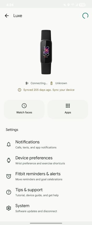
- The Fitbit app’s settings page now matches the Pixel Watch app, making everything feel more connected and way easier to use.
- You’ll see your current watch face, battery, sync time, and connection status right at the top—plus a “Sync now” button for quick updates.
- Cards for Watch Faces, Apps, and Tiles look fresh but still work the same.
Google just gave the Fitbit app a quiet but meaningful glow-up, rolling out a refreshed Device Settings page for its smartwatches and fitness trackers.
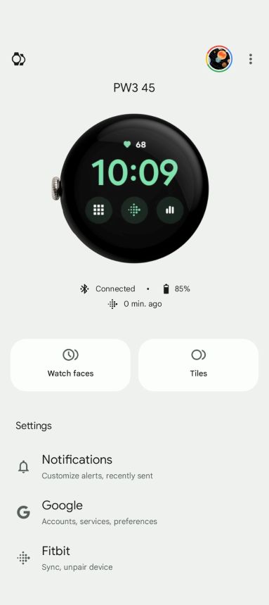
As spotted by 9to5Google, the fresh layout now matches the Pixel Watch app’s interface, which is clearly a step toward making everything in the Google-Fitbit universe play nice together.
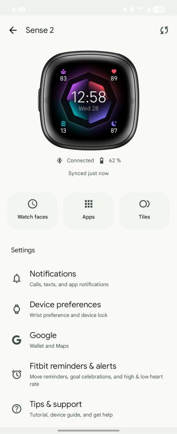
This update is aimed at Fitbit OS devices and brings a more visual, user-friendly feel. Right off the bat, you’ll see a big preview of your watch and its current face. Just below that, key information like battery level, last sync time, and connection status is front and center. There’s even a handy “Sync now” button tucked in the top-right corner for quick refreshes.
Article continues belowFamiliar, but cleaner layout
Right under your Fitbit’s preview, you’ll see neatly organized cards for Watch Faces, Apps, and Tiles. These are straight out of the Pixel Watch app playbook. The layout has gained a fresh coat of paint, but don’t expect anything wild—those cards still lead to the same settings you’ve been using.
Even the main settings menu got a fresh coat of paint. On a Fitbit Sense 2, for instance, you’ll now spot organized sections like Notifications, Device Preferences, Google Services (Wallet and Maps), Fitbit Reminders & Alerts, Tips & Support, System, and Smart Features like Alexa and on-wrist calls.
Material 3 Expressive makeover incoming
Outside of the device settings revamp, Google is also prepping the Fitbit app for a full Material 3 Expressive makeover. The classic Steps view isn’t going anywhere, but you’ll notice a few slick upgrades, like a floating action button for Gemini popping up next to the toolbar. That toolbar is getting a tweak too, ditching the top tabs for a cleaner layout to switch between Day, Week, Month, and Year views.
Google has been tightening up the Fitbit app in the past few months. One of the bigger changes came early last year when Sleep tracking got a major revamp. Instead of bouncing between screens, you now get everything — last night’s sleep breakdown, your overall score, and a full timeline — all in one scroll-free view.
Get the latest news from Android Central, your trusted companion in the world of Android
Back in March, Fitbit gave its Health Metrics page a makeover to match the app’s overall feel. As part of the revamp, it ditched the separate “Today” and “Trends” tabs and rolled everything into one unified view.

Jay Bonggolto always keeps a nose for news. He has been writing about consumer tech and apps for as long as he can remember, and he has used a variety of Android phones since falling in love with Jelly Bean. Send him a direct message via X or LinkedIn.
You must confirm your public display name before commenting
Please logout and then login again, you will then be prompted to enter your display name.
