It looks like the Google Play Store will soon get a big UI overhaul
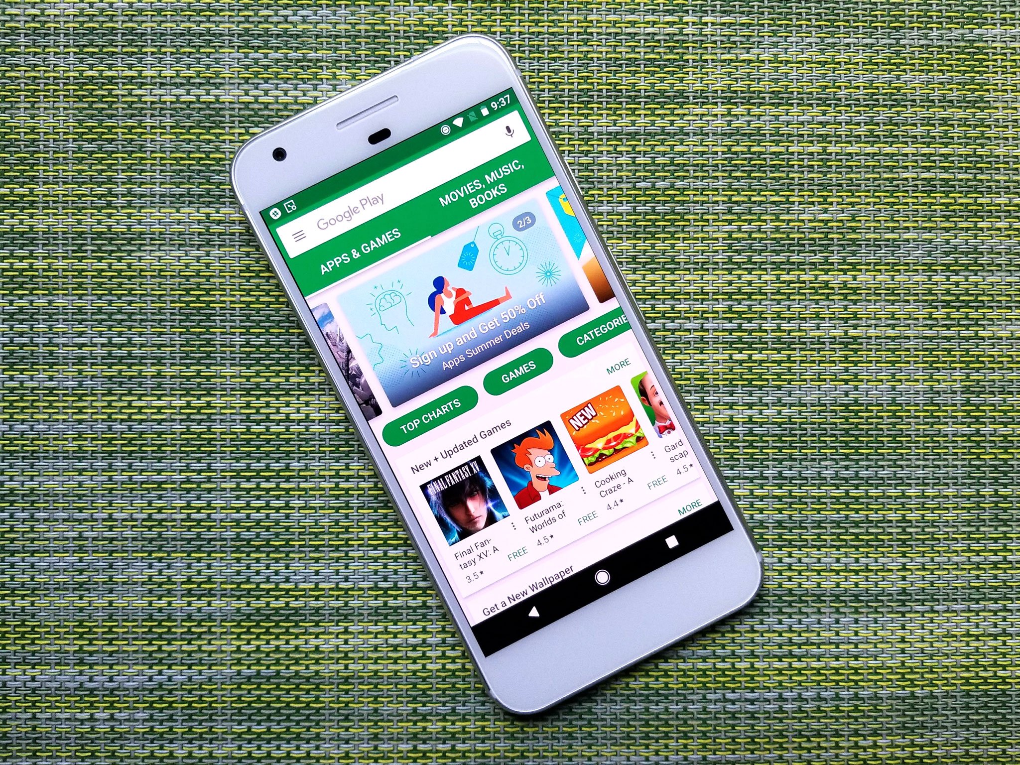
Google Play Store
Google Play Store (Image credit: Android Central)

It appears the Play Store might be next on the list for a Google Material Theme refresh, following in the steps of Gmail, Google Messages, and Google Drive's recent redesigns. The folks over at 9to5Google have dissected the recent version of the Play Store's APK to discover what this redesign will look like.
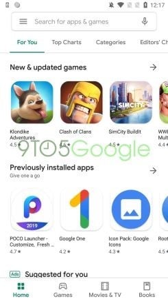
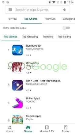
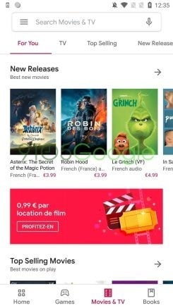
While this updated design is a big change from the current Play Store, if you've been using Gmail or Google Drive recently, then it'll all look familiar. For starters, the top search bar is now identical to the one found in a lot of Google's other apps. The old square outline and green box are now gone, opting for a white background with rounded corners and a shadow. From now on, the search bar will also display the category you are searching in, replacing the generic Google Play moniker.

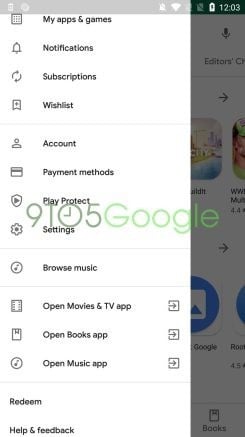
The Play Store has now also adopted a bottom navigation bar. This is where you will find Home, Games, Movies & TV, and Books. The Music category has been removed. However, Browse Music can be found inside of the navigation drawer.

The icons now feature a hollowed out appearance when inactive and are filled with the matching color of the service when selected, for example, green for Games, red for Movies & TV, and blue for Books. With these moved to the bottom, the top carousel now displays For You, Top Charts, Premium, Categories, and more while losing the icons in favor of text-only buttons.

Google has dropped the card interface and now uses a bold font for the text of the section headers, as well as replacing the "more" button with an arrow.
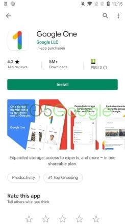
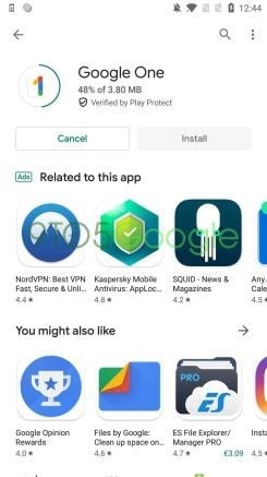
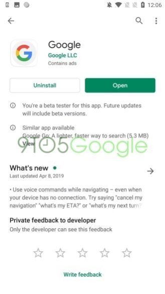
Some big changes have also been made to the app info page, including a switch to the Google Sans font, install bars now stretch the full width, and the app icons are now squares with rounded corners. Even the download indicator has changed when you install an app, as it now appears as a circle around the icon instead of a straight bar.

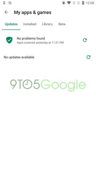
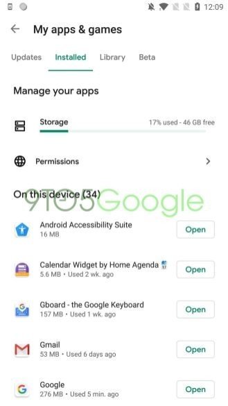
The My Apps & Games screen has also simplified its design by removing the lines separating apps and providing a shortcut directly to app Permissions.

Overall, this is a big UI overhaul the Play Store has desperately needed to bring it up to date with Material Theme standards and will help it match with other current Google apps. This may not be a finalized version, but it is a good representation of what we can expect when the update does arrive.

Best Android apps in 2019

Jason England
35 Comments
  • About time, need it to be in line with other awesome Google app modern design.
  • It's so bright and bland. It's a shame Google has no sense of style anymore. Forcing this blinding white on users is absurd. What happened to design, Google? Why are you making all of your products extraordinarily ugly?
  • I hope it fixes my problem with updating my apps, for some reason they don't update anymore. I have to go into the app settings in their storage and clear all data for it to be able to download my updates for my apps. I have a Samsung Note 9 on pie with the March 1 security update.
  • strange, mine updates no problem s9+
  • If clearing the data didn't help I would reset your phone
  • I almost went blind looking at that UI.
    They better have an option to turn all those white backgrounds into black otherwise this will be unusable for people with functional corneas.
  • You know they won't.
  • Well good thing Google is concentrating on dark themes right now.
  • When i read "Google play store will soon" i half expected the next words to be "be cancelled". Either way I don't care unless they add a dark theme. UI design doesn't make much difference to me while they're using light grey text on stark white backgrounds.
  • I am so annoyed with this blinding white stuff.
  • Same here. That's why I like Samsung One UI built in dark theme so much. I have my apps set to download and install updates automatically so I don't have to open the play store that much, and use a widget for Play Music. Only time I open the play store is to download a new app I have heard about or read about.
  • Who cares? It's not like I spend a good percentage of my time in there. Dark mode would be nice though.
  • Google has been putting dark theme option in its apps recently. Why not here? None of this other stuff matters.
  • More blinding white. #DarkThemesMatter
  • Following in the footsteps of Music, soon it will be called "YouTube Play."
  • Imagine how bright this update will be? Not sure my eyeballs can handle it.
  • I am another person that is not a fan of all the white Google seems to be going with lately. It just looks ugly, boring, cold and sterile. They really need to start adding colors to everything.
  • Please!!! Dark theme is the trend, Google! All the Google things are white, the Keep Notes, the news, the music player...
  • Looks terrible... Somethings are better left alone... RIP Windows Phone and Blackberry 10, innovation died with you...
  • Good Lord.....all that blinding white! Get with it...give us the option for a dark theme!
  • Samsung already updated their app store. Unfortunately, they made updating apps a multi step process. But sure, it's a cleaner look.
  • Samsung's app store is s pile of uncoordinated poo.
  • Thoughtful? Not really..... I mean, you really took the time to write that?
  • Sure did.
    Eloquence is my speciality.
  • How about spending on money on keeping the malware/adware ridden apps out of the store?!
  • Hundreds, if not more, are blocked every day.
  • Whenever I've finished using these dazzling white Google apps I immediately have this intense urge to do some underground spelunking 😡
  • What a bunch of whiners here! Oh, my eyes! Oh, it's so blinding white! Oh, my eyes hurt! Bla bla bla...
    I'm here to stand up in favor of the white design! At least I don't have to turn on the light to read my phone!
  • "At least I don't have to turn on the light to read my phone" - dumbest comment of 2019... Maybe ever...
  • I must have missed the sentence work it said we will be able to sort our apps by categories.
  • I don't give a cr@p about any UI overhaul that doesn't provide an advanced search (and filtering) which would give me a chance to find the app(s) I'm looking for.
  • Yeah. The biggest issue about Google is the play store.. right...
  • It could stay as is and I'd be ok with it. I'm fine with white backgrounds. I like the new look of Gmail so I'm sure I'll like the new store design. The only place I prefer a dark background is in my app drawer because so many of the icons have white in them a light color washes them out.
  • It's nice to see that Google made everything so consistent very quickly.
  • Android users are such whiny b.tch.es.