Dark mode is a lie

Hero image for "dark mode is a lie" editorial
(Image credit: Nicholas Sutrich / Android Central)

The war between light and dark mode themes on phones has long relied on personal preference to determine a winner. But while dark mode has been called the more eye-friendly mode, I'm here to call its bluff, but that might be for the reason you think.

While it's true that light mode can feel like it's nuking your retinas with the unbelievably bright displays from the best phones, dark mode does the same thing in a completely different way. The crux of the problem is that too many apps and phones use what's known as "dim" dark mode instead of true "lights out" dark mode.

Dim mode might feel more eye-friendly at first but, in actuality, phones that use PWM dimming mean that this mode is worse for your eyes than either fully light or "lights out" dark mode. Some eye conditions mean dark mode is bad in any form, as Wired and Android Authority have written previously about, but I'm here to cover a different reason to toss dim mode out the window.

It's not actually darker

Demoing all the UI color options in Twitter

(Image credit: Android Central)

When dark mode first started appearing in apps and on some phones, it was often paired with the promise of battery life savings on phones with OLED screens. After all, a black pixel is completely off on an OLED. Therefore, the more black pixels you have on a display, the less often it's actually using the battery to light a pixel up.

But the problem is that many phones and apps don't have proper "lights off" dark modes. Instead, they replace white backgrounds with a dark grey — or another darker version of your favorite color via the Material You theme engine — which still keeps the display on, completely ruining the core purpose of dark mode in the first place. The X (Twitter) app above showcases all three types.

Worse yet, because most modern OLEDs use PWM flickering to fake dimming, this "dark mode" means your display is flickering more than when the phone is using light mode and could give you terrible headaches or other adverse effects, especially if you use dark mode in a dark room.

(Image credit: Nicholas Sutrich / Android Central)

If you don't know what PWM dimming is, here's the briefest explainer I can come up with:

Instead of dropping the voltage to each pixel, lots of modern phones turn the display on and off several hundred times per second. By doing this, displays trick your brain into seeing a display that's brighter or dimmer, depending on how long the display stays off during this cycle.

That means your display is actually flashing at you with full-intensity brightness (2,000 nits on some phones) immediately after the display is completely off. This extreme difference in light levels is incredibly uncomfortable — and even painful — to folks sensitive to flicker. Worse yet, if you're like me, these kinds of displays and lights could eventually cause you to become sensitive to this horrible effect.

Medically, this is known as temporal light modulation, and the negative effects have been documented by studies over the years, yet many smartphone manufacturers seem oblivious to the truth.

You can capture the PWM rate of a phone by using a camera to take a picture or video at a high shutter speed of 1/6000 or higher. PWM shows up as dark lines running across the screen — as you can see in the image above — and thicker lines mean that the display is flashing more intensely per cycle.

Notice which lines are thickest above? That's right: the darkest ones.

(Image credit: Nicholas Sutrich / Android Central)

OLEDs didn't always do this and don't have to do this, but some companies have decided that displays "pop" more or appear to have better colors because of how an OLED works. In reality, this is lazy engineering, and it often makes a display cheaper to manufacture, so these companies are quite literally putting your health at risk just to save a few pennies.

On a phone that uses proper DC-dimming — like the Motorola Edge (2023) pictured above — dark colors actually emit less light instead of flashing at more extreme rates to fake a darker color. To actually fix this problem, we need more phone displays to work like this.

Until then, lights out

Google Photos on a Pixel 6 Pro

(Image credit: Nicholas Sutrich / Android Central)

Until most phones can be considered PWM-friendly phones, the best stop-gap is to petition for more lights-out modes.

Some manufacturers already do this. Samsung's lights-out dark mode could help reduce the effects of PWM sickness if Samsung's displays weren't so darn intense. Unfortunately, though, even lights-out dark mode doesn't make enough of a difference on Samsung's flickering displays to help people like me who are sensitive to flickering lights.

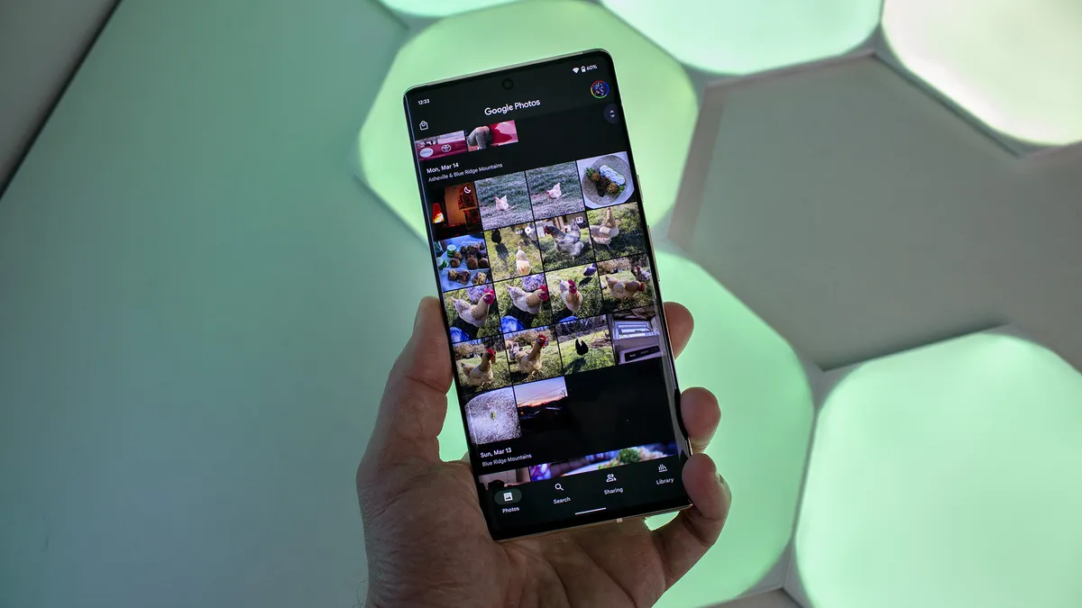
Conversely, companies like Google are the worst offenders because they use dark backgrounds instead of proper black backgrounds. Ironically, "dark theme" in stock Android and on Pixel phones specifically states that "dark theme uses a black background to help keep your battery alive longer." It's just a shame that reality doesn't match up with what's printed on the tin.

The obvious problem is that light theme is too bright to use in a dark room, and given the nature of PWM dimming, reducing that brightness slider doesn't actually reduce the brightness. It just makes the phone flicker differently.

So, is lights-out mode the only saving grace on these devices? For now, yes. Ultimately, though, we need displays that aren't flashing at our retinas at all levels of brightness.

Nicholas Sutrich
Senior Content Producer — Smartphones & VR
Nick started with DOS and NES and uses those fond memories of floppy disks and cartridges to fuel his opinions on modern tech. Whether it's VR, smart home gadgets, or something else that beeps and boops, he's been writing about it since 2011. Reach him on Twitter or Instagram @Gwanatu
  • finbaar
    If PWM was a problem then I can understand that the issue with dark screens would be important to you in dark rooms. However I hate light modes on anything and I'm not effected by the PWM issue so I'm happy with dark mode and I wonder what the numbers who have the issue are? I'm not denying the issue BTW and I would prefer if Samsung didn't make cheap displays and sorted this out so everyone can enjoy dark mode.
    Reply
  • fuzzylumpkin
    finbaar said:
    If PWM was a problem then I can understand that the issue with dark screens would be important to you in dark rooms. However I hate light modes on anything and I'm not effected by the PWM issue so I'm happy with dark mode and I wonder what the numbers who have the issue are? I'm not denying the issue BTW and I would prefer if Samsung didn't make cheap displays and sorted this out so everyone can enjoy dark mode.
    I can't use a phone with light mode at all due to my own issues with vision. No dark mode means no visibility at all for me.

    Seems like the author is mainly focused on the half baked dark modes that companies like Google use rather than real#000000 dark modes though, which I agree with.

    The irony being these "dim modes" exist for the benefit of LCDs
    Reply
  • politebat2001
    Every article this guy writes is the same thing, ok We got it. Just buy a Oneplus phone.
    Reply
  • scotchedpommes
    Just came to this after hearing the discussion about it on the podcast yesterday, so I'm aware of how keen Nick is to engage with comments, but still thought it might be worth adding something on my own experience with using dark modes, as well as the motivation for it.

    Apologies if there's a wee bit too much in this, but I know it can be illuminating to find out how others with different forms of visual impairment approach using (or avoiding) these displays, even if it's not always with the help of standard accessibility features.

    tl;dr - have always used dark modes wherever possible here, to help with the effects of an eye condition consistently made worse by the light alternative. "Forced dark mode" (toggled in developer settings) saved me for years when using apps without their own integrated mode, but it seems to be increasingly common for devs to break compatibility with that system-implemented functionality through app updates.


    No doubt those of us dealing with various conditions have a wide range of views on the usefulness of dark modes and other display-altering functions, with those bound to differ depending on the effects that we have to contend with. In my case, there are a few different sight conditions - now including near complete loss of vision in my left eye - but the underlying one that still has a bearing on my preference for dark modes is advanced Keratoconus in the more useful right eye.

    Keratoconus is actually referenced in the Wired article that Nick linked to, but the only comment on it there is made in relation to the light sensitivity brought about for some making dark modes more useful. It helpfully doesn't clarify that the research findings mentioned on legibility apparently run contrary to the bulk of what might be experienced with the condition; I'd guess much of it simply doesn't apply to those with Keratoconus, or perhaps the last couple of decades really have been a carefully crafted illusion.

    For me, although I'm an outlier (and an almost comical worst case scenario with the condition in a number of respects), I'd say light sensitivity in itself isn't a lone deciding factor when looking at how I try to adapt my screen usage. Yes, it is an immediate, sometimes intense strain to try to view any page dominated by a light background, but the key to improving usability for me tends to be in a combination of removing brighter light and also lessening the severity of the additional distortions* that are created around text and images.

    That's best done by having light text (or any other visual elements) on a dark or black background. It doesn't have to be black rather than darkened or dimmed colours, but I'd certainly choose that too. I'd maintain that legibility is improved, and the comfort of then not having to endure light backgrounds on a page is a bonus.

    If apps didn't have dark modes at all, there was a period of time when I would just avoid them altogether. You might ask why anyone so affected wouldn't just resort to using full inversion, but clearly there are other problems that come with that. You can still be hit by blocks of inverted dark areas in predominantly light apps, and images, design and colour are all effectively sacrificed, meaning it's never going to be a preferred solution. I'm fortunate to still be able to see and appreciate what's shown on a screen well enough, even with persistent distortions, that I typically wouldn't want to ruin other aspects of using a display by inverting everything.

    "Forced dark mode", accessed through developer settings, is probably the best compromise that I've found, and has made the greatest difference to me outwith anything that was available via dedicated vision-oriented accessibility settings. It worked across a surprising number of apps that didn't have their own integrated dark modes, and for the most part it succeeded in blacking out white or dimming light backgrounds, still preserving most images. As of recent Android versions though, I've found that app updates have been removing compatibility with it. I don't know whether that's inadvertent and just an indication of a disregard for these issues on the part of developers, or more hopefully the precursor to integrated dark modes being introduced as standard. That might be more wishful thinking, though one app that I'd used with forced dark mode for a couple of years suddenly broke it with an update, only to then add their own dark mode (irrespective of attempts to communicate with them about it) a month later. Others that have become incompatible in the past year have seemed like a lost cause.

    I hadn't known about PWM issues at all until I heard the subject raised on the podcast weeks ago, so I'm in no position to comment on what's "good" in those cases, but dark modes of any shade remain vital to me.


    *Essentially, every image or fragment of text that I focus on is repeated in multiple persistent arrays or with visible "ghosting" around it. I find that the distortions are considerably easier to handle when the objects are set against a dark - preferably black - background. I've curiously seen others with Keratoconus that have reported the opposite being the case for them, so there's plainly significant variation in experience all round. they're obviously the weird ones in all of this.]
    Reply
  • fuzzylumpkin
    scotchedpommes said:
    Just came to this after hearing the discussion about it on the podcast yesterday, so I'm aware of how keen Nick is to engage with comments, but still thought it might be worth adding something on my own experience with using dark modes, as well as the motivation for it.

    Apologies if there's a wee bit too much in this, but I know it can be illuminating to find out how others with different forms of visual impairment approach using (or avoiding) these displays, even if it's not always with the help of standard accessibility features.

    tl;dr - have always used dark modes wherever possible here, to help with the effects of an eye condition consistently made worse by the light alternative. "Forced dark mode" (toggled in developer settings) saved me for years when using apps without their own integrated mode, but it seems to be increasingly common for devs to break compatibility with that system-implemented functionality through app updates.


    No doubt those of us dealing with various conditions have a wide range of views on the usefulness of dark modes and other display-altering functions, with those bound to differ depending on the effects that we have to contend with. In my case, there are a few different sight conditions - now including near complete loss of vision in my left eye - but the underlying one that still has a bearing on my preference for dark modes is advanced Keratoconus in the more useful right eye.

    Keratoconus is actually referenced in the Wired article that Nick linked to, but the only comment on it there is made in relation to the light sensitivity brought about for some making dark modes more useful. It helpfully doesn't clarify that the research findings mentioned on legibility apparently run contrary to the bulk of what might be experienced with the condition; I'd guess much of it simply doesn't apply to those with Keratoconus, or perhaps the last couple of decades really have been a carefully crafted illusion.

    For me, although I'm an outlier (and an almost comical worst case scenario with the condition in a number of respects), I'd say light sensitivity in itself isn't a lone deciding factor when looking at how I try to adapt my screen usage. Yes, it is an immediate, sometimes intense strain to try to view any page dominated by a light background, but the key to improving usability for me tends to be in a combination of removing brighter light and also lessening the severity of the additional distortions* that are created around text and images.

    That's best done by having light text (or any other visual elements) on a dark or black background. It doesn't have to be black rather than darkened or dimmed colours, but I'd certainly choose that too. I'd maintain that legibility is improved, and the comfort of then not having to endure light backgrounds on a page is a bonus.

    If apps didn't have dark modes at all, there was a period of time when I would just avoid them altogether. You might ask why anyone so affected wouldn't just resort to using full inversion, but clearly there are other problems that come with that. You can still be hit by blocks of inverted dark areas in predominantly light apps, and images, design and colour are all effectively sacrificed, meaning it's never going to be a preferred solution. I'm fortunate to still be able to see and appreciate what's shown on a screen well enough, even with persistent distortions, that I typically wouldn't want to ruin other aspects of using a display by inverting everything.

    "Forced dark mode", accessed through developer settings, is probably the best compromise that I've found, and has made the greatest difference to me outwith anything that was available via dedicated vision-oriented accessibility settings. It worked across a surprising number of apps that didn't have their own integrated dark modes, and for the most part it succeeded in blacking out white or dimming light backgrounds, still preserving most images. As of recent Android versions though, I've found that app updates have been removing compatibility with it. I don't know whether that's inadvertent and just an indication of a disregard for these issues on the part of developers, or more hopefully the precursor to integrated dark modes being introduced as standard. That might be more wishful thinking, though one app that I'd used with forced dark mode for a couple of years suddenly broke it with an update, only to then add their own dark mode (irrespective of attempts to communicate with them about it) a month later. Others that have become incompatible in the past year have seemed like a lost cause.

    I hadn't known about PWM issues at all until I heard the subject raised on the podcast weeks ago, so I'm in no position to comment on what's "good" in those cases, but dark modes of any shade remain vital to me.


    *Essentially, every image or fragment of text that I focus on is repeated in multiple persistent arrays or with visible "ghosting" around it. I find that the distortions are considerably easier to handle when the objects are set against a dark - preferably black - background. I've curiously seen others with Keratoconus that have reported the opposite being the case for them, so there's plainly significant variation in experience all round. they're obviously the weird ones in all of this.]
    I have a very similar experience. To elaborate on my previous comment, I am an RP sufferer and have several secondary conditions. I also used to make full use of force dark, but stopped due to it becoming pointless. It sometimes feeels as though companies like Amazon and Uber are actively being malicious... I also use chrome flags to enable dark them theme across the web (unfortunately, firefox doesn't work well everywhere) and now have Samsung routines to automatically invert colours on specific apps. But, as you mention, this is far from an elegant solution. What Nick is unfortunately discovering is that companies don't really care about people with disabilities. Don't get me wrong, I am thankful that there are more accessibility features these days, but what |I have learned is that companies like samsung and google will break the functionality of these features on a whim and then take months or even years to fix the damage, if it ever gets fixed.

    The thing that originally brought me to Samsung was the dark theme . I had been using substratum, which google killed the backend support for in android 9 so it could release it's own theme engine 3 years later. Samsung on the other hand had dark theme and a theme engine of their own. They even have high contrast themes in their accessibility menu, great! Except they broke those themes 2 months ago and seem unwilling to fix them. People who rely on them can only hope that they will be fixed when they are updated for OneUI 6, but I have run out of faith. I've personally reported bugs that I know are easy fixes that still have not been fixed. Most of the time I can't even make their CS reps understand that it is a bug in accessibility I am trying to report... they have no training in or knowledge of the features.

    That got a bit ranty lol. But the post I replied to made me think it may be valuable for people to know they aren't alone in their struggles, and there are others who are haveing to find creative solutions to problems that could easily be solved by a developer.

    Speaking of which, a shout out to small devs! Most of the ones I have spoken to who have neglected accessibility in their apps will fix it very quickly when it is pointed out I have personally reported bugs with accessibility to indy devs and have been fixed in a matter of days while similar bugs in products from Amazon, Google and Samsung go unresolved for months or years. If they get resolved at all..
    Reply
  • scotchedpommes
    fuzzylumpkin said:
    I have a very similar experience. To elaborate on my previous comment, I am an RP sufferer and have several secondary conditions. I also used to make full use of force dark, but stopped due to it becoming pointless. It sometimes feeels as though companies like Amazon and Uber are actively being malicious... I also use chrome flags to enable dark them theme across the web (unfortunately, firefox doesn't work well everywhere) and now have Samsung routines to automatically invert colours on specific apps. But, as you mention, this is far from an elegant solution. What Nick is unfortunately discovering is that companies don't really care about people with disabilities. Don't get me wrong, I am thankful that there are more accessibility features these days, but what |I have learned is that companies like samsung and google will break the functionality of these features on a whim and then take months or even years to fix the damage, if it ever gets fixed.

    The thing that originally brought me to Samsung was the dark theme . I had been using substratum, which google killed the backend support for in android 9 so it could release it's own theme engine 3 years later. Samsung on the other hand had dark theme and a theme engine of their own. They even have high contrast themes in their accessibility menu, great! Except they broke those themes 2 months ago and seem unwilling to fix them. People who rely on them can only hope that they will be fixed when they are updated for OneUI 6, but I have run out of faith. I've personally reported bugs that I know are easy fixes that still have not been fixed. Most of the time I can't even make their CS reps understand that it is a bug in accessibility I am trying to report... they have no training in or knowledge of the features.

    That got a bit ranty lol. But the post I replied to made me think it may be valuable for people to know they aren't alone in their struggles, and there are others who are haveing to find creative solutions to problems that could easily be solved by a developer.

    Speaking of which, a shout out to small devs! Most of the ones I have spoken to who have neglected accessibility in their apps will fix it very quickly when it is pointed out I have personally reported bugs with accessibility to indy devs and have been fixed in a matter of days while similar bugs in products from Amazon, Google and Samsung go unresolved for months or years. If they get resolved at all..

    Thanks for this - I haven't been active in communities dealing with these issues, but agree that there's value in hearing from others, and I can relate to that sense of frustration and more. (Even the mention of Substratum, with the themes and unsupported software that I held on to here for as long as possible.) Hadn't actually used the full high contrast themes that have been broken, though I always have the separate high contrast mode on inside Samsung Internet.

    You've also reminded me to check Routines; I hadn't even considered it for accessibility, but have heard it recommended several times before for other uses and I typically forget to get round to exploring it.

    Cheers.
    Reply