What you need to know
- Google's new Play Store UI is rolling out now on Android devices.
- The updated UI removes the hamburger menu and moves it to the profile thumbnail.
- The redesign is already a point of contention for some.
There have been whispers of Google working on a UI refresh for the Play Store for some time now. The last time Play Store received a new look was in 2019 when it rolled out the new Material theme with a new color scheme and bottom navigation bar. While those elements have remained, this latest redesign does move around some UI elements in an effort to make things look cleaner.


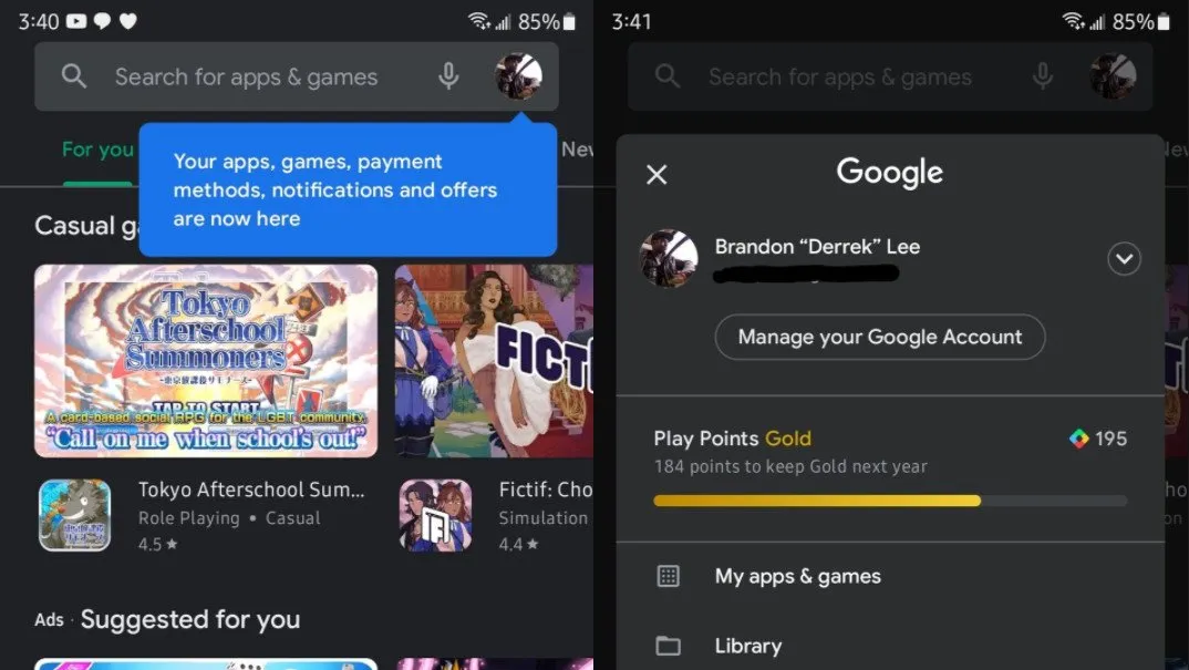
Source: Derrek Lee / Android Central
When you first open the new Play Store UI, you'll notice that the hamburger menu on the left side is no longer there. You'll be greeted with a dialogue telling you that the Play Store menu items have all been moved to your profile thumbnail. Clicking it will bring up the menu, which has been condensed. For instance, the option to open the Play Books or Play Movies & TV apps has been moved to Library along with the wishlist. Payments and Subscriptions have also been condensed into one single menu item.


Source: Derrek Lee / Android Central
The settings menu also gets an overhaul, one that was previously spotted before. Instead of listing out all the settings, they're now condensed into expandable folders that indicate where you can find certain settings. Some elements to the app search are also changed. A search will now pull up an enlarged card where you can easily tap to install the app instead of first launching the app page.
Unfortunately, not all the changes to the Play Store are being bet positively, with some complaining about how Google is hiding menu items and making them more difficult to find:
I get that nobody likes hamburger menus anymore (I think they're fine!), but it was dumb when Apple hid a bunch of App Store functions under your profile photo and it's dumb that Google Play is following https://t.co/KTPfy8SaCRI get that nobody likes hamburger menus anymore (I think they're fine!), but it was dumb when Apple hid a bunch of App Store functions under your profile photo and it's dumb that Google Play is following https://t.co/KTPfy8SaCR— Dieter Bohn (@backlon) April 7, 2021April 7, 2021
It is worth noting that one problem with the hamburger menu was that it was unreachable thanks to the increasing size of the best Android phones like the Samsung Galaxy S21 Ultra. Google's gesture navigation in Android is often unreliable in that regard and did little to resolve that. Moving the menu to another element at the top of the screen seems to make matters worse because tapping the profile thumbnail appears to be the only option now.
Have you received the new Play Store UI yet? What are your thoughts on the changes?

