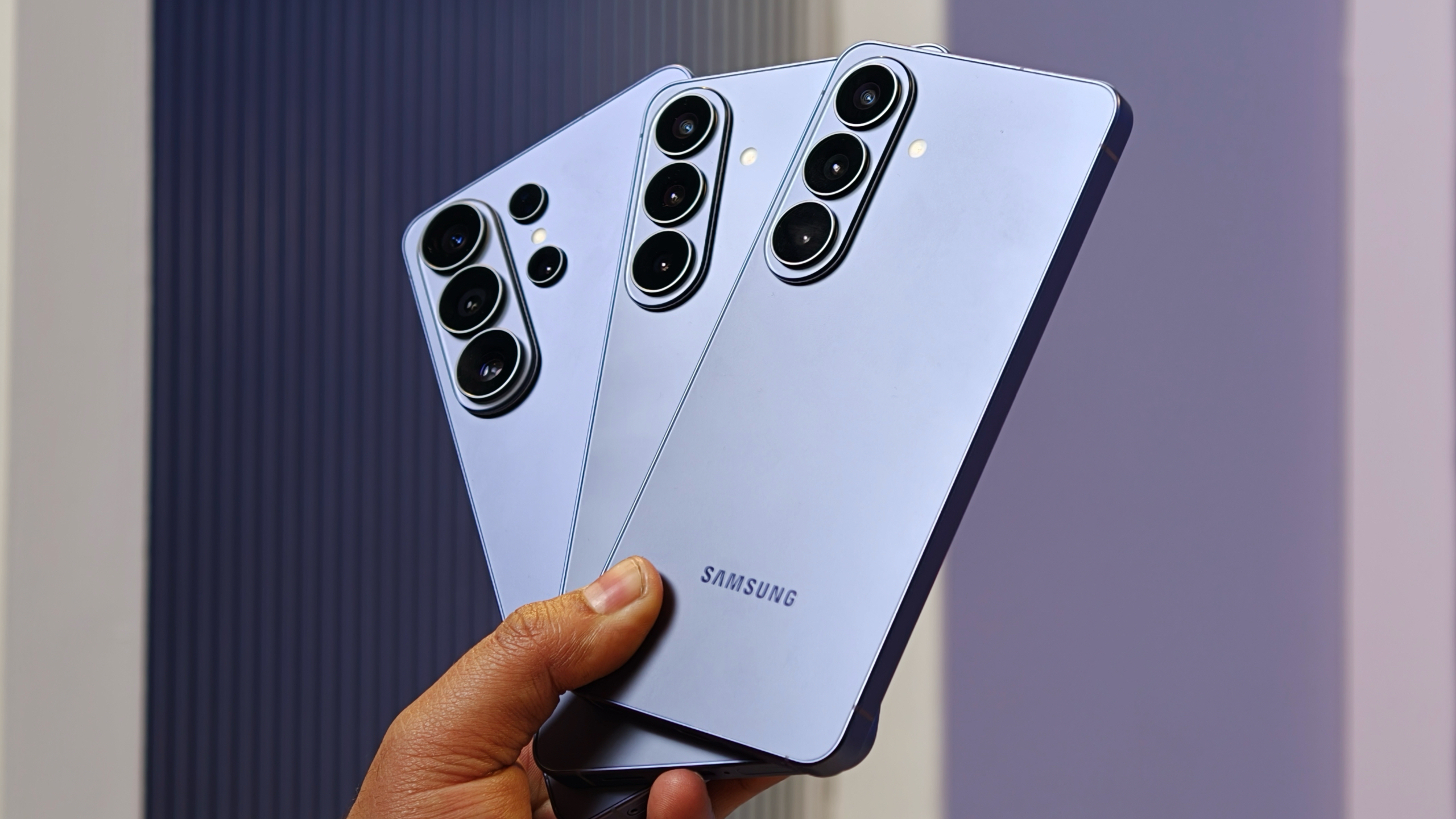
Google Keep gets a big UI overhaul with its latest update
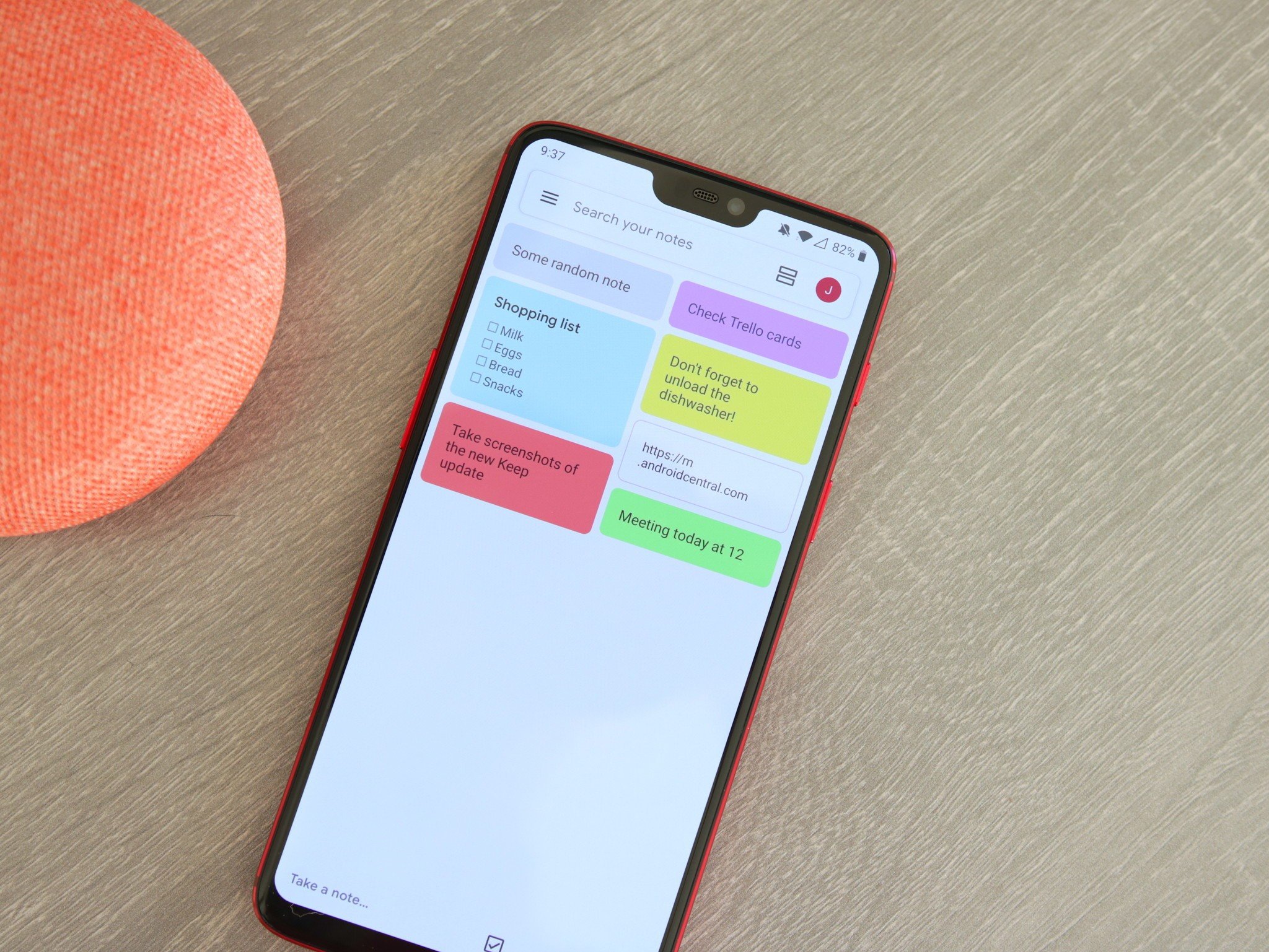
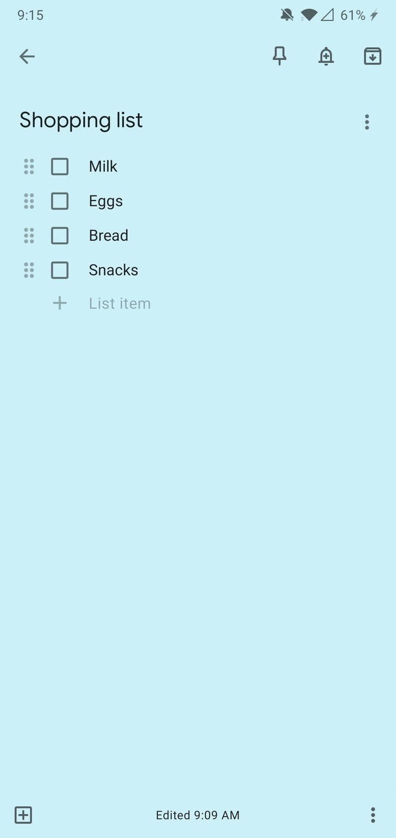
Google Keep is undoubtedly one of the best note-taking apps on Android, but its UI has had the same general look and feel for quite a few years now. Thankfully, Google's finally given Keep the design overhaul we've been waiting for with its latest update.

The new Google Keep

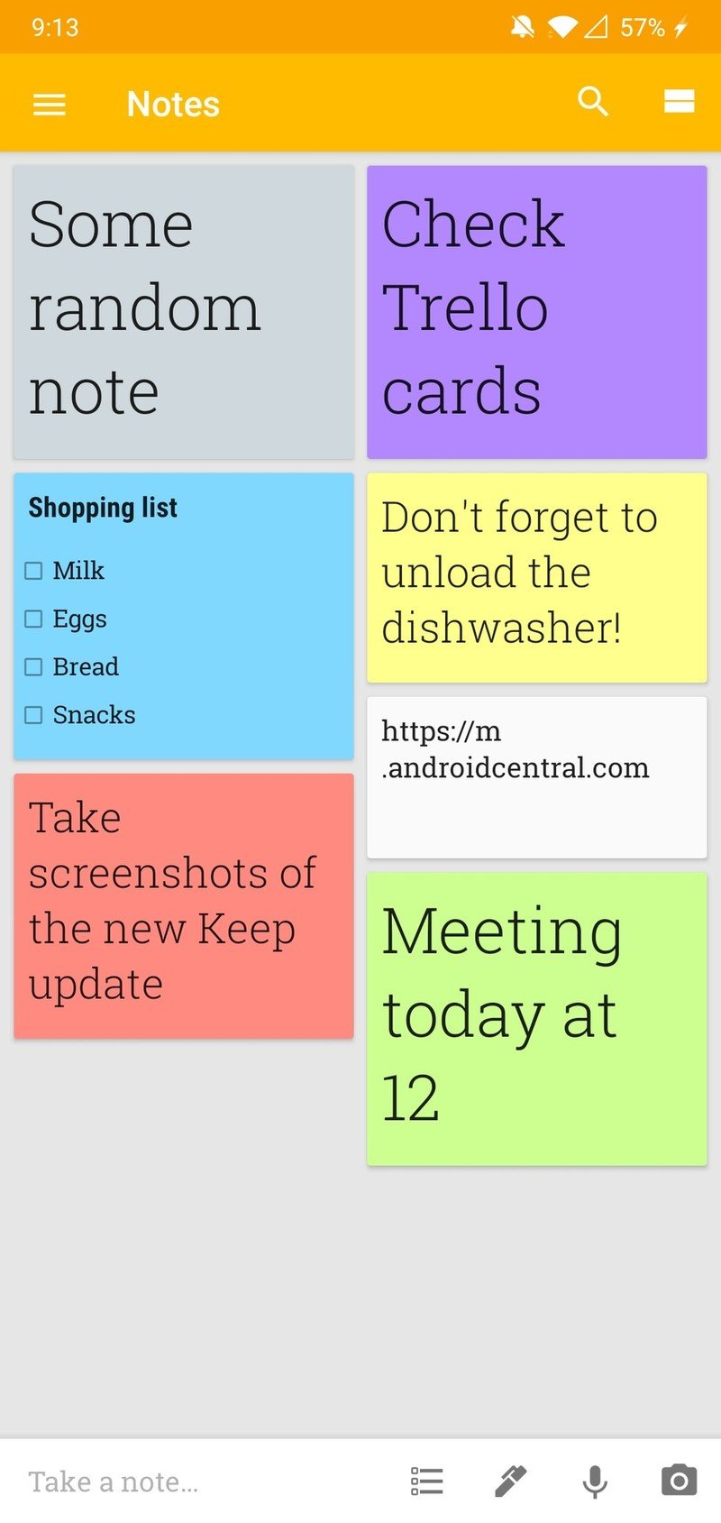
Rolling out now as version 5.0.411.09, this update refreshes Keep with the same Material Theme UI that we now have in the Google Home, Messages, and Contacts apps. The background is now a stark white versus a light gray and some of the colors for notes have been updated, too.

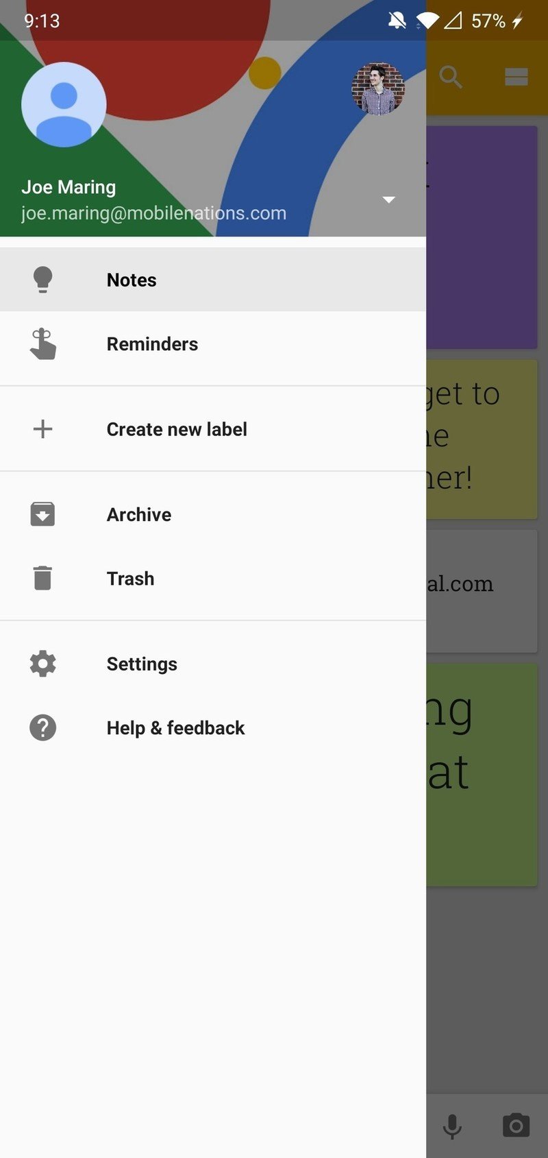
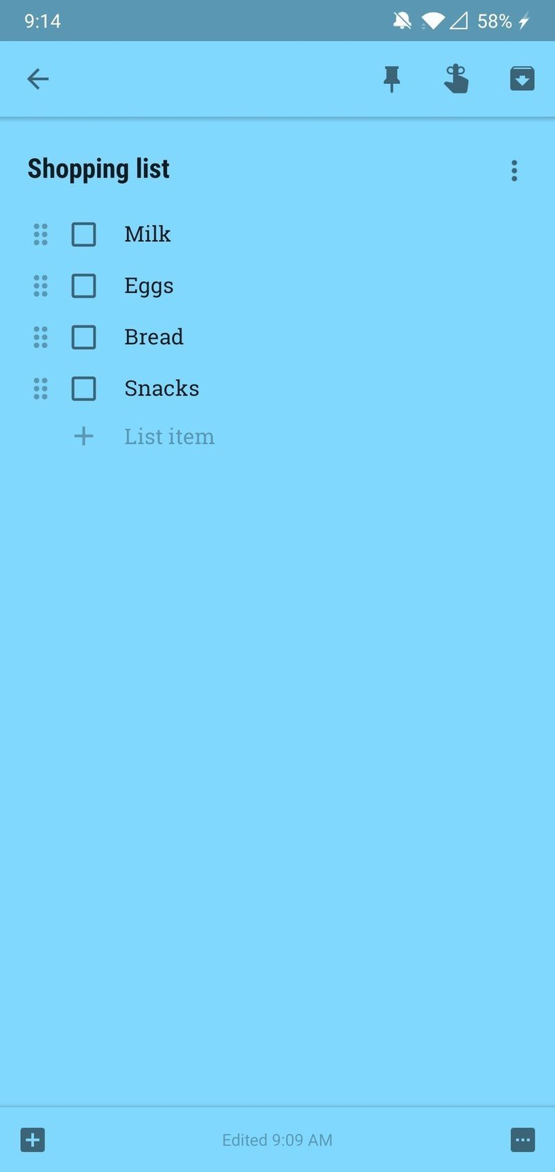
The old Google Keep

The core functionality remains mostly the same, with controls at the bottom for creating a new note and a hamburger menu to the left that allows you to see your reminders, custom labels, and more. If you want to switch to a different Google account, you'll now need to tap your profile icon at the top right of the screen from the home page.

These Material Theme updates have caused for some mixed feelings among users, but once again, I really, really like the direction Google's going for here.

Are you a fan of Google Keep's new look?

Download: Google Keep (free) (opens in new tab)

Joe Maring

Joe Maring was a Senior Editor for Android Central between 2017 and 2021. You can reach him on Twitter at @JoeMaring1.
14 Comments
  • Put my shopping list from Google home back into keep. I don't use Google express and I never will
  • You took the words right out of my mouth
  • This
  • It's coming back!!! https://www.reddit.com/r/googlehome/comments/9pas4i/shopping_lists_will_...
  • I love the refreshed theming direction Google had taken. This just means we may get a dark theme for Keep too!
  • I hate the direction they're going. I really liked the splashes of colour throughout the OG material design. Now everything is just going white, like Apple.
  • I agree somewhat, I like the cleaner look, but it could use just a bit more color.
  • I have definitely not been waiting for this update. I hate the utterly bland and whitewashed look that Google forces on all its apps.
  • why should we be excited by a 'stark whutr' overhaul?! Google has been on a white crusade for a long time now. is more white big news? how bout adding a dark theme option to Keep? now That would be news worth trumpeting.
  • 100% agree. I don't understand Google's obsession with white and overly bright colors without offering a dark option.
  • MUI is all about white space. Get the 😎 ready. Messages has the same problem. Dark mode to the ready.
  • I think it looks great. I love the white theme Google is using across their apps. I actually like the bright white theme as opposed to dark that most people seem to prefer.
  • Another unsought "improvement." In other products where there is so little, none, semantic changes, Google have the consideration to leave an option for the old format to be used as an ongoing A/B test of their love of novelty and inability to leave adequate-enough alone. Of all the things they could have done (direct click to unpinned cards for example) this bleaching and wasting of desktop space is galling.
  • Yet again Google have ruined what was a good app by using a horrible white background and a skinny font, it was completely fine before this, there was no need for it