
This may not be the extreme Android forking that some would have expected, but Facebook Home is still a pretty dramatic change to the way you will use your phone. With the installation of just one app, you're faced with what looks on the surface like a completely new operating system. From the main home screens to the app drawer and navigation, Facebook has certainly gone its own way with the design.
And for most users out there, Facebook Home will be their first foray into "custom" launchers -- whether they know what that is or not -- and it's not the easiest concept to understand. Get past understanding technically what it is, and you've still got to explain what it does. So what is Facebook Home? Stick around with us after the break and see if we can help clear things up a little bit.
Home screens
One look at the Facebook Home interface and it's very clear that this isn't your standard third party launcher. The main push by Facebook here is that people, not apps, should be the first thing you experience on your phone when it is turned on. Unlocking the device, you're given a set of horizontally scrolling frames called "Cover Feed" -- each of which is a status update from one of your Facebook friends. Pictures, links, check-ins and even text-only posts are all found here (without any clear way to determine what order they're in).

Posts including pictures prominently display that image as the background of the page, with a slowly moving animation adding a little liveliness to the screen. Those including links will use the image associated, and text-only posts use the person's cover photo from their profile. Double tapping on the center of the screen "likes" the status, and tapping on the comment bubble in the bottom left corner lets you comment.
When you're done browsing through the pretty (or not so pretty) pictures and statuses, a single tap anywhere in the middle of the screen brings up your profile picture at the bottom of the screen, which is then used for navigation. Tapping and dragging your profile image in one of three directions takes you to different places -- left to Facebook Messenger, up to Apps, and right to your most recent app used.
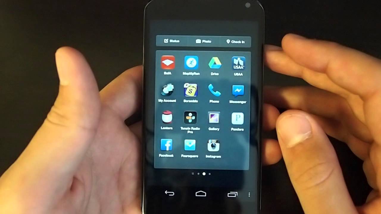
The app drawer


Despite the fact that most of the focus has been put on Cover Feed, Home doesn't block any access to your full set of installed apps. Swiping your profile picture up into the "Apps" option, you're taken to a horizontally paginated list of your most used apps. If you've set up a launcher previously, it basically pulls in whatever you had on that launcher to these pages. You can organize them in any way you want, though, and the number of pages changes according to how many apps you try to drag out. Think of this area as what would traditionally be your home screen. You can't make folders, but your most used apps can be placed here however you want otherwise.
Swiping over to the furthest page left is what would then be a traditional app drawer, with every app you have installed on the device visible. You can long press and take apps from here to the app launcher. The system works for most users that use just a handful of apps regularly, but power users that rely on many folders and widgets will likely get frustrated with the system. It's easy enough to make the one swipe up and see your apps, but that's one extra step from a regular launcher.
Settings


The only settings pertaining directly to Home are those to turn off the launcher, show or hide the status bar (hidden by default) and turn on and off the lock screen (which is also off by default). You can also toggle an awkwardly named category called "Data Use" between low, medium and high. Presumably this changes how images and data are refreshed and cached.
Most of the other selections just kick you out to the main Facebook and Messenger apps, where you can then edit things like notifications and other broader account settings. Of the entire Home experience, the settings area feels the most tacked on to us. Though this isn't much of a surprise considering how weakly implemented settings have been in Facebook's other apps, you kind of wish there were more options in there. Expect improvements to come with the promised monthly updates to Home.
A place you can call Home?

Still a little foggy on Facebook Home? That's okay, because it's quite the departure from your standard Android home screen experience. But if you're an even moderately active Facebook user, it'll only be a matter of minutes before you start to feel comfortable with the way Home displays information. And if you find that it doesn't offer what you want, going back and forth between Home and any other launcher couldn't be easier.

