The worst part about shopping at Amazon is its awful mobile app
Get the latest news from Android Central, your trusted companion in the world of Android
You are now subscribed
Your newsletter sign-up was successful
Growing up in a rural town of about 1,000 people where going to a grocery or superstore required a 15-45-minute drive, online shopping has been my go-to for a good portion of my life. It's how my parents and I ordered countless things while I was growing up, and it's how my wife and I now do a lot of our shopping. When I was a kid and to this very day, Amazon is the site that gets most of my money.
Even though I now live a stone's throw away from stores like Target, Walmart, Best Buy, etc., Amazon is where I often go to buy cleaning supplies, Tim Horton's coffee, phone cases, you name it. And, I imagine that's the case for a lot of people. With two-day (and now one-day shipping in a lot of areas) for Prime subscribers, the convenience Amazon offers remains unmatched.
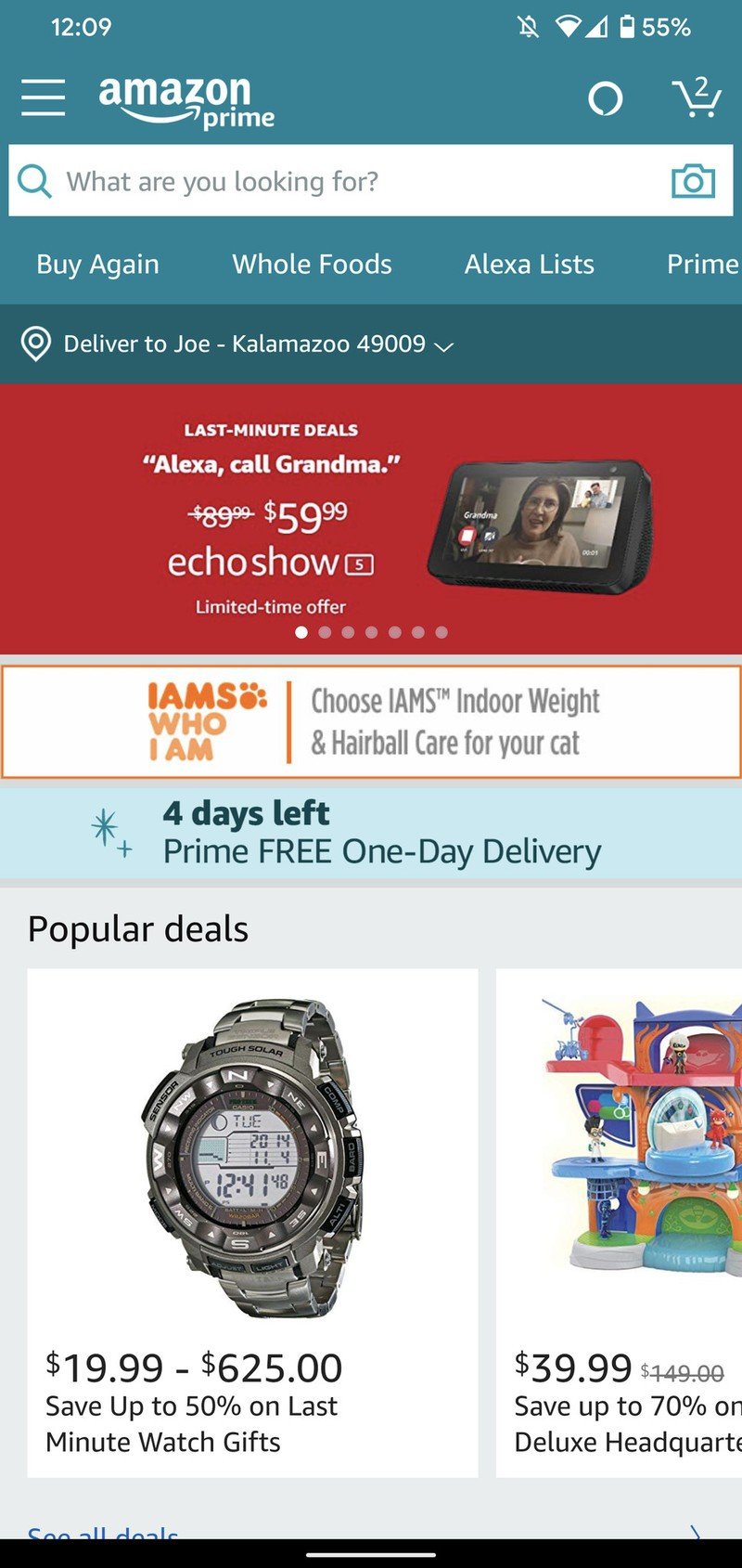
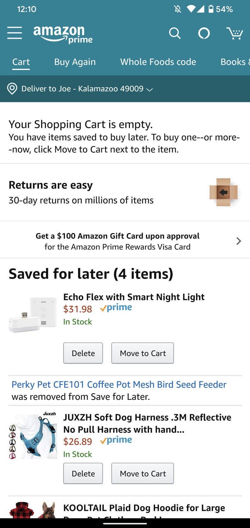
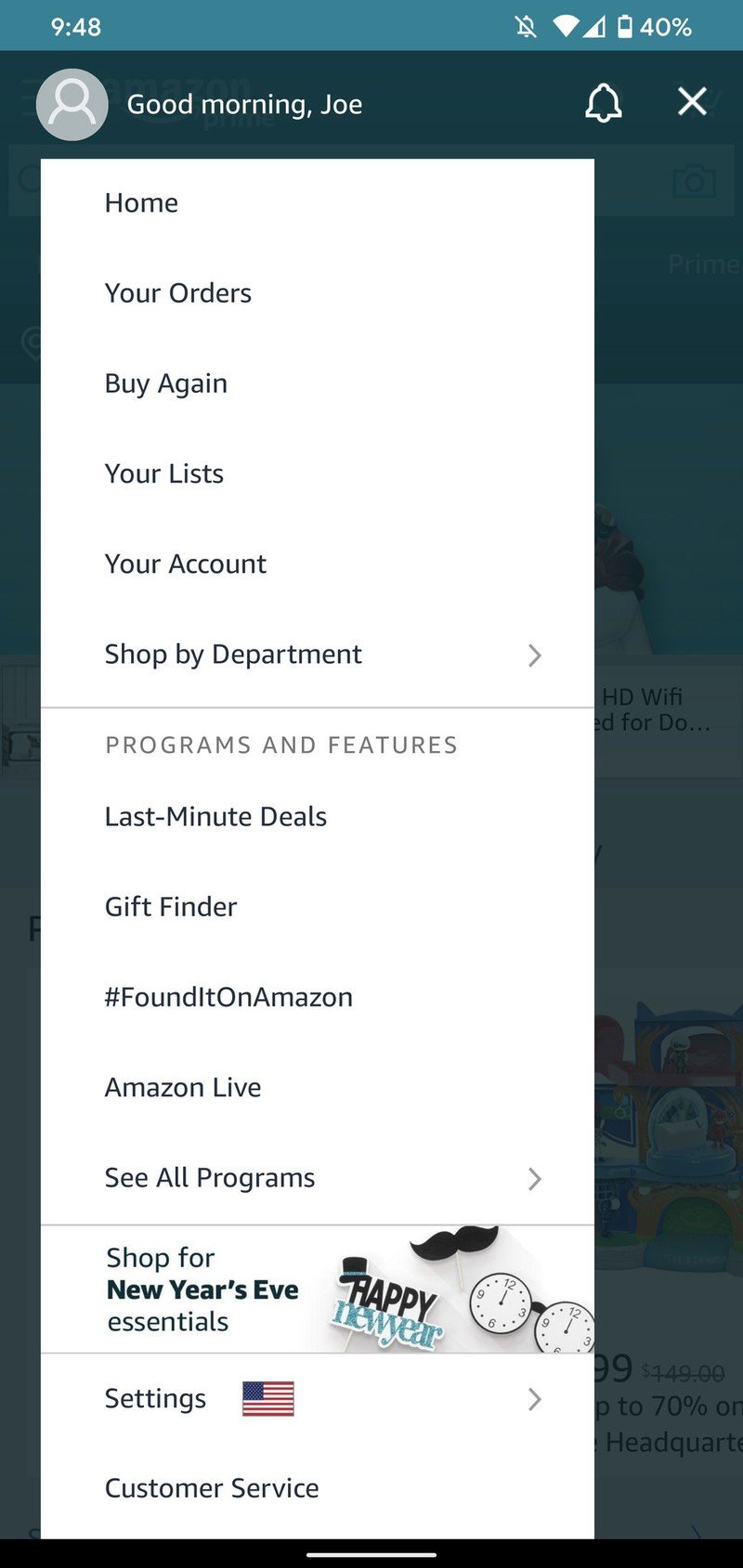
Source: Joe Maring / Android CentralNone of this looks good
Article continues belowAs much as I use and rely on the company, however, that doesn't excuse my distaste for its objectively bad Android app.

When you're an online-based retailer, having a well-designed app is kind of important. It's the primary way a lot of your customers are going to interact with you, and if it's a bad user experience, they might not come back. In Amazon's case, however, the same rules don't necessarily apply. Its mobile app is not particularly enjoyable to use, but because there's no other company quite like it, Amazon gets away with a sub-par product.
There are two main issues I have with the Amazon app, the first of which is how much is crammed into it. At its core, the app is used for searching for and purchasing things that Amazon sells. This process does work perfectly fine, but if you tap the wrong button or find yourself in a menu you didn't mean to go to, it's easy to be overwhelmed with just how much is going on.
The Account page in the Amazon app is seriously this long. It's ridiculous.
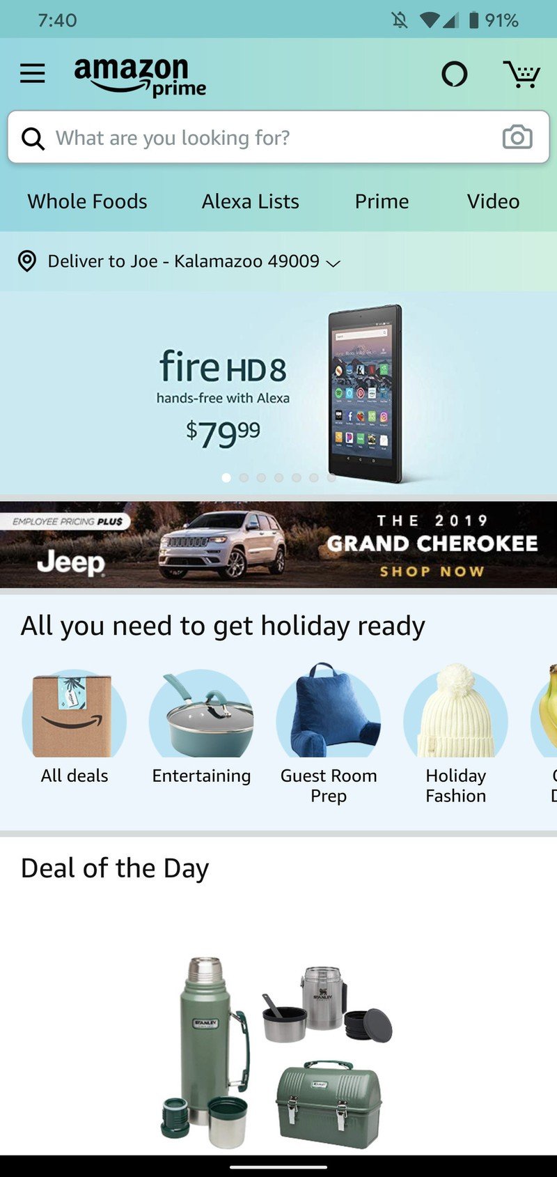
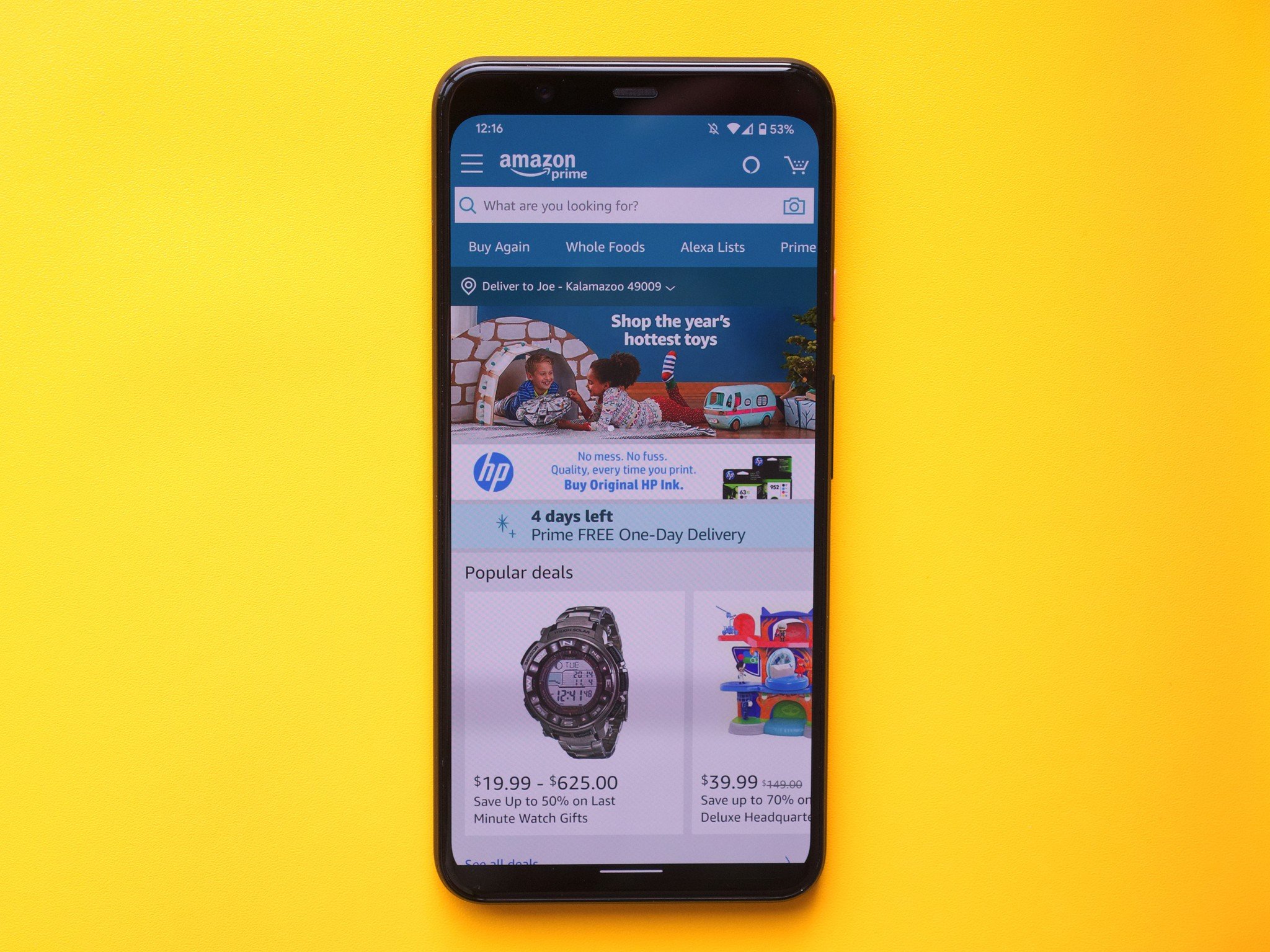
Take the home screen, for example. Below the search bar where you'd expect to find quick links related to your shopping, Amazon's loaded it up with a shortcut to a Whole Foods QR code, a page promoting the benefits you get with Amazon Prime, and links to its Prime Video and and Amazon Music Unlimited services — both of which have their own standalone apps. Oh, and if you tap the shopping cart icon, all of these menu items completely change. Why not, right?
Get the latest news from Android Central, your trusted companion in the world of Android
Then there's the Main Menu on the left-side of the app. The top portion offers easy access to your past orders, lists you've made, a way to shop by department, etc. There's a tab for Your Account on this menu, and as you'd expect, it gives you access to all of your account details. I understand that your Amazon account has a lot going on with it, but there's no way you're going to convince me that having 41 different pages of information isn't too much.
Why is the Profile page almost at the very bottom? Why does there need to be a separate page highlighting my No-Rush Rewards balance — shouldn't these just be added to my Amazon credit balance and that's it? Thank god there's three links for my payment options, gift cards, and credit card points. It'd be silly to group all of these in one streamlined page. Oh, and if you want to adjust the app's notifications, Amazon Assistant, AmazonSmile, or 1-Click settings, these are all grouped under a separate Settings section on the Main Menu.
None of this is easy to digest, and while it doesn't really impact the day-to-day experience of buying things, it's huge pain in the butt for those times when you do need to dig a bit deeper in the app for whatever reason.
Secondly, and even more annoying for myself, the overall design and appearance of the Amazon app is bland, boring, and outdated. I'm a stickler for good UI, and that's the last thing I'd use to describe the Amazon app. There's a lot here that I dislike, so I'll try to condense my thoughts as best as I can.
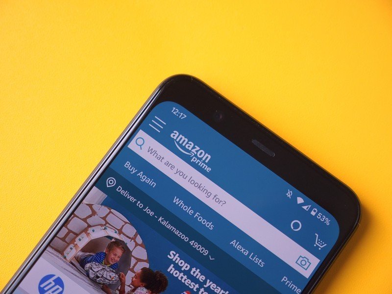
Something I've noticed about the app is that it feels very lifeless and doesn't have a clear direction of what it wants to look or feel like. The flat blue header color isn't visually interesting (and doesn't have any connection with Amazon's orange and navy color pallete), you get two very different (and choppy) animations when opening and closing the Main Menu, and the whole app is overly text-heavy with hardly any use of helpful or interesting icons.
There are smaller things, too, such as the old-looking buttons, Android Gingerbread-era loading indicators, and messy app navigation. The top menu below the search bar scrolls horizontally, the Main Menu is laid out vertically, and the lack of a bottom navigation bar gives it a distinctly different feel compared to most other apps.
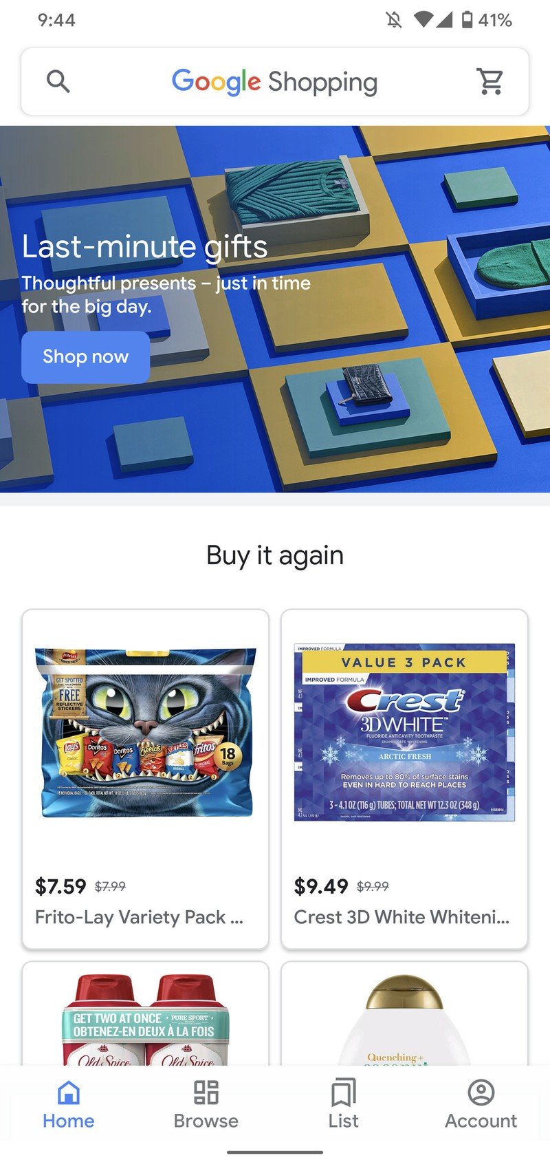
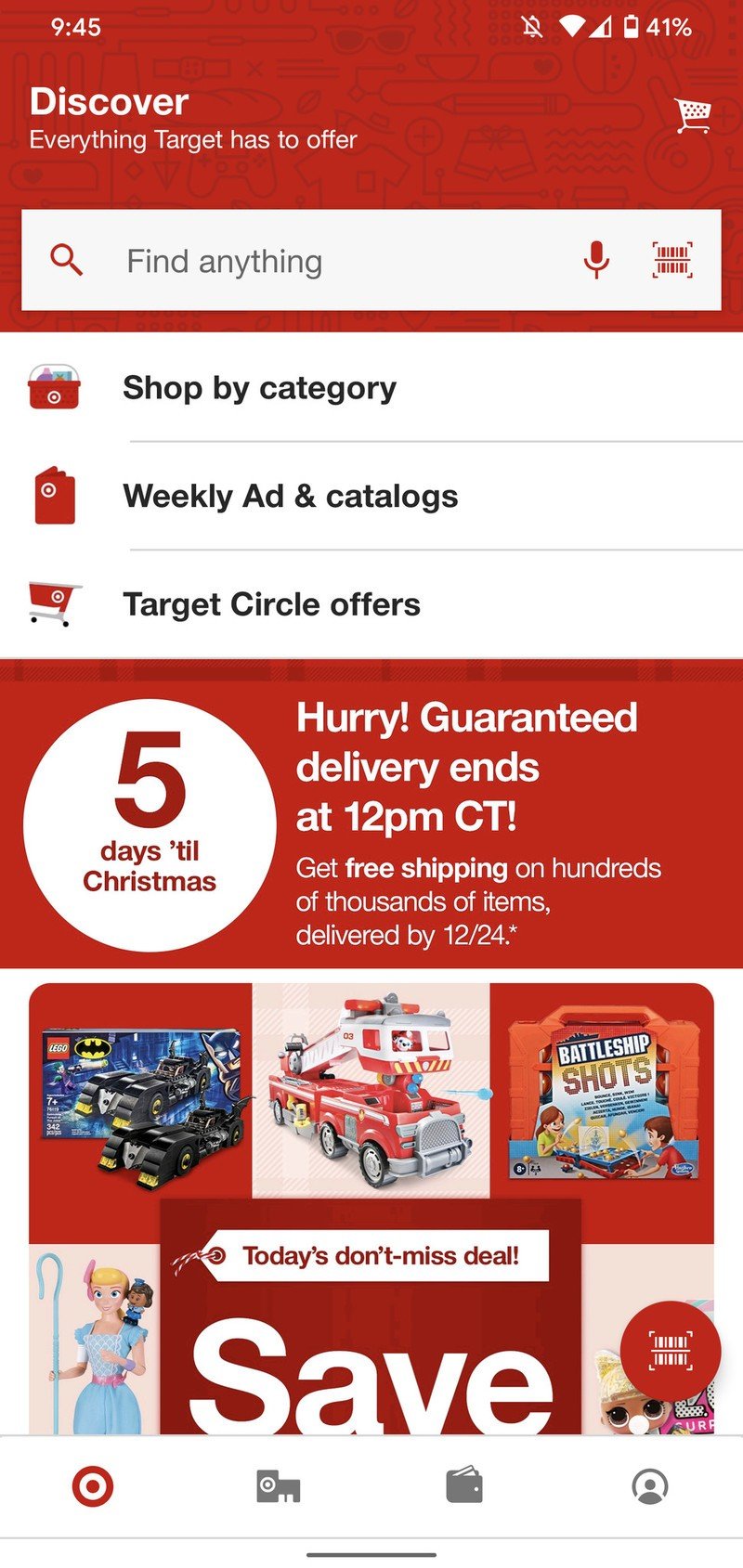
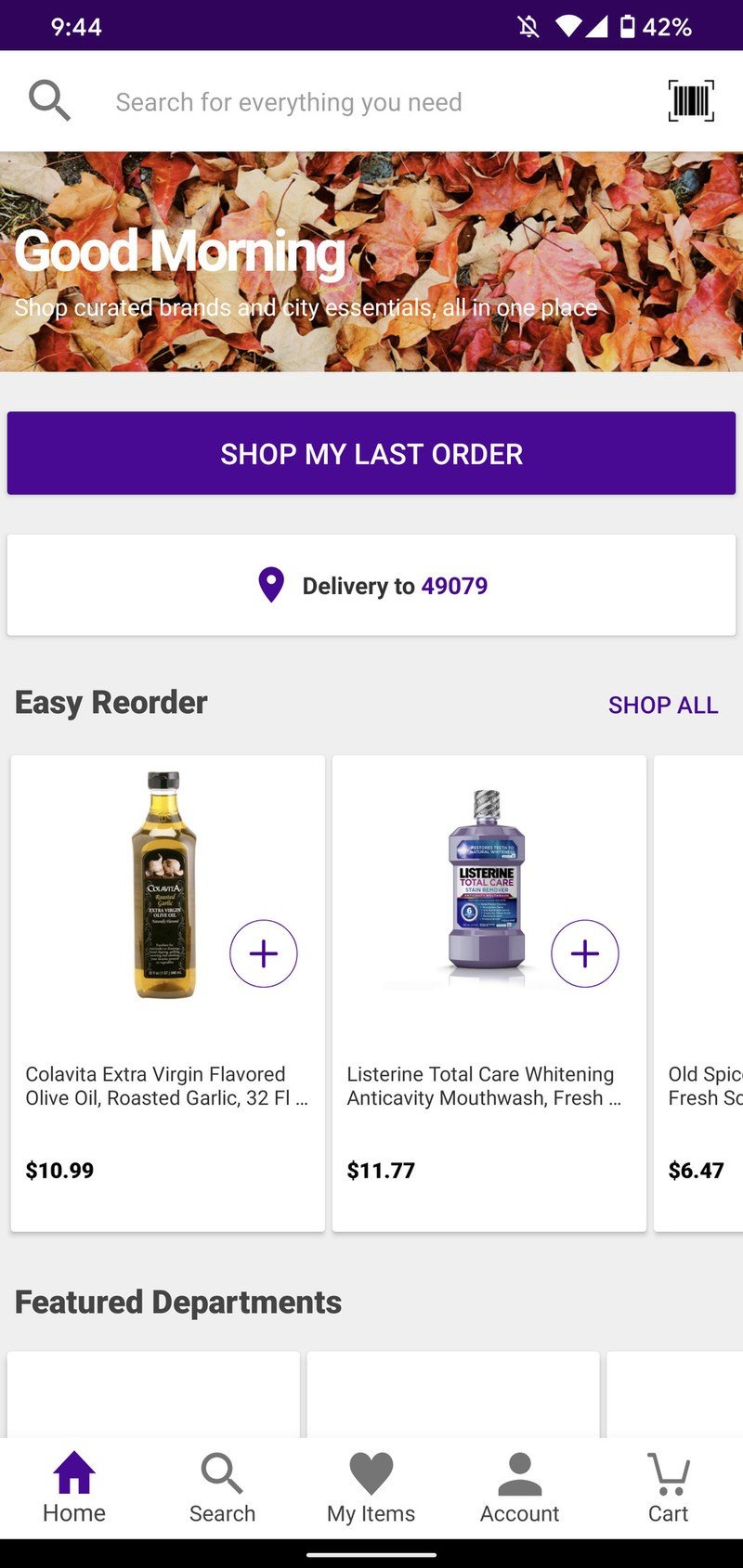
Source: Joe Maring / Android CentralApps for Google Shopping, Target, and Jet
Back in November, Amazon actually tested a slightly-tweaked home screen that I had access to for a couple of days before it reverted back to normal.
The updated look wasn't much, but it swapped out the flat blue header for a gradiant color, rounded the corners of the search bar and camera icon, and added a subtle shadow below the search bar. Those are three really small changes, but it made the app feel considerably better and more modern. I don't know why Amazon changed it back to the old layout or if it'll ever come back, but for those few short moments, it looked like Amazon was eager to take action.
Source: Joe Maring / Android CentralA slightly redesigned version of the Amazon app (left) compared to its current from (right)
Amazon has to be careful about how and what it changes with its app considering how many millions of people use it on a daily basis, but the current implementation can't be doing any favors. Yes, I'm sure most of us have grown used to it, but we shouldn't have to settle for something this bad from a company that has virtually endless amounts of cash.
I still do most of my shopping on Amazon due to the company's ridiculous selection and often unbeatable prices, but when I do buy things through other retailers, I find the experience so much more enjoyable. Google Shopping, Jet, Target, and Walmart all offer vastly better mobile apps, and the longer Amazon's app remains stagnent, the more likely I am to check with those other companies before heading straight to Amazon.
A badly-designed app isn't going to be the sole reason people turn their backs on Amazon, and chances are I'm in the minority of Amazon's customer-base with people that actually notice stuff like this. However, that shouldn't be an excuse for the multi-billion dollar company to not invest time and money into a better user experience for its shoppers.
I continue to spend money at Amazon in spite of my annoyance with its app, because while I prefer the software offered by its competitors, Amazon's fast delivery and unending inventory isn't offered on the same level anywhere else.
As such, I'll go ahead and use my soapbox here to air my grievances until something (hopefully) changes.
Amazon Music is the one streaming service you shouldn't ignore

Joe Maring was a Senior Editor for Android Central between 2017 and 2021. You can reach him on Twitter at @JoeMaring1.
