Twitter's new look includes a redesign for its Android app

Get the latest news from Android Central, your trusted companion in the world of Android
You are now subscribed
Your newsletter sign-up was successful
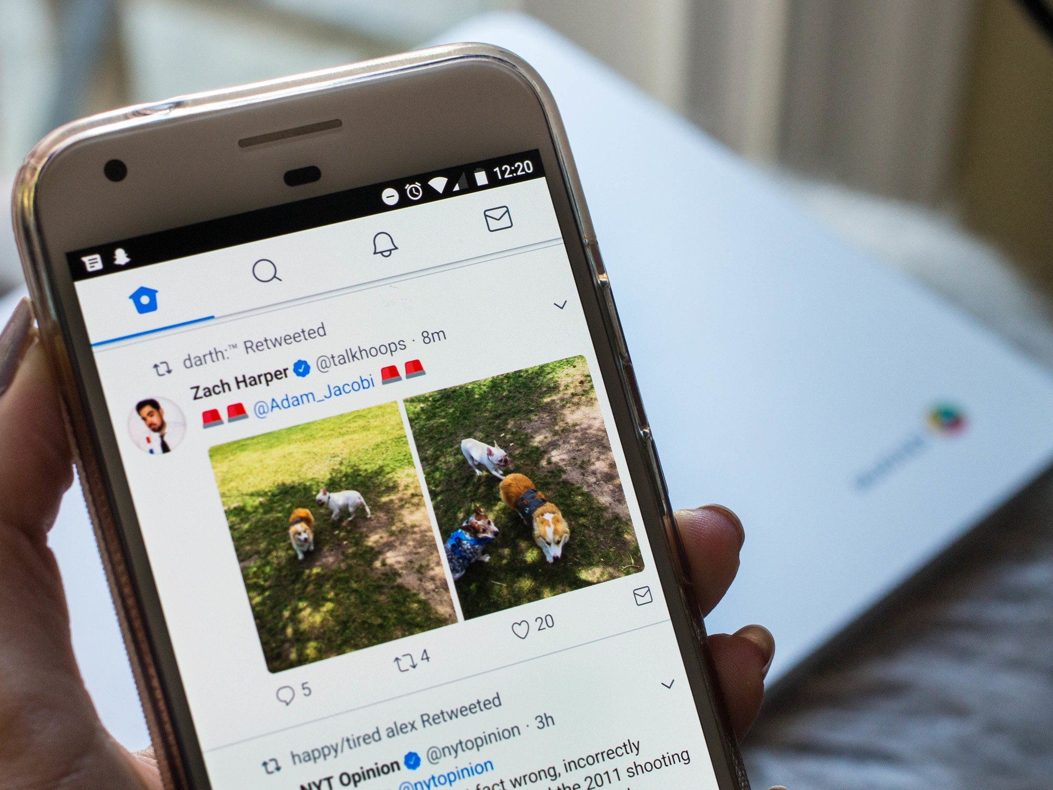
After a vigorous beta testing phase and numerous feedback from fervent tweeters, Twitter has finally rolled out a new look and a bevy of new features. If you're on the social network, you'll see these changes reflected in Twitter for Android, TweetDeck, Twitter Lite, and on twitter.com.
The full rundown of features has been elaborated on in an official blog post. The new additions are as follows:
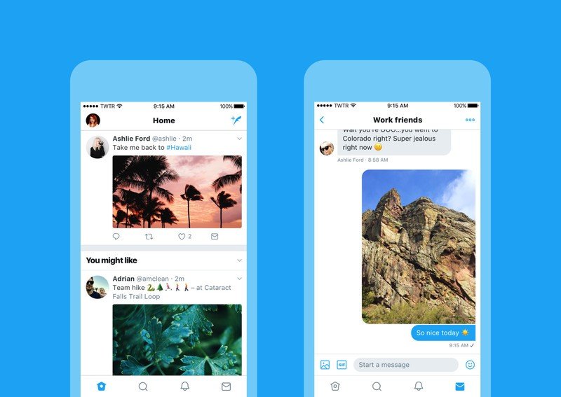
- Profile, additional accounts, settings, and privacy – all in one place! A new side navigation menu and fewer tabs at the bottom of our app = less clutter and easier browsing. You told us you loved this change on Android last year and we're excited to now bring it to iOS.
- Links to articles and websites now open in Safari's viewer in the Twitter app so you can easily access accounts on websites you're already signed into. [iOS only]
- We've refined our typography to make it more consistent, and added bolder headlines to make it easier to focus on what's happening. Also, rounded profile photos make it clearer to see what's being said and who's saying it.
- More intuitive icons make it easier to engage with Tweets – especially if you're coming to Twitter for the first time. For example, people thought the reply icon, an arrow, meant delete or go back to a previous page. We switched to a speech bubble, a symbol most know and love. We also made the icons lighter for more seamless interaction.
- Tweets now update instantly with reply, Retweet, and like counts so you can see conversations as they're happening – live.

If you've logged in to Twitter today through the web, you've likely already seen these changes. The icons are lighter, rounder, and decidedly more millennial-esque in their aesthetic. What's particularly interesting to note is that the icons were remade to be "more intuitive" due to the fact that "people thought the reply icon, an arrow, meant delete or go back to a previous page." You'll see a speech bubble where the arrows were instead.
Article continues belowThe new layout isn't out on Android yet, though beta users have already had some time with it. There's no mention of an update in the Google Play Store either, but Twitter has noted that it's in the process of rolling out.
So, how do people feel about the new Twitter changes? Naturally, they took to Twitter:
Feelings about the Twitter redesign. pic.twitter.com/q9jLREY7gsFeelings about the Twitter redesign. pic.twitter.com/q9jLREY7gs— Norm Kelly (@norm) June 15, 2017June 15, 2017
How are you feeling about the Twitter changes? Do you think they were really necessary considering Twitter's host of other problems? And do you think the redesign makes the Android app look like more like iOS?
Get the latest news from Android Central, your trusted companion in the world of Android

Florence Ion was formerly an editor and columnist at Android Central. She writes about Android-powered devices of all types and explores their usefulness in her everyday life. You can follow her on Twitter or watch her Tuesday nights on All About Android.
