Pebble Time review

The folks at Pebble are back in the smartwatch game with the Pebble Time, and I've had one of the Kickstarter early bird models here for a little over a week. The smartwatch world has moved rapidly since the introduction of the original Pebble, and when looking at products like Android Wear and the Apple Watch, it's easy to see they have some tough competition to face.
Can the Pebble Time stand against the likes of full-touchscreen Android-based watches from the big players who make our Android phones? That was my question going into things. In some ways, it can (and actually does some things better) — and in other ways it can't.
It is all going to come down to what you want your smartwatch to do, how you want it to do those things, and what features you want to see on your wrist. Let's kick things off with a quick review of the Pebble Time.
The design and specifications
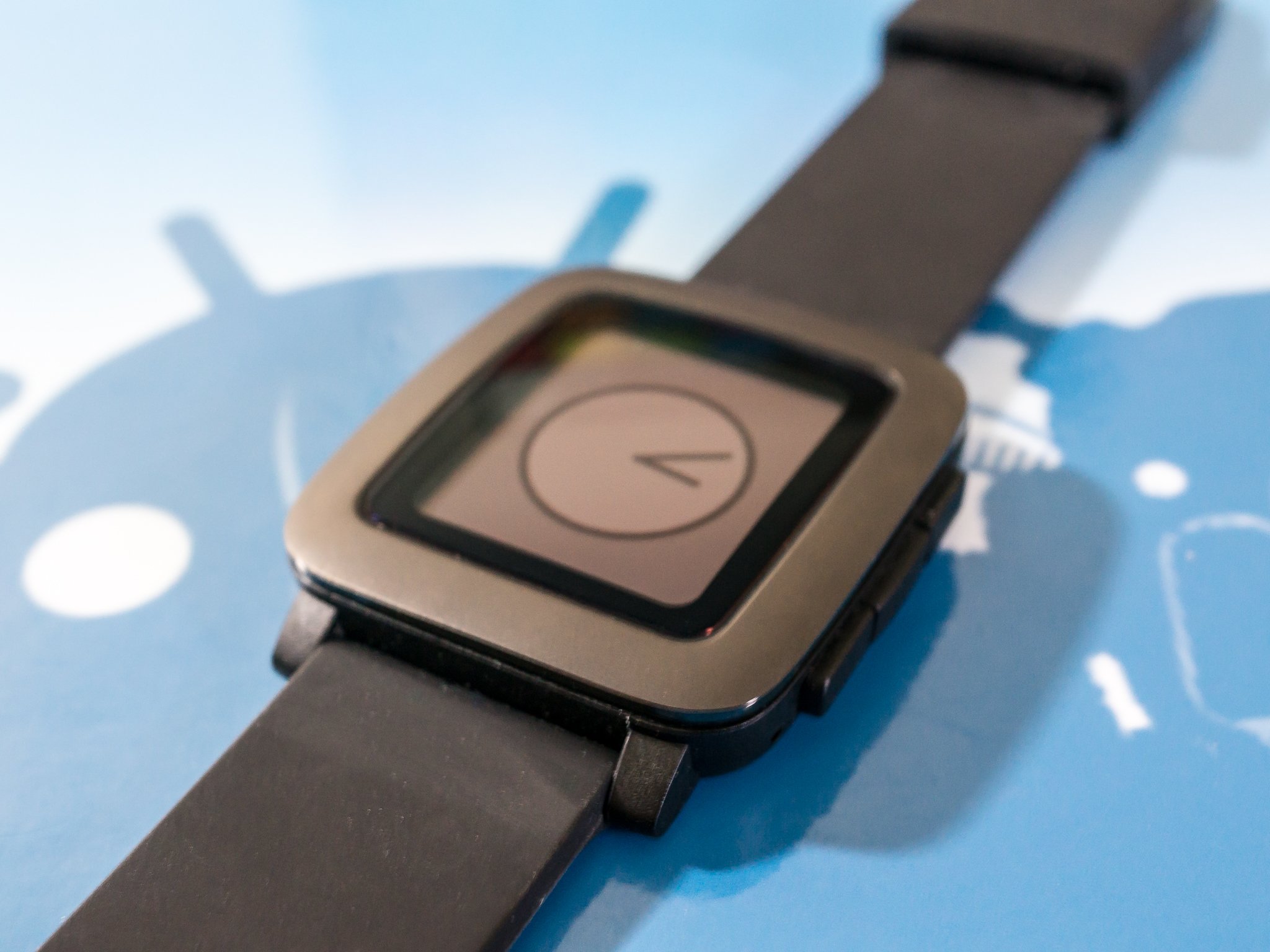
The Pebble Time has an unassuming, low-key design. It looks different from the previous Pebble and the Pebble Steel, and its polycarbonate (read: plastic, but not bad feeling or looking plastic) body and steel bezel don't have the fashion-inspired look of watches like the LG Watch Urbane or ASUS ZenWatch. It looks a lot like the original LG G Watch, as it's a rectangular block that sits atop your wrist. I'm using the black version, but red and white versions will be available as well. All colors have the same grey stainless bezel.
Inside it all is a Lithium-ion polymer battery that Pebble says can last up to seven days between charges
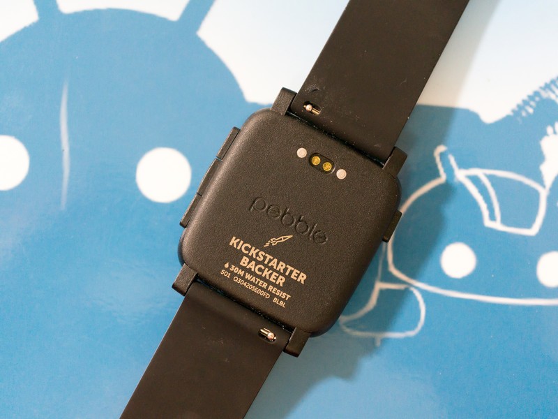
The Pebble Time's body has a slight curve to the rear. This, paired with the silicon strap, makes it very comfortable to wear but because it's a black silicon strap, everything sticks to it and it constantly looks dirty — white may be an option that sits better with any OCD tendencies you (or I) may have. The case has a 40.5mm by 37.5mm footprint, and checks in at 9.5mm thick. Add in the lugs for the strap, and the long side is 47mm. With the 22mm wide silicon band attached, it hits the scale at 42.5g. It's smaller all around than any Android Wear watch, and you can tell it's smaller while wearing it.
While there is no mil-spec certification listed, the Pebble Time is water-resistant. According to the folks at Pebble, you can submerge the watch in 30 meters of water with no issues. The watch has an operating temperature range of 15 to 140 degrees Fahrenheit, and can operate in atmosphere at up to 10,000 feet. Unless you're deep-sea diving or doing something that requires a parachute, chances are you'll be well within operating specs. I wear mine in the shower and while fishing with no issues so far. I have not yet tried jumping out of a plane while wearing it, and probably won't.
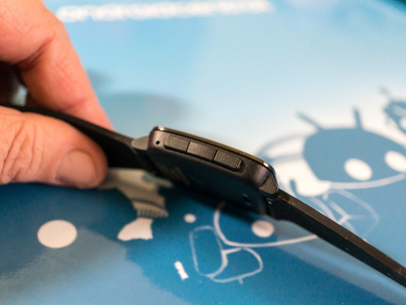
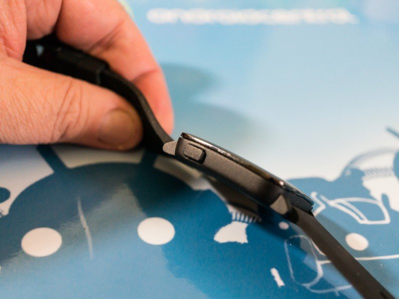
The Gorilla Glass covered screen is a 1.25-inch color e-paper display, with an LED for backlighting. The display doesn't have the pop that Android Wear users with OLED or LCD displays are used to, but the positives are readability in bright light, and much longer battery life. The screen itself has no touch capability. All interactions are done with physical buttons — three on the right side and one on the left. For some things, this works well. For others, a touch display would work better. Using the accelerometer, a quick flick of the wrist (or a push of the left button) turns on the backlight.
The Pebble Time has a handful of useful sensors on-board, including an accelerometer, a compass, a light sensor and a microphone. Applications can make use of these, and many do just that. There is no heart sensor for fitness apps, and the Pebble Time doesn't work with Google Fit.
Inside it all is a Lithium-ion polymer battery that Pebble says can last up to seven days between charges. A magnetic connector on the back is both a charging port and a port for future smart accessories built into watch straps.
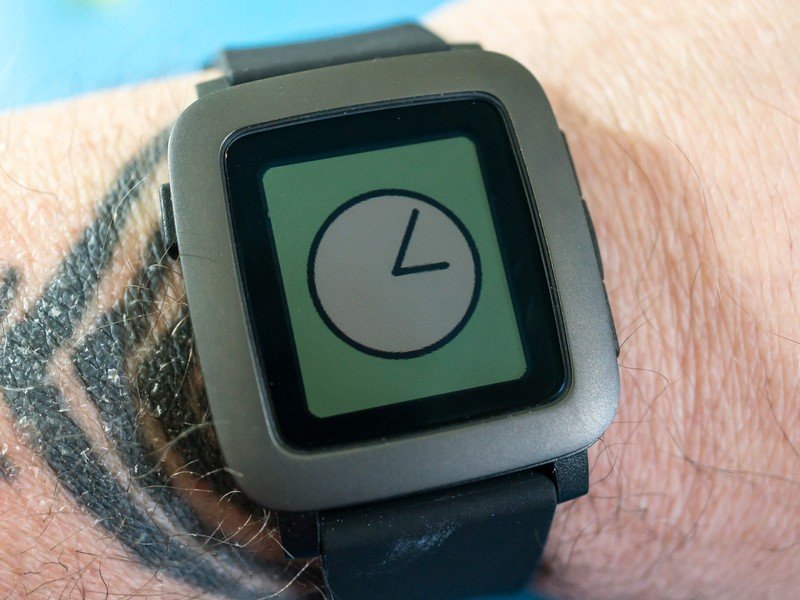
The Pebble Time doesn't look like any other smartwatch out there. Reactions have been mixed, with about half of the people who have seen it thinking it was a toy watch, and the other half comparing it to a Casio digital throwback. It really looks like neither — it doesn't try (and fail) to look like an expensive diver's watch, complete with a non-rotating bezel, or mimic a name-brand luxury watch. It has a "different" look that you may or may not like.
Myself? I like the fact that Pebble didn't try to make their new product look like an existing product. It's not the prettiest watch in my case, but it is unique. Only you can decide if the design is something you enjoy. I'm torn on the looks, and looks are important when it comes to a watch.
The software
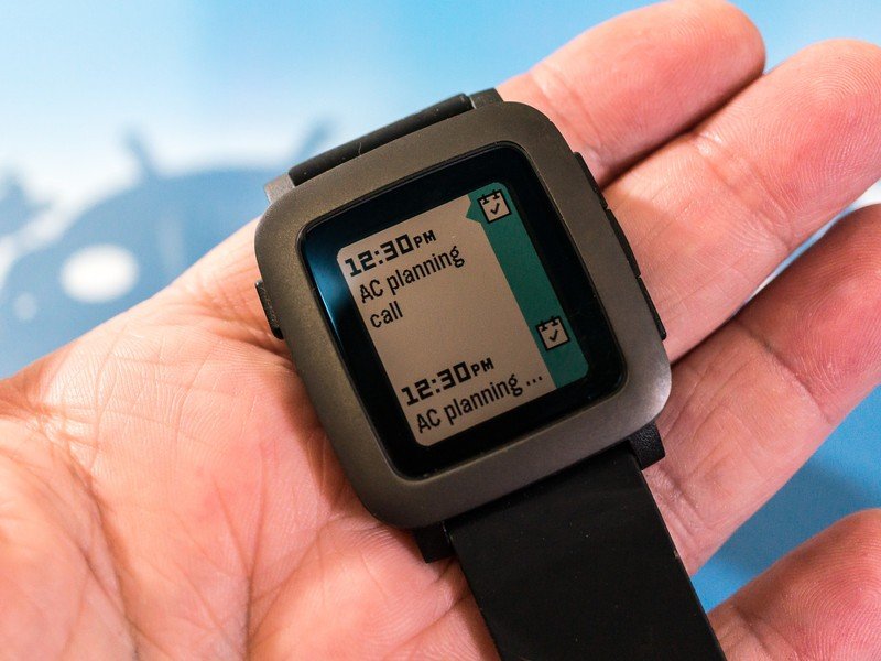
Gone are the scrolling list menus of the last-generation Pebble, and the new color display brings a blocky and colorful look, complete with animations and transition effects. Pebble calls this look the Timeline, and it takes a bit of getting used to. It's a big change from the swipey swipe interface of Android Wear, that's for sure.
Pressing the up and down buttons on the right side brings you a running list of events. Pressing up sends you backwards to see what's already happened, while pressing down sends you forwards to see what comes next. You'll find things like calendar events and upcoming alarms in the Timeline by default, and applications are able to pin information — say for example, the Weather Channel app can tell me a detailed local forecast. A click of the center button brings up more information, or can open an associated app.
If you thought scrolling with a "Digital Crown" was a poor way to navigate through informative screens on your wrist, know that using buttons is even worse
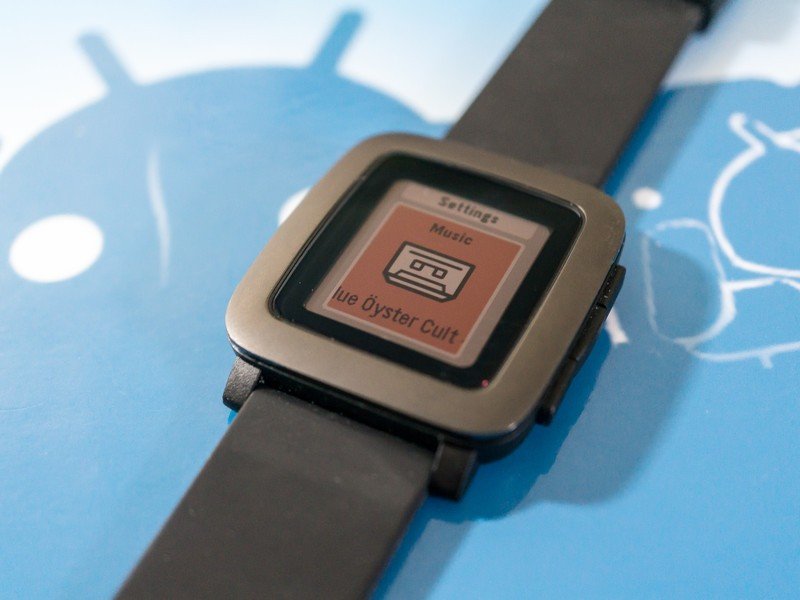
A press of the center button brings up a list of square colorful icons for each app you have installed, as well as built-in apps like settings or alarms. Scroll through the list using the top and bottom buttons, and another press on the center button opens the app of your choosing. You'll also find your list of unread notifications here, and you access them the same way.
It's a great way to display information and is one of the most intuitive interfaces you could ask for on your wrist. But the buttons kill the experience.
I can only imagine this software running on a full-touch enabled watch, where button clicking is replaced by swiping and tapping and long-pressing. If you thought scrolling with a "Digital Crown" was a poor way to navigate through informative screens on your wrist, know that using push buttons is even worse. It's a shame, because I think that the best interface we've seen so far will wither because of the lack of touch.
The most important thing a smartwatch can do (for most of us) is display notifications on your wrist. The Pebble Time does a wonderful job here.
The Pebble Time uses its vibration motor to buzz on your wrist when a notification comes in, and they are easy to read and act on. You'll want to manage what comes to your wrist, because you need to dismiss or act on each one using — you guessed it — a button press. You do this in the Pebble Time app on your phone much like you would using Android Wear. My biggest issue here is that by default, notifications for any app you install on your phone are enabled. I don't want or need some things sent to my wrist, so I have to remember to disable notifications when I install apps.
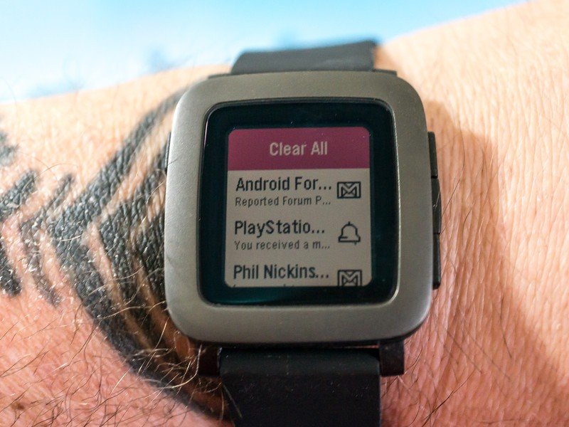
When a notification arrives, you can act on it in a few different ways. You can just dismiss the thing, but for certain notifications (like text messages or emails) you can reply. A tap on the center button while the notification is open will let you send a saved snippet (set these up on the Pebble Time app on your phone), an emoji, or by using your voice to dictate a short message. To do the latter you'll need to install the Android Wear app on your phone, as Pebble is leveraging some of the communication features built into the Android Wear APIs.
I've found voice input to be about as good as it is on my Android Wear devices, which is to say it's good enough. It's a great way to send a quick reply without digging out your phone, and usually the dictation is good enough for the meaning to be understood.
In short, I love the Pebble Time interface and notification system. I think it's far better than what Google delivers with Android Wear, and it presents the information I want in an easy to read and easy to navigate way.
But using buttons to do it almost ruins the entire experience.
Apps and watchfaces
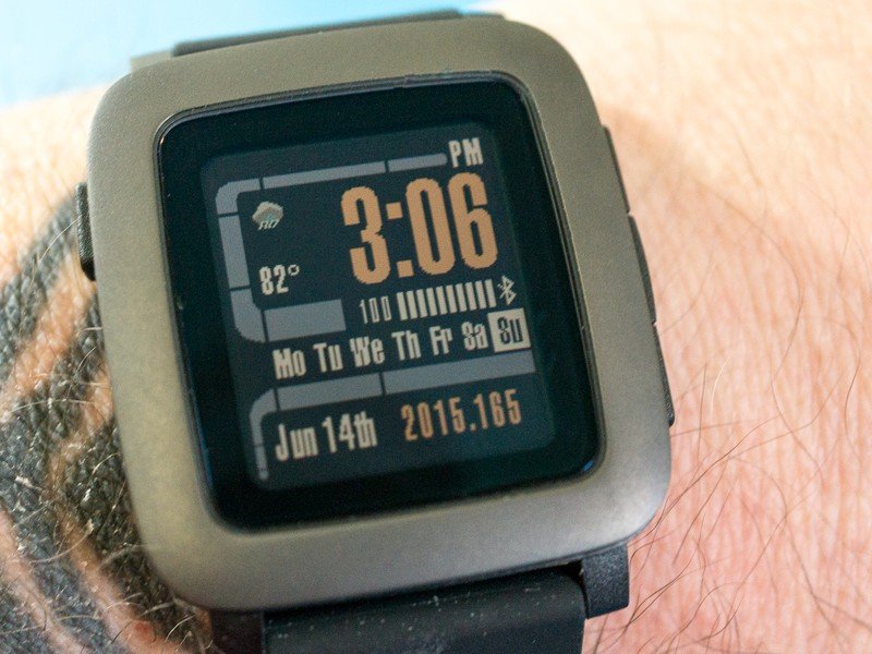
There are a lot of apps and watchfaces for the Pebble Time. Any and all of the previous generation Pebble apps will run, and we're already seeing plenty of new Pebble Time optimized apps hit the Pebble Store.
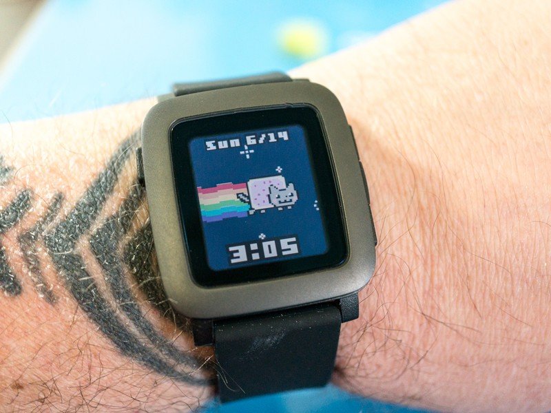
Any time you add a lot of anything, you'll be adding both good and bad. A look through the watch faces will certainly find you something you like, whether it be an analog dial or a futuristic digital look, or even unofficial, unlicensed brands like Street Fighter or Mickey Mouse. I dig the Trekv3 LCARS face because I'm that kind of nerd, but chances are you'll find a watchface that suits you just as well — there are a lot of them.
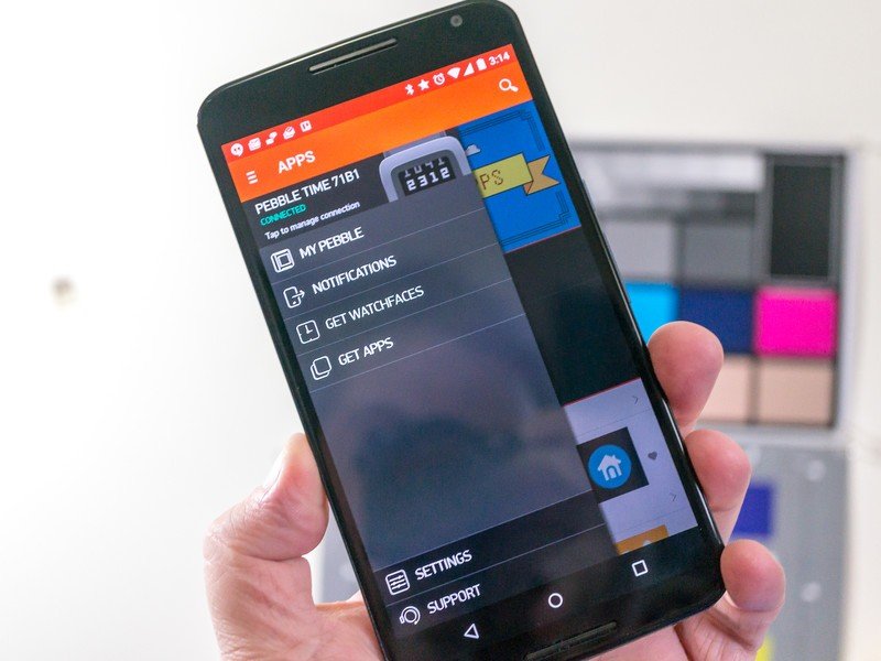
A bit of browsing through the applications will also have you installing a few. Useful additions like countdown timers, detailed weather apps and battery meters are things you should have a look at, as well as fitness apps that leverage the accelerometer for step counting or sleep tracking. Ingress users will love the Ingress Info app that loads your Agent Profile. Apps like Note Pusher will help you stay organized and productive. There is something for everyone in the growing Pebble Store.
You find and install apps and watchfaces from your phone through the Pebble Time app. The app is easy to navigate and well designed, and makes wading through the crapplications easy so you can find the gems. The Pebble Time app requires Android 4.0 (Ice Cream Sandwich) or higher, which is almost every Android phone left in the wild.
Should I buy this thing?
There are plenty of pros and cons to the Pebble Time. The elephant in the room is the battery life. I am getting five full days of battery life on a single charge, and that's with me fiddling, poking, button pressing and checking things out far more than I will be doing after I'm done reviewing things. If your main consideration and must-have feature in a smartwatch is long battery life, you've found what you're looking for.
The color e-paper screen is a neat bit of tech, but it has some drawbacks. It's easy to see outside in the sun, but when the lights are low it's a bit difficult. Even the backlight doesn't fix everything, as it washes out everything that's not black. It's not exactly what anyone expected and there are times when I had to look twice to tell what I was seeing. Using e-paper does mean great battery life though. See above.
If your main consideration and must-have feature in a smartwatch is long battery life, you've found what you're looking for
The user interface is amazing. The engineers and code monkeys at Pebble have provided an outstanding method to see the things you think are important, and display it all in a way that makes sense. The new Timeline takes advantage of the entire screen, and tucks away when you just want your watch to tell time. But the buttons feel archaic and antiquated, and make actually using the Pebble Time a bit clunky. I would love to see an option that has a touch display, even if it adds to the cost.
Finally, the design isn't going to appeal to everyone. It's not sleek, and no matter how well constructed the Time is, it looks a bit toyish. I appreciate the efforts, but I also want my watch to look good and compliment my wrist.
I weighed out the pros and cons of the Pebble Time to see if it's the smartwatch I want to use. I love the new Timeline interface. But — as you can tell — I'm not feeling the push-button input. On the other hand, I love the battery life. The screen takes some getting used to, but in the end it's great most of the time. The thing is built like a tank, but looks a bit odd — especially against some of the newer, more fashionable offerings from others. It works for me, and I'll keep using it for a while. I'm looking forwards to the Steel version come July.
The bigger question is, "Would I recommend the Pebble Time to you?" If you're interested in a smartwatch mostly for notifications and reminders, then the Pebble Time fits. The lack of a touchscreen means we aren't likely to see Android Wear features (at least not done the same way) ported over, and I'm a bit worried about how future-proof the Pebble Time will be if and when we see more home automation/Internet of Things "stuff" built into our smartwatches. But many of us don't want or need the entire world on our wrist — and the complications that come with. Earlier I remarked about Pebble's low-key approach with the Pebble Time, and I think that could be a plus for many. And as a bonus, you can go for days and days without charging it.
We're going to talk about upgrading from the last-generation of Pebble and switching from Android Wear in separate posts, so look for those very soon.
Get the Android Central Newsletter
Instant access to breaking news, the hottest reviews, great deals and helpful tips.
Jerry is an amateur woodworker and struggling shade tree mechanic. There's nothing he can't take apart, but many things he can't reassemble. You'll find him writing and speaking his loud opinion on Android Central and occasionally on Twitter.
-
Can't wait for my Steel to come in, though at this point I wish I'd gotten the red version of the regular Time. Oh well. Posted via the Android Central App
-
Jerry you have given me exactly what I needed to know. Best Buy here I come. Still using the Sprint GSIII on FreedomPop Unlimited for $19.99
-
Looks like something from 2005. Posted via the Android Central App
-
Well, doesn't matter how awesome the Pebble is or how many downvotes you give, this guy said the truth.
-
More like 1985...
-
Now, I remember 1985, and this would have been advanced. In 1985, this would have been a grayscale LCD with a processor that wouldn't even be considered viable by today's standards, even in calculators. That said, the graphical interface reminds me a lot of a cartoonish version of the Palm IIIc...
-
I'll stick to the Moto360 for now,thanks :P If it only had that battery life :(
-
Battery life and a stronger vibration for notifications. I never missed one on my original Pebble, but regularly do on my Moto 360. Of course, I can READ my Moto 360 whereas I always struggled to read the Pebble screen in anything but bright light, even with the backlight.
-
I had the same issue after getting my Moto 360 switching from a Pebble Steel. I installed SWApp Launcher which has an option to make notifications vibrate stronger. It helps for me, give a try and see if it works for you.
-
Hey Jerry! Great review!
Small typo: I'd change "compliment my wrist" to "complement my wrist", so that readers don't have an image in our heads of your watch telling your wrist "Damn, you're a good-lookin' wrist, boy!"
I agree it looks a bit toyish...in a neat way...but still a little toyish. Hmm. -
Haha! I just had that image too. What's that? You need a massage, wrist? *Bzz Bzz Bzz* There you go..... Posted via the Android Central App
-
Great review, Jerry. I think that it actually looks much better on a wrist than it does off of it. I don't know how they designed it that way, but it does look like a toy when it's not on my wrist, but it makes sense in the full composition. I love the battery, and voice response is a really handy thing to add to the original Pebble. Between that and the lighter weight and new design, I'm super happy with the watch!
-
I really like the Pebble, but the price is way to high for what you get. I got a LG G watch for $50 new. If they sold these for no more than 100-150 then maybe. But for 200+ it is not worth it.
-
I got one as an early Father's Day gift. So far, I like it. I mean, I'm still getting used to simply wearing a watch, let alone the functionality of it. I definitely tried to touch it a few times before I remembered, Oh yeah...buttons. But like any new tech, it's just something to get used to.
-
You haven't mentioned the price compared to other smart watches... It's far cheaper, which is surely a big factor too?
-
Not really far cheaper. It's $200 which imo is high since you can get almost every android wear watch for that much. It is far less than the urbane or the apple watch, but I think they should have priced it at $150 to really make it a good deal.
-
I just picked up a Sony Smartwatch 3 off of Expansys for $150 new. GPS, WIFI...which Pebble does not have. Posted via the Android Central App
-
I got my G Watch for $50 on sale. I've seen many Android Wear watches on sale for far less than $200.
-
I love my Pebble Time, but yeah, I don't love it as mush as I wish I would have.
To be honest, smartwatches still sucks. When I look at morons using apps on their Apple Watch in promo videos and fan reviews I just facepalm myself.
I bought a Pebble to have a watch that can interact with my phone and help me become more productive and the Timeline concept is the best around. Can Pebble really succeed at making it work? To early to tell, but at least they are working on it instead of putting Instagram on my wrist... -
I work in an office and I don't think I would wear that in the office. Some of the screen images reminds me of a SNES. If only we could get great graphics and stellar battery life.. Ahhh - the dream...
-
The regular version looks far too "toyish" to me. The steel variant looks a lot better, at least on their site. I might be interested once that is released. Posted via the Android Central App
-
Really enjoying my pebble time had it for 10 days now and love the battery life along with screen quality. The mic works well with the SMS reply also. Posted via the Android Central App
-
I like the watch as something you wear while being active. Like if I was exercising or wearing athletic type clothing on the weekend. I don't think it is very stylish for wearing to work or whatever though. It is the only smartwatch I would consider right now due to cost and what I think is worth having in a watch.
-
Agreed, not practical for an office setting. Pebble took a step back with the Time Steel imo.
-
The pebble time should work with the Plexfit app which does sync with Google Fit. It's paid, but I feel worth for the flat $3 license.
-
Agreed! It did take me a little time to fiddle around with the sensitivity so it matched closer to the numbers Google Fit gives me, but I'm very pleased with out it turned out.
Battery life is reduced ~4 days for me, but not unexpected since I have it set to be always on. I have seen some recent issues with tracking my steps, but they are Google Fit related and the dev and google are aware of the problem.
Namely, Google Fit has the "track" and "upload" on the same rocker instead of separate, so when you turn off Google Fit step tracking, it also turns off the upload to their server, though the info still remains on the phone. Should be fixed "soon"(tim). -
I completely disagree with this review when it comes to the matter of buttons. I find the "swipey" interface to Android Wear to be infuriating. It takes way to long to go where you need to go. It covers your screen with fingerprints. UI elements have to be huge because the touchscreen area is small. It doesn't work while it's wet. Can't use it with gloves. And you have to look at the watch to interact with it. Pebble has the opposite of all that, and none of those problems. A great compromise, would be if Pebble had touch BEZELS, like original Sony Live View, to compliment it's buttons. You could use them soley for scrolling or directional movement. This would be the best of both worlds, and far better than a digital crown or full touchscreen.
-
I was just thinking this the other day. Something like a narrow trackpad along one entire side. Seems ideal to me. Posted via the Android Central App
-
Totally agree... I was surprised buttons were trashed so much in this article. Posted via the Android Central App
-
I really respect Pebble and almost feel obligated to grab one of their smartwatches some day soon. I just wish it wasn't so much black border around the screens.
-
Does everything I don't need my phone for and is very low maintence
everywhere. Take it off once a week to charge. Original Pebble is my "beater". What's not to like? Posted via Android Central App -
I find that the buttons work just fine on my original Pebble Steel. You don't often need to scroll huge amounts - you're looking at something and picking an action, not scrolling through long lists of information.
-
I'm fine with them adding a touchscreen, but I hope they would keep the physical buttons too. I have both a Pebble and a Moto 360 and I LOVE bring able to skip songs, pause podcasts, stop runs, etc. without even having to look at the Pebble. The buttons are easy to feel and press without looking. On the other hand, trying to change songs and pause my run tracking on my Moto 360's 1 inch touchscreen while running / bouncing around with sweaty hands was an absolute nightmare. I couldn't use the Moto 360 for runs because a touchscreen just sucks compared to physical buttons in that case.
-
Hello Jerry Hildenbrand,
I enjoyed your review of the Pebble Time smart watch. I have a few things to knit pick. You said, "The folks at pebble are back in the smart watch game with the Pebble Time" Since it's beginnings, Pebble has not been out of the game. There watch sales are higher than Samsung and other big players. I agree about the toy like appearance but I believe the steel version will not look toy-like, just like the original steel did not look as toy like as it's plastic counterpart. Regarding the strap, you failed to mention that with the 22mm size you can put any strap on the watch including your Granddad's Spidel twistoflex. You clearly do not like the buttons, but I must say I find them really easy. I prefer them to a touch screen. I don't want prints and whatever all over my watch face. If I want to do that, I still have my phone. On a small touch watch screen, you have no way to operate the watch with out looking at it. YOu can't drive and use it without taking your eyes off the road. While using a music program, I would have to look at the screen and have my eyes off the road while changing music tracks or radio stations. I do not have to do that with a pebble. I do it with feel, and can operate it without taking my hands off the steering wheel. The up button goes to the previous track. The middle button pauses and the starts play; the lower button takes you to the next track. By holding the middle button for about a second the upper and lower buttons turn into volume controls. Same thing with using the watchc to control a camera while standing in a group of people. Take pictures without having to be near the camera. Shoot video and zoom, all would be cumberson using a touch screen. Regarding notifications, you stated "My biggest issue here is that by default notifications for any app on your phone are enabled." This is not true. When you set up the watch notifications, you are given a list of apps and you check off only those you want to receive notifications on the watch. Don't want Facebook notifications? Just don't check Facebook in the list. . It's really easy, takes less than a minute and the pebble software retains your choices. None of that all the apps are enabled stuff. YOu can also set up when you do not want notifications for instance while sleeping. The missing heart rate sensor will be addressed when the higher tech watch bands come out. I have owned my Gen 1 Pebble Steel for about a year and I have seen how fast the improvements have come, so I'm not too worried about the heart rate sensor. It is true that everyone's idea of what a smart watch should be is up to the individual. Pebble's core idea is the watch is an extention of your smart phone, which I really like. -
Folks saying you have to look at an Android Wear watch to operate it have likely not yet mastered "OK Google." If you are driving and want to change the track, depending on your watch (Moto 360 here), just turn your wrist and say, "OK Google Next Song" or "OK Google, play Milkshake by Kelis" I owned a Pebble Steel for a week, and I found the buttons to be a little ridiculous and cumbersome, so I returned it and waited for the 360 to go on sale (it did!). But to each their own, that's why they sell so many different types of smartwatches. Android Wear watches are so, soooo not ready for prime time, but for the most part, my 360 does what I want it to do.
-
I have both the 360 and the Pebble Time. . I like both of them for what they are. Surprisingly enough I actually like the buttons on the Pebble. I love the battery life and it's a simple watch that does what it should do. . No more. No less. Posted via Android Central App
-
Jerry...Dont fear the Reaper Man! Posted via Android Central App
-
Thansk Jerry for another excellent review. I have the original Pebble, a Kickstater Time, and several Android Wear watches (definitely a gadget addict). My favorite Android Wear watch is the ASUS ZenWatch. My biggest disappointment with the Time is the screen. In direct sunlight, the Pebble is very good; however the low light, and evening readability have been a disappointment for my aging eyes. I have also found the colors too dull along with a too small non-adjustable font size. I realize multi-day battery life is important for many, but all I need is a full day since I charge the Time every night anyway. I will gladly trade the multi-day battery life for a much brighter backlight, and the ability to adjust how long the backlight illuminates per press. I have no problems with the buttons, but a touchscreen would be nice as well. It would be great to scroll the timeline via touchscreen control. It would be ideal if a smart watch was released that had the direct sunlight readability of the Pebble, and the low light / evening readability of Android Wear.
-
Can't get past the bezels. There's bezels than there's this. Double bezel is too much. If the whole black area was the display it would have been better. Posted via the Android Central App
-
Wow , one ugly motherfu^%$er. Looks more like toy than anything else.
-
I use my original Pebble as an exercise watch in partnership with my phone. Waterproof, ultra light, east to read display outdoors, and long battery life. Of course it works with the likes of Endomondo and Runtastic and can also control my beats. Fantastic watch for how I use it. No incentive to upgrade yet, but that may change later. I am pleased to see that Pebble is still very relevant in this age of Apple and AW watches.
-
Battery life is one of the biggest pluses for me. I charge my original about every 5 to 6 days and that's usually when it tells me 20 % left. Could easily get another day out of it maybe 2. The time steel is said to last 10 days. And the buttons let you do stuff on the watch without looking at our.
-
I actually see that as a negative. I like having a routine and having to charge my watch at intervals of 5 to 7 or more days just doesn't fit with my need to do something at specific intervals. I think it's because as I age I need a more regular routine and charging every night does it for me. Posted via the Android Central App
-
So you just charge it every night. I did with my Pebble. The point was it would survive when I'd screw up and forget, or sleep somewhere else, or go camping, or go on a weekend trip. My Moto 360 will barely make it to bedtime, and my G Watch might make it an extra day if I shut it down for the night (although I'd need the charging base to turn it back on, countering that idea). I still prefer those devices, but I'd kill for the Pebble's battery life just as a safety net for when my charging routine lets me down.
-
The G Watch has a small button near the charging pins, if you hold it for a few seconds it powers the watch on.
-
I usually don't have anything quite small enough for it. But I honestly pretty rarely think about it anyway. It was just an example of the hoops needed to jump through for something with one-day battery life.
-
"It looks a lot like the original LG G Watch..." I have an LG G Watch sitting on my wrist. Looks nothing like that beyond having a square screen. Meanwhile later: "The Pebble Time doesn't look like any other smartwatch out there." Oh, so you agree...?
-
Great review Jerry. I wear my original Pebble Steel every day. I had a Moto 360 and gave it to my stepson after a few months. I'm not sold on the Time yet, but since battery life and notifications are my prime considerations, I suspect one is in my future eventually. Love the Lcars watch face, it looks great in color. Posted via the Android Central App
-
Peanut butter Pebble time.....Peanut butter Pebble time.....
-
Nice review Jerry! I've been looking forward to it. I have an original pebble and was very tempted to get the Pebble time on kickstarter but wasn't sure how I felt about the physical design. I personally love the fact that the Pebble Time is still not touch screen, I actually enjoy the buttons. Posted via Android Central App
-
I have yet to be corrupted with a watch with a touch screen, so the buttons don't really bother me.
That being said, it would definitely enhance the experience if it was swippy. Of course, I'll enjoy my many day battery life over that for the time being. -
I had a smartwatch with a touch screen and went back to Pebble. No comparison hands down. I am the one that knocks...
-
You (or small children you may interact with) are much less likely to accidentally change settings, etc. with the buttons vs with a touchscreen.
-
Holy crap. I reckon the face of that thing is at least 60% not-display. What were they thinking?
-
That's a good point, if you are gonna put that size device on your wrist, why not maximise the screen real estate, seems wasteful to only use a small part of it.
-
I have no issues with the buttons on the time. I think they have done very well with the interface and navigation. Responding to text messages via voice works very well, but it does require my phone to be connected. The Pebble is doing exactly what it was designed to do, be a watch first with extra's added. I'm also getting around 5 days on the battery, but I've also been playing with it. I have the steel version coming soon and this one will go to my wife.
-
I kinda wish Pebble would also give us the option of hooking this up via Android Wear, not the Pebble App. I would like to switch between the two but I hate the nagging "You're not connected to a Pebble device" notification when I don't use it.
-
Just go into device settings then apps and find the Pebble app and disable the notifications check box.
-
There are two things in particular I had hoped would have been updated in the pebble time and steel over the original one:
1. Add two more buttons on the left side bringing the total to 6. This would have given much more flexibility in the user interface
2. A customisable vibration motor or at least a more refined one. Whilst the buzzer in my current pebble is the best alarm I have ever used as in theory in can go off without waking my partner as well, she very often still hears and feels the rather angry buzz of the watch -
Jerry,
I believe that the white version has a more silver bezel, not as dark, so you might need to correct that. And I love buttons. Using a tiny touchscreen with sweaty fingers is a terrible experience. Good review. I think you should discuss price because 200 seems a little high compared to Android Wear options. I'm enjoying mine, but only for the early bird Kickstarter price. -
Hi Jerry thanks for the review! Can you confirm if there is an issue with the watch reconnecting after a distance related disconnect. I have a pebble steel and lately with a Samsung S 6 E - if I go beyond the Bluetooth range and return to the phone, the watch does not reconnect automatically to the phone. I contacted Pebble Support and they described issues with lollipop on Samsung devices and Bluetooth. Thanks, Alex Posted via the Android Central App
-
I have an original Pebble and a Pebble time. The pebble time seems to be much better at not randomly disconnecting. I have not had problems reconnecting after a distance disconnect. I even designed a watchface with a short long sorry vibration on a disconnect so you don't loose your phone (I got my Pebble after losing my phone). There are multiple apps that can turn on your ringer to find your phone or turn on the vibrate to find your pebble once they pair back up. Posted via the Android Central App
-
Some of the menus use smaller fonts and they are still easily readable. Posted via the Android Central App
-
I've had the black PT for about two weeks now and love it - it's everything you need in a smartwatch and nothing that you don't. As for the looks, it's MUCH better in person. Not sure why, but pictures make it look like a toy. Wait until you see one in person before deciding about the looks. I'm surprised how spot-on the software on both the watch and phone are out of the gate - so far no bugs at all. Overall, you won't get a better companion for under $200 - once the novelty of a smartwatch wears off you will really only use it for notifications, different watch faces, and a few key apps for fitness/etc. The PT kills it in this regard.
-
I got my wife a Pebble Time; I have a Moto 360. I rather like the Pebble, and my wife does too!
-
Same here (Moto 360 for myself, white PT for my wife). We upgraded from original Pebbles, and I still use my Pebble Steel. The thing is, every Android Wear watch looks ridiculously large on my wife's thin wrists, so the Pebble is about the only smartwatch she can wear. My wife was pretty disappointed at the washed out colors and dim display on the PT, but otherwise likes it. The silicon band is really soft and comfortable.