Android color management: Everything you need to know
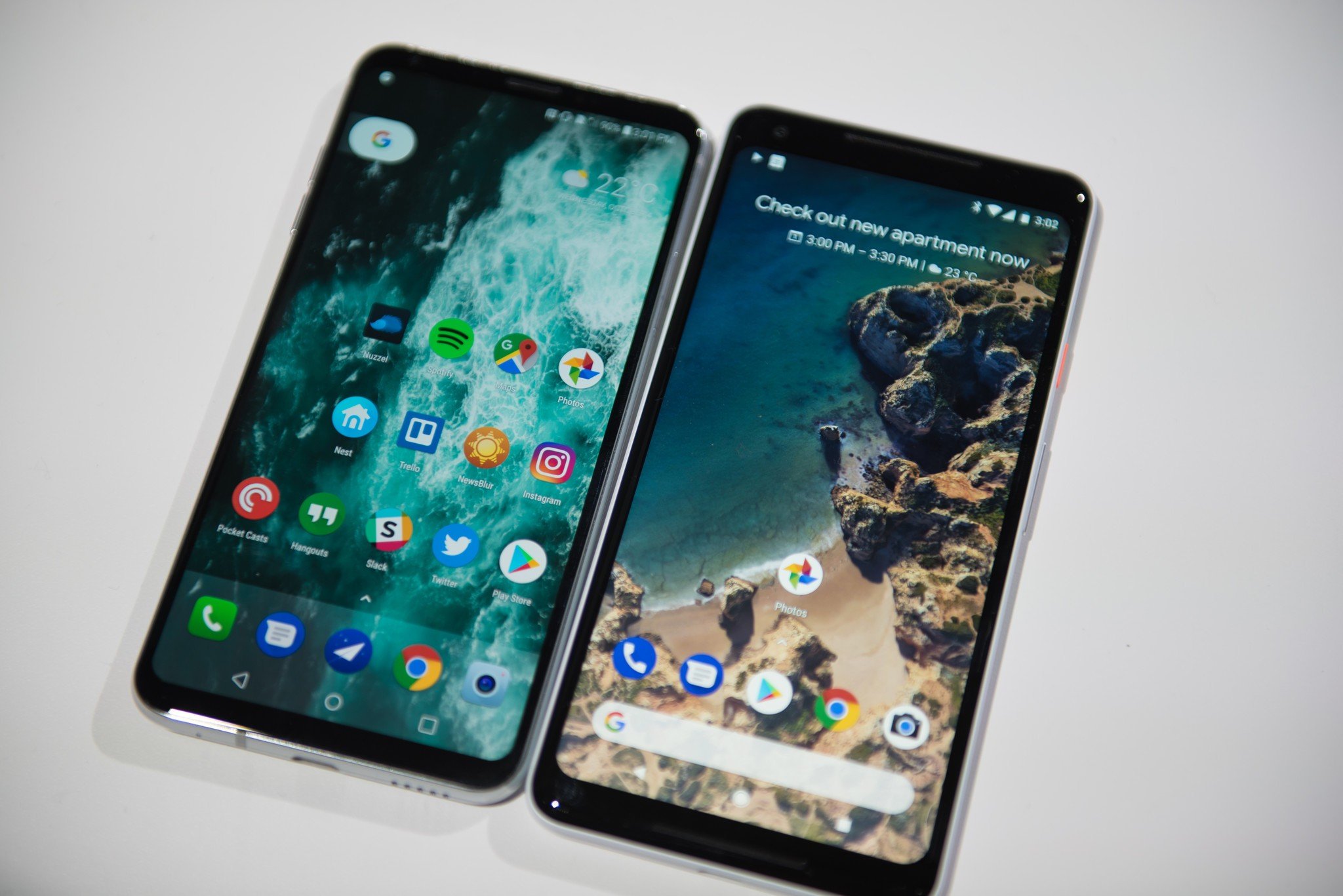
There has been a lot of talk about color management here and elsewhere on the internet lately. Android Oreo provides new support for color management, the Pixel 2 XL has a reputation for doing it poorly, and these two things combined make us want to talk about it. But, what exactly does color management mean?
Let's talk about that and a bit about how and why it's used, and maybe even some more cool stuff.
What is color management?
Don't laugh, but you have to understand just what color is based on the way our eyes see it before you talk about how our gadgets try to do it right.
Article continues belowColor is easiest described as the result of Hue, Saturation, and Brilliance.
Light emits energy over specific bands or wavelengths, but our eyes can't see most of them. This is known as spectrum. Terms like IR (infrared, or longer wavelengths than the red end of the spectrum we can see) and UV (ultraviolet, shorter than the blue wavelengths we can see) are real and there is plenty of science about measuring their intensity but they don't have anything to do with color because color is a human thing.
In those wavelengths of light that are visible, Hue is the point where a band has the most energy, Saturation defines the bandwidth (where the emission of light begins on the spectrum and where it ends), and Brilliance is the intensity of a human-visible light wave. Hue defines what color our eyes will see, Saturation defines the purity of it, and Brilliance defines its brightness. Charts help, so here's one.
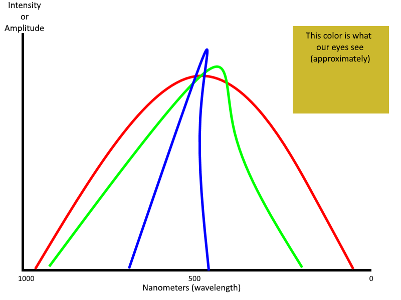
In this chart, red, green and blue all have approximately the same hue — they peak around 450 - 550 nanometers. Red has the most bandwidth (it covers more spectrum) so is less saturated than blue which has the least amount of bandwidth. All three colors have a very high brilliance where they peak, so they are equally intense. Our eyes interpret this as a muddy ugly yellow color. All colors created in red, blue, and green will have their own spectrum profile just like ugly-yellow does.
Get the latest news from Android Central, your trusted companion in the world of Android
The color on your TV and the color on your phone and the color from your camera all need to match.
RGB stands for red, green, and blue. It's an additive model to create color, where light in each spectrum is emitted to create the color. If you have a color inkjet printer (remember those?) it creates a color using cyan, magenta, yellow and black (CMYK) as a subtractive model, where colors are applied so that the light reflected from a surface is a specific color. RGBA (the A is for Alpha and determines the level of transparency) is the model used on a display to produce a color, no matter what type of display is being used.
The color produced by a printer using the CMYK model and color produced on your phone's screen using the RGBA model have to appear the same to our eyes — red needs to look red.
This is color management in its most basic form.
Actual color management
There are a lot of different ways to "create" color. We looked at the HSB, RGB, and CMYK models above, but there are a lot of other ways to try and represent what the output of a light source looks like to our eyes. They were all designed so that pink looks pink, green looks green, orange looks orange, and so forth. We can get a good basic idea of what color is trying to be represented by any color model in any medium. But a basic idea just isn't enough.
Doing something is not the same as doing it well, and that goes for color management, too.
The spectrum of colors is nearly infinite, and when you are using something capable of displaying more than a handful of them you need a way to make sure a particular shade of green looks the same to a person's eyes no matter where it's being displayed or what model is being used to create it. When you're dealing with the millions of different colors a modern electronic display can show, a good method to reproduce the correct color becomes very important.
You need a good screen
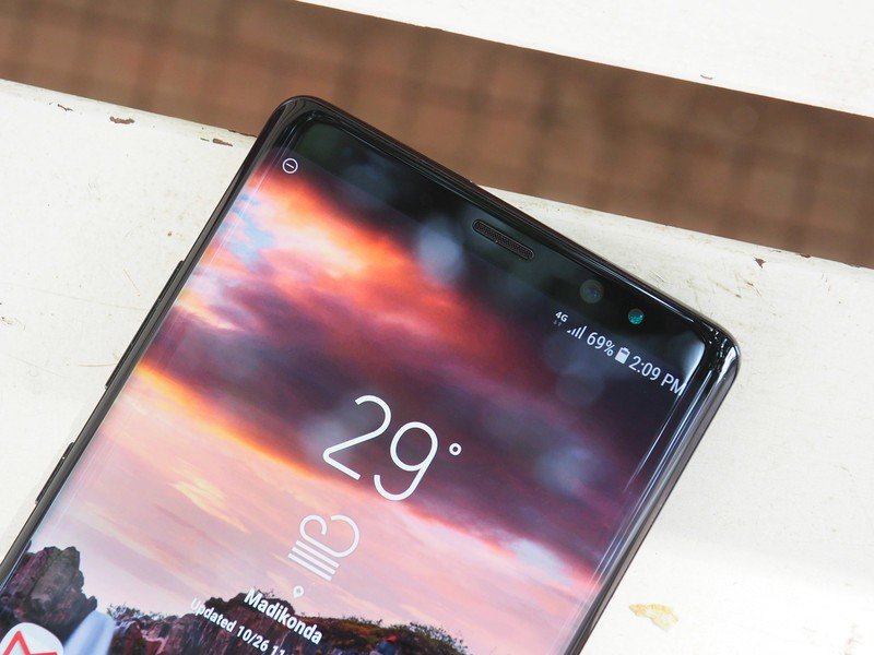
You start with the display itself. Any good high-end display needs to be able to reproduce a Wide Color Gamut. There are standards from the ITU-R (International Telecommunication Union - Radiocommunications Sector) that decides what a wide color gamut is, and they involve a lot of math and science. Thankfully, we don't need to do the math and only need to know what color spaces meet the standards. For our phones, that's usually the DCI-P3 color space.
This matters more now that displays can show more colors.
The ill-fated Galaxy Note 7 is listed as the first phone to ship with a 100% DCI-P3 HDR display, but since we've seen DCI-P3 capable displays from plenty of companies. The iPhone 7 and newer ship with one, the OnePlus 5 and up have one, the HTC U11+ and the Pixel 2 XL and more all have 100% compliant DCI-P3 displays. This means that the screen can reproduce colors correctly and accurately to meet the ITU-R standards.
Then you calibrate it
Once you use the right hardware, calibration comes into play. Calibration is measuring the output of a display as it reproduces different colors and adjusting the hardware so that the readings meet a specific value. Because it's impossible to calibrate 16.7 million different colors, common colors spaces are used. The most common is sRGB (standard Red Green Blue).
Developed by HP and Microsoft, sRGB is the standard on monitors, printers and the internet when no specific color space is defined, and it's a very good standard. Calibrating for sRGB is fairly easy because you adjust with one channel at a non-zero value and the other two at zero and cycle through. That's why you'll see 255,255,255 expressed for a color (that one is white) or 255,0,0 (that's red). Once the chromatic of each primary channel is calibrated, every other color will be, too.
Ideally, this is what every company making a display does then it ships the display out the door.
Before Oreo, color management on Android was broken
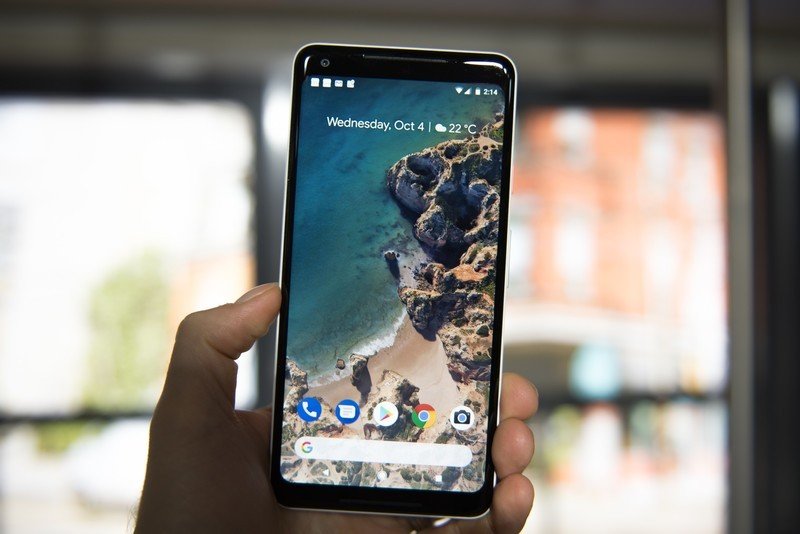
The problem is that some companies using Wide Color Gamut displays would stretch the sRGB space and reinterpret the color values into their own unique gamut. This makes the three primary channels very oversaturated, which in turn means that every one of the 16.7 million colors the display was capable of showing was no longer calibrated to look the same on any other device.
There are many color spaces and profiles. The one most important to Android is sRGB.
Before Android Oreo, applications used the sRGB color space. There's a reason for this — low-end hardware. Displaying a wide color gamut takes more GPU and CPU power than the sRGB space. If Android were set up with a wide color space as the default, some of the phones people are buying would struggle to display it. Even if a phone's display wasn't even capable of showing all the colors, there's still a fairly large performance hit.
Manufacturers of high-end devices felt that "breaking" color calibration and processing color with their own values would showcase their superior displays, and if there's one thing I've learned doing this job for almost eight years is that a phone manufacturer only cares about what's best for itself.
Some apps still need to show mostly accurate color, even when a manufacturer breaks the color space, so developers had to desaturate their assets to try and compensate. A video, for example, looks best when a red stop sign is the same red you recognize it as and not a random color that a manufacturer decided it should be. Once you introduce a device with a 100% DCI-P3 display calibrated for the sRGB color space, things start to look broken. This is the crux of the issues surrounding the "muted" colors on the Pixel 2, though some experts say the calibration is not very accurate from unit to unit.
Here's how it gets fixed
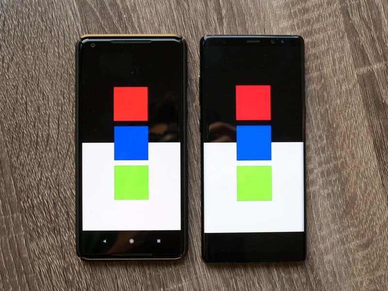
This is the simple part and probably should have been done from the very beginning. A developer can detect if a device is using a Wide Color Gamut display and have an activity inside of the application use the correct color space to make the most of it. If the device is not capable of displaying wide color, the default sRGB profile is used.
Google has provided plenty of assets for developers who want to follow the new guidelines in their apps:
- Android general color space documentation for API 26
- Color spaces supported by Android
- Wide color assets and content guide
This is all well and good and should prove to be a great way to make sure that colors look the same from device to device unless it's a lower-end model incapable of displaying every color. Those would still look correct between devices because they would use the sRGB color space. The problem is getting everyone on board to do the same thing.
We're hopeful things will get better
For this to work, Samsung, OnePlus, LG and every other company that's "broken" the sRGB interpretation has to go back and correct it and developers need to rebuild their apps to support the new color space guidelines. And nobody wants to do it.
Companies won't likely change the way they do things until app developers make the apps that look good, and developers aren't going to write apps that will look broken on millions and millions of phones. Apple was able to transition to proper color management because it controls the hardware and software space, as well as set App Store guidelines. Google doesn't have that luxury.
Somewhere someone is thinking of the way to fix all of this. And shipping a broken user-selectable color space on Pixel 2 phones to compensate — well, that's not it. We know that everyone involved wants to do things the right way, and that also means not breaking anything on the phones that have already been sold. Hopefully, it gets sorted out sooner than later.

Jerry is an amateur woodworker and struggling shade tree mechanic. There's nothing he can't take apart, but many things he can't reassemble. You'll find him writing and speaking his loud opinion on Android Central and occasionally on Threads.
