YouTube Music rolls out Now Playing redesign, tucks away the dislike button
Google's music platform freshens up a little more.

What you need to know
- YouTube Music is beginning to roll out a new Now Playing screen redesign with version 5.32 on Android.
- The changes will display where music is playing from (playlists, radio, etc.) and also remove the dislike button.
- Lighter changes include rounding the edges of album covers and a white background for the play button.
YouTube Music is touching up how users interact with their music through a new redesign.
Spotted by 9to5Google, YouTube Music has started rolling out a redesign update for its Now Playing screen. The update seems to be appearing on Android devices running YouTube Music version 5.32. This update, per 9to5's findings, has not yet shown the redesign on iOS devices.
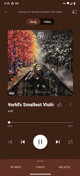
There are two notable feature alterations with this new redesign, and that begins with the Now Playing screen letting you know where your music is playing from. There's a small string of text at the top of the screen, which lets users know if their music is playing from a playlist, radio station, queue, likes, or an artist's page.
Article continues below 
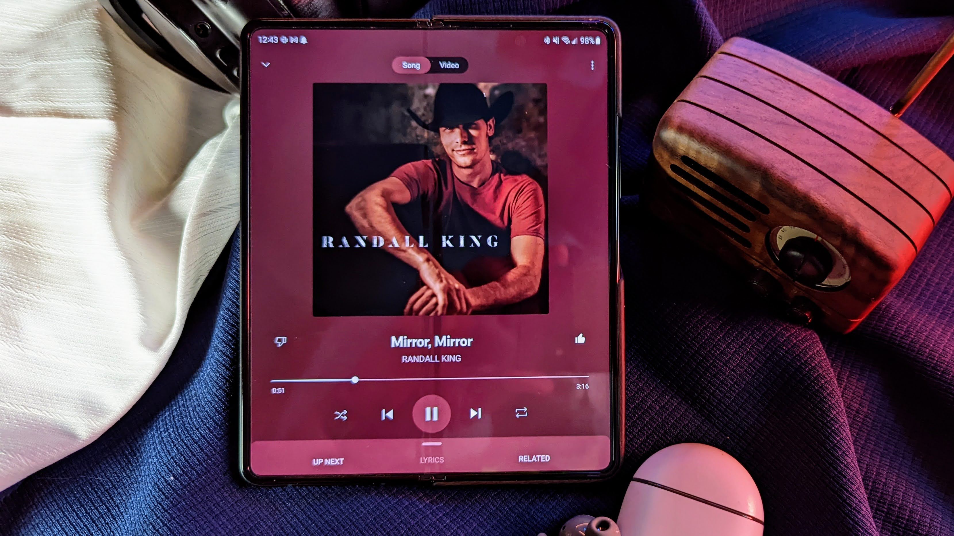
The next change is that YouTube Music's Now Playing redesign has removed the dislike button from appearing on the left side of a song's title. Now, the track title is positioned a little over to the left and only features the like button on its right side.
This isn't the first time YouTube has tried to either hide dislikes or remove the button entirely from its platform. On the video platform, users currently cannot see the dislike count, although creators still retain that ability. The change came with quite a bit of backlash as some argued that the dislike count could help to gauge the quality of a video through a consensus of peers. However, when it comes to music, most people may opt to simply skip to the next song rather than hit a thumbs-down, and the thumbs-down button is arguably less relevant on the music platform. Still, it can potentially help the app discern what types of songs to avoid when it comes to recommendations, although that may not actually be the case either way.
That said, the button isn't completely gone, but you have to open the overflow menu to find it, which has also been moved from the top left of the display to the right of the song title and like button. As a result, the Now Playing screen displays the classic Google casting button at the top right instead of hitting it within the song artwork. Album art/covers now feature rounded edges instead of their former sharper, square look.
As for the controls, they remained largely the same, although they've been moved down slightly on the UI, and the round play/pause button is now filled with white instead of matching the theme of the screen based on the album artwork.
Get the latest news from Android Central, your trusted companion in the world of Android
YouTube Music's Now Playing redesign comes nearly two weeks after the platform started testing a change to make your playlists stand out more on the home screen. This update would add your playlist as a card to YouTube Music's home screen with its art, owner, and how many songs it contains.
So far, the redesign hasn't appeared on any of our devices, meaning it's likely a server-side change.

Nickolas is always excited about tech and getting his hands on it. Writing for him can vary from delivering the latest tech story to scribbling in his journal. When Nickolas isn't hitting a story, he's often grinding away at a game or chilling with a book in his hand.
