Android 12 beta 5 hands-on: So close, yet so far
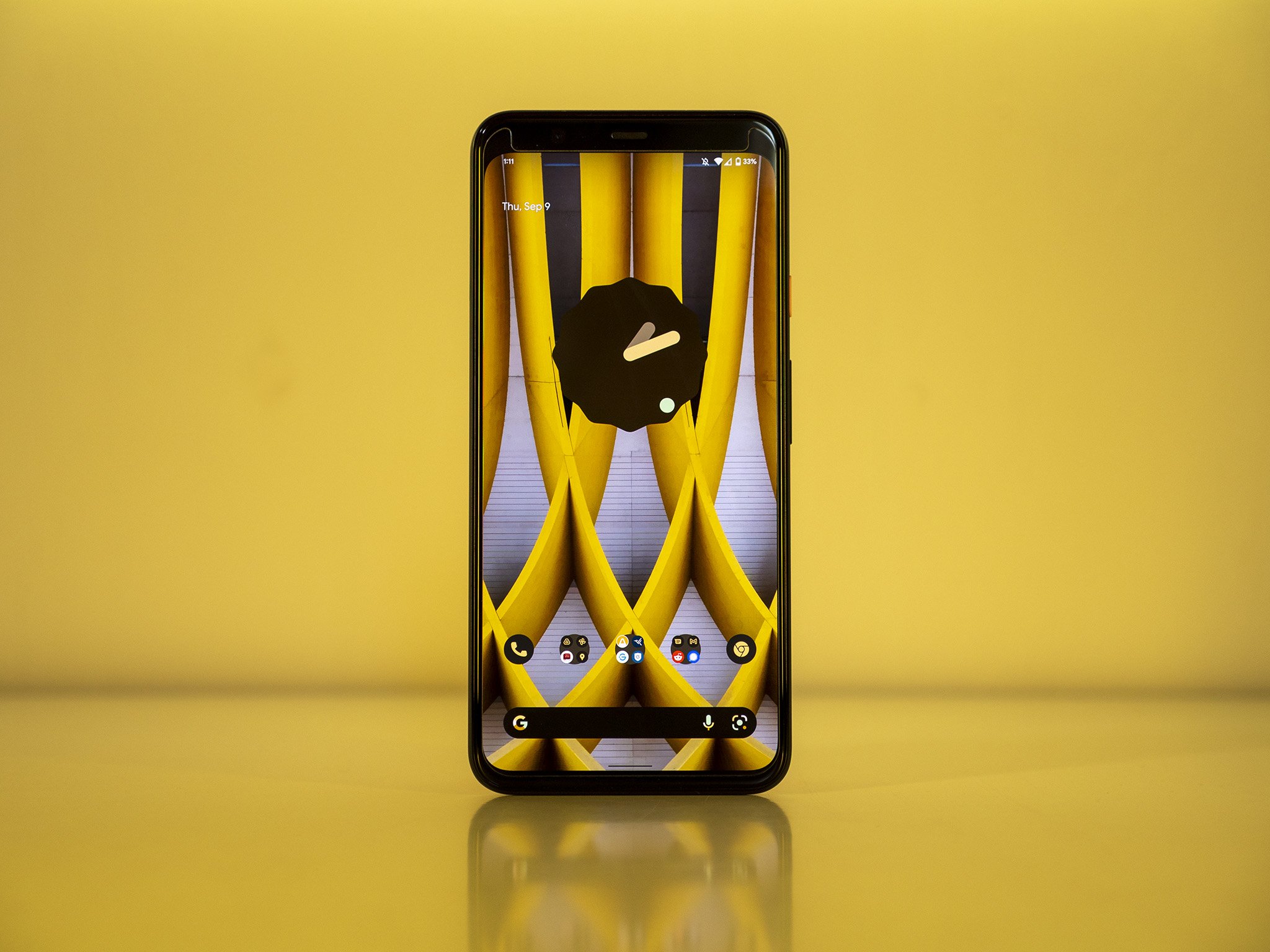
Another month, another beta release for Android 12. Android 12 beta 5 marks the beginning of the release candidate sequence, where basically everything is final unless some massive bug rears its ugly head before the official launch date. Like Android 12 beta 4, this release is mostly focused on stability, having hopefully squashed several phone-crashing bugs and tweaking the UI to look more like a final product.
To date, Android 12 has been the buggiest beta release of Android we've seen in some time — maybe ever, in fact. Part in parcel of that bugginess is the massive shift in how the UI looks and operates, including the Pixel-exclusive automatic color-changing feature found in the Material You design language.
We're just mere weeks away from the full and proper release of Android 12 on many devices, including the upcoming Android 12 beta on the Galaxy S21, and likely just over a month and a half away from the Pixel 6 release — Google's flagship phone for Material You design. As such, a few people have been nervous to see so many bugs this close to release. This is what a beta program is for, however, and it looks like Google is doing good work on stabilizing the platform.
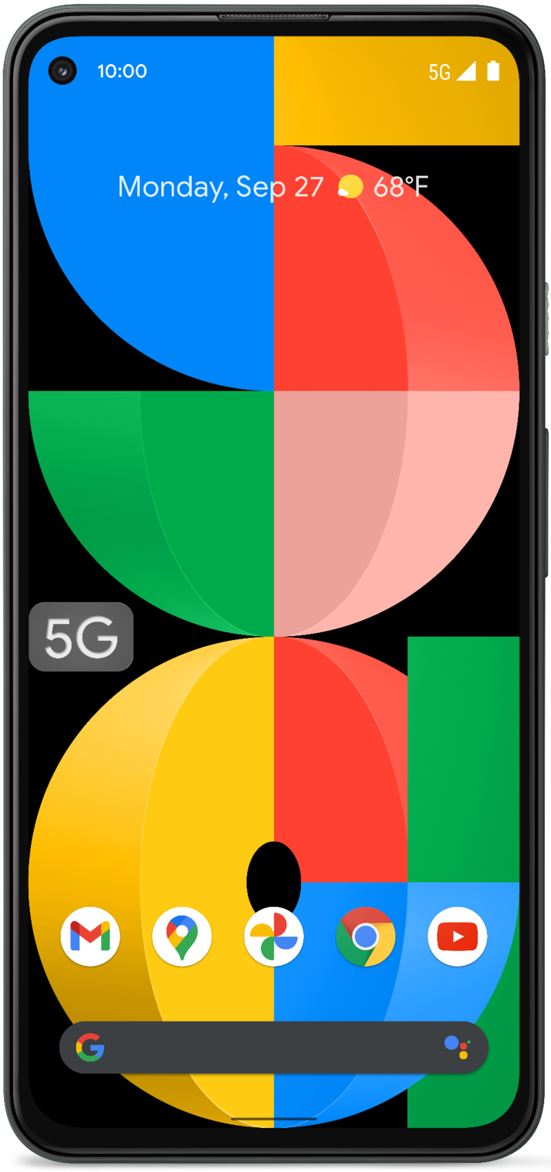
Article continues belowAndroid 12 beta 5 can be installed right now and even welcomes the Pixel 5a as the newest phone to qualify for testing. But you'll need an eligible phone and a willingness to put up with a few remaining bugs.
Android 12 beta 5 hands-on: Material You makeovers
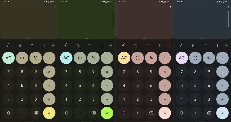
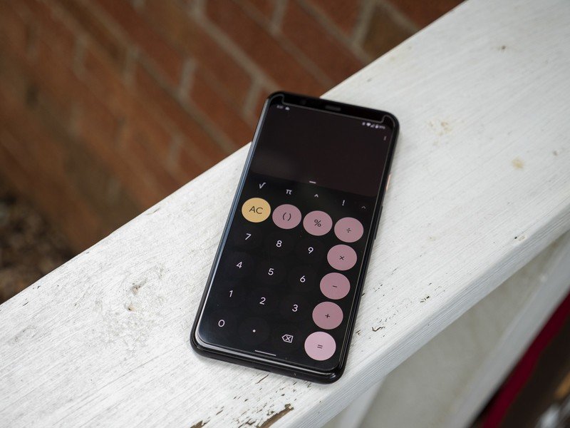
Major system apps, like clock and calculator, have finally gotten a Material You redesign.
Every beta release has seen some major shift toward Material You design language, and the final pieces of the puzzle are finally coming together in Android 12 beta 5. Some of the core everyday system apps, like the clock and calculator apps, are seeing their first major redesigns in years.
Gone are the nondescript designs of yore and, in their place, you'll find lots of colored backgrounds behind text that help denote sections. This is in stark contrast to the complete absence of lines or colored sections in the previous Android design refresh, which amplified white space as a primary design trait.
Within the clock app, you'll find larger buttons with a distinct rounded rectangle design throughout. Colors are automatically adapted from the wallpaper you set and match the rest of the colorful UI. These colors are separate from light and dark themes, which can still be toggled at any time, either manually or via a schedule.
Get the latest news from Android Central, your trusted companion in the world of Android
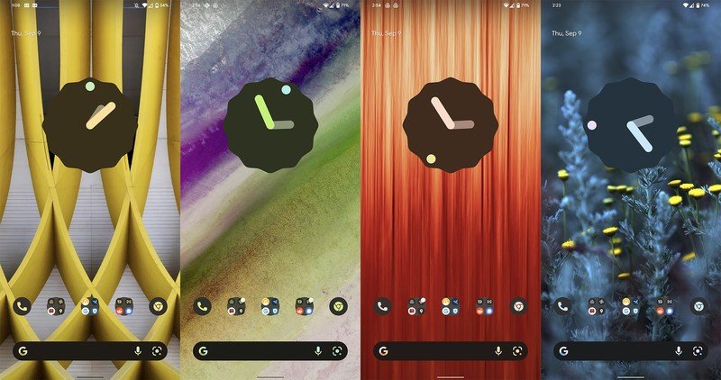
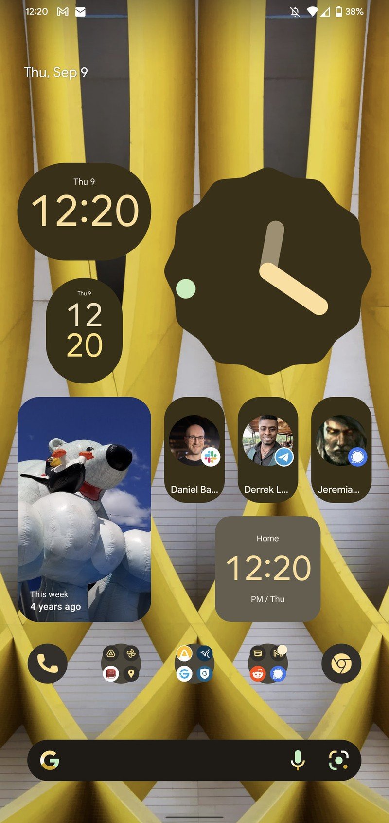
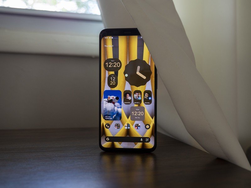
The clock widgets we've seen so much of in Android 12 teaser videos from Google are finally making an appearance, as well. Four different shapes can now be chosen from, all of which are resizable and automatically assume the color of the rest of the UI. Likewise, many other widgets also look more distinctly Material You this time around, rounding off the squared corners and adding a dash of color where appropriate.
Conversation widgets finally made their appearance in Android 12 beta 4.1 a few weeks ago but were still half-working for some people. The conversation widgets in this beta release work perfectly on my Pixel 4 XL and are a brilliant way to keep track of conversations across all of the multiple chat apps we have these days. That gives you a one-tap way to head to your favorite chats, no matter the app.
Lastly are changes to the At A Glance widget, which has been a staple of Pixel home screens for years. Google looks to be making this widget more customizable than ever but, unfortunately, has completely broken it in this release. The current system At A Glance widget lacks weather or calendar details and is strangely top-left aligned on the home screen.
The At A Glance widget is totally broken but looks to be getting a big customizable overhaul.
There's currently no way to turn it off or adjust settings, as they're just all missing. Even toggling the switches in the options screen does nothing. The manual At A Glace widget can still be added but looks a bit funny underneath the broken one, and it also lacks some key features.
Android 12 beta 5 hands-on: Getting closer to the bottom
Google continues to move toward one-hand-friendly half-size dialog boxes.
Quite a bit of the design focus in modern UIs includes moving more elements to the bottom half of the screen. This is a direct response to the screen size increase phones have received over the years, as it's challenging to use many phone functions one-handed without shifting your hand. More dialogs are now accessible via a half-sized pop-up window — similar to how we saw the new quick switching Wi-Fi menu change in the first Android 12 betas — and are also adopting the colorful rounded-square look of Material You.
Nearby Share has received a complete facelift and now offers new functionality to make sharing easier. When Nearby Share is activated from the notification shade, users will have the option to share to everyone around them with a quick tap on one of the three buttons now available in the UI. Previously, Nearby Share would pop up a dialog saying it was available, but you would have to go into Nearby Share options to modify who can share content. Curiously, this new dialog doesn't seem to be available to all users, including me.
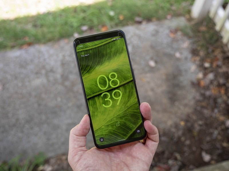
The lock screen has seen a slight facelift in Android 12 beta 5, including some clock movement on the always-on display. Further yet, smart home device control is now available both on the lock screen and via the notification shade. The icon has also changed from a light bulb to a house, helping to appear less like a flashlight when on the home screen.
Device Controls have been a point of contention for users since Google removed the option to keep device controls in the power menu in Android 12 beta 2. This has been reported as a bug in the Android issue tracker — even though it's a design decision and not a bug — but the amount of negative feedback Google has received on this decision could signal its eventual return in the final release of Android 12.
Back on the home screen, you'll find that Google has recently updated the Google search bar at the bottom of the screen with a dedicated Google Lens icon. We've seen this happen in the past, but it's great to have one-touch access to visual searches returned to its rightful place.
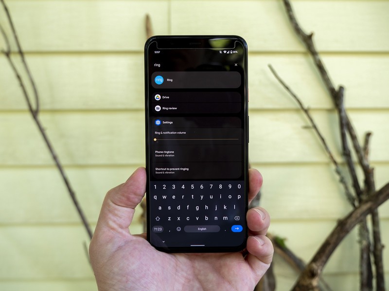
Staying on the topic of search, device search is now fully available when searching from the app drawer. When pulling up the app drawer, the search box up top can find more than just apps in the app drawer. Device search will pull up emails, text messages, apps, and even more results from the web. As a bonus, you can set it so that the keyboard automatically appears when sliding the app drawer up, enabling faster searching from the home screen.
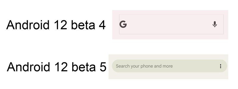
Google has also fixed the broken rectangle design from the past two beta releases, which looked very odd on the light theme. That search box is now a proper horizontally-elongated circle, as you would expect a search box to look.
Android 12 beta 5 hands-on: A colorful but glitchy future
Whether or not Google can squash all the bugs present in Android 12 before release is anyone's guess, but Android 12 beta 5 seems to have made significant progress toward that goal. Still, I've run across several instances of apps freezing, system gestures taking several seconds to process, and a handful of other quirks that all show signs that this isn't quite up to par with release candidate quality.
While an Android 12 release is a given for the best Android phones, we're still unsure how many of the defining features of Material You will transition from the Pixel line to those other phones. One thing is clear, though: if you want everything you see here, particularly the visual changes made to Android, a Pixel phone is the best way to go.

