A fresh interface and yet another great Auto Awesome feature have us loving the latest version
It wouldn't be a step too far to call this week's Google+ app update one of the biggest redesigns since the app first arrived on the Android Market (yes, that long ago) back in 2011. The update changed the look of the entire app, switched up how you navigate through it, and if that wasn't enough also included a brand new featured called "Stories."
This is a big step in terms of design and features for Google+, and we like the changes. There is quite a bit to get used to in this latest refresh, though, and we're going to walk you through all of the changes and new features.
First reactions and getting around

It's a good thing that Google decided to do a two-panel "what's new" splash screen when you update the Google+ app, because the interface changed pretty dramatically with a single update. Google has gone to a bold style with a bright red bar at the top of the app, contrastingly strongly against the whites and grays elsewhere. Gone are the slide-in drawer from the left edge and the ever-present status update bar at the bottom, hiding a bit of interface redundancy.
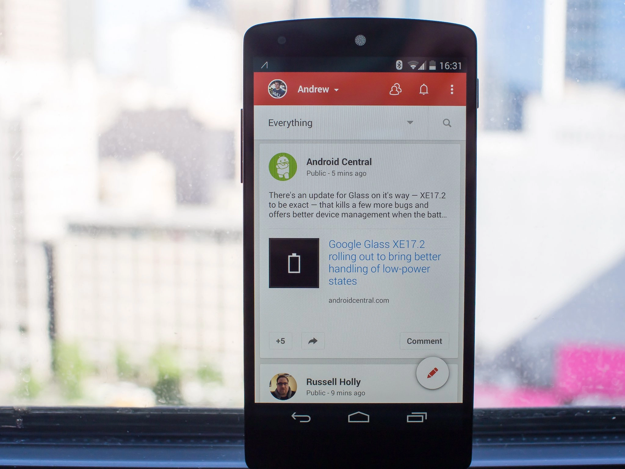
What you'd normally find behind the slide-in drawer is now available from a secondary bar at the top of the screen, mostly. You can tap the "Everything" listing in the top bar to switch between the content you view, including specific circles, communities, "what's hot" and nearby. A search button is now permanently in view on the home screen, which makes a bit more sense considering we're talking about Google here.
There's no longer quick access to the Hangouts app inside the Google+ app (it used to be in that side bar), but considering how it has been completely decoupled with the last few updates of Hangouts, this makes sense. The account switcher can be accessed by tapping your name in the top bar, and it'll drop down a screen where you can move to other accounts or pages that you manage.
Pull-to-refresh is still here, as is the actual "refresh" option inside the menu button. Google dropped pull-to-refresh and the dedicated refresh icon from the individual post view, but it's still available behind the menu button if you need to hard refresh a specific post you're viewing.
Creating posts

The former bottom bar is now condensed to a red pencil with a white circle around it in the bottom right corner of the interface — tapping it will give you a more generic composition window where you can then add locations, moods, links or pictures. For picture sharing, you get a sneak peak at your most recent photos — as well as a live view of your camera — below the compose box so you can quickly add photos. Swiping up reveals a scrolling list of more photos, and you can tap "All photos" if you want to go back even further in history.
The location picker gives you a top-down map view of your current location, where you can then select a specific point on a map, a landmark or even a city- or county-level location. The funky animated smilies or "moods" can now be added from the post creator as well. You can also now disable reshares or comments as you create the post with a tap on the menu button.
Stories and Photos

Nothing has drastically changed on the Photos side of Google+, aside from the big addition of a new "Auto Awesome" feature called "Stories." Stories are a new way for Google to pull together all of your posts, pictures, videos, check-ins and travels into an interactive storytelling experience. If you move around a specific location, travel, take a lot of pictures or check into locations Google+ will now pull those together to make a Story.
For example I recently took a trip to San Jose for the Nvidia GPU Tech Conference. Google+ took all of my pictures, check-ins and posts from that time period and put them together into a great little storyboard. You can selectively choose which locations, photos and check-ins are in each auto-generated Story, add or change annotations on pictures and re-name the Story to your liking.
Stories look great on both the app and the web, and just like other Auto Awesome-generated content you choose which ones you want to make public. It's not something that you'll see pop up for you every day, but it's a huge incentive booster for turning on Google+ Auto Upload and getting more information into Google+. The next time you travel or have a trip around the city, be on the lookout for your Google+ app to give you a Story worth sharing.
A new design direction - and we like it

Although this newly-designed Google+ app is a step in a different direction from other Google apps that have been recently updated, we like where this is headed. The use of bold color is great, as is the simplification of navigation and the new posting interface. Stories are a great feature that makes each and every one of us look like an amazing photographer and story teller while taking out all of the hard work.
If this is the new design direction coming to even more Google apps going forward, we can't wait to see those updates.

