Nothing phone (1) hands-on: A basic phone that gets the basics right
And at the right price, too.
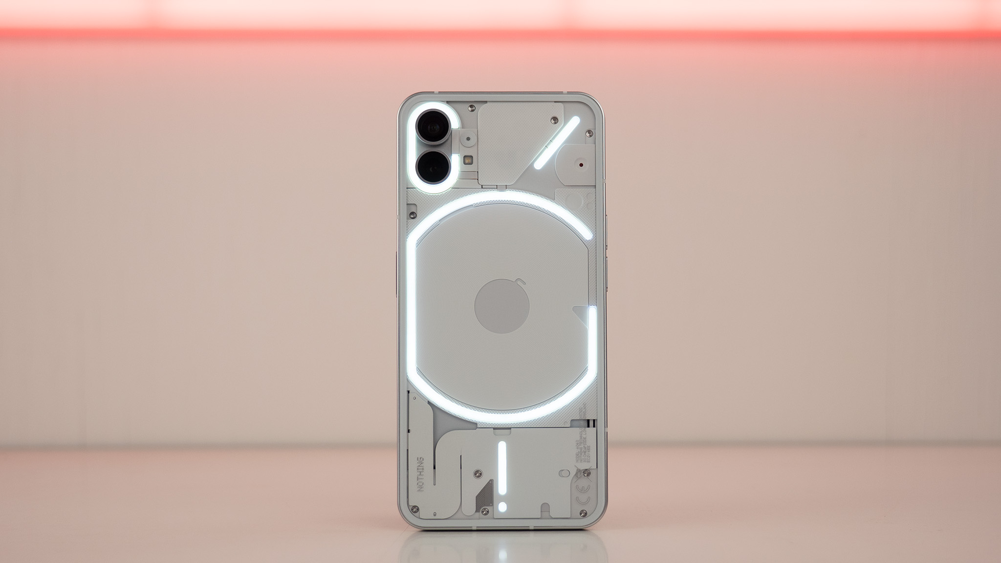
As I sat in a trendy hotel room lobby across from Carl Pei, I couldn't help but notice how cruelly dim it was compared to the gorgeous bright Summer Sun outside. It certainly wasn't the venue I was hoping to use my Panasonic Lumix to capture the year's most anticipated phone. That's about the time the glyphs on the back of the Nothing phone (1) lit up, causing my pupils to constrict as they tried in futility to take in the contrast between bright LEDs and their dim surroundings.
If nothing else, the Nothing phone (1) is a novel concept wrapped in a surprisingly affordable, yet sturdy package. From a distance, you might not be able to tell the difference between it and other great Android phones. That is, either until you see its LED glyphs illuminate, or you get close enough to see its cleverly minimalist, transparent back.
And while the software does little to surprise or impress — it's little more than a lightly themed version of Android 12 with a custom launcher and widgets — the price is more than just a surprise. It's all but guaranteed to shake things up when the phone launches in the very near future in several countries — just not the U.S. Think it lives up to the hype? My Nothing phone (1) hands-on time certainly seems to point to "yes."
Article continues belowAll-in on design
When Nothing successfully wooed Dyson's head of design away from the famed company into its quickly growing fold, we knew big things were coming. Nothing's ear (1) earbuds were certainly a telltale sign of things to come, if my first impressions of the phone (1) are anything to go by.
At just £399 for the base model, the phone (1) looks and feels anything but cheap or affordable. The display alone makes this feel like a much more expensive phone, but I'll get to that in a moment.
This strangely complex-yet-simple design scheme takes the busyness that often comes with transparent electronics, and replaces it with something elegant.
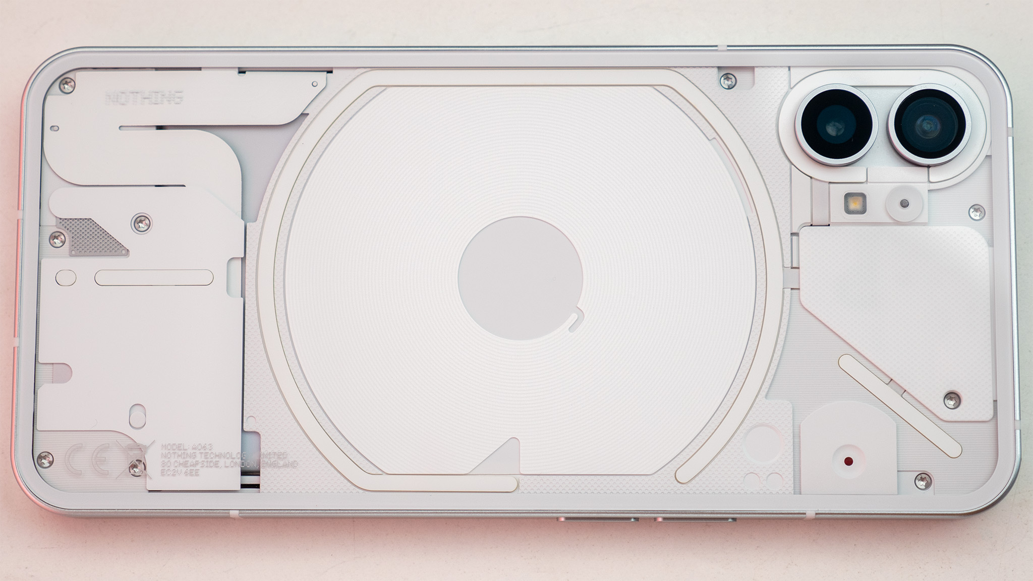
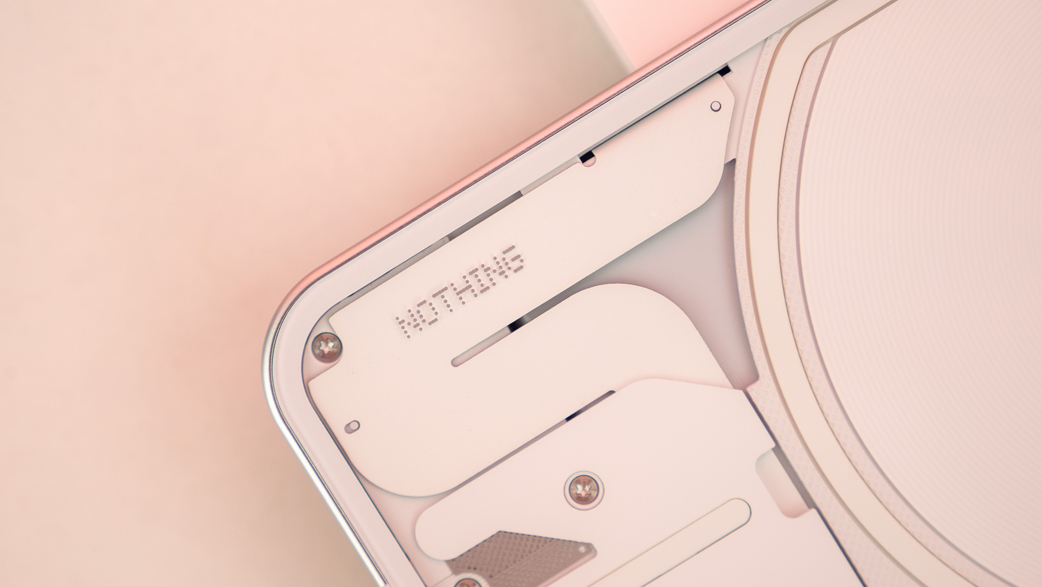
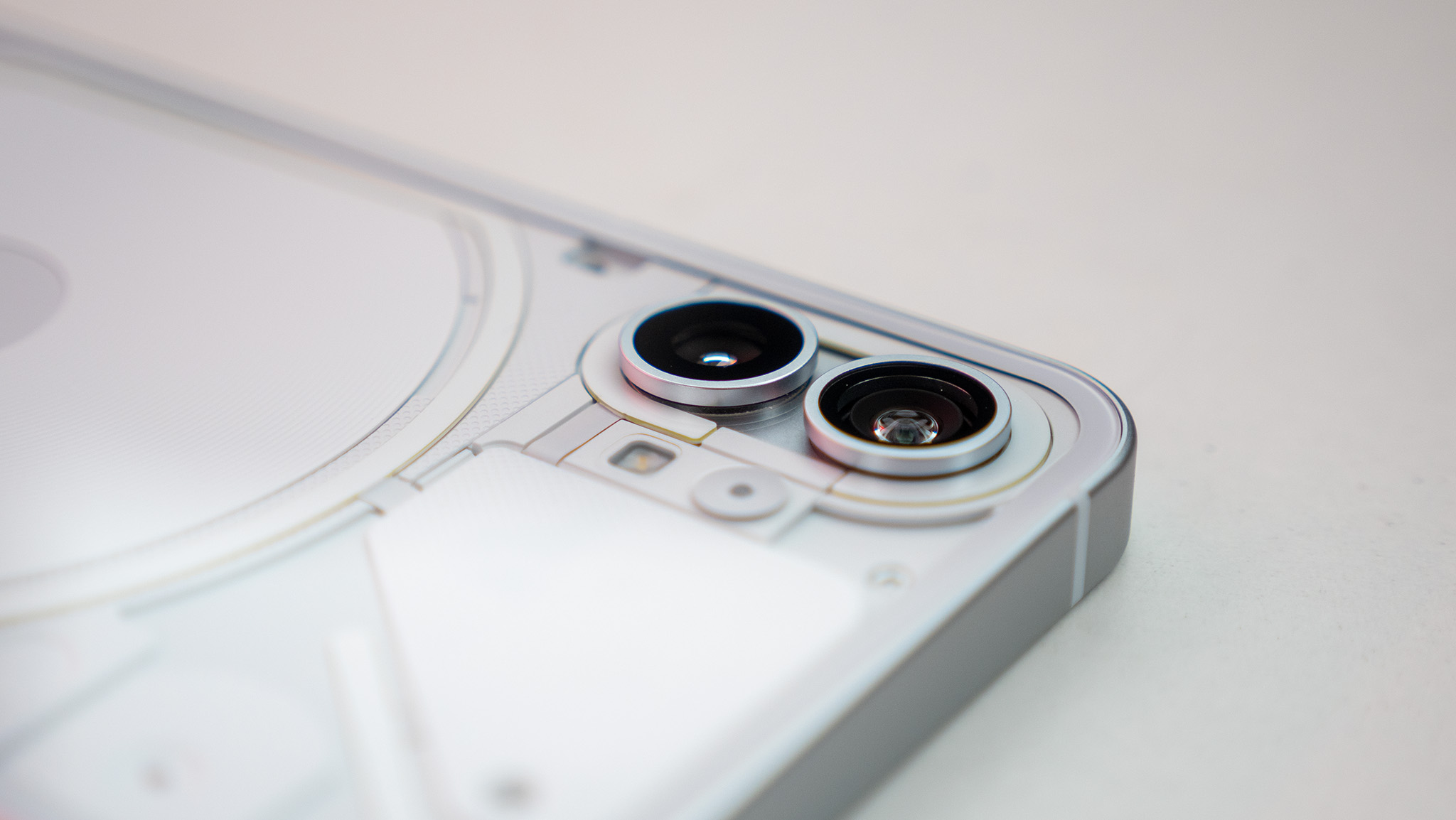
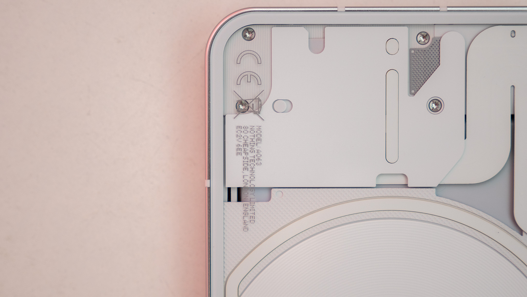
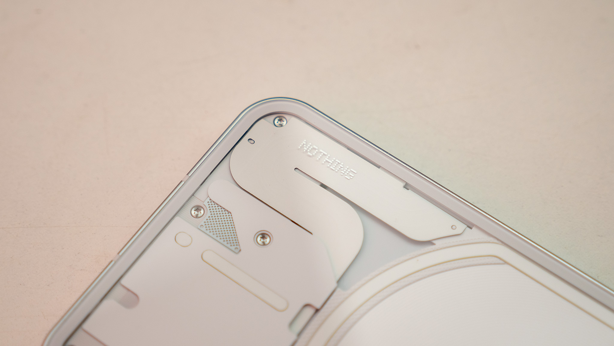
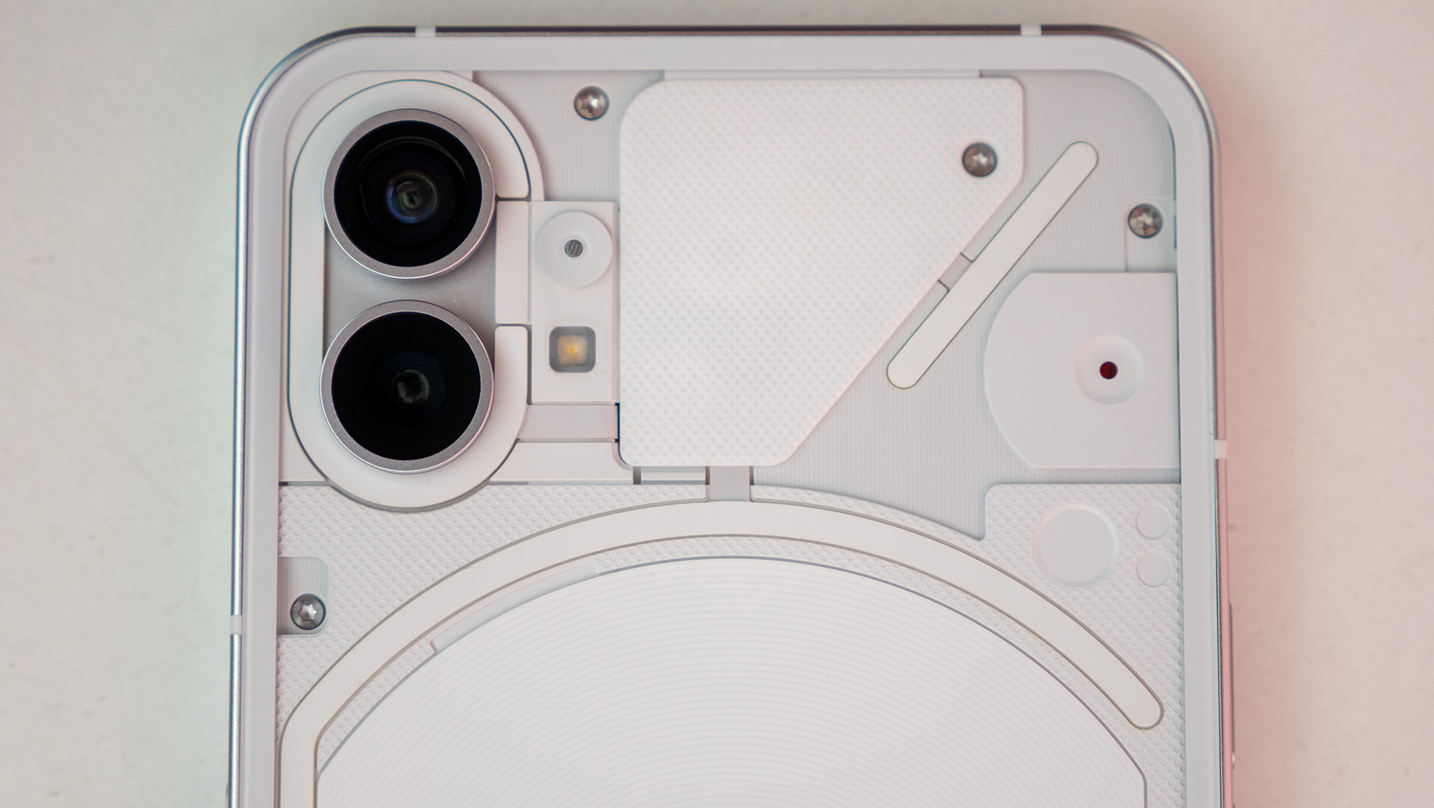
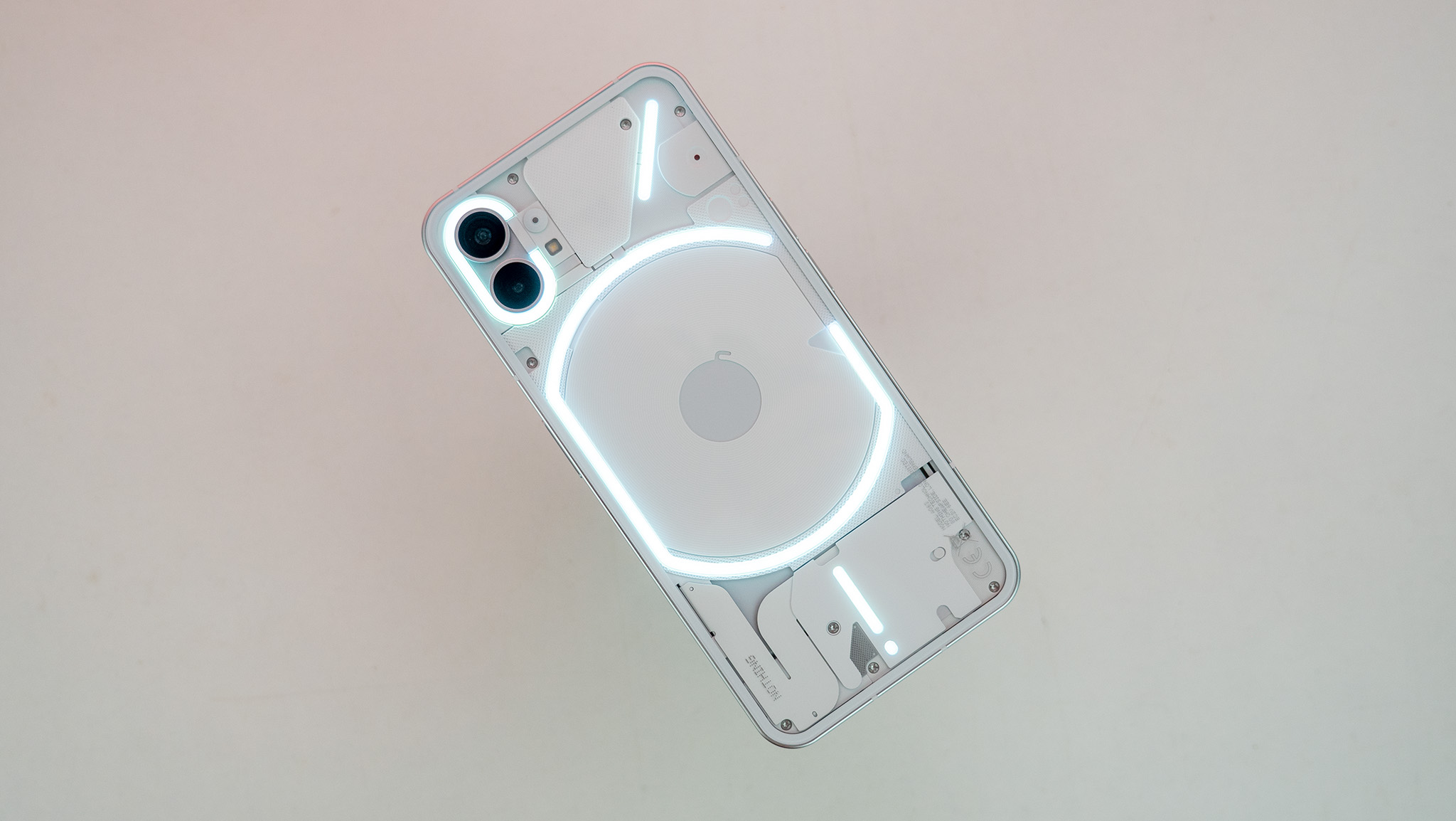
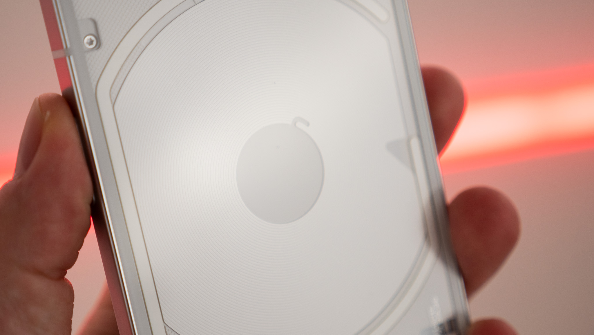
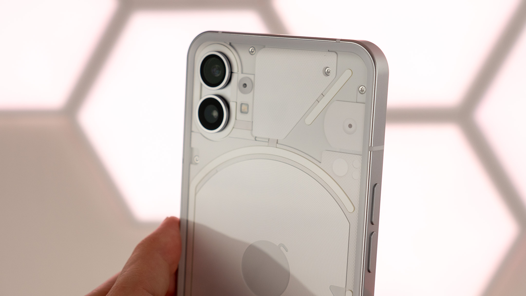
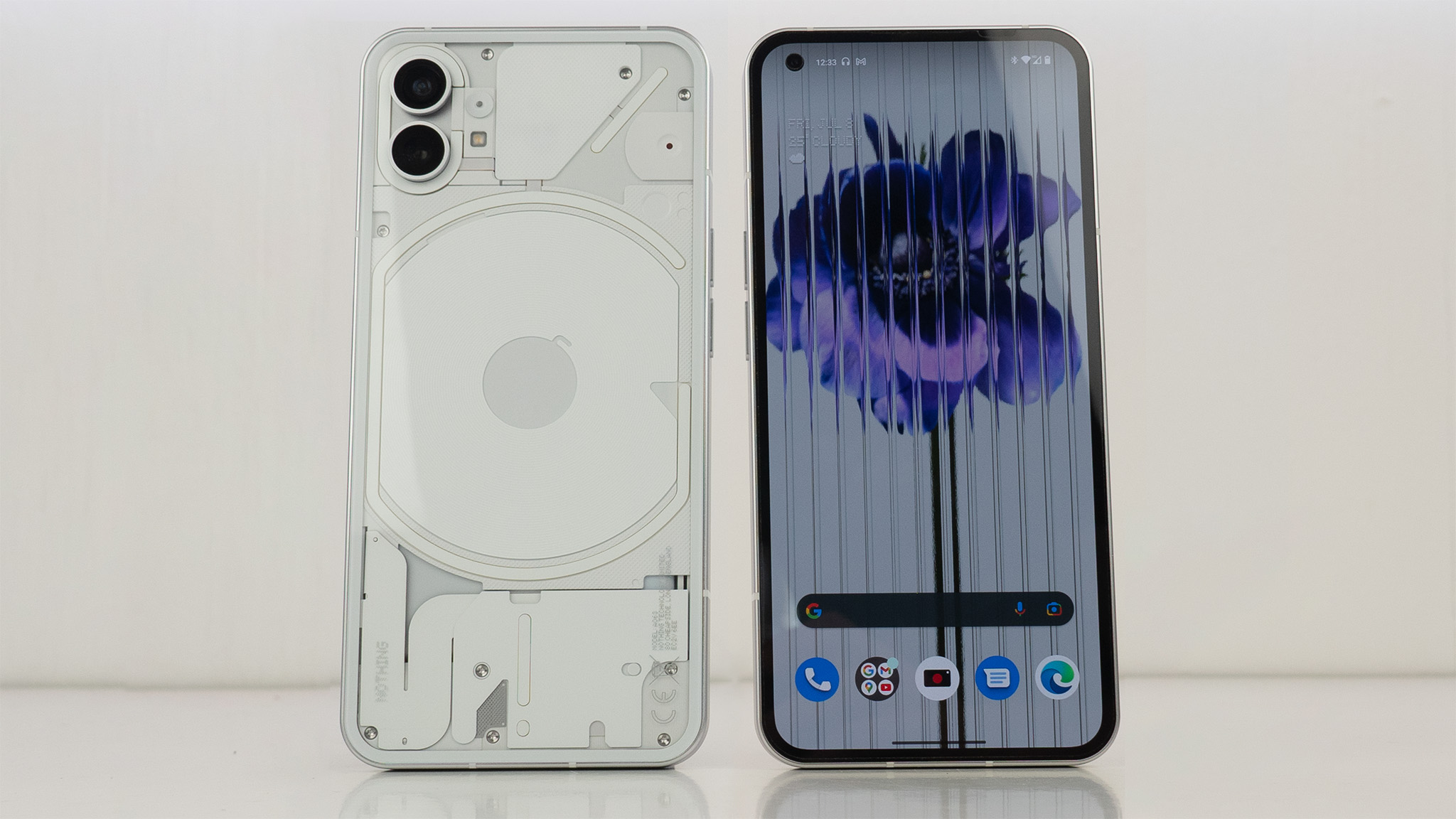
The most obvious crux of the design is the back of the phone, which sports a uniquely minimalist transparent design. The surprising part here is that it doesn't showcase the phone's electronic components the way other transparent phones in the past have.
Rather, this strangely complex-yet-simple design scheme takes the busyness that often comes with transparent electronics — think a GameBoy or iMac from the 90s with its layered, colorful circuitry underneath the candy-colored clear coating — and replaces it with something elegant. Whether you pick the white or black colorway, all the electronics within are painted that same color, instead of being a multicolored bonanza.
Get the latest news from Android Central, your trusted companion in the world of Android
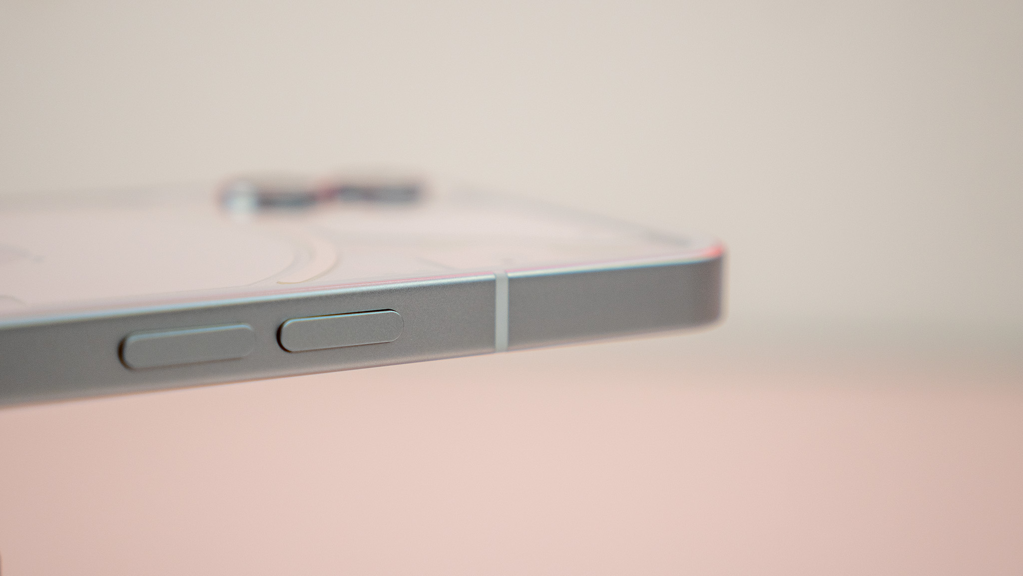
Impressively enough, there's even a really nice haptic motor inside that feels punchy and deep while typing or swiping around on the phone. It's a nice quality that's almost nonexistent in this price point, and is often forgotten in phones even in the next price bracket. Looking at you, Galaxy S21 FE.
| Category | Nothing phone (1) specs |
|---|---|
| Chipset | Qualcomm Snapdragon 778G+ |
| Memory | 8GB/12GB LPDDR5 |
| Storage | 128/256GB UFS 3.1 |
| Display | 6.55-inch flexible OLED, 2400x1080 resolution, 120Hz, HDR10+, 1,200 nits peak brightness, 240Hz touch sampling rate, Gorilla Glass 5 |
| Rear Camera 1 | 50MP Sony IMX766, ƒ/1.8, 1μm pixel size, 4K video |
| Rear Camera 2 | 50MP Samsung JN1, ƒ/2.2, 114-degree FoV, 4cm macro mode, 4K video |
| Front Camera | 16MP, Sony IMX471, ƒ/2.45, 1080p video |
| Battery | 4,500mAh, 33W PD3.0 wired charging, 15W wireless charging, 5W reverse wireless charging |
| Dimensions | 159.2mm x 75.8mm x 8.3mm |
| Weight | 193.5g |
| Water and dust resistance | IP53 |
| Colors | White, black |
| OS | Nothing OS with Android 12 |
| Update guarantee | 3 years of Android updates, 4 years of bi-monthly security updates |
The LEDs adorning the back are also a simple, single color. RGB lighting and self-professed gamer styling aren't the phone (1)’s style, like they are on a Razer product or ROG Phone 6 Pro.
Instead, each of these glyphs — as Nothing calls the individual light sections — serves a specific purpose. Starting at the bottom, you'll find a small circle that functions as the resurrection of the notification LED that seems to have perished alongside the 3.5mm jack on modern smartphones.
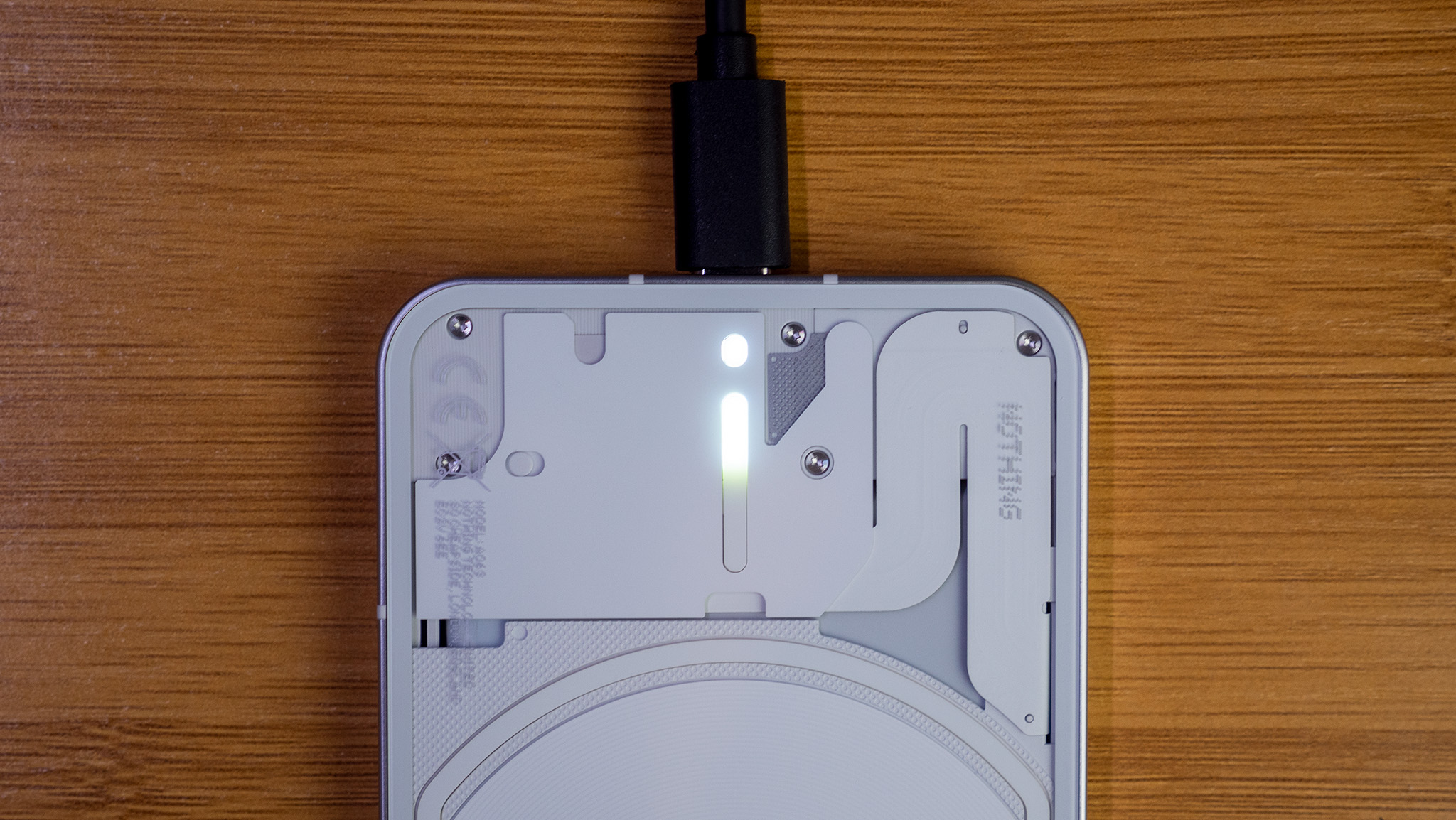
The high number of LEDs can also be used as a great way to illuminate a room softly while using the camera.
The vertical line is used to indicate the current battery percentage when the phone is plugged in and charging. Likewise, the pseudo circle that encompasses the wireless charging coil on the back shines when a wireless charger connects — or a pair of headphones attempts to reverse charge from the phone's power reserves.
The only superfluous LED strip on the back is the one on the top right, which can illuminate as part of a complex light pattern for ringtones or notifications, or it can just be turned on at any old time to show off your phone at a party.
Nothing's clever software integration with these custom-built LEDs allows them to light up in a fun pattern according to the ringtone or notification sound chosen. You can even select custom patterns for individual contacts so you know exactly who is calling before having to look at the screen.
Carl Pei told me that the high number of LEDs can also be used as a great way to illuminate a room more softly while using the camera, rather than the traditional single or dual LEDs found on most smartphones. We’ll have to see how well this works in our review, but it’s something that can be quickly toggled in the camera UI by tapping on the flash icon.
I can't help but wonder if all these lights might feel a little gaudy to the average user.
Those cameras, too, look like they pack quite a punch — especially in this price segment. A pair of 50MP sensors sit on the back, and the ultra-wide-angle camera doubles as a macro camera that can get up to 4cm away from subjects.
But I can't help but wonder if all these lights might feel a little gaudy to the average user. Personally, while I love the look and function of what Nothing designed, I'm not fully sure I'd be comfortable with using them in public. Truth be told, though, I tend to be overly introverted in public spaces when it comes to things like this. Heck, I will barely even smile for a selfie while in public, if I even bother to take a photo of myself at all.
Second to that is my initial disappointment with the first crop of cases for the phone, although Pei brought up a good point that helps dilute my first thought. While the first cases are boring — they're just simple clear cases like you'll find on any other phone — the back of the phone is interesting enough to stand out for a while, anyway.
More cases are in the works which will hopefully satiate my desire to see those infamous subway maps illuminated along the back in cathartic ways. Pei said Nothing is working on giving users more customization over how these LEDs light up, including custom animations for custom ringtone and notification sounds.
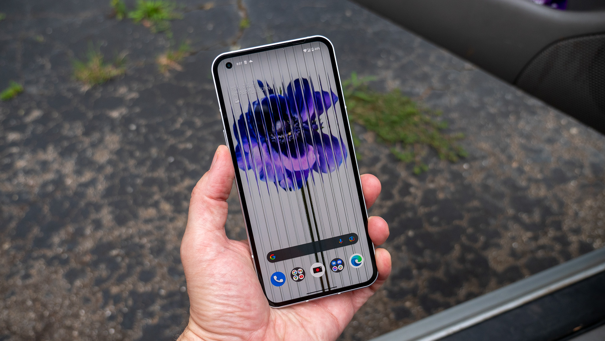
Having a uniform bezel on the front (and a faux bezel on the back) gives the phone a beautiful, elegant look for those that appreciate such things.
Before we move on from hardware, I’d be remiss not to mention the care and detail that went into choosing a display panel for the phone. By opting to choose Corning instead of Samsung as a display partner, Nothing was able to use a 120Hz flexible OLED instead of a normal AMOLED that’s present on most modern phones.
In short, this means that the bezels on all four sides are completely uniform — even the bottom bezel. Oh and yes, this £399 phone has a 120Hz screen and a competent Snapdragon 778G+ processor to back it up.
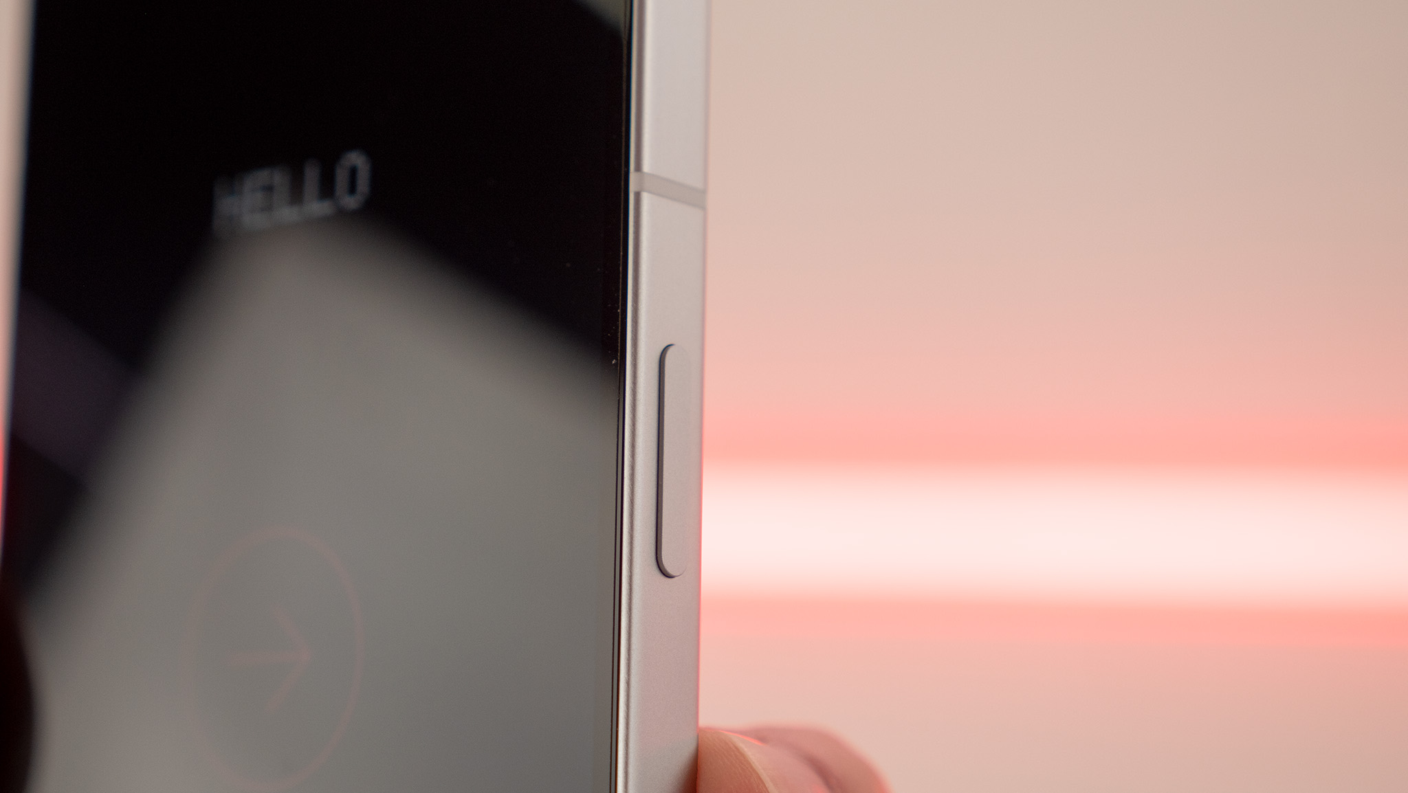
The display type is almost unheard of on Android phones, which commonly choose higher-quality AMOLED panels, but end up dealing with a larger chin as a trade-off. Having a uniform bezel on the front (and a faux bezel on the back) gives the phone a beautiful, elegant look for those that appreciate such things.
Software that matters
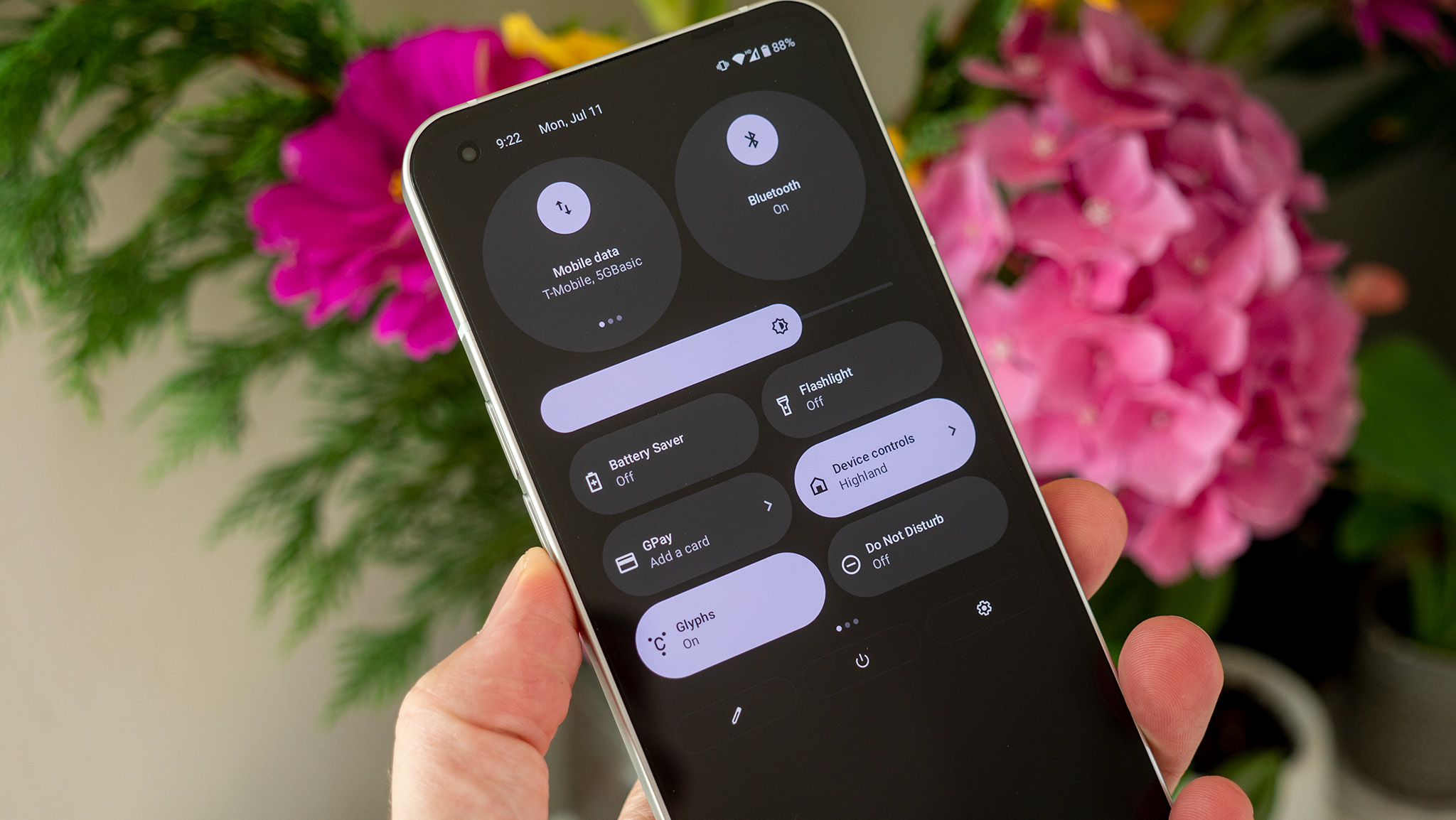
While this hands-on doesn’t cover an OS deep dive — that’ll be left up to the full review process — I wanted to take a minute to cover a few niceties that Nothing added to its eponymous Nothing OS; a flavor of Android 12. From what I could tell, Nothing’s approach is to start with the basics, perfect them, and then move on from there.
Glancing at the UI won’t reveal too much initially — outside of the company’s unique dot matrix style font — but a quick pull-down on the notification shade reveals some important changes made to Android 12’s quick toggle design. By default, Android 12 only shows four quick toggles on the first pull-down, with another four added when the notification shade is pulled down a second time.
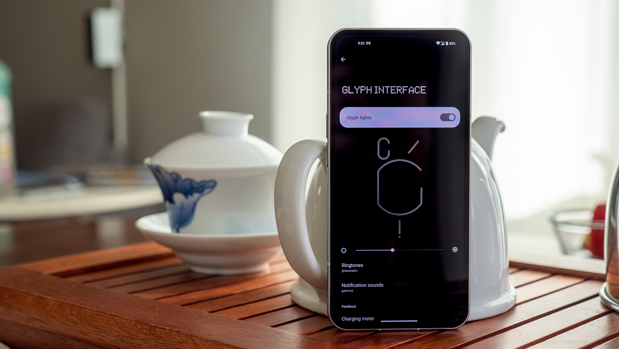
When you pull down a second time, the top two quick toggles are enlarged and feature additional functionality.
Nothing, on the other hand, shows six quick toggles in the first pull-down and, instead of showing more quick toggles when you pull down a second time, the top two toggles are enlarged and feature additional functionality. Swiping on the internet/data quick toggle in this state reveals your mobile data connection, Wi-Fi connection, and Wi-Fi hotspot.
Likewise, swiping on the Bluetooth icon will show all Bluetooth devices you have connected at the time. Tapping on either of these quick toggles brings up a panel to quickly connect or disconnect from devices or Wi-Fi access points, and is a notable improvement over what’s offered in base Android 12.
Nothing has also added in some functionality with Tesla cars, shipping the phone with a built-in connect to Tesla function. No doubt, Pei and company are assuming people who buy a Nothing phone (1) are fans of making a fashion statement.
Other than this and the custom Glyph Interface options — remember, the Glyphs are what Nothing calls the lights on the back — little else has been added to the OS. It’s very close to what many would call a “pure” version of Android, and doesn’t feel too removed from the OxygenOS of old back in the OnePlus 2 and 3 days.
Simple is good
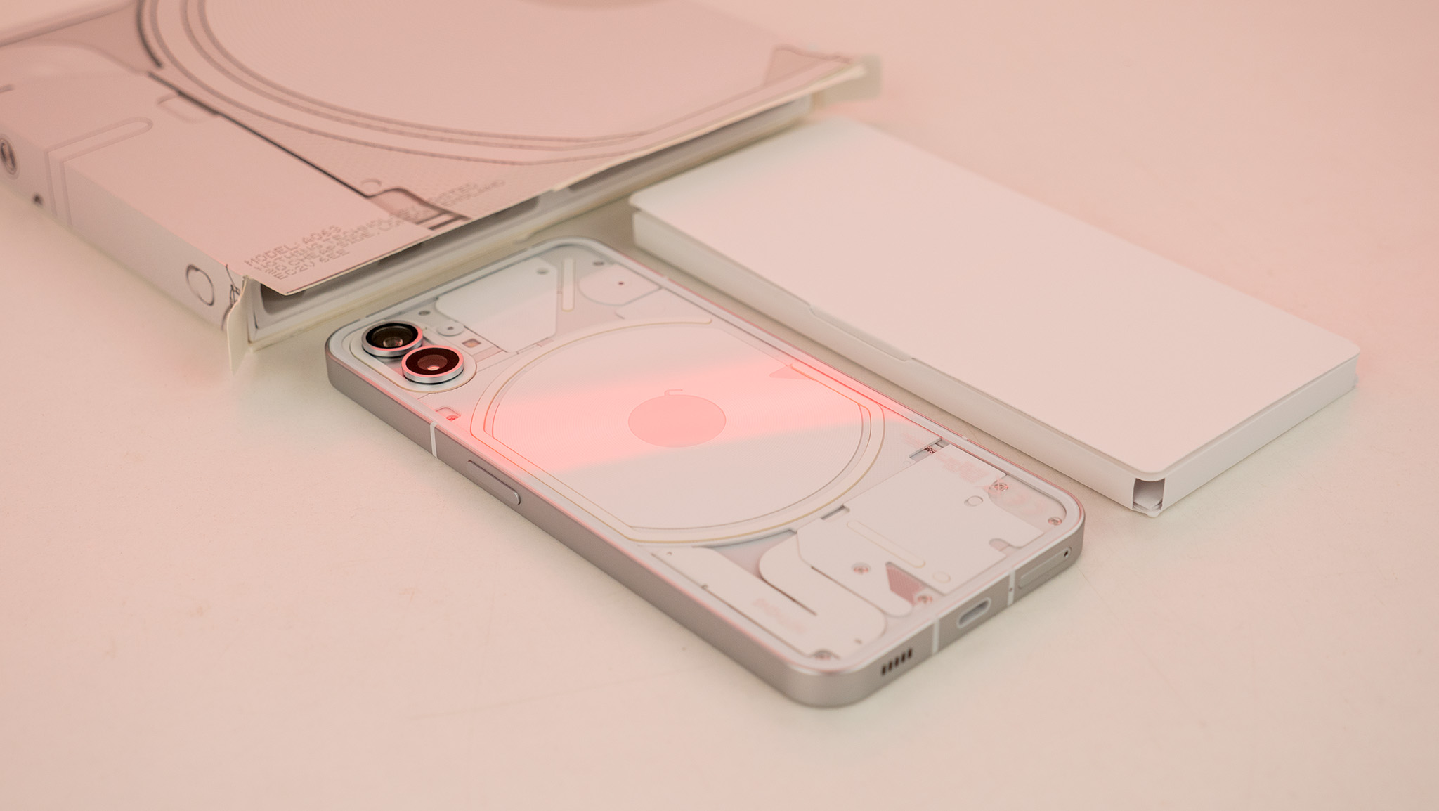
My time with the Nothing phone (1) at a briefing in New York City (and a bit of time at home since) showed me that this phone has the potential to really shine (pun intended) when it releases. That’s not just because it seems to be a really solidly built and designed phone, but also because the price just feels so right.
The biggest shame of it all is that it’s not officially launching in the U.S., leaving out a potentially huge market for Nothing’s first phone launch. Still, the counties that have official access — and, more importantly, support for the cell networks in those counties — now have a new choice that could very well be the best affordable phone we’ve seen in the past few years.
Harish Jonnalagadda will be doing our full Nothing phone (1) review over the coming days, but until then, I have pretty high expectations that this will be a must-have for folks looking for an upgrade this year.

