Google Maps wants to help you keep track of COVID-19 cases in your city

Get the latest news from Android Central, your trusted companion in the world of Android
You are now subscribed
Your newsletter sign-up was successful
What you need to know
- Google Maps will now show a layer dedicated to visualising COVID-19 area penetration.
- You'll be able to see a 7 day average of COVID-19 cases per 100, 000 people in an area. You'll also see whether the cases are trending upwards or downwards.
- It's rolling out this week to countries supported by Google Maps.
As COVID-19 cases spike globally, Google is taking steps to help users travel safely. It's had a few tweaks to the Maps and Travel apps to that end in the recent past, and now it's building in a new COVID-19 layer into Maps on mobile.
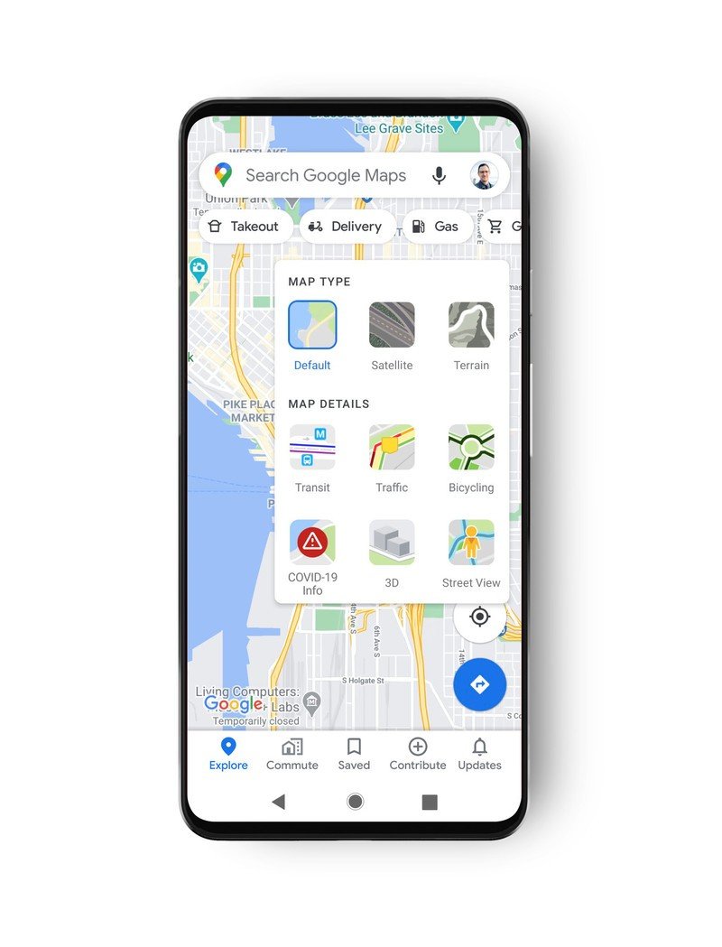
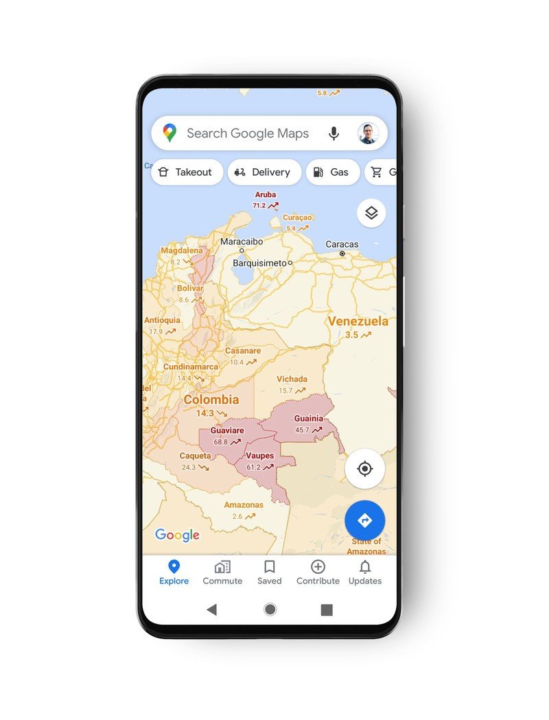
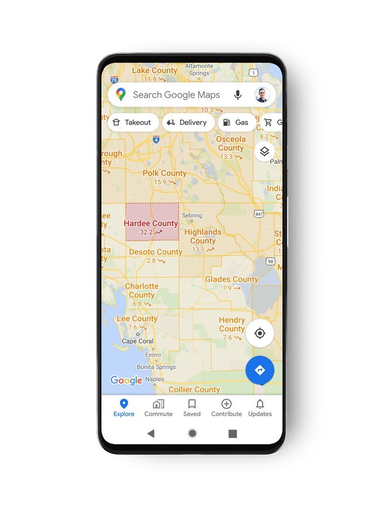
With the same ease that you're able to switch to a 3D view, you'll now be able to toggle on a COVID-19 layer in the Maps app. This new layer will show you a seven day average of the number of cases per 100, 000 people in the selected location as well as a label indicating whether the caseload is trending up or down.
The areas will also be color-coded for your convenience so you can tell them at a glance. Displayed per 100, 000 people, the colors are as follows:
Article continues below- Grey: Less than 1 case
- Yellow: 1-10 cases
- Orange: 10-20 cases
- Dark orange: 20-30 cases
- Red: 30-40 cases
- Dark red: 40+ cases
Source: Google
The new COVID layer will roll out this week on iOS and Android. Google says it has data for all 220 countries currently supported by Googe Maps with more granular data available where possible. You'll probably see that sort of fine data in places like London or New York which provide more detailed breakdowns, and Google notes that it'll be pulling information from the WHO as well as a other national and local health authorities.
How to stop Google Maps from storing your location
Get the latest news from Android Central, your trusted companion in the world of Android


