First look: The Carbon for Android Twitter app
Get the latest news from Android Central, your trusted companion in the world of Android
You are now subscribed
Your newsletter sign-up was successful
It's tough to talk about the Carbon for Android Twitter client without saying a few things up front:
- No, it's still not available. But that we've been given a pre-release version to share should tell you something.
- Yes, we're all very much aware that we've been talking about Carbon, off and on, for more than a year now. (A whopping six stories out of some 6,000 written over 13 months, if our math is right.) Announcements of imminent release have come and gone, followed by long periods of silence. You can either choose to get over that, read this preview and give this app a shot when it's released in the near future, or not.
- There are now two Carbon apps for Android. This one, obviously, is the Twitter app, from the developer dots & lines, which first brought Carbon to webOS, where it garnered much praise. It later came to Windows Phone before being put out to pasture, much to the chagrin of this Microsoft faithful. The other Carbon app is a backup and sync client from Koushik Dutta. We're not sure which app will see first public release (our money's on the backup app), but having two apps with the same name is about as fun for us as it is for you, we reckon.
- Carbon (the Twitter app) may well be the best-designed Twitter app we've used yet -- and there are some good ones out there.
So with those things in mind, join us for our first look at the long-awaited Carbon Twitter app.
Updated on Feb. 3: Carbon has been published to Google Play, and we've added a few sentences on the Settings menu, which was not in our preview build.
Article continues belowThe Carbon for Android video preview
The Carbon for Android preview
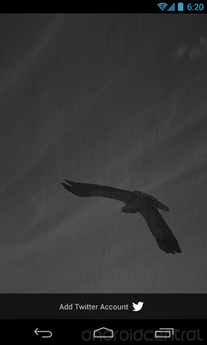
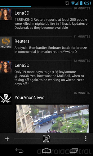
Fire up Carbon for the first time and you're greeted by the familiar hawk logo. (OK, familiar if you've used Carbon before, I suppose.) Logging into your Twitter account is the same process as in any other app. White-on-black themes aren't anything new, but Carbon's timeline design is cleaner than just about any we've used. Not throwing extraneous colors into the mix for links and Twitter handles makes a difference here. Not that those things aren't there, it's that your eye is drawn to the things that matter: Who sent the tweet, their avatar, how long ago it was sent, and the tweet itself.
You get four or five tweets on the timeline, depending on how long they are and whether there's any media attached, such as a Youtube preview or an image. (The Youtube API isn't implemented in our preview build, but it could be added later, the developer tells us. Look for a few other tricks, such as a Vine viewer, too.)
Get the latest news from Android Central, your trusted companion in the world of Android
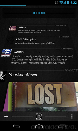
Pull down to refresh, and the timeline tilts on you to show that it's refreshing. It's much cooler than Android's stock method of a glowing light at the top of the list, and it gives it sort of a Star Wars opening crawl look. A number will pop up after the refresh, showing how many new tweets are in that timeline. (Be sure to note the animation here. Nice touch.)
Flipping between your main timeline, mentions and direct messages is as simple as swiping left and right. When you do that, little header icons will pop down. You can tap them to hop from one timeline to the other, if you prefer. There's no obvious way to jump to the top of a timeline -- and this is but one piece of functionality that differs from most other Twitter apps we've used. Instead, swipe down with two fingers to go to the top of the timeline. Or swipe up with two fingers to go to the end. It's easy, but there's no obvious way to know it's there (at least in our preview build).
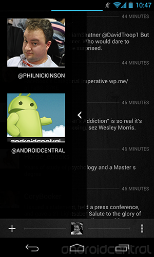
Swipe left from the main timeline (by swiping your finger right -- remember motions are all backward, which makes writing this sort of thing fun), and you get the accounts selector. Carbon supports multiple Twitter accounts, which is must for many of us. There are no unified timelines -- you're either looking at one account or another. We go back and forth on which we prefer. (We're admittedly a poor usage case for this sort of thing -- large accounts with a lot of @ replies make a mess out of things pretty quickly.)
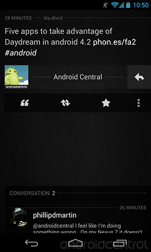
A couple ways to interact with individual tweets: You can tap on one to bring up the whole thing, and from there you get buttons to reply, quote, retweet and favorite. There's also an overflow menu (the three-dots menu button) that adds the option to copy the tweet, copy a link to the tweet, or share it via the usual Android sharing options.
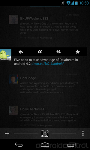
Or, if you don't want to open the individual tweet, you can long-press on it from the timeline to open up the reply/retweet options. (Don't linger too long on the screen here, though. Any vertical movement will start a timeline refresh, and the reply/retweet buttons will disappear.)
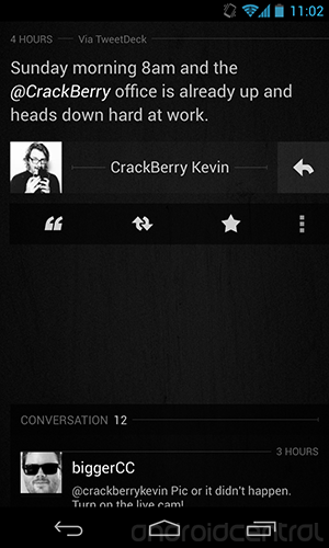
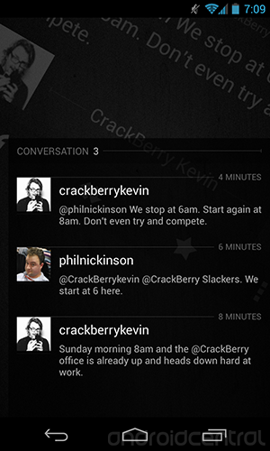
The conversation view -- in which you can see a series of tweets between you and someone else -- is downright beautiful. Start in an individual tweet and you'll see the replies at the bottom. Pull the tweets up, and the original rotates a bit and heads to the background, making way for the full conversation.
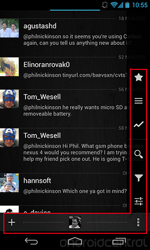
At the bottom of the timeline views are three buttons -- a "+" for composing new tweets, the avatar of the account you're currently using (tap it to view that profile), and another overflow menu button. Tap the latter, and from the right-hand side pops out more list options: Favorited tweets, lists, trendy trending tweets, search, filters and settings. (The settings options weren't completed in our preview build and only pulled up an account selector -- we'll update this post when the full version is released.) Again, there are some nice, subtle animations here.
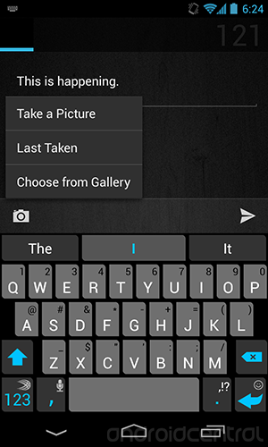
Composing a tweet isn't exactly rocket science, but it's nicely done in Carbon for Android. If you're using more than one account, you can choose from which you want to post here, but you can't post to more than one at a time. (That's probably not a huge deal for most people.) You've got a few choices for adding a picture -- take a new one, choose one you've already taken -- or you can chose the last picture you took with your phone. It's a cool feature, but on the other hand if I just took a picture and want to tweet it immediately, I'll probably share it directly from the gallery attached to the camera app instead of switching to a Twitter app first. Depending on how often you take pictures with your phone, there's a decent chance you won't remember the last shot you snapped.
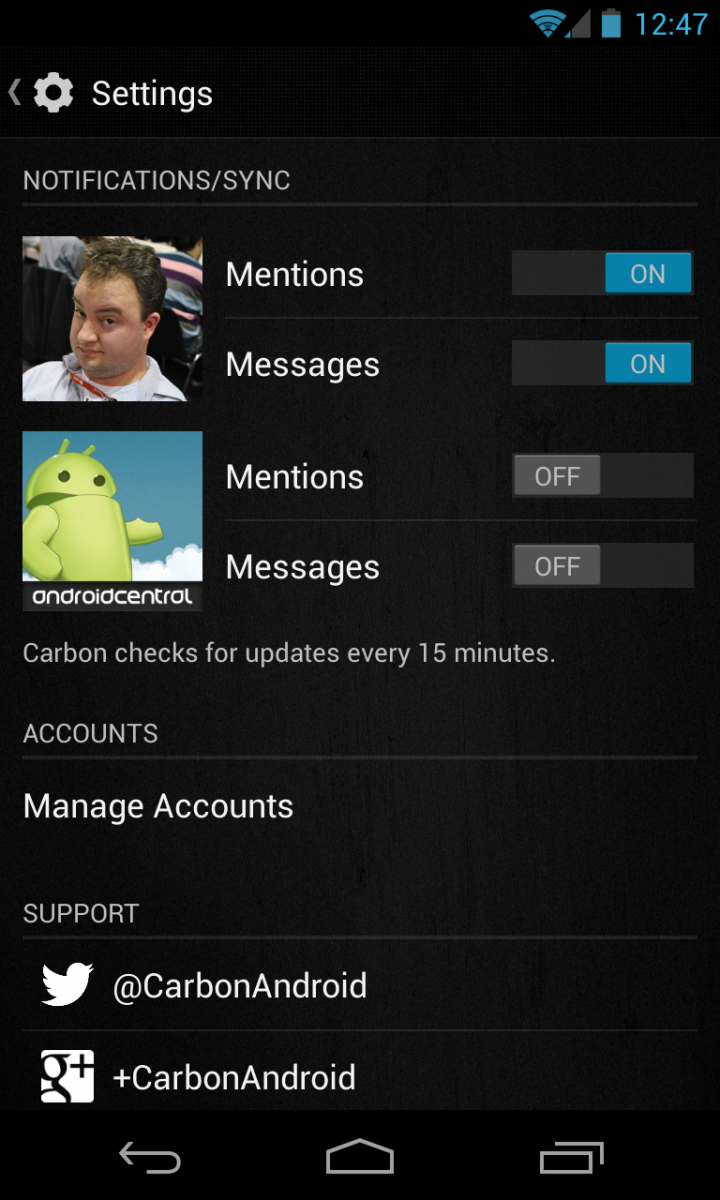
Updated Feb. 3: Here's a look at the Settings menu. Note how you can toggle which accounts will ping notifications. You've also got shortcuts to the accounts manager and to ping Carbon for Android for support.
Other initial thoughts ...
- The big question right now is "Is Carbon better than Falcon Pro?" And it's a good question. Falcon Pro, I think has more overall features. (Having, ya know, actually been released for a while helps with that.) But I think Carbon has a more sophisticated design -- and good design is tougher to do than implementing features. (Never mind that this is a preview release I'm using, and additional features are a given.)
- The good news on the comparison front is that Carbon for Android is going to be free when it's released to Google Play. So there's no harm in giving it a shot. (Though it will count against Carbon's Twitter token allowance.)
- Our preview build's not playing nicely with tablets, so we've got nothing to say on that front yet. Don't worry too much about that though. (Update: Ah. T'wasn't our place to say before, but the cat apparently has been let out of the bag. There will be a separate app dedicated for tablet layouts. More on that as soon as we get it.)
- Scrolling is ridiculously smooth. If your app doesn't scroll like Carbon, you're doing it wrong.
It's tough to find much to complain about in Carbon for Android. If anything, it'd be that there's a bit of a paradigm shift from other Twitter apps in that there are more gestures than traditional buttons, but that all leads to better design, and it's nothing that you can't pick up in a few minutes of use. But those changes could be a little more intuitive. (A quick initial "how-to" overlay could go a long way here.) And a few more features as we mentioned above wouldn't hurt things, but that'll come in time.
And, of course, there's the fact that you can't yet download Carbon. That's a big one, and the saga of its release is hardly lost on us. And after all this, we don't yet have a date to give you. (I'm trying real hard to keep from typing "soon.")
But we will say this much: After even just a few hours with Carbon for Android, you're going to give this one a shot. And it's going to be tough to beat.

