
Prime Video recently increased its subscription by $2.99 for an ad-free experience, yet its in-video navigation has been a big issue since its inception. Despite charging ever-increasing prices, many of these platforms still let users deal with their clunky interfaces. So why are streaming platforms forcing customers to pay more while offering an average user experience?
Platforms like Netflix, Amazon Prime Video, Max, etc., have replaced traditional cable subscriptions as a go-to source of entertainment. According to a recent study, Americans spend 20 hours a week on these platforms and pay an average of $46 per month for these services. The reason is the wide variety of content that is constantly refreshed on the platform weekly, sometimes even daily. However, in their pursuit of content acquisition, these streaming giants seem to be neglecting one crucial point—user experience.
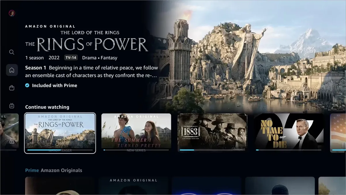
According to a recent survey conducted by Forbes Home, Amazon Prime Video has the second-highest number of subscribers in 2024 (200 million). However, only 14 percent of the respondents felt it was easy to navigate through its UI.
The woes of a clunky UI

For many users, fast-forwarding and rewinding or navigating Prime Video’s clunky UI can be bothersome. The interface sort of lags when you try to scrub within the video, making it difficult for users to gauge where they actually left off.
A Reddit thread showcases the problems users face today on Amazon Prime Video. One user even goes so far as to say that the platform has the worst user interface.
“Some of the original Amazon content is worth watching, but that’s all they have going for them. It’s truly hilarious that Amazon is one of the biggest corporations in the world. They spent $1 Billion on their ‘Lord of the Rings’ TV show, and yet they can’t even get something as basic as a functional user interface right,” a user added.
Another user comments that “much like Amazon’s product search nowadays, their Prime Video search is hot garbage. And now they’re adding ads; they might as well just give up altogether now.”
Richard Lachman, the director of digital media in the RTA School of Media at Toronto Metropolitan University, says people often don’t find features in common when switching platforms, which can lead to a frustrating experience. “Some features aren’t easily available, some are buggy, and some aren’t available on all platforms,” he added.
Amazon Prime isn’t the only platform that has been criticized for its UI. Hulu and Max (formerly HBO Max) also had users complaining about navigation inconsistency and overall glitchy UI.
Mia Eltiste, a user experience (UX) researcher based in Austin, Texas, reviews streaming platforms and their interfaces on TikTok. In one of her videos, she points out that Hulu’s navigation bar keeps disappearing when returning to the home screen. “Do not put your navigation on the top bar; put it on the side,” Eltiste states.
As users scroll down vertically, the bar keeps disappearing, but when it’s on the side, it’s easier to access. She adds that the platform should ensure the navigation bar is available on all pages—not just the home screen.
Moreover, while everyone feels that Netflix has nailed its UI, many feel the search bar still needs work, and watching the end credits of a series or movie seems impossible because the UI jumps to the next episode or movie you can watch. Android Central’s Jerry Hildenbrand agrees with the sentiment and says that he finds it frustrating to search for things to watch.
“Netflix looks nice and is easy to use, but it doesn’t show me enough content. Nobody wants to use the search from their phone, so it’s important to show me what ya got.”
Striking a balance between content acquisition and UI
Lachman says the business strategy for several of these platforms isn’t focused on user experience as a differentiator but on content acquisition. It gets to the point where some services are rushed to launch, “spending the bulk of their budget on content without mature tech/UX teams and a priority on understanding and responding to user experiences.”
He feels that user complaints about UX are not a reason people choose to unsubscribe to streaming services, but this is set to change as users start taking UI into consideration when deciding to leave or subscribe to a service. “If there are fewer players, all with high-quality content, then the UX teams may gain some priority in decision-making and budgets.”
According to Ampere Analysis, global streaming services are set to increase their total content spending by 7 percent in 2024 to $46 billion. Netflix will spend $17 billion this year acquiring content, while Amazon’s total video and music expense in 2023 was $18.9 billion.
Back in 2022, Amazon Prime Video redesigned its home page, giving it a modern facelift. The current UI features a simplified navigation menu, a new Live TV page, and redesigned carousels for better content discovery. However, this redesign focused on highlighting their broad selection of content and not on the basics of how the app functions.
How can platforms do better?

According to Eltiste, any platform that wants to improve its user experience should focus on being functional, reliable, and usable. Still, many companies don’t even think about it being a pleasurable experience on their platform.
Lachman says that a better way to approach UI is to focus on usage and content consumption. Companies should also pay attention to user frustrations and track social media complaints about the UX and product features.
In 2023, Max made some changes to its user experience amid the merger between HBO Max and Discovery Plus into one platform. Following complaints about its glitchy interface, TechCrunch reported that Max was set to gain an updated user interface with various improvements to deliver a seamless transition for existing HBO Max subscribers across most platforms.
Lachman notes that companies need to prioritize UX in budget, hiring, and strategy. “Make sure user experience champions are the key members of decision-making and empower them to dedicate resources to improving the interface.”
As the streaming landscape constantly changes, focusing solely on content acquisition might not be enough to attract or retain subscribers. Platforms also need to prioritize user feedback, which could help them retain their subscribers in the long run.

