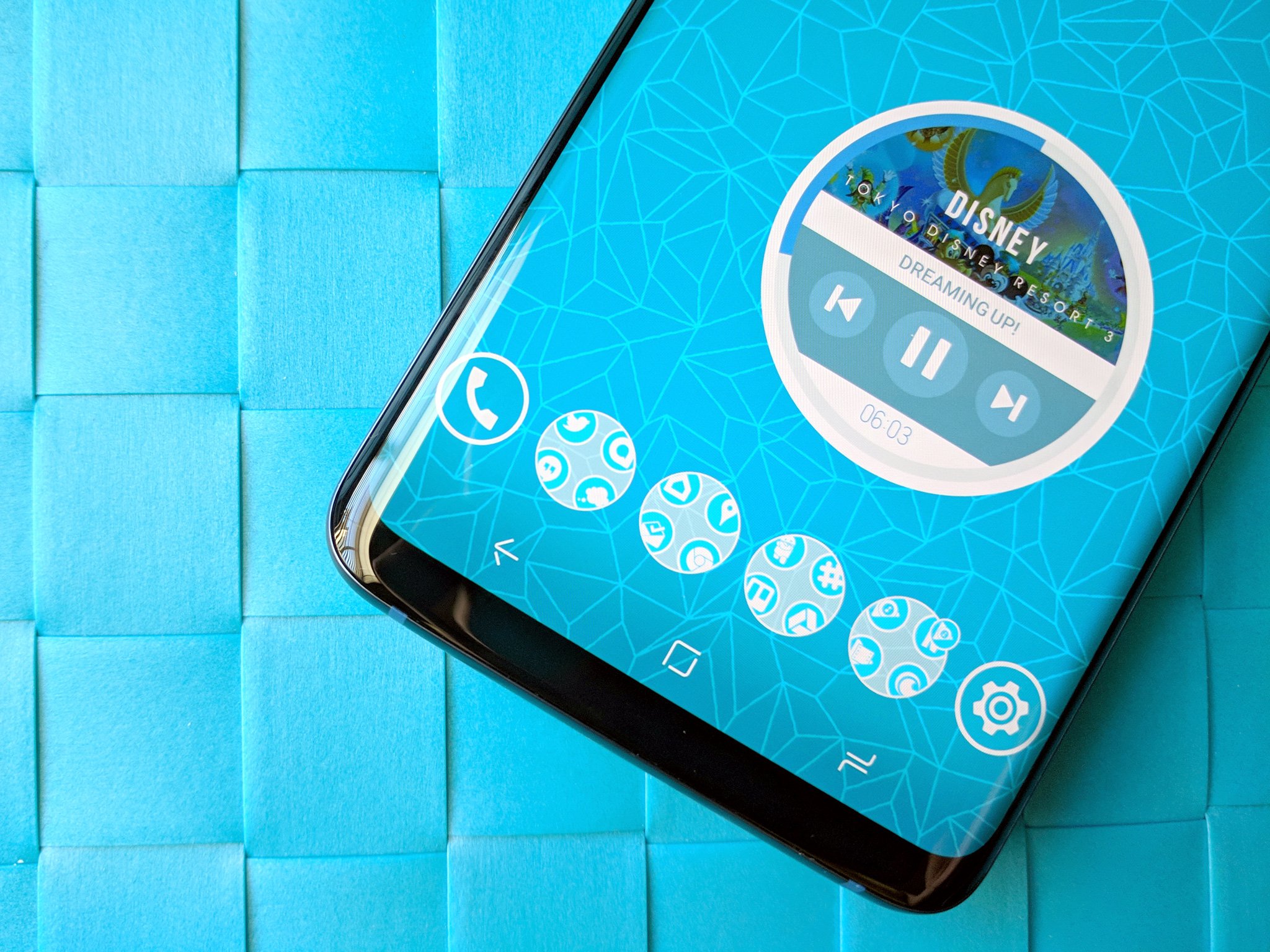
Icon Pack Studio means never having gaps in your app drawer again
Get the latest news from Android Central, your trusted companion in the world of Android
You are now subscribed
Your newsletter sign-up was successful
Adaptive icons and icon packs try to make our app drawers and docks look uniform, consistent, and beautiful, but they both have their limits. Where they fail, however, Icon Pack Studio not only succeeds but thrives. Whether you just want your apps to have a consistent look and feel or you want to create an icon pack that perfectly suits your budding themes, Icon Pack Studio is a fantastic tool to keep in your toolkit.
Even the best icon packs leave gaps. There are millions of apps in Google Play, to say nothing of third-party app stores, and it's impossible for icon makers to make specialized icons for them all in their packs. Icon masks help smooth over the gaps an icon pack can leave in your app drawer, and Icon Pack Studio helps users make an icon mask just the way they want it.
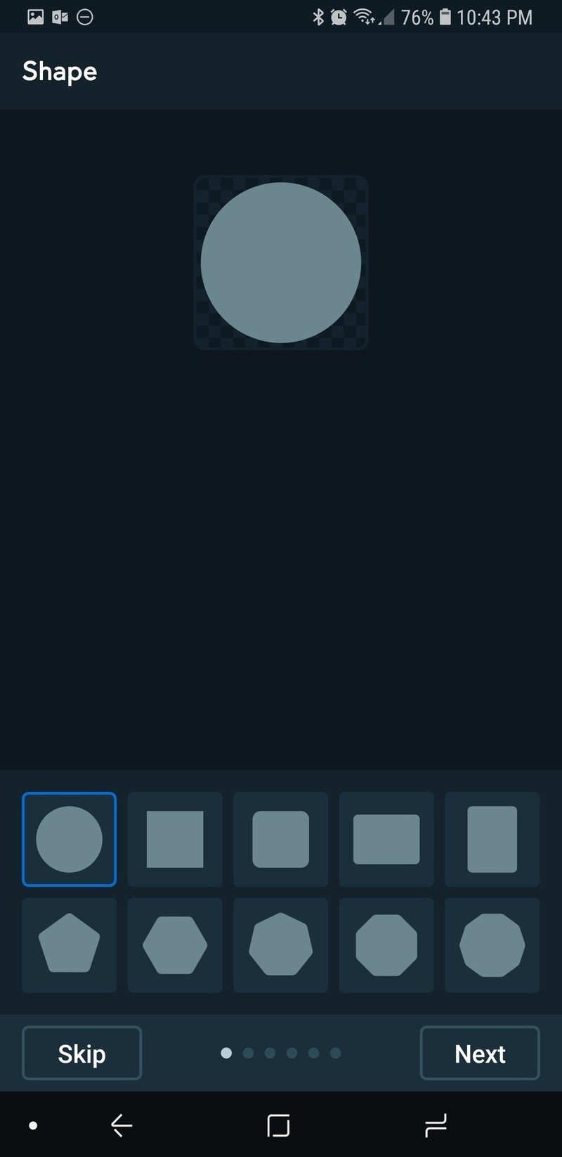
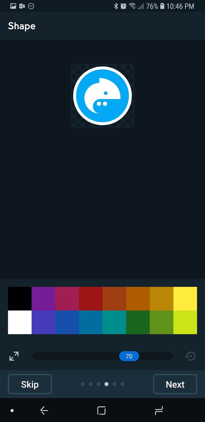
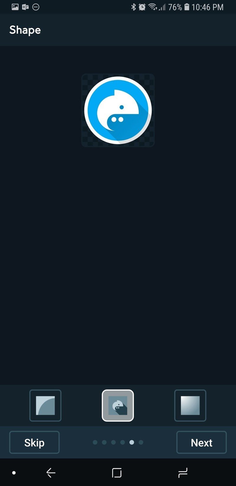
You go through the basic features when initially setting up your icon pack in Icon Pack Studio: picking a shape, a stroke, how big or small you want the logos in your icons to be, giving everything a color, adding some basic effects. It's once you've named your pack that you can get into the full editor and start doing some really cool things with your icon pack:
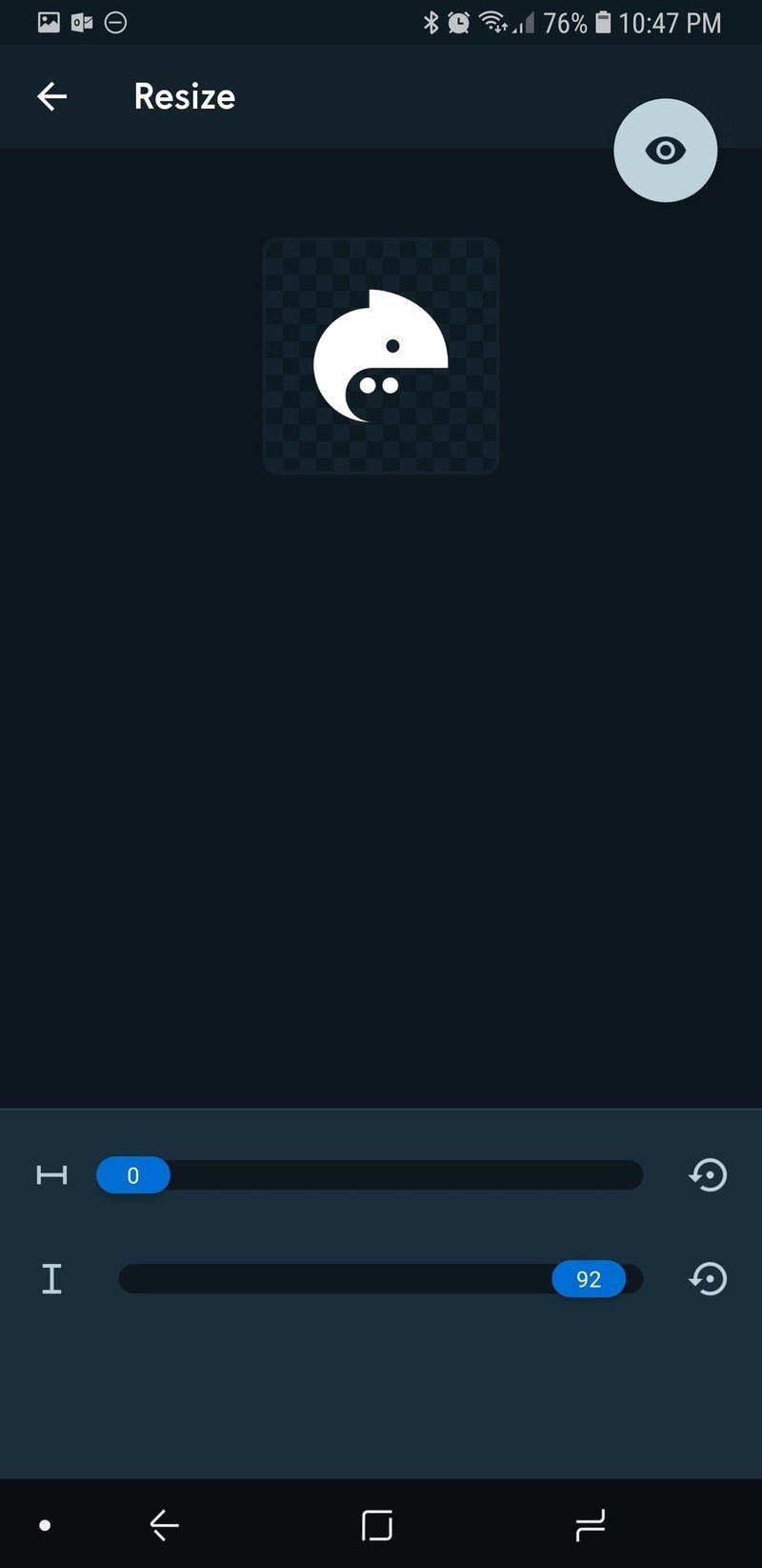
Article continues below- Don't want your icon pack to have a shape behind it? Resize the Background to 0 and you'll have a sweet monocolor icon pack, like a color-changable Whicons pack.
- Want see-through icons? The compositing options for Logo allow you to make semi-clear or completely clear logos in your icons?
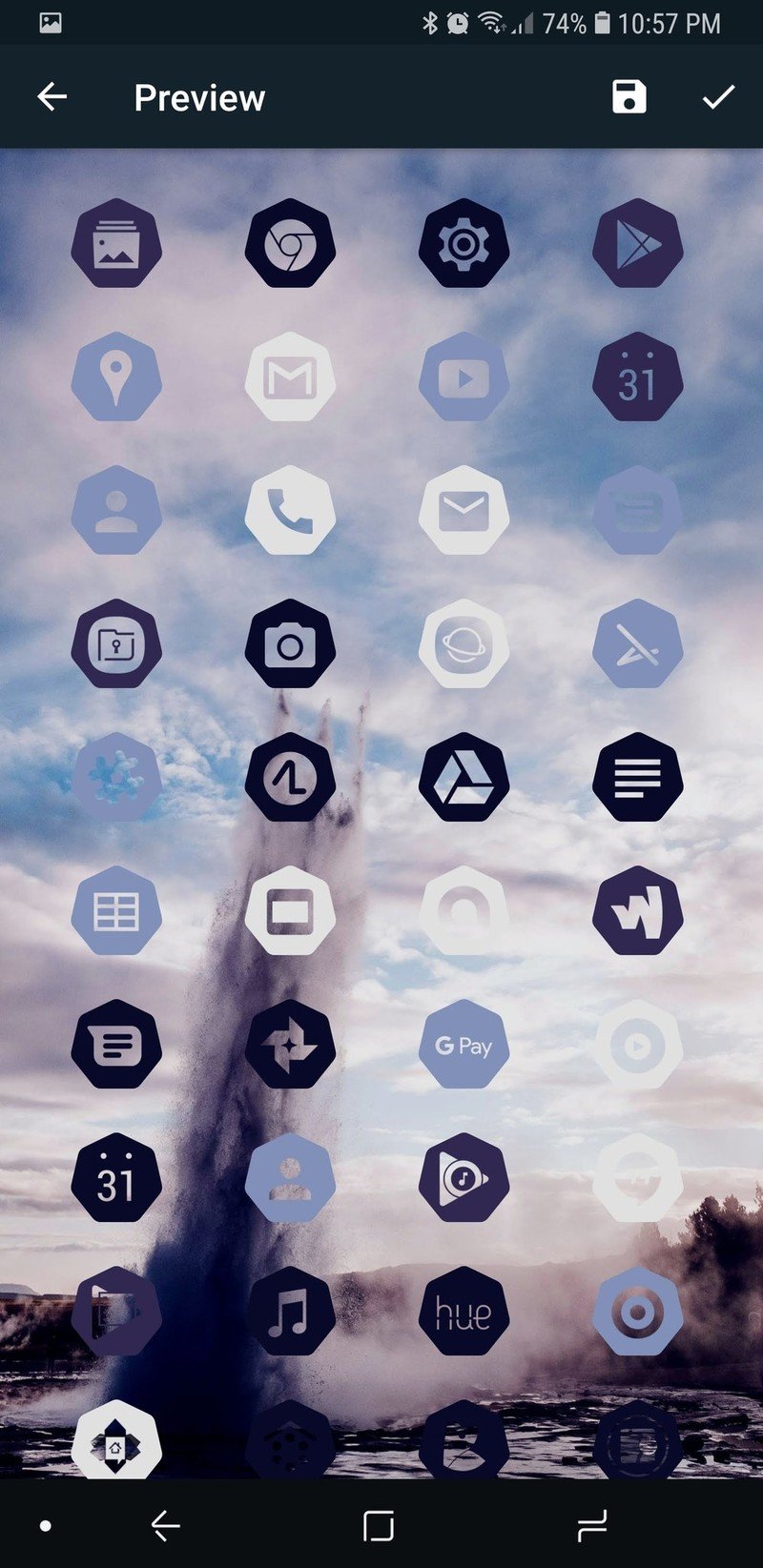
- Want your icons to match your theme? Icon Pack Studio can pull colors from your wallpapers — just like Action Launcher's Quicktheme — or even pull colors from your original app icons, making the Facebook app blue, Hangouts green, and so on. Pulling the app colors isn't always perfect, but the wallpaper colors are usually pretty dead on.
- An update this week also gave Icon Pack Studio a new option for color-picking: hex color input, so that you can match your colors precisely with other elements of your theme.
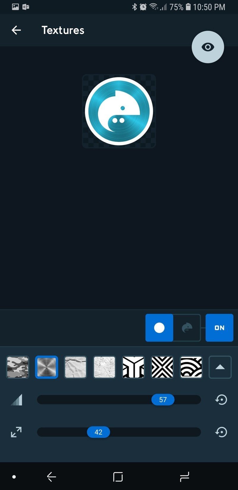
- Use textures to create unique metallic packs, camo packs, and geometric packs. The scalloped pattern makes for a cool mermaid icon pack. Many of the FX like this are part of the Material Bundle, a $2.49 upgrade that turns Icon Pack Studio up to 11.
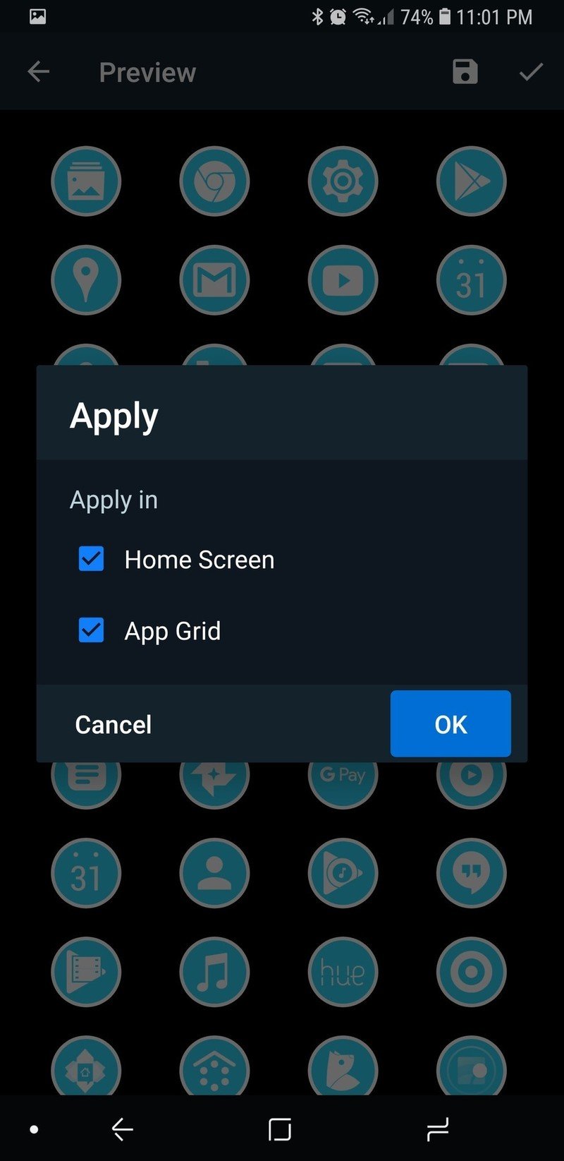
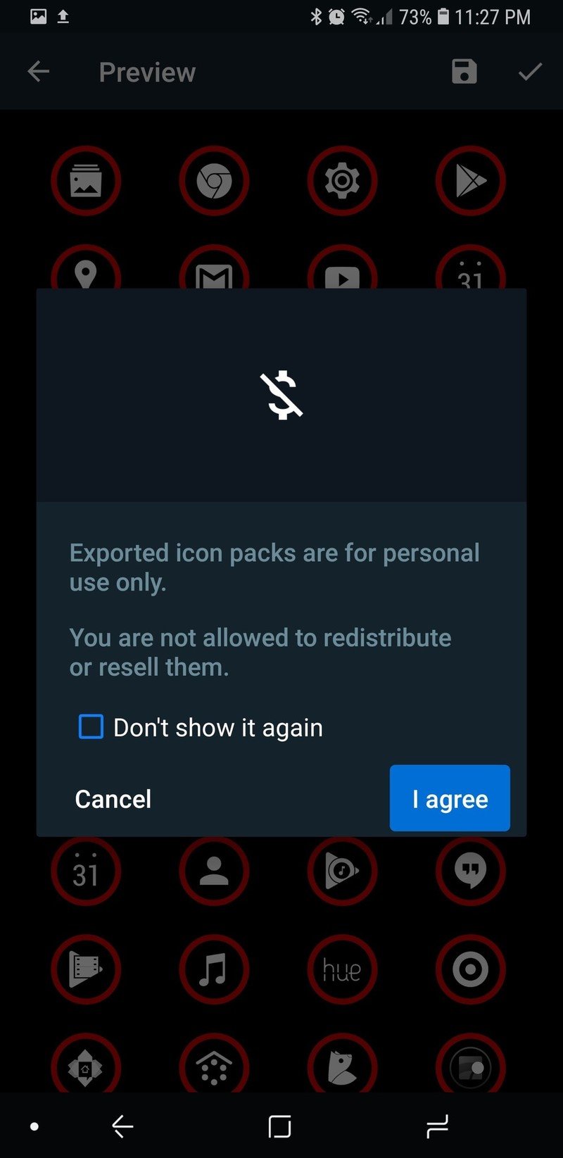
Once you've made an icon pack, you still need to apply the icon pack. If you're using Smart Launcher 5 you can do this pretty much instantly — after all, Icon Pack Studio is made by the Smart Launcher team. If you're using another launcher, Icon Pack Studio will export your icon pack as a separate app that can be installed and applied like a regular icon pack.
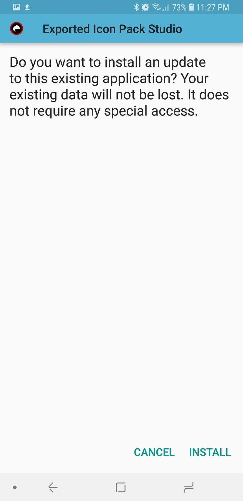
The export and install process is fairly painless, though you can only have one exported icon pack installed at a time, as every pack from Icon Pack Studio exports and installs as an app with the same name: Exported Icon Pack Studio. Since most launchers can only use one icon pack at a time, that's not really a problem, but if you bounce back and forth a lot between themes, be prepared to come back and re-export each time you switch — or consider switching to Smart Launcher.
If you're a themer that like to share your setups with others, Icon Pack Studio also got a heck of a lot more alluring with its last update, which allows you to Share the settings of one of your packs to someone else with Icon Pack Studio so they can import it and apply it in a few easy clicks. We'll cover that next week in our new Deadpool theme!
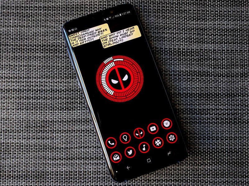
Icon Pack Studio is a great tool for building icon packs that perfectly pair with your wallpapers, and it's also a great tool for Smart Launcher to try and improve its functionality and image as a theming launcher. Whether you just want an app drawer that is completely consistent or you want icons that match each and every theme perfectly, Icon Pack Studio is for you.
Get the latest news from Android Central, your trusted companion in the world of Android
Ara Wagoner was a staff writer at Android Central. She themes phones and pokes YouTube Music with a stick. When she's not writing about cases, Chromebooks, or customization, she's wandering around Walt Disney World. If you see her without headphones, RUN. You can follow her on Twitter at @arawagco.
