Interview: Google's EK Chung on Android 9 Pie design, simplicity and digital wellbeing
Get the latest news from Android Central, your trusted companion in the world of Android
You are now subscribed
Your newsletter sign-up was successful
At first glance, Android 9 Pie looks very similar to Oreo — particularly to the casual observer. While it's true that Google didn't redefine the phone interface paradigm or introduce one huge category-defining feature with Pie, this release marks a considerable change in the overall experience of using Android. The change comes from a countless number of thoughtful design and user experience decisions to focus on a few main principles including simplicity and user-focused features.
I had the wonderful opportunity to speak with EK Chung, UX manager for Android handheld and Pixel at Google, to learn about the design philosophy and principles behind Android Pie ahead of its public launch. And though I've been using the Android P Beta since May, learning about how every single detail of Android 9's release came to be put the whole package into perspective: this is a big update.
Article continues belowSimplicity and speed are key
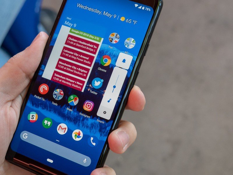
One thing that was clear from the announcement of the Android P Beta Program at Google I/O was that this latest release was going to be about restraint and simplicity. There were four core tenets to Pie's development, according to EK: subtract, combine, prioritize and clarify.
It comes down to four core tenets: subtract, combine, prioritize, clarify.
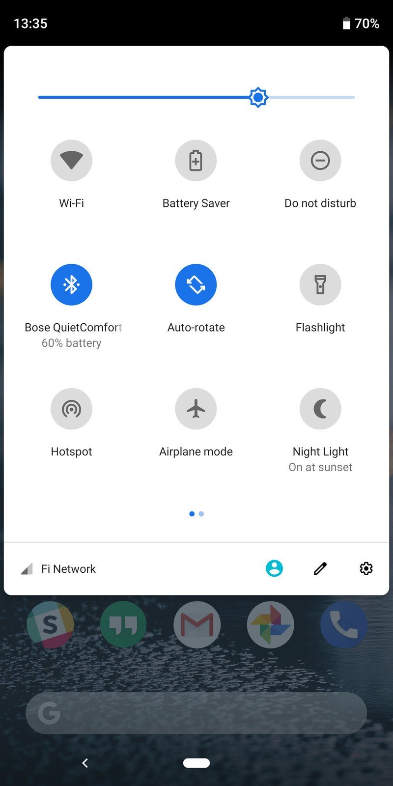
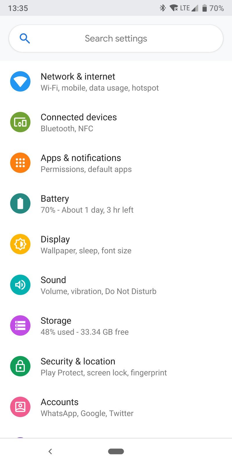
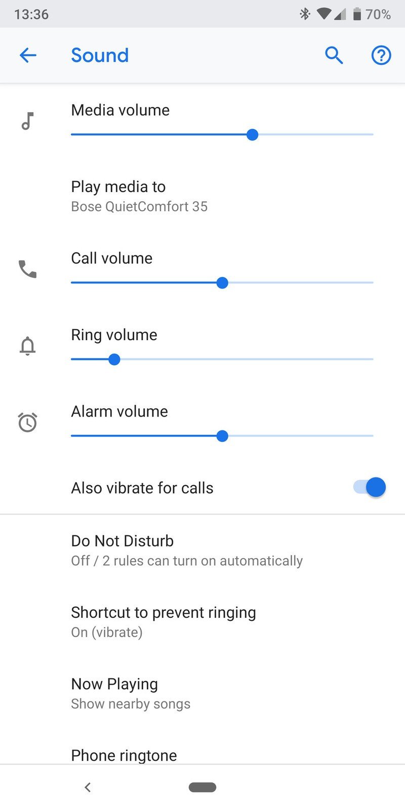
"Subtract" is pretty simple: if something is redundant or serves little purpose, it should be removed in order to have just one way to do each action. "Combine" follows the same logic: if there are multiple related actions, they should be in the same area; for example, the home button providing multiple options for navigation in a single area. "Prioritize" was a big one: making it clear to users what everything in the interface is designed for; look at the notification shade toggles and see that you can simply tap them for a quick change or long-press to enter the settings. Each button works the same way, and there's no longer a different action depending where you tap it. Finally, "clarify" — if anything is confusing to a novice user, it should be changed to be clear; think about how Pie's volume rocker switch simply changes the media volume, and that's it. Other volumes can be changed in the sound settings area only — look back to the "subtract" tie-in there.
The idea behind an overall simplification of the operating system with Pie is that not every person is a die-hard Android user — in fact, most people aren't. With Pie, Google wanted to make the system more approachable and desirable to everyone — and not just in terms of looks, but also how it actually works. And while it feels counter-intuitive, this simplicity benefits everyone — yes, even the power users among us.
Android is powerful, but it got a little out of control — it was time to simplify.
EK says that particular attention was paid to the subtle parts of the interface you won't inherently notice, like the transitions and animations: "There have been great improvements to our window manager on the framework side." In Pie, animations are "short and sweet" in an attempt to cut down on unnecessary wait time between actions. "The fluidity of transitions is A LOT better in Pie ... I will use the developer settings to slow down the animations just to show people and give the side-by-side comparison [to Oreo]."
Get the latest news from Android Central, your trusted companion in the world of Android
The goal of the transitions you see in Pie is to give the user a logical trail to follow so you don't get lost — you'll notice that the animations emanate from the place you tapped, and show the new windows coming and going from a deliberate location to let your eye follow the process. "This is a very subtle thing, but really helps users orient themselves — 'okay I tapped on this and then this object grew and became this full-screen app' ... it always helps users get a sense of what's happening and where the system is taking them." These are things we saw in Oreo to some extent, but the emphasis in Pie was to make it a universal requirement for the entire operating system.
About those gestures
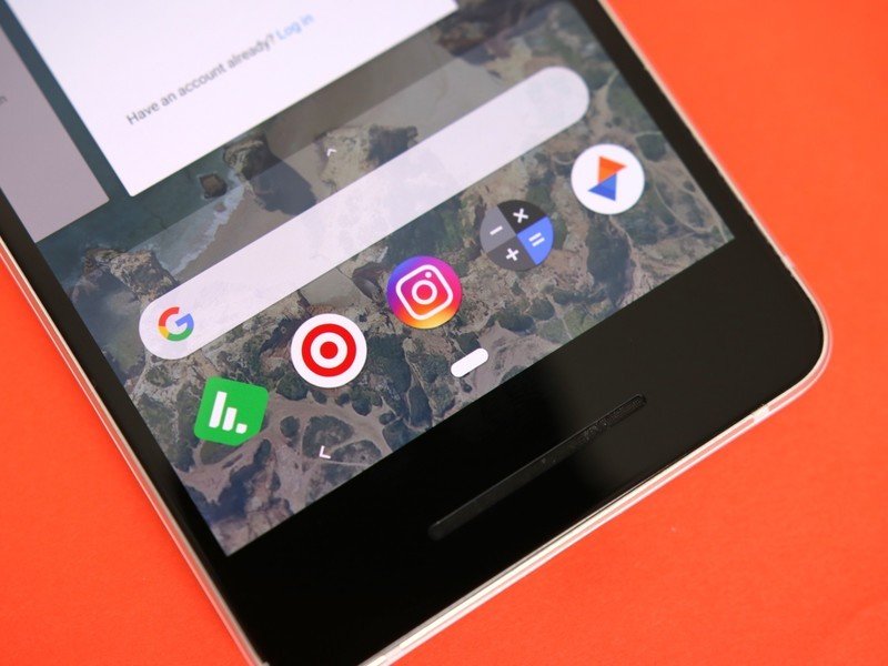
One of the biggest talking points of Android Pie has been its gesture navigation system, which marks the first functional change to Google's navigation since Ice Cream Sandwich debuted on the Samsung Galaxy Nexus in 2011. While it seems odd to those of us who have used every Android phone under the sun, EK makes an interesting point that "[Android users] are all familiar with what those buttons do, but people who are new to Android are puzzled by it."

Indeed, anyone who's been using an iPhone for years doesn't really have a grasp for what the buttons are supposed to do or why they're there permanently. In the case of the back button, it's still a necessary part of the interface — but now it's hidden whenever there isn't a function to go "back" in the app. The multitasking button, however, was primed to be replaced as user diagnostics showed very few people actually utilized it on a regular basis. So for EK's team, there was room to improve.
Testing has shown people can take to the gestures quite easily — even more advanced functions.
Interestingly, Google found early on that people took to the gesture system quite easily. The company conducted a longitudinal study with all sorts of "normal" consumers, giving them Pixels running Android 9 to test the new gesture system. After a brief teaching session, they were left to use the phones and the provide their feedback when they returned them. Surprisingly the most-loved feature, according to Ms. Chung, was the ability to scrub between apps using the home button in the gesture area. "They thought it was super-useful, super-fast, easy to use and powerful — all of the goals we wanted to hit. We were pleasantly surprised by that."
And make no mistake: this isn't just a fad or a test, Google is making this its primary navigation system going forward. While Pixel devices that are updated from Oreo will still see their three-button navigation by default with an option to switch to gestures, future Google phones (and any other manufacturer that wants it) will ship with gesture navigation turned on by default. And given how Google's promoted the gestures and shown them to perform well, I would expect them to be the only navigation on upcoming Pixels. If there's one knock on this new gesture system, it's that it won't be universal ... companies can still choose to ship with the old three-button navigation if they want, or use their own gesture system like OnePlus or Motorola.
Ed. note: This section has been updated to reflect that Google did not confirm that future Pixels will only have gesture navigation, simply that the default navigation system in Pie is gestures.
Deprecation of the traditional 'home screen'
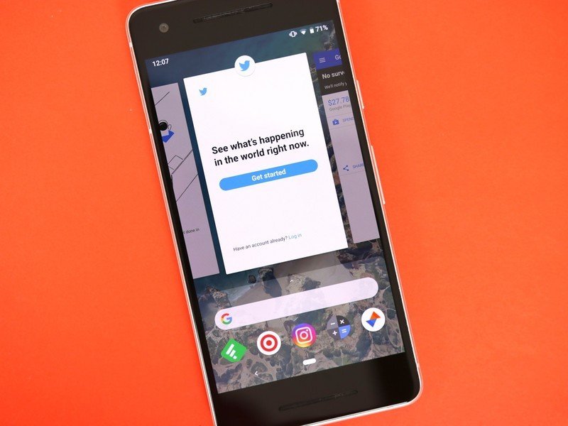
The new gesture navigation is an interesting bit of eye candy for the Pie release, but it's about more than just moving from three buttons to either one or two. It actually signals a reduction in the importance of the canonical home screen, shifting to an interface that focuses on streamlining the process of switching between apps and tasks.
EK's goal for the design was very clear: "When we look at the whole operating system, being able to switch between multiple tasks or apps is the fundamental function." Following the "simplicity" mission, it was important to change the home screen experience to better focus on getting people between apps and tasks rather than sending people back to a home screen over and over again.
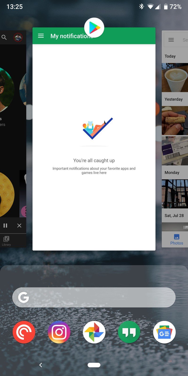
"This new design essentially merged the launcher functionality and switching functionality together into one swipe up ... we intentionally detached the bottom layer from the launcher to make it accessible from anywhere, even within an app." And it works! When you have the gesture navigation enabled, you're able to swipe up and access the app drawer and Google search box at any time, even when you're in an app. That's a fundamental change to the "app, home screen, app, home screen" paradigm, and it's extremely intuitive to me.
As for the app drawer essentially being a two-staged release that first shows a row of suggested apps followed by the rest of the apps, EK says it was a very deliberate choice based on user feedback. The numbers showed that 60% of the time when people swiped up from the bottom to display the app drawer, they took one of the suggested apps at the top. Google's algorithms that choose when to place apps there can be applauded, but it just goes to show how few apps people actually use on a regular basis. By making that interaction faster and simpler, it improves the speed of getting to the right app a majority of the time.
Digital wellbeing — more than limiting app usage
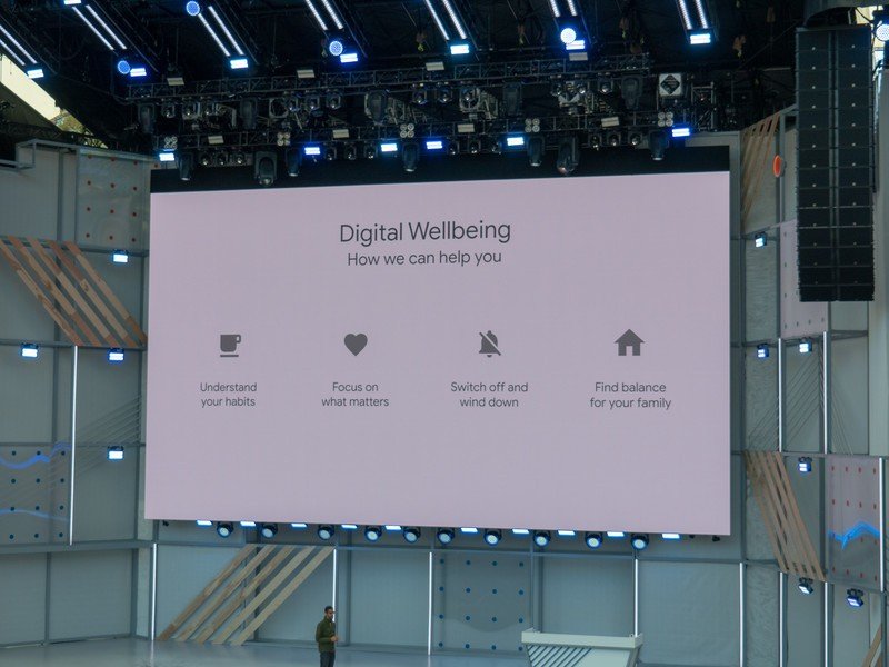
I'm a noted skeptic of Google's new self-described "digital wellbeing" initiative, mostly because the positing that it's designed to help you use your phone less feels misaligned with Google's true goal of getting you to use your phone (and therefore its services) more in order to make money.
Digital wellbeing is about more than just limiting how much you use specific apps.
It's easy to focus on the all-new features that let you track and limit specific app usage, or grey out your whole screen to make it less appealing to use, but there's far more to "digital wellbeing" than a couple settings. According to EK, it's an idea that's been applied to the entire operating system: "[Pie's interface] is all about high efficiency, and making your interaction with your device more meaningful and efficient so that you can get things done and then get back to what's really meaningful in your life ... actually simplifying how people get things done."
Pie helps you get in, do what needs done, and get out quickly.
It goes beyond forcing yourself to use Instagram or Twitter less — Pie is filled with little changes to the interface that are focused on making your interactions shorter and more efficient, so you can get the same things done with less time on the screen. Features like predicted actions, app suggestions in the multitasking view, and app slices can all help you get things done so you can get off your phone and back to the real world. "It's all related," EK says, "making the OS efficient, powerful and highly productive, that way you can get your time back and then think about how you use your device and then use the digital wellbeing features to provide a little nudge to yourself to limit your time."
The way she sees it, not everyone will feel the need to use the actual limiting features of Pie to force themselves to tone back on specific apps. The hope is that the system's simplicity and fluidity will help you get actions done quickly so you don't get to that point. I'm still unsure of how well this will work in practice, but this explanation makes far more sense than adding what feels like a tacked-on "wellbeing" feature to any other operating system — these changes EK is talking about make the phone experience better for everyone, not just those who feel incapable of setting their phone down.
Android 9 Pie may not be the most ambitious version Google has ever released, but it improved interaction and interface in so many ways it deserves appreciation as a complete package and its own distinct software, not simply a refresh of Oreo.

Andrew was an Executive Editor, U.S. at Android Central between 2012 and 2020.
