Google attempts to simplify its upcoming Duet redesign for Chrome on phones

Get the latest news from Android Central, your trusted companion in the world of Android
You are now subscribed
Your newsletter sign-up was successful
What you need to know
- Google has redesigned its redesign for mobile Chrome.
- The bottom bar in the Duet design now has only three buttons.
- The home page has also been changed — and not in a good way.
Google is once again tinkering with the design of its browser on mobile devices. Dubbed 'Duet,' the design aims to provide a more convenient browsing experience in today's world of 7-inch smartphones. The big change here is the company's decision to move many of the browser's tools and settings to the bottom of the screen, where they can more easily be reached via one-handed use.
However, Google wasn't satisfied with its initial idea and moved the URL bar back to the top, leaving everything else below. Now, the company is fiddling around with the design again (via Android Police), seemingly because its engineers think five buttons on the bottom bar are two buttons too many; it was already struggling with figuring out how to cleanly incorporate multiple elements via hidden and floating menus.

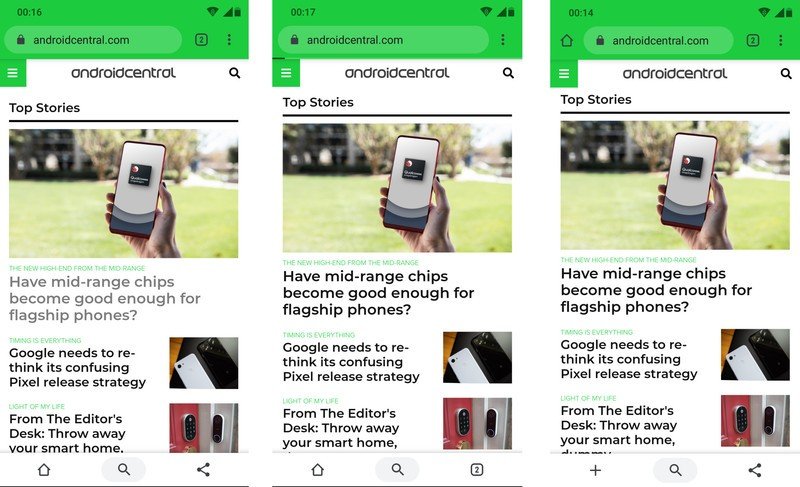
So, it's paring back the number of buttons at the bottom to just three. However, the company can't quite decide which of the three it wants to go with, so it's giving users a choice between different combinations, shown above. I suppose the company wants to let the users choose themselves.
Article continues belowThe three combos currently on offer are
- Home / Search / Share
- Home / Search / Tab Switcher
- New Tab / Search / Share

You can access these options via the Chrome Duet flag by inputting chrome://flags/#enable-chrome-duet into the URL bar. It's disabled by default, and if you simply select the 'Enabled' option, you'll get the first of the three.
Note that for the two variants that don't feature the tab switcher at the bottom, it's been moved up to the top, very similar to how Chrome looks without the Duet design. And the additional options accessible via the vertical ellipsis have now been moved to the top as well, for all three variants.
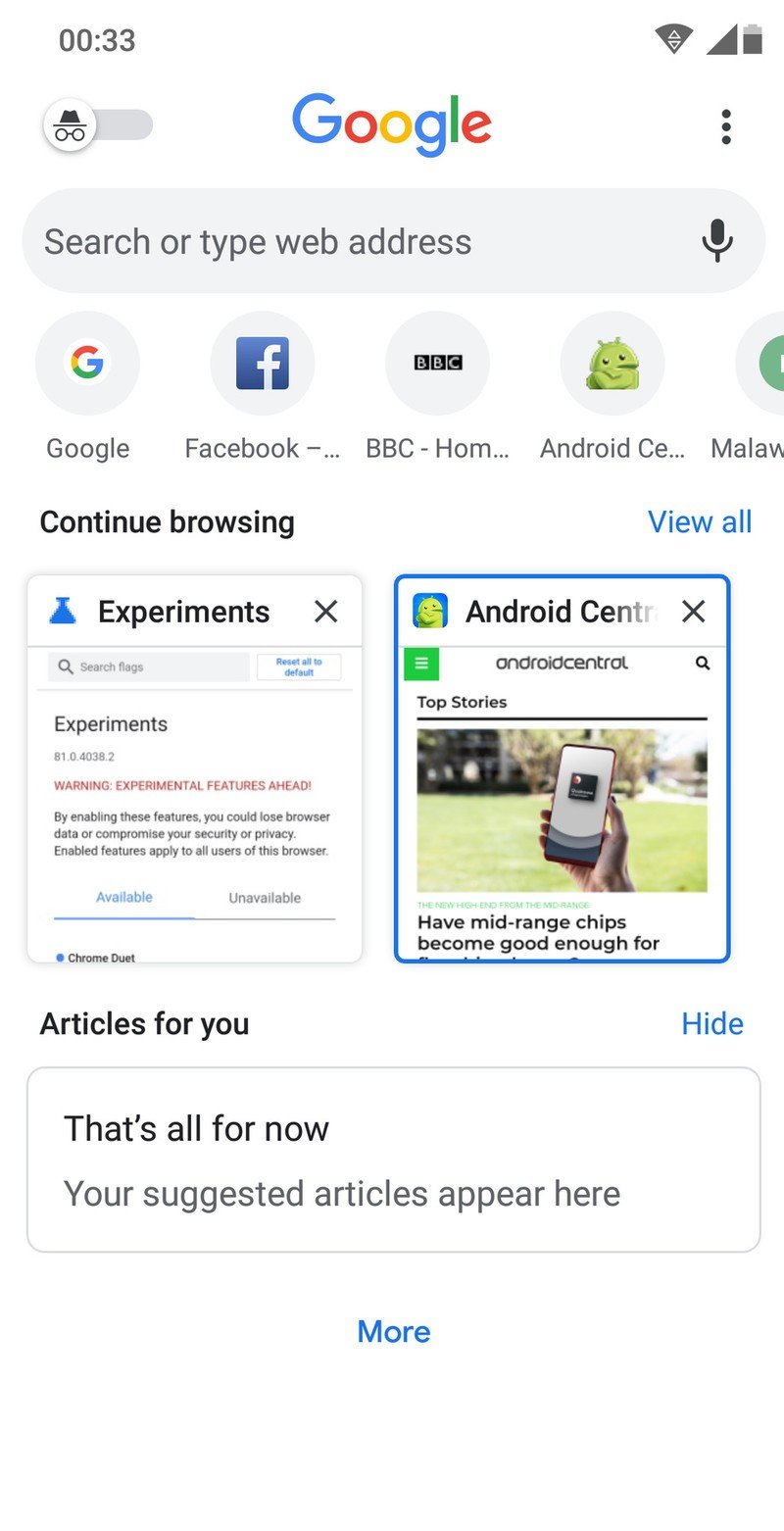
It's a pretty confusing state of affairs as it stands, not only because of the myriad options thrown your way but also because the new home page with this design is extremely cluttered and includes your favorites, previews of open tabs, and suggested articles all in the same place. Ugh!
Get the latest news from Android Central, your trusted companion in the world of Android
On top of that, all the options without the tab switcher at the bottom actually take you back to this gaudy new home page when you open the tab switcher, instead of the clean tab-switcher-that's-just-a-tab-switcher from before.
In its attempt at simplifying things, Google seems to have only made its browser more baroque and unappealing.
Google wants to make navigation in Chrome easier with new UI for tab groups

