Android launchers -- comprising the basic makeup of homescreens and the app drawer -- hardly are scarce. And they tend to share features, emulating the stock Android launcher while tweaking things and adding features.
Action Launcher is from developer Chris Lacy, the driving force behind the Tweet Lanes Twitter client, and it goes in a different direction, though still with some familiar features.
We've gotten a good look at a preview version of the launcher. Hit the break for our take.


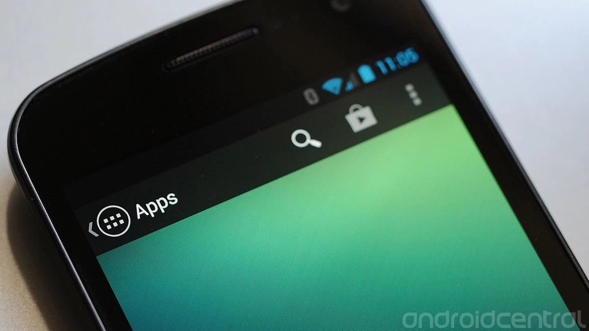
Action launcher is devilishly simple. It looks and feels like it's a part of stock Android. The visual cues are all there, from the fonts to the app icon itself, but It takes the app drawer and moves it from the dock at the bottom to the upper left corner. The Google Search bar is removed as well, transformed to a simple magnifying glass at the top of the screen, next to a shortcut to the Google Play Store. (And that means I can take the Play Store out of my homescreen apps folder.) To the right of that shortcut is a menu button, which expands to options that allow you to customize the homescreen (including adding app icons and widgets), manage your existing applications, duck straight into the system settings, and to tell your friends about Action Launcher (via the usual sharing intents).
That customizations menu is "a notable design decision," Lacy tells us. "The standard launcher's app drawer is a bit of a jumble, in that it serves multiple purposes (customization and launching apps)." That widgets are in stock Android's app drawer but wallpapers remain elsewhere was another cause for concern for Lacy, and so they're in the customization pane as well.

Where things get really interesting is with the app drawer. For starters, it's now in list form, with little thumbnail icons. Scrolling on the list is excellent, though we'd still prefer to be able to pare down that list some. Lacy agreed. "Finding an app in the sliding drawer does take a bit of time," he said, adding that options to customize that list are in the works. "For now, using the scroll bar on the right allows you to jump to the bottom of the list." Lacy also reminds us that this list scrolls far quicker than the stock launcher's horizontal pages.
But even though it's a pretty radical departure from how we traditionally use the app drawer in grid form, we grew pretty comfortable with it.
The other fun -- yes, fun -- feature of the new app drawer is the way you access it. There's the button in the top-left, of course, which you can hit at your leisure. Or, you can press the phone's home button again from the homescreen.
But our preferred way to get to the apps list is to to the extreme left homescreen, then keep panning that direction. A simple swipe opens the app list. (It's a paradigm not unfamiliar to anyone who's dabbled in Winodws Phone, actually.) A swipe back toward the left (moving your thumb to the right, since motions are all backward) closes the list and returns you to the home screen.

And you know what? This all works. Maybe it's because we're happy to see something new, and because it works well out of the box. Action Launcher also just works. Will it work for you? Maybe, maybe not. And we're happy to see that it'll be marketed with a free version and a premium upgrade, which will unlock more options. So you can give it a whirl before shelling out some cash.
Lacy says options that will be unlocked in the premium version include gestures, unread counts and other configuration options. He's also got "a really, really cool feature planed" that he's keeping under wraps for now.
Price has yet to be determined, but Lacy says it should be competitive with other third-party launchers.

