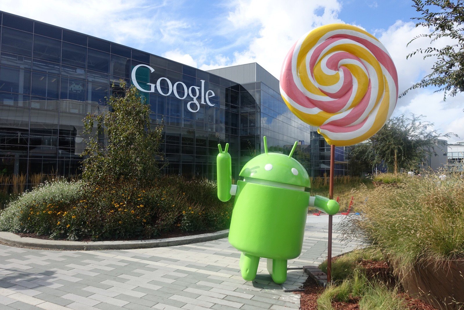
With the new Android 5.0 Lollipop release, Google's OS enters its third era. The first saw the scrappy platform achieve early success on smartphones, with devices like the Droid series and the first Samsung Galaxy handsets, paving the way to later dominance of the category. The second era was characterized by the important Android 4.0 Ice Cream Sandwich release, which introduced a new focus on design, including the "Holo" visual style, and also allowed Android to gain early traction on tablets.
And now we're seeing the most important Android release in at least three years. Though we're just now getting to use it on Nexus handsets, Lollipop is about much more than smartphones. It promises to establish Android in new device categories like TVs, cars and smartwatches — and eventually an Android runtime on Chromebooks will augment Google's desktop presence. In its third era, Android is no longer just a mobile OS — it's an everything OS. It's the new embedded Linux or embedded Windows — a ready-made, feature-rich, and now design-rich OS — and Google wants to bring it to every screen you use.
Nevertheless, mobile remains the largest growth segment (to say nothing about being what we do), and that's what we're going to focus on in this review. Appropriately, there are a number of important new additions for traditional mobile devices like phones and tablets. Lollipop introduces Material Design, Matias Duarte and co's new design language for the whole of Google, along with improved battery life thanks to the "Project Volta" initiative, and a rethinking of the way Android devices handle notifications. And that's before you consider important under-the-hood tweaks like the new Android Runtime (ART). To put it simply, this is one of the biggest Android updates ever.
Article continues belowLet's dive deeper into the depths of Android 5.0 Lollipop in our full review of the OS.
Material Design
The new design language for Android — and the whole of Google
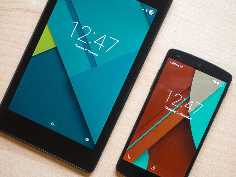
Google's various properties across mobile devices and the web have long been a mish-mash of assorted visual styles. Material Design aims to change that, bringing a coherent design language to the whole of Google, starting with Android. At the core of Material Design is the concept that pixels and surfaces have not only width and height, but also depth. Material brings magical paper-like surfaces to the whole UI, while also overhauling the the way these surfaces move and interact with each other. You could call it skeuomorphic, in that surfaces do mimic real life objects to an extent. However that's not really what Material Design is about.
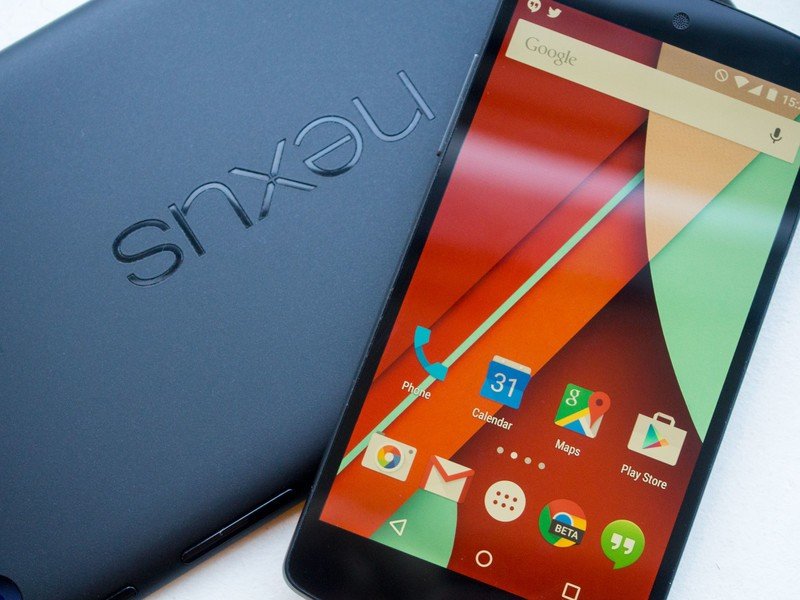
Material is flat, sure, but what sets it apart from the drop-shadowed rectangles you might find in other user interfaces is the way it behaves. Whereas most UIs have windows appearing out of the ether and disappearing away into nothing, there's now a very physical relationship between everything on-screen. New apps slide up from the bottom of the display. The notification shade collapses down with a pleasing elasticity. The app drawer explodes into view out of the related button. Menu blocks and other controls radiate out bursts of energy from the point of touch. The result is something that's much more natural — and frankly, more fun — to interact with than the previous iterations. In essence, Material Design feels like an interface for touch first, not a traditional computer UI that just happens to use a touchscreen.
Get the latest news from Android Central, your trusted companion in the world of Android
It's true that this makes Android more visually busy than before, but for the most part it's done in a way that's not overwhelming or cluttered. There are a few instances where things do seem a little over-animated, like Google's a bit too keen for you to enjoy all these beautifully-animated transitions. For the most part, though, Duarte and his team have struck a pretty nice balance.
Material Design is the new design language for the whole of Google, bringing magical paper-like surfaces and whimsical animations to Android and other products.
The rich, drop-shadowed surfaces present throughout Android 5.0 can be seen as an evolution of Google's "cards" metaphor, introduced a couple of years back in Google Now and other products. Nowhere is this more apparent than in the "Overview" menu, which is the new way to switch between apps. Press the new, square-shaped button and you're now presented with a Rolodex-like stack of cards representing your applications. These cards persist even between reboots — similar to iOS's multitasking setup — so there's always a breadcrumb trail to follow.
Lollipop also allows developers to have their apps create multiple cards in the new task-switching menu, and the main example you'll come across right away is Google Chrome, which shifts away from the in-app tab-switching interface in favor of a new "cards as tabs" dynamic. This means individual Chrome tabs live alongside your other recent apps, and that can get a bit confusing and cluttered, especially given how busy this menu tends to get. What's more, in our experience switching tabs by pressing the task-switching key isn't quite as quick as we'd like on some devices. Fortunately you can switch back to the old Chrome tabs setup in the settings, so that's easily fixed.
Things also get a little weird on tablets — on the Nexus 9 and Nexus 7 in particular, especially in landscape mode, the new Overview screen doesn't make the most of these larger displays.
On the whole, though, it's a welcome change. Other multitasking setups, like HTC and LG's grid-based arrangements, may offer greater information density, but Google's stack of virtual cards feels more natural to scroll through, and more enjoyable to use. And that's helped along by the colored headers seen in Material-optimized apps.
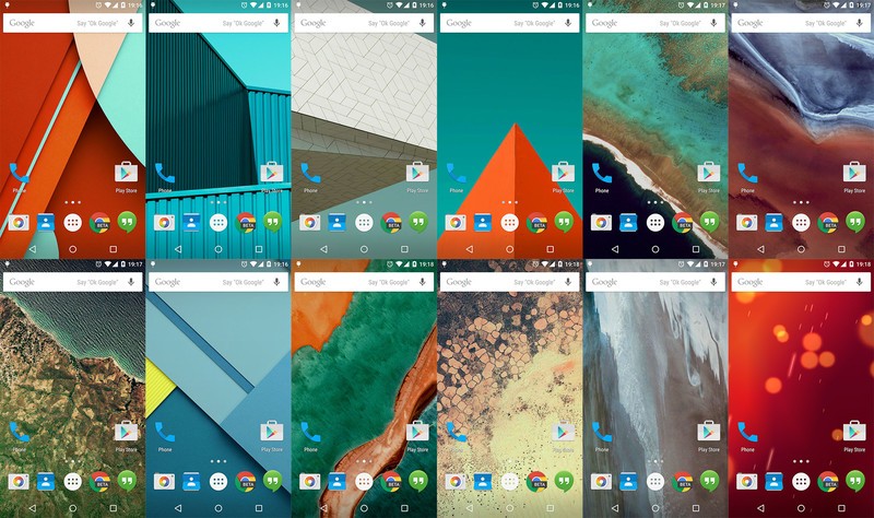
Lollipop is more colorful than previous Android versions, but it's colorful in a way that feels meaningful and considered, not clownish.
Colors are an important part of Material Design in general, and as such Google has published a guideline color palette to help designers pick primary and accent shades. New APIs in Android 5.0 also allow developers to draw colors out of images — such as album art or contact photos — and use them as background shades. As a result, Lollipop is more colorful than previous Android versions, but it's colorful in a way that feels meaningful and considered, not clownish.
We're seeing hints of this in the handful of apps that have been updated for Lollipop, including many of Google's own apps, which have inherited strong primary colors. Elsewhere, however, there's still a lot of Holo-style light grey going on, including Google offerings like Photos and Drive. These don't necessarily look bad, but they're a far cry from the bold, richly colored app mock-ups demonstrated with the announcement of Material Design.
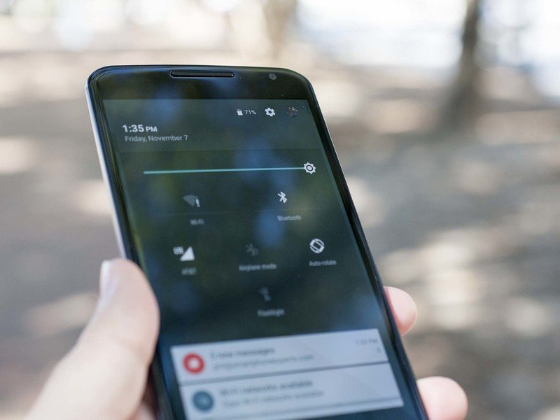
For all of Google's efforts, there are also a couple of areas that seem a bit over-designed. The arrangement of quick settings in the notification shade — now accessed by swiping down again — feels a little arbitrary, while the lack of key boundaries on the new Google Keyboard makes things feel less precise. These are relatively minor complaints, though, considering how significantly Android has been overhauled in this release.
Clearly it's going to take some more time to get the whole of Google fully Materialized — to say nothing of the third-party apps faced with the same design challenges. And then there's the question of what third-party manufacturers will do to Material Design when they get their hands on it. It's almost inevitable that Lollipop's going to lose some of its luster when paired with an LG or Samsung skin.
Lollipop features and apps
The changes are more than skin deep...
Major design changes in Android necessitate an all-new suite of Google apps, and that's exactly what Lollipop brings.
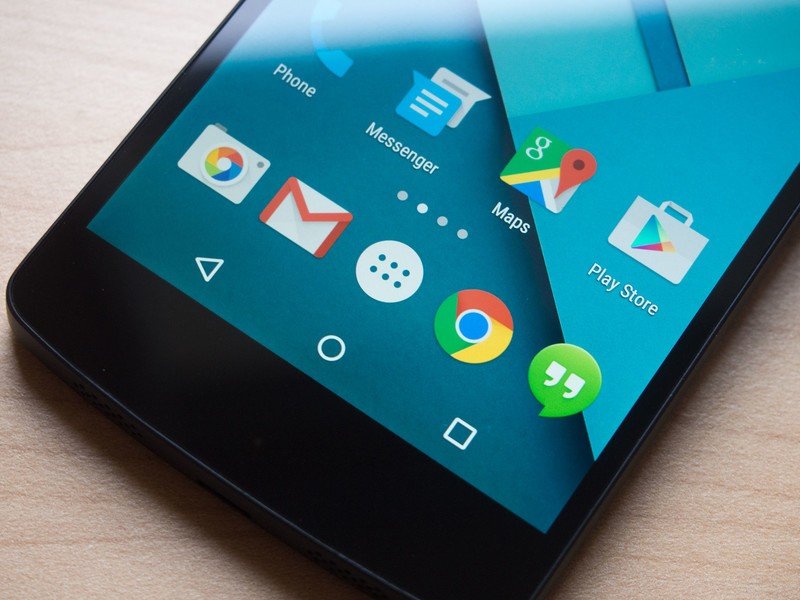
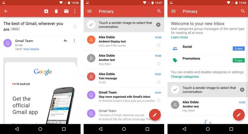
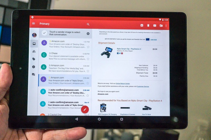
Major design changes in Android necessitate an all-new suite of Google apps, and in recent weeks we've witnessed a gradual rollout of new apps on the Play Store. The Material updates to apps like Gmail, Google Calendar, Play Music and the Play Store itself have given Android owners on KitKat and Jelly Bean the opportunity to experience Google's new design language, albeit without some of the new animations and transitions. On Lollipop, however, these apps are right at home, giving the whole Nexus software experience a cohesion that it's perhaps lacked in previous years.
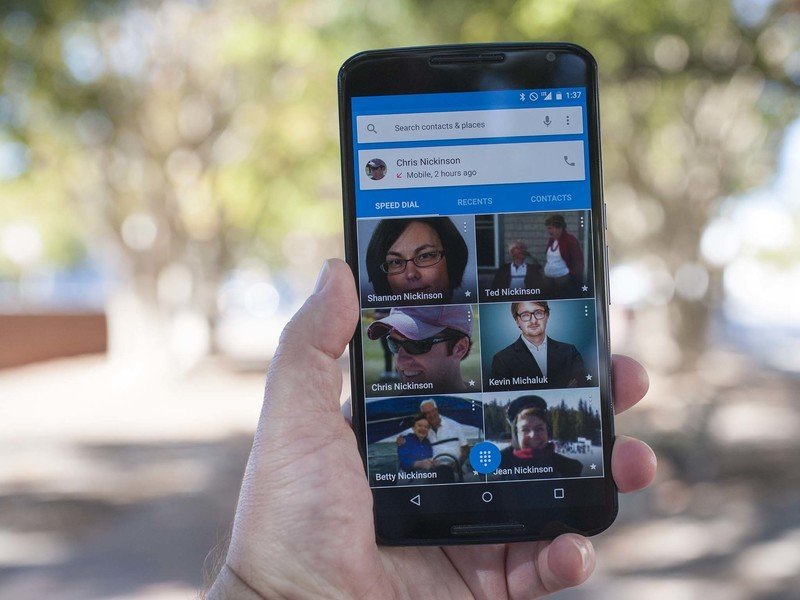
If we were to nit-pick, there are small inconsistencies to be found. The go-to complaint is that the slide-out menu bars — and the buttons that control them — look and behave slightly differently between apps. And at the OS level, we have a few niggling complaints with the new lock screen shortcuts for the camera and dialer, which seem to want you to drag them towards the center of the screen, but only activate if you pull left or right.
Regardless, these are minor and fairly pedantic complaints, and many Google apps have taken a quantum leap forward. The Gmail app, last overhauled in 2011, has been completely revamped with eye-catching red accents, sharper typography and fresh new animations. Google Calendar is smarter than ever, including events from your Gmail if you allow it, while sprucing up your events with photography and maps from Google's vast archives. Elsewhere, the Google Play apps — Music, Movies & TV, Books, etc. — also get a light splash of Material-inspired color, with new icons and animations to boot.
It's the little things that make Material Design and Lollipop such a joy to use.
Arguably though, it's the little things that make Material Design and Lollipop such a joy to use — the attention to minor details that most users will, in all likelihood, barely notice. The new screen-off effect, for instance, not only fades out the display, but shrinks it back and desaturates as it disappears from view. The three-line "hamburger" menu icon folds in on itself to form an arrow, and back again, when opening menu panels. And the background color of the Clock app slowly changes as day turns to night. Such attention to detail is unprecedented in earlier Google products, and evidence of the company's commitment to its new design language.
So Android 5.0 brings about some pretty huge design changes, resulting in the platform's biggest visual refresh in years. However that's not the only reason we're jumping a full version number this time around.
Lollipop continues a trend that started back in KitKat, bringing important new features that make vanilla Android more useful to normal people, not just tech enthusiasts.
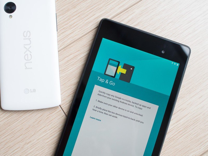
First and foremost is the re-vamped setup experience you'll see when you power on a Lollipop device for the first time. Not only does it look prettier, with new graphics and a lighter, more welcoming personality, it also makes things a whole lot simpler if you're moving from an older Android device. The easiest way to do this, provided both support NFC, is to use the new Tap & Go feature — hold both phones back-to-back when prompted, and then Google's cloud magic takes over, restoring your apps and preferences to your new phone.
Alternatively, you can choose to restore from a backup of a previous device, and if you do this you now get much more control than before. Lollipop's setup assistant lets you pick a specific device to restore from, and even tag selectively restore apps.
That's a big, much-needed improvement to the out-of-box experience, and we'd implore the other manufacturers and wireless operators to not destroy it. What's still not so great (or pretty horrendous, if we're honest) is the experience of updating apps and getting set up once you're dumped to the home screen. Even on the very latest version of Android, there's a maze of app updates and Google Play Services upgrades to worry about, and these are handled in a way that's often slow and error message-prone.
Maybe that's something for the next version of Android to tackle.
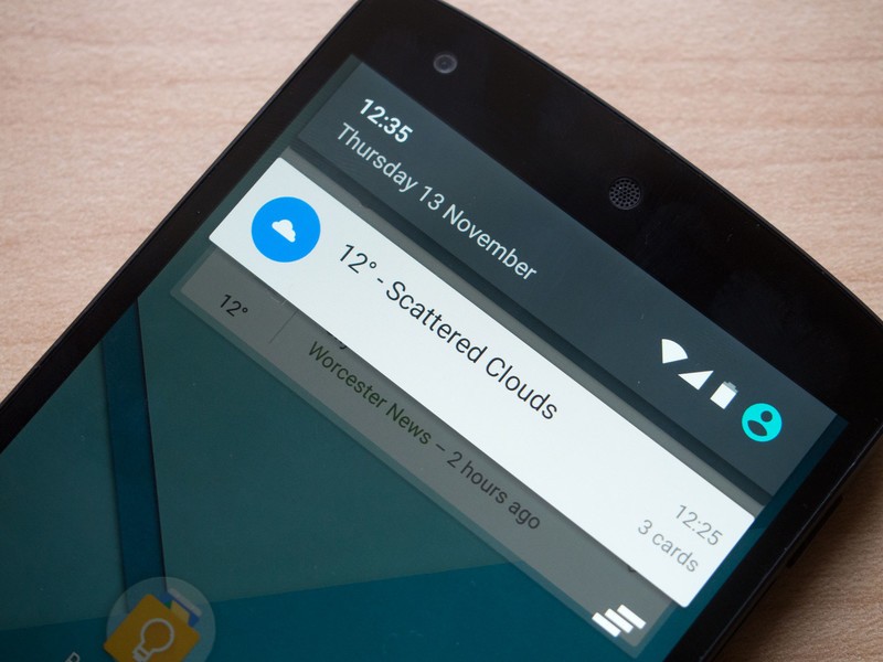
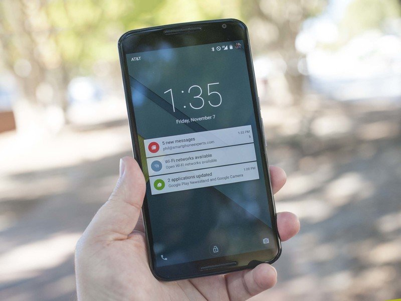
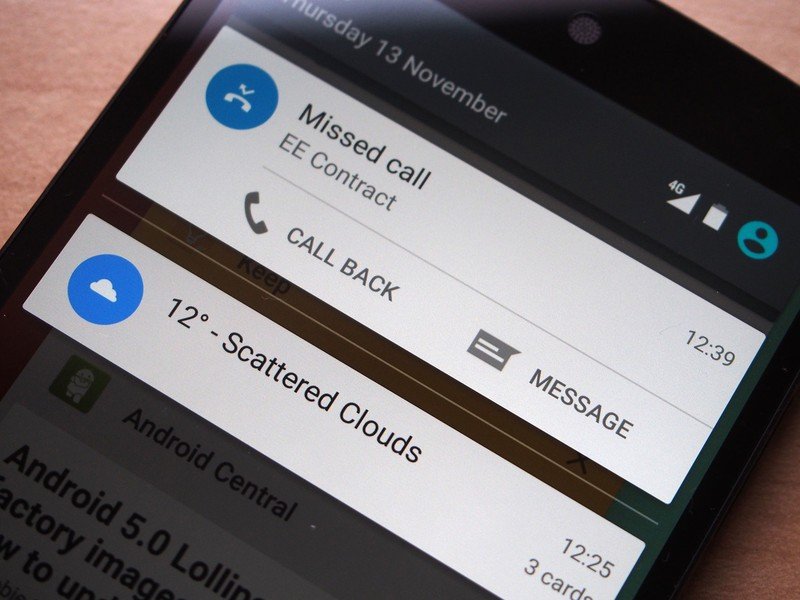
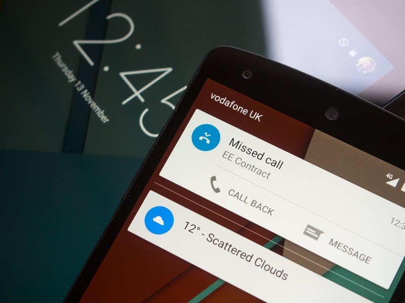
Android's rich notification system has always been one of its strengths, and Lollipop introduces some of the biggest notification changes in the platform's history. For starters, notifications now appear as floating, Material-style cards, in keeping with the new design language, and they pop into view and expand with pleasing animations that match the rest of the OS.
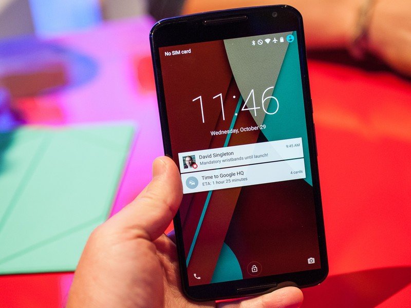
At a more functional level, though, the big news is that notifications now live on your lock screen, making it easier to see important stuff with fewer taps. On the Nexus 6 there's also an Ambient Display mode, similar to the Moto X's Moto Display, that lets you see a preview of notifications while your phone is locked. For the privacy-conscious, there's the option to hide the contents of sensitive notifications like emails or messages from the lock screen if lock screen security is enabled. It's unclear which other devices will get Ambient Display, as it's somewhat dependent on the Nexus 6's AMOLED display, which uses very little power when displaying text on a black background.
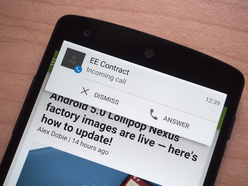
The new heads-up notifications let you see more information, and act upon it, without interrupting what you're doing. For example, if you're playing a full-screen game and you receive a call, a heads-up notification will let you see who's calling, and let you accept or dismiss the call then and there. Some Android phone makers have incorporated similar features for calls and texts, but not this functionality is available for all apps to use.
Android's rich notification system gets some hugely important improvements.
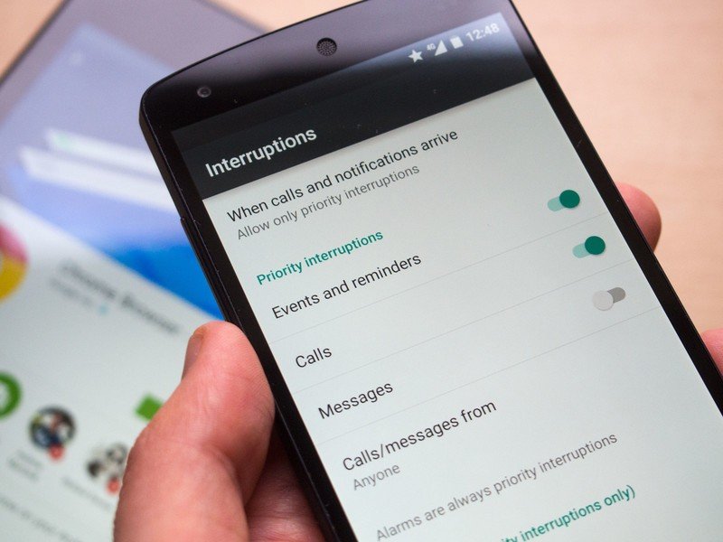
Lollipop also brings more control over when you'll see your notifications. Priority mode lets you choose to only be interrupted by the important stuff — calls and messages from particular people, or apps that you specify under Settings > Sound & notification > App notifications. And you can also specify periods of "downtime," during which only priority notifications will be shown.
All of these improvements make one of Android's key features even better and more useful for busy working people. But there's one nagging part of Lollipop's notification setup that seems bizarrely over-thought to us. The normal mute function is gone. If you want your phone to stop making a sound at all, you need to switch notifications to "None," which blocks absolutely everything, including alarms. If you think about it, it kind of makes sense. But it also lacks the simplicity and familiarity of a big ol' mute button, and that's going to lead to some confusion. It feels like an overengineered solution for an everyday problem.
Multi-user support has been part of Android on tablets since version 4.2, and in Lollipop it's come to phones as well. In addition to your main account, you can create additional users by tapping the profile icon in the notification shade. That's all well and good, but what's more useful is the new Guest mode, which lets you hand your phone to a friend without also giving them the keys to your digital life. Guests get a limited selection of apps, and they can't see your stuff without knowing your lock screen PIN or pattern, if you have one.
Google has focused on security at all levels, from app pinning and guest mode, to SELinux and device encryption.
Similarly, the new "app pinning" feature lets you lock your device to a single app, with a long-press of the back and task-switching keys required to unlock it again. It's not going to stop a determined friend (or frenemy) from breaking out and messing with your stuff, but it might just be enough to keep your kids in an app of your choosing.
Google's also gotten serious about other areas of security in Lollipop. Another feature borrowed from Motorola is Smart Lock, which can use a trusted Bluetooth accessory or NFC tag to unlock your phone automatically. As we've seen using Moto's Trusted Bluetooth feature — and the handful of apps that mimic it — this is a great way to keep your device relatively secure without having to constantly enter an unlock code. If you use a smartwatch, fitness band or any other kind of accessory, it's really a no-brainer. Every phone should have this.
Under the hood
ART, Project Volta and more ...
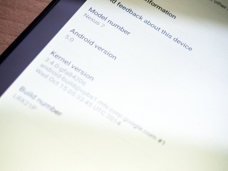
Each major version of Android brings countless under-the-hood changes — stuff most end-users will never see — and Lollipop is no different. Developers get more than 5,000 new APIs to play with, and Google has been hard at work making Android faster and more efficient.
Security has also been enhanced, with SELinux Enforcing by default, reducing the likelihood of devices being compromised through software vulnerabilities. And devices that ship with Lollipop will be encrypted by default, making it much more difficult for sensitive data to be pulled off the device. As Android looks to broaden its appeal to enterprises, both features make perfect sense. And Lollipop's business credentials will be strengthened with the eventual arrival of Android for Work, which draws on Samsung's KNOX technology to allow personal and work-related data to coexist safely on the same device.
Performance and battery life are two things you can never have enough of on a mobile device, and these areas are the focus of important low-level improvements in Lollipop.
The new ART runtime gives Android apps a free performance boost.
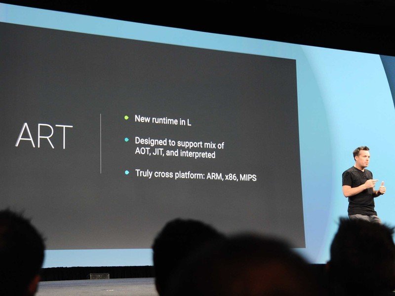
The new Android Runtime (ART), first introduced as a developer option in KitKat, is now the default runtime in Lollipop, replacing the old Dalvik virtual machine as the main way Android runs applications. ART is important because it essentially gives every app a free performance boost, thanks to changes to the way Android apps are compiled into native code. Previously, apps had to be compiled on the fly as they were run (just-in-time compilation). ART uses ahead-of-time compilation, meaning apps are instead compiled at installation. This means apps perform faster, and it's also more efficient, as you're not constantly having to compile the same code at runtime.
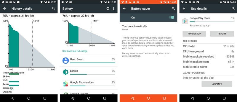
"Project Volta," meanwhile, encompasses Lollipop's efforts to improve battery life by streamlining background processes and making it easier for developers to track the battery cost of their apps. Just as Project Butter in Jelly Bean let developers see the performance cost of their apps, Volta provides tools for measuring the battery cost of apps' background activities. What's more, the new Job Scheduler feature lets developers intelligently schedule background tasks to run within a certain time period, or when certain conditions are met, for example when the device is on Wifi, or charging.
Volta isn't a magical solution to Android battery life woes. However, as more developers take advantage of the Job Scheduler and tools for measuring power usage, Lollipop device owners should reap the benefits. And you'll also find a number of user-facing features in Lollipop for making the most of your device's battery. The new battery stats screen shows an estimate of how much longer you've got left. And for the first time in stock Android there's a power saving mode — similar to those offered by most major phone makers — that limits CPU speed and background data in order to save power.
Android 5.0 Lollipop:The Bottom Line
That's a lot of new stuff.
The next generation of Android phones and tablets have a solid foundation to build upon.
Android 5.0 Lollipop packages up an comprehensive design overhaul with important new features, both in front of and behind the scenes. While Google's transition to Material Design may not yet be fully realized, Lollipop is a crucial first step on that road. Meanwhile, vanilla Android becomes more usable for normal working people with new notification additions, as well as features like guest mode, Smart Lock and priority alerts. And it's important not to underestimate the impact of low-level changes like the ART runtime and Project Volta, which should make it easier for the next generation of Android phones to offer faster performance and improved longevity. Based on what we've seen of Lollipop so far, the next generation of Android devices have a solid foundation to build upon.
As with previous versions of Android, you'll get the most of Lollipop if you've fully bought into the Google ecosystem, with Google Now on your home screen, Gmail and Calendar working away to organize your messages and events, Play Music giving you unlimited streaming access, and Google+ automatically backing up your photos. Maybe you've even got an Android Wear smartwatch on your wrist, and Google Fit tracking your exercise. It seems Android gets Googlier with every release, and that's especially true of Lollipop. Six years after its inception, Google's master plan for Android is plain to see: a smartphone platform drawing from every corner of its vast empire.
What's needed now is a way to push this big, important out to the hundreds of millions of active Android devices across the globe. "Fragmentation," for want of a better word, is built into Android's DNA, however there are already signs that updates might be quicker this time around, at least on flagship devices. LG claims to be first with its G3 Lollipop update. Motorola has already signed off on updates for the 2014 Moto X and Moto G. Samsung looks to be pretty far along with its own Lollipop updates. And HTC has promised updates for its past two flagships within 90 days. Slowly but surely, things seem to be moving in the right direction.
Just how the major Android OEMs will build upon vanilla Android's Material-Designed masterpiece remains to be seen. Leaks have shown us that Samsung is at least attempting to work the new Google design language into its own apps. LG, not so much.
Now that stock Android is more beautiful and functional than ever before, Google needs to make sure consumers actually get to see it. Perhaps that'll be the greatest challenge of all.

Alex was with Android Central for over a decade, producing written and video content for the site, and served as global Executive Editor from 2016 to 2022.
