Unpacking huge changes in the Settings menu of the Android N Developer Preview
Get the latest news from Android Central, your trusted companion in the world of Android
You are now subscribed
Your newsletter sign-up was successful
Everything in Android N is fresh and new to us, and we're going through each part of it to find what's most important and interesting to look at. Beyond the changes to the way notifications work and the inclusion of a multi-window system, the Settings menu is probably the largest visual change we're seeing in the first Android N Developer Preview.
Knowing that what we see here is very early days, and at this point is only applicable to Nexus devices, let's check out what the Settings look like in the Android N Developer Preview.
Showing more information
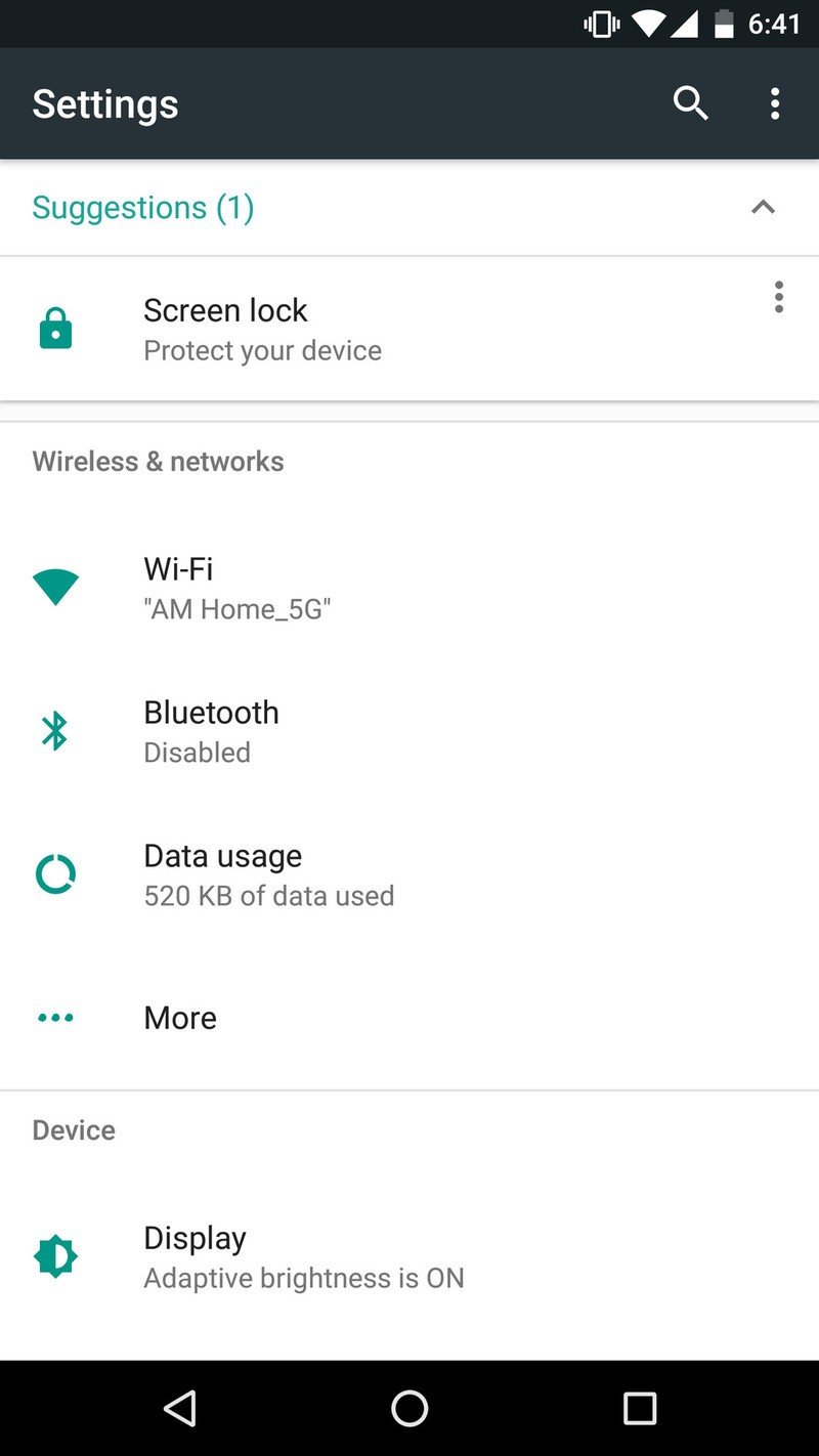
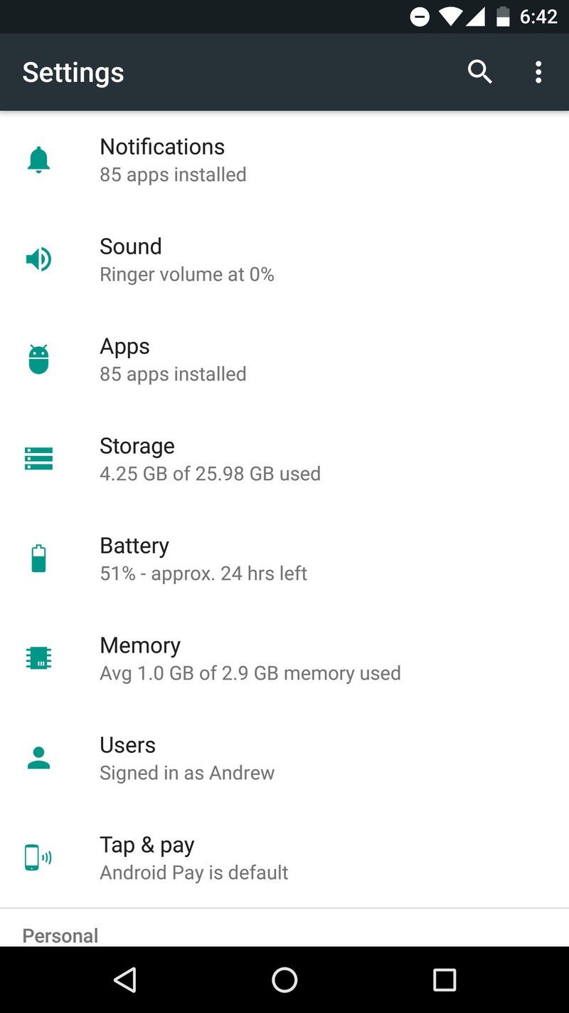
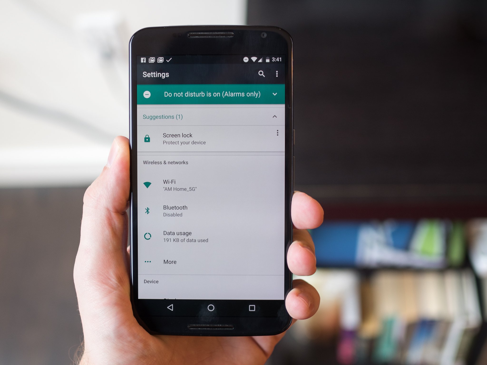
At a glance, the Settings of Android N look basically the same as Marshmallow, but you quickly notice how much more information is surfaced compared to the previous version. The sections and subsections are all the same, but now under each one you get a little snippet of information about the most important feature within that area. For example the Bluetooth menu option will display the connection state of Bluetooth, the Display menu will list whether Adaptive brightness is turned on and the Storage menu will display how much storage is currently being used.
Article continues belowAlong with the fear of surfacing too much information, Google is giving some extra glanceable snippets to hopefully save you from making a few unnecessary taps just to see the thing you were going to go a level deeper to see anyway. For example you can scroll down and quickly see your phone's audio state, or what Wi-Fi network you're connected to, without leaving the main Settings list.
Mini 'notifications' inside Settings
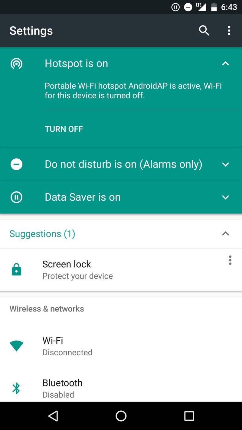
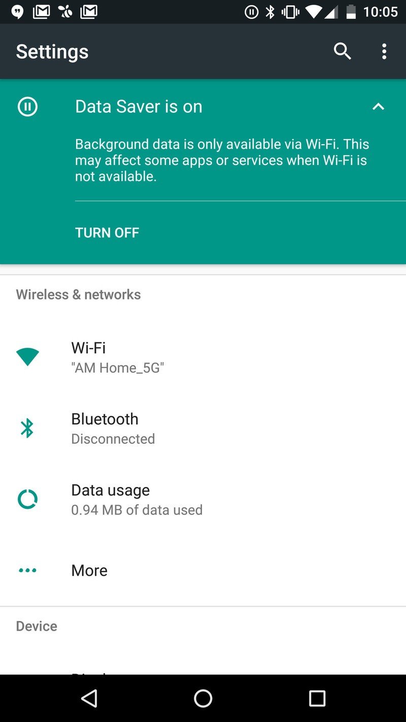
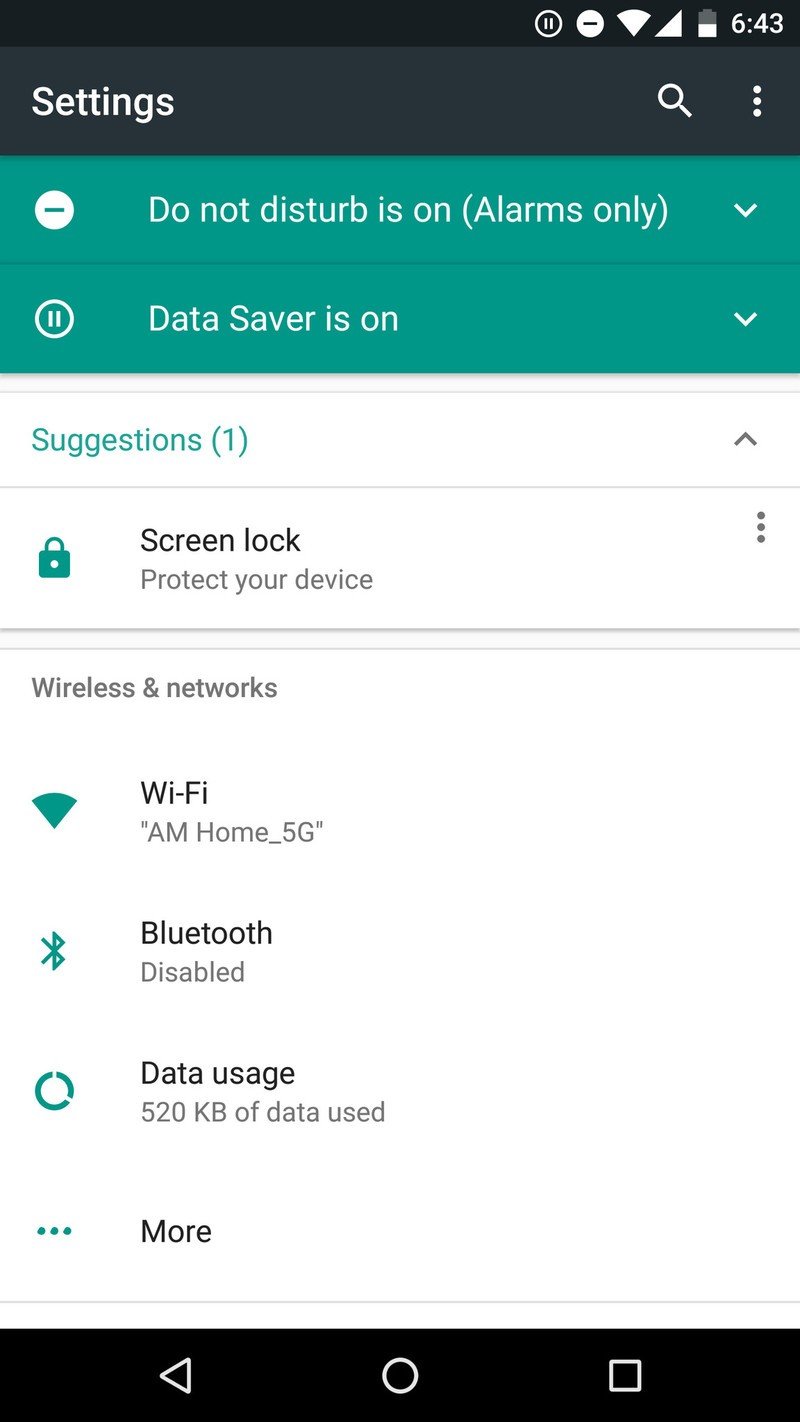
Going further with this idea of glanceable and dynamic information, the top of the Settings menu now has its own little notification area of sorts. That sounds a bit confusing, but it's really quite useful — a few different areas of the system can surface big turquoise bars at the very top of the Settings to show that a feature is turned on. So far it looks like Do Not Disturb, Mobile Hotspot and Data Saver are the big three that show up — and it makes sense that big features like this that have large effects on the device would be surfaced here instead of a persistent notification in the standard notification tray.
Surfacing more information, saving you taps.
Each notification has a small arrow that you can tap to expand and see just what that feature is (useful the first couple of times), along with a button to immediately turn it off — you can also just swipe away the notification and it won't have any effect on the feature itself.
A step further, the top of the Settings menu will also show "Suggestions" for you to check out that pertain to things you can do in the Settings. For example you'll see a suggestion to turn on lock screen security if you haven't yet. A nice little nudge to get you to check out a new feature, without putting it in the regular notification shade where it may be annoying and not something you want to work on right away.
Get the latest news from Android Central, your trusted companion in the world of Android
A couple changes a level deeper
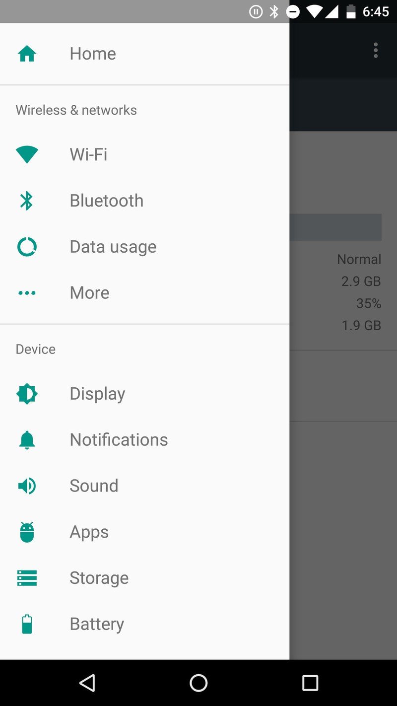
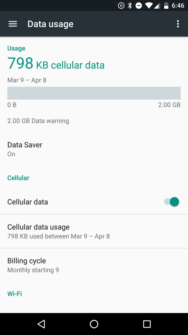
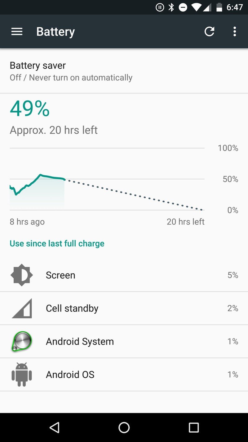
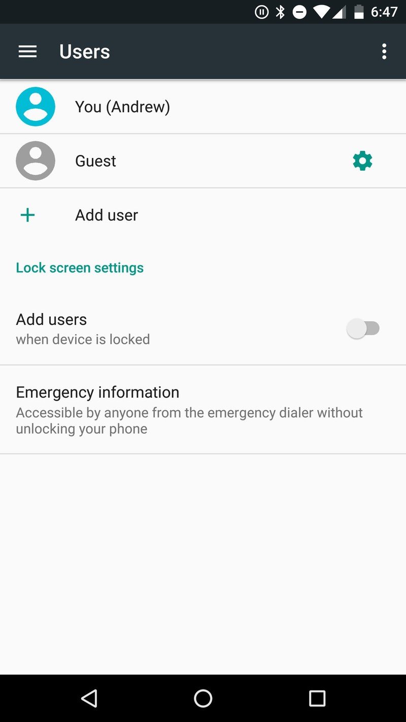
Going a level deeper in the Settings, we're seeing just a few more changes that are worth noting. The cellular data usage screen, battery usage screen and multi-user area have all received little face lifts that give you more information while also keeping things easy to understand. As you can see the colors are still very much the same as Marshmallow — at least at this point — relying heavily on a primary background of white with black, turquoise and grey accents throughout.
The changes are subtle for the most part, but when you add them all up once again they stand out as big updates from Marshmallow — and at least in this release, they seem like good, useful upgrades.

Andrew was an Executive Editor, U.S. at Android Central between 2012 and 2020.
