Samsung Pay updated with a cleaner and more traditional UI

Get the latest news from Android Central, your trusted companion in the world of Android
You are now subscribed
Your newsletter sign-up was successful
During my short stint with the Galaxy S8 last year, one of my favorite features was easily Samsung Pay. Between MST support and reward points for making regular purchases, it's definitely my prefered mobile payment service of choice. The app in its current state is perfectly functional, but the latest update brings a new design that looks rather nice.
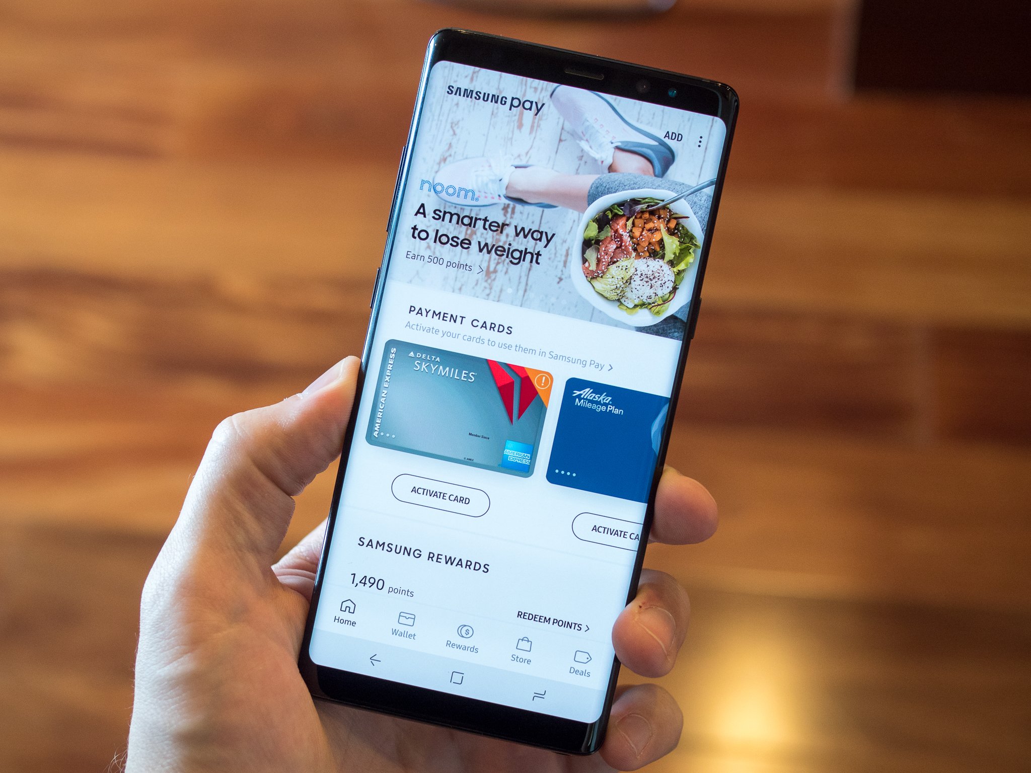
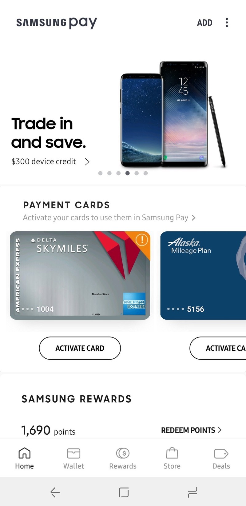
First spotted by our friends at Droid Life, updating Samsung Pay to build number 2.8.18 brings a new user interface that's cleaned up and makes a bit more sense from a usability point of view.
As you can see in the left screenshot below, the version of Samsung Pay we've had for a while has the main navigation buttons for the app smack dab in the middle below the rotating hero images. In the new version, these buttons have been moved down to a bottom navigation bar like we've been seeing in more and more Android apps as of late.
Article continues belowSamsung Pay's old UI (left) and the new one (right).
The Home page shows all of the latest promotions, your current status with Samsung Rewards, how many cards are in your wallet, and any recent transactions you've made. Along with this, there are separate pages for Wallet, Rewards, Store, and Deals.
What do you think about Samsung Pay's new look?
Future Samsung phones might be made out of new 'Metal 12' magnesium alloy
Get the latest news from Android Central, your trusted companion in the world of Android

Joe Maring was a Senior Editor for Android Central between 2017 and 2021. You can reach him on Twitter at @JoeMaring1.


