Press, a brand new Google Reader news client, has been the focus of the Android app community since its release, being heralded for its great design choices and general ease of use. It certainly isn't the first -- nor will it be the last -- in this arena, but right now its one that has everyone watching, and early indications are that it's living up to the hype.
Do the design and features offer enough of a draw to pull you away from another reading app of your choice? Stick around after the break and see if Press is worth your consideration.
The basic premise of Press, if you're not familiar, is to sync with your Google Reader and serve up news that you've added via RSS feeds. It's generally something that the more tech savvy -- or dare I say "power users" -- among us will use to consume news, but that's not to say that a novice couldn't set up a similar system on their own. Make no mistake, however, this isn't as simple and visually appealing as an app like Flipboard or Google Currents will be to the average user. That being said, for those who need to churn through thousands of stories every week -- say, like writers for a technology website -- a great, minimalist RSS news reader is a necessity.

This is a minimalist news reading client done right.
Interface and navigation


The main interface and navigation of Press isn't more than a stone's throw away from what Google already offers in its first party Reader client, but that last bit of difference is what makes it so great. To be honest most of the hard design work for Press was done for them -- this app follows Google's "holo" guidelines extensively. That's not at all meant to take anything away from the developers, the folks at TwentyFive Squares have made one hell of a nice app here, but more to say that Press is just taking the great Android design cues already available and making the best app possible. You can tell that time was spent on the user experience and ease of use rather than superfluous animations and wasted features.
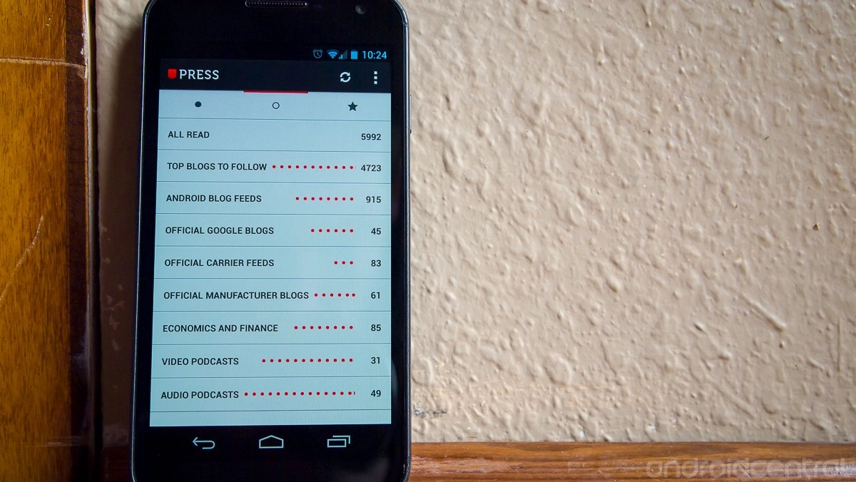
Navigation is extremely simple, with just three tabs across the top of the app -- unread (a filled circle,) read (an open circle,) and starred. For some reason my immediate reaction was that the circles for read and unread should be reversed, and it really took a while to get used to it. Something about the open circle tells me "unfinished," and the closed circle means it's "complete." Weird OCD moments aside, everything here is simple to use. You get a numerical count of read/unread articles at the far right of each folder listing, and a set of red dots that indicate the number of feeds the articles are in. For example, two red dots and "10" on the side mean there are two feeds with ten unread stories between them. It helps you get a feeling for how much news is really in the folder before you tap through -- if there's one feed with 30 unread stories, you can probably guess someone reset an RSS feed and flooded the folder.
Settings


The settings menu of Press is an exercise in minimalism -- which isn't usually found in conjunction with a power user type of app -- but all of the main categories can be found here. You can manage the number of articles that can be synced, a few different UI tweaks and that's about it. One setting that seems to be missing is a background sync interval to keep articles in order. I don't necessarily need this personally because I'm always going to hit the refresh button when I enter so I have the absolute latest news, but I could see some users wanting this. A happy (battery and data friendly) middle ground would be a "refresh on app open" checkbox.
Another setting that I personally wish was there is a way to hide specific folders from views. I also use Google Reader to manage my podcast (both audio and video) feeds on my computer, and I just have no need for those to show up in my news client. My podcatcher is smart enough to take in just my podcast feeds, my news reader should be able to handle the opposite.
Usability and design
I alluded to the extreme simplicity and ease of use in the above sections, but there really is nothing fancy about the interface here, and that's a really good thing. The interface of Press just gets out of your way and lets you read your news. When in a news feed, you're mainly using the sliding panel paradigm. You tap a story to view it, and when you want to go back to the articles list you slide it back over and select a new story. You can use the overflow settings key in the top right to share the article, copy the URL, open in the browser and change fonts.


Speaking of fonts, there are several available: Roboto, Open Sans, Source Sans Pro (default,) Lora, Bitter and PT Serif. I'm really a fan of Roboto (the default font in Android since ICS) so I kept with that in my use. I'm far from a font connoisseur -- I know some of you are -- but I really enjoyed all of the font offerings here. Any regular user picking up the app will be happy enough with the default font that they won't even consider looking for a setting to change it. There are two simple buttons at the top left of each page to increase or decrease the font size -- a nice touch. Again, the fonts are just another part of the app that simply let you read. Perfect.
Of the articles I've read using Press, everything formatted nicely with no issues. Inline pictures, block quotes and links all displayed properly, making for a smooth experience. Scrolling and navigation were extremely quick (this running on my Galaxy Nexus) with nary a hiccup. I highly suggest you use the integrated browser as well, as it offers a nearly seamless switch between RSS and web views. Pages load much faster than an external browser and have the same great performance as the pre-loaded RSS stories.
As with any new app, it will take some time to get used to the gestures and controls before you feel comfortable with it. That time comes quickly with Press, and it won't take long before you start to get into some of the neat hidden features -- such as double tapping images to enter a zoom mode or tapping article favicons to mark stories read/unread. When it comes to just picking up the app and using it, I still can't express how simple Press is to use.
The verdict

If you're already in the Google Reader ecosystem when it comes to managing and reading news, there really is no better choice out there right now than Press. With a simple design and easy to use navigation, it blows Google's own Reader app out of the water and surpasses many of the more complicated clients out there.
If you're currently using a more casual app -- such as Flipboard or Currents -- to read news, moving to Press is a bigger investment than just the app. The choice of whether or not this app commands such a big move (to an RSS feed system) is a personal one, but if you do make it then Press is the client to get.
Press is only $1.99 in the Play Store, and after a few days with it you'll likely think it commands a much higher premium for the quality experience it offers.

