From blah to blob: The history of Android emoji

Get the latest news from Android Central, your trusted companion in the world of Android
You are now subscribed
Your newsletter sign-up was successful
If you've been following along with what's to come in Android O, then you've likely heard that Google is retiring its line of blob-like emoji. Plenty of loyal Android users have expressed their joy over the upgrade to circular emoji, conforming to the rest of the emoji standards set forth in the mobile world, but there is also a host of us who had long rued the day that this would happen. That day was World Emoji Day, which the Internet celebrated with great fanfare this week. It's the day that Google reminded us it's still retiring the blobs to that Great Big Emoji Farm in the sky. #blobvoyage
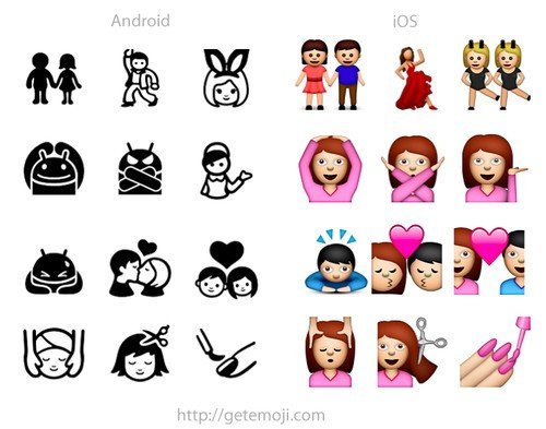
But Android didn't always employ yellow blobs as its emoji schtick. A long time ago, in the heydays of Android, you were lucky to have emoji at all — and if you did, they looked nothing like iOS's. But when those yellow blobs came along, they were the perfect response to what was once a homogenized world of skeuomorphic smiley faces and peaches resembling butts. 🍑
From cutesy to blobby to conventional
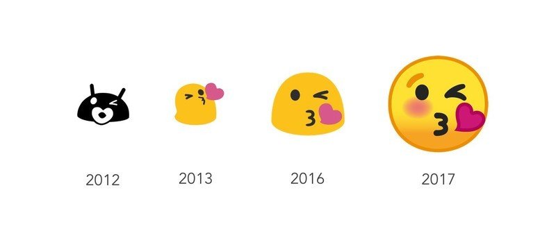
Android has a unique emoji history, partly because it didn't even widely support them until much later in its lifecycle. In its early days, Android's emoji were essentially antenna-eared doppelgängers. They were cutesy and mod-like, though they were also kind of silly compared to Apple's more realistic glyphs.
Article continues below 
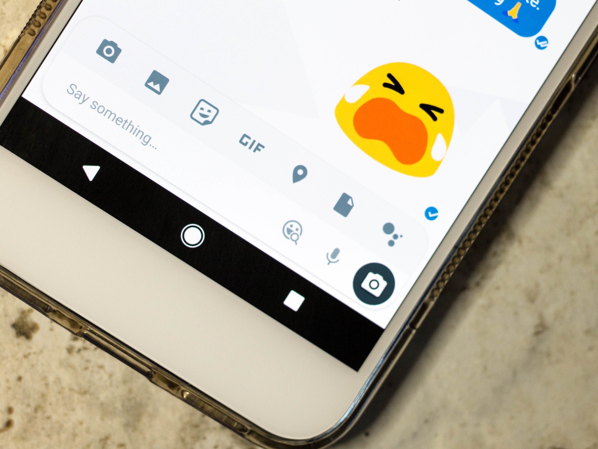
Google only added native emoji support in 2013 with the release of Android 4.3 Jelly Bean, and that's when it revamped the glyphs to look like the yellow blobs we know today. They were pudgier back then, but eventually evolved to be just as expressive and as relatable as the iOS variants that had become a craze.
Android's blobs were favorable, too, because they weren't all overtly emotive like on the iPhone. Some of the characters were ambiguous enough that they passed off as double entendres, and though that's part of why Google is revising the emoji anyway, it also gave Android users a sense of identity they didn't have before: The identity of an amorphous blob that could be interpreted as needed.

The blobs were refined over the years, and Google eventually added more human-like emoji as the Unicode standard expanded so that blob was not always the only option. You can imagine the shock, then, when Google announced it would introduce a new aesthetic to an emoji system that seemed nearly perfect.
Google's Rachel Been explained the overhaul of the emojis in a blog post after Google I/O 2017:
Get the latest news from Android Central, your trusted companion in the world of Android
Our original emoji style was simple and flat with bold pops of color. The flat design became Android's signature style, differentiating us from other platforms.Over the years, as additional emoji were added across all of the categories, the set became stylistically divergent. Our design system wasn't equipped to provide standards that unified the look and feel of all the illustrations across the many emoji categories. As a result, our emoji became inconsistent between old and new designs, making it difficult to quickly scan the keyboard to find the right emoji.
It's a fair point. I've often reverted to using emoticon ;) to express my like or disdain in a text message knowing very well that my Android emoji didn't express the same sentiment on the iOS side.
The revamp of the emoji from blobs to conforming circles modifies the meaning behind some emoji.
The blog also cites the fact that Google is attempting to address "cross-platform emotional consistency" — that is, that Android's emoji communicate the same message regardless of the platform. "We wanted to assure the user that when they sent an emoji to a friend, the message was communicated regardless of whether they are on iOS, Windows, Samsung, or any other platform," wrote Been.
But what about how it changes the way that Android users communicate? The revamp of the emoji from blobs to conforming circles modifies the meaning behind some emoji. Take the face with cold sweat emoji, for example, which The Verge also references in its ode to the blob. This particular emoji is often used to denote nervousness or anxiety because of the sweat bead accompanying its decidedly blank expression. Android O changes the meaning entirely, however, offering up a more sickly interpretation instead. The emoji no longer shows nervousness, but tiredness, which is not the same thing.

You'll notice that the frowning face is also in line with the way it appears on Apple's iOS, and that's the real kicker here. Just like the Google Pixel was made to look like the iPhone, so will emojis have to conform to what iOS users see on their end. It is the way it is, and it's the best way to sell devices to a crowd who often lament that Android doesn't have what iOS does. But in the process, we all lose our identity as Android blobs.
Fortunately, we can choose which emoji to display by downloading other keyboard apps from the Play Store, or even by switching phone manufacturers. And if you're an Allo user, you can download the blob sticker pack to keep the tradition going long after the blobs are out of commission.

Florence Ion was formerly an editor and columnist at Android Central. She writes about Android-powered devices of all types and explores their usefulness in her everyday life. You can follow her on Twitter or watch her Tuesday nights on All About Android.
