Android Auto's 2019 update is dramatically better, and makes me love it all over again
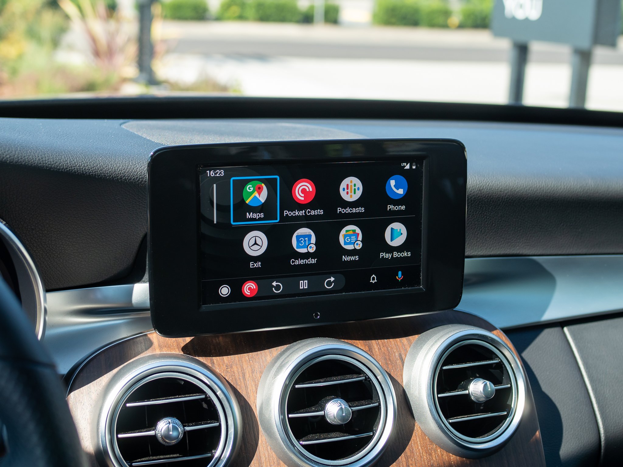
Android Auto launched over five years ago, and has only received minor tweaks and updates. But the first major redesign of the platform is here now, and it integrates feedback and a plethora of new ideas to make it an undeniably better platform to keep you informed, connected and safe while driving.
The update is rolling out to everyone (opens in new tab) over the next few weeks, but I've been using it for a week now — here's what it's all about, and why the latest update is making me love Android Auto all over again.
Better in every way on your car's display
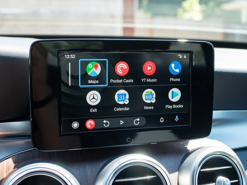
No part of the Android Auto experience went untouched.
The best way to experience Android Auto has always been on a bigger screen in your car, so it makes sense that that's the only place this new design is rolling out. (Google Assistant Driving Mode will replace Android Auto on the phone later this year.) Google has fundamentally changed the paradigm of how Android Auto looks and operates, and no part of the experience went untouched. The biggest theme of the update is simplicity and reducing the amount of interacting you have to do with the car to get things done.
Android Auto no longer starts up to a home screen, and instead jumps straight to Google Maps (or Waze) to bring you just a tap away from navigating to your destination. And if you already had directions loaded up on your phone, it will pick up and start navigating immediately. It also automatically resumes media you were listening to on your phone, if you opt to keep the default setting turned on.
The navigation bar changes are useful for everyone, but particularly so if you don't have a touch screen.
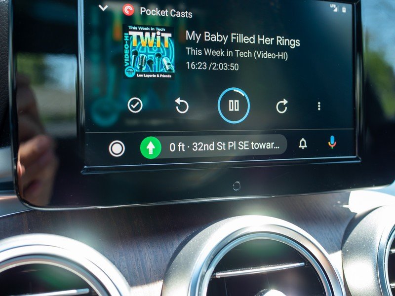
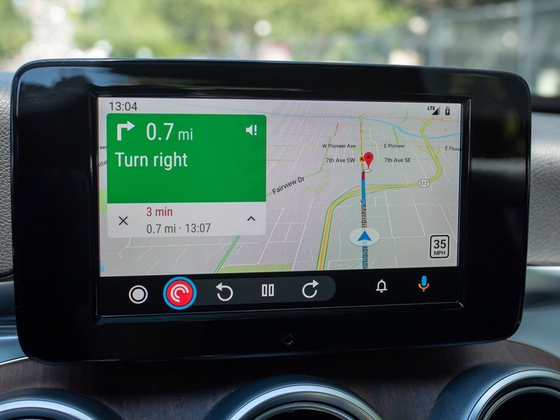
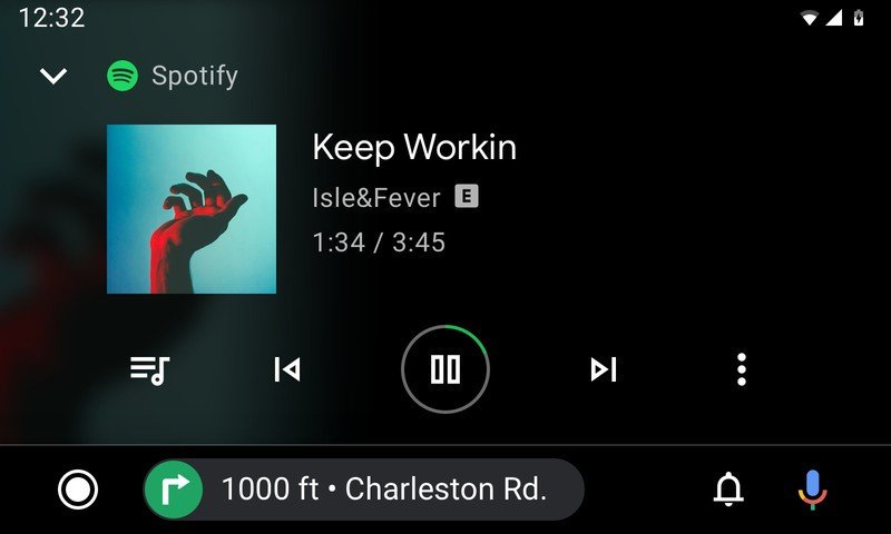
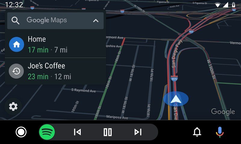
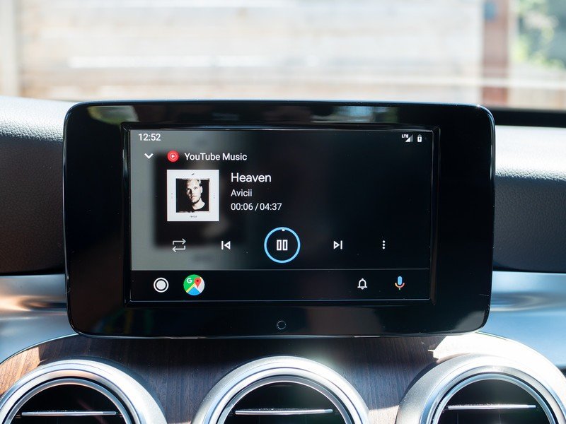
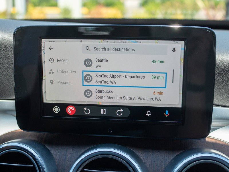
The navigation bar is now dynamic, and dramatically more useful. No matter what you have pulled up on screen, the bar will change to show you the next-most-relevant bit of information. For example, if you're navigating in Maps, the bar will show controls for whatever media is playing. If you pull up a media app like Spotify or YouTube Music full-screen, the bar will show the next step in your navigation. If a phone call comes in, you'll get phone controls in the bar with Maps on the main screen. An app icon for the navigation bar shortcut lets you jump to that app if you want to switch. This saves a ton of time because you don't have to switch back and forth between full-screen experiences to get just a tiny bit of information or perform a single action.
In cars like my Mercedes that don't have a touch screen (yes, even in 2019) and rely on a rotary controller, the new interface is simpler to navigate with fewer twists and clicks to get to most-used features. Rather than going to the bottom bar, switching apps, then moving up to controls in that app, I can simply drop one click down to the bar and get the same thing done directly, then be right back in the main app I was using. The process easily takes less than half the time it did before.
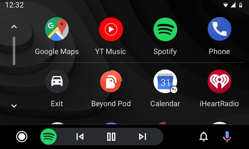
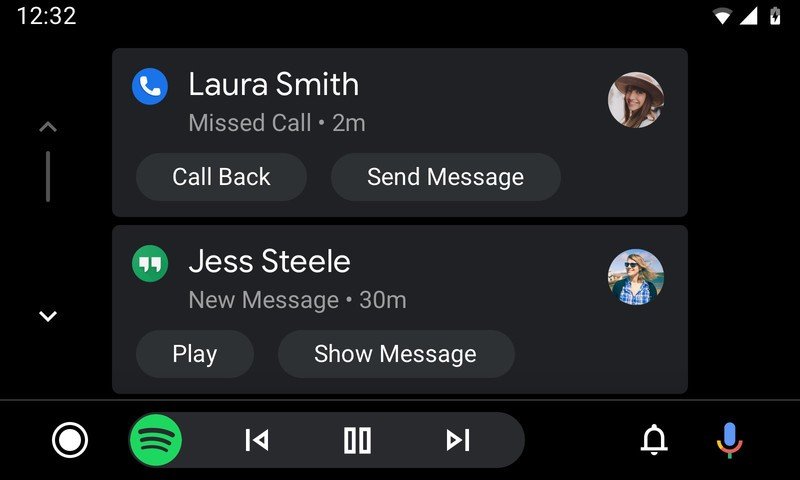
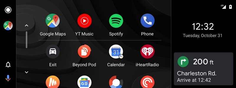
Apps and notifications have their own distinct areas where you can quickly select what you want.
Google says it's working with manufacturers to change the layout even more in cars that have extra-wide displays — Jaguar, Lexus and Mazda are already on board. Certain models with upgraded ultra-wide displays will see side-by-side information rather than just a main app and the navigation bar.
There's still a "home" button, which takes you to an app drawer with easy-to-select app icons. Your favorite mapping app, the dialer, and two most-used media apps are pinned at the top. Alongside apps are shortcuts to Google Assistant commands, like asking about the weather or upcoming calendar events, which you can trigger with a tap (or click) rather than with your voice. You now also have a voice command button in the navigation bar, if you'd prefer to not use "Ok Google" or it's unavailable in your car model.
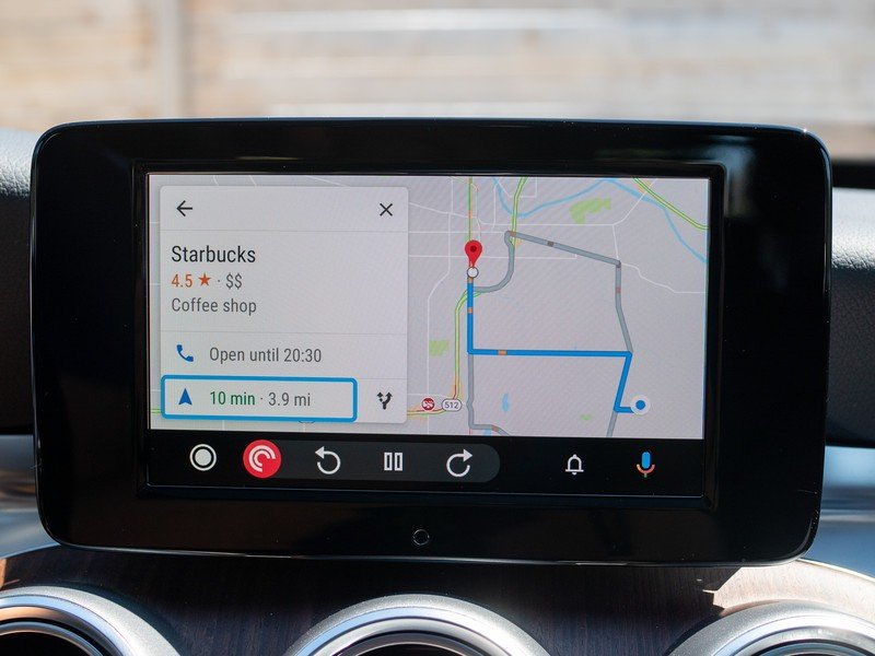
You still get pop-over notifications for certain high-priority apps, but there's also a dedicated notification center (accessed from the navigation bar) where you can scrub through everything that's arrived since you started driving. You obviously shouldn't be doing much notification management while driving, but having things in a dedicated place makes more sense than having to choose whether to act on them right away. There's still an odd variety in which apps can and can't (or won't) display notifications in Android Auto, but hopefully that continues to improve as developers add support.
The latest Android Auto is a massive upgrade that every Auto user will be ecstatic to get in their car.
Matching the simplified interface layout is an overall sleeker design. Google paid particular attention to using more contrast and easier-to-read fonts, which together make it easier on the eyes and generally safer to use while driving. And there's a new dark mode if that's your sort of thing. With the straightforward paradigm of a full screen app and dynamic nav bar, an easier-to-read font, and focus on helping you access the most-used functions quickly, the latest Android Auto is a massive upgrade that every Auto user will be ecstatic to get in their car.
The great part of this Android Auto update is that it can simply be pushed via the Android app on your phone (opens in new tab) — it doesn't require any sort of update on your car's end. All that was required was unplugging and re-plugging my phone, and I had the new interface on my in-car screen. And having used it now, I'm glad that's the case — I wouldn't want to delay getting this new interface for a moment longer.
This is the best way to connect your phone to your car.
The latest Android Auto update is simpler to use, easier on the eyes, and safer for getting things done on your drive.
Accessories to simplify your driving time
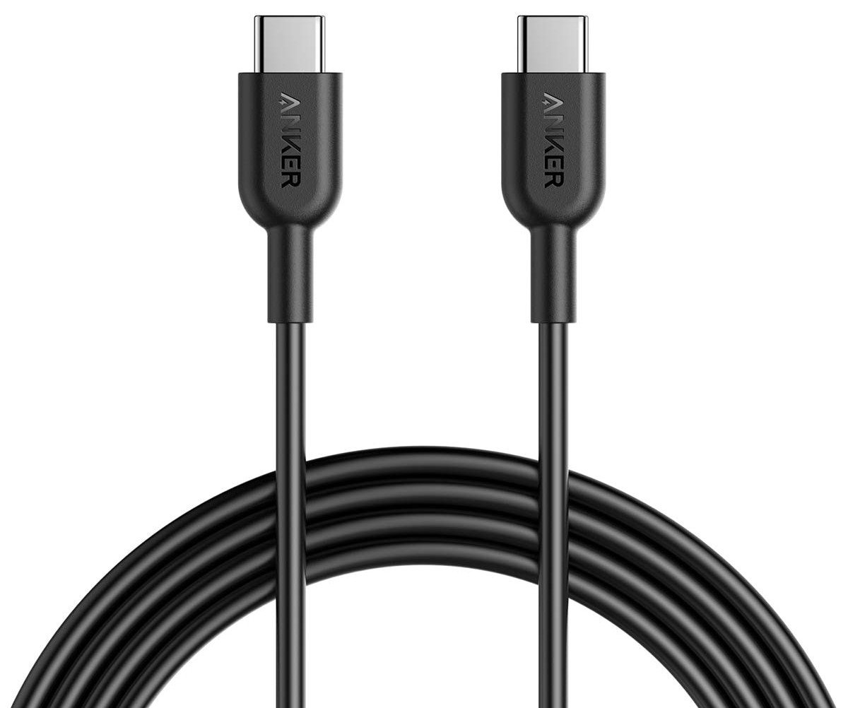
Anker Powerline+ USB-C to C cable (6 ft) (opens in new tab) ($14 at Amazon)
An extra-long USB-C cable is a great accessory for any car. Use it for Android Auto, or pair it with a car charger for those times when you're not navigating — it'll even reach to the back seat.
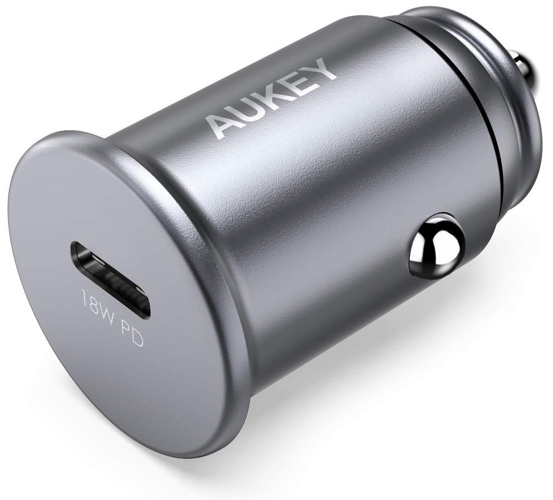
AUKEY 18W USB-C PD car charger (opens in new tab) ($17 at Amazon)
This is a super-compact USB-C car charger you can plug in and forget it's there until you (or your passenger) need to charge your phone at top speed. Now that's handy.
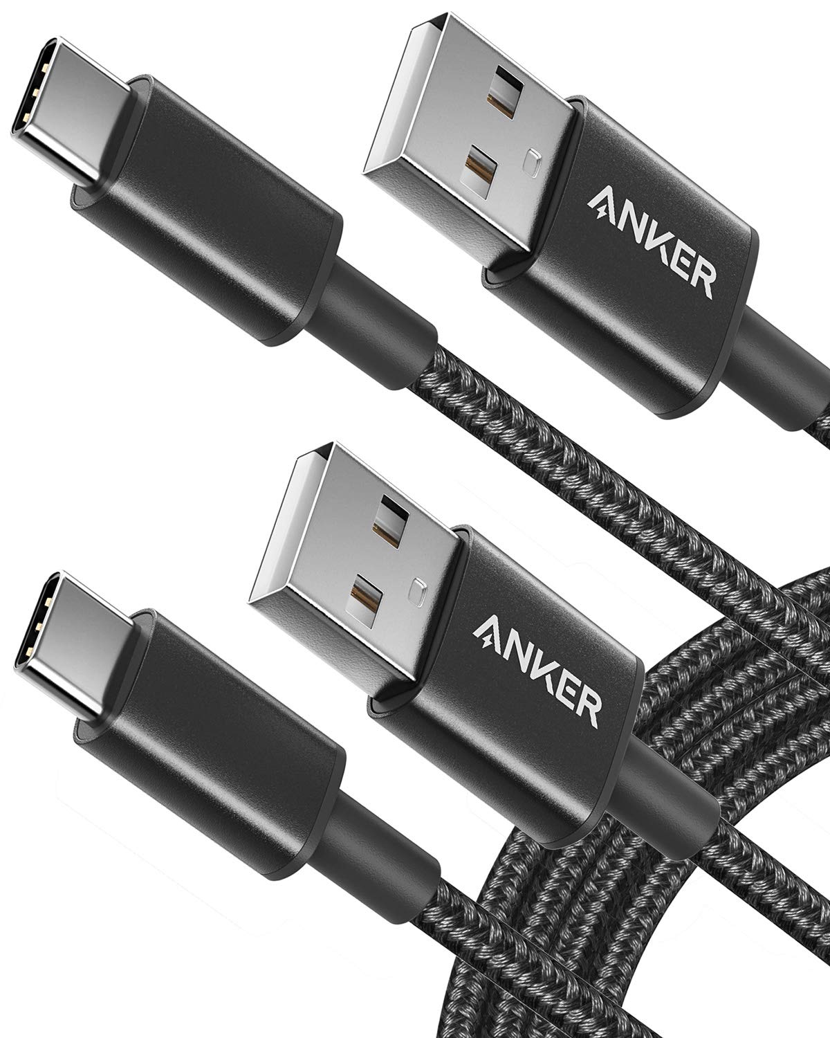
Anker Nylon USB-C to A cable (3 ft, 2-pack) (opens in new tab) ($11 at Amazon)
Sometimes when you're just putting your phone in a center console to use Android Auto, you'd prefer to have a shorter cable. Anker's braided nylon cables are just three feet long and are perfect car companions.
Get the Android Central Newsletter
Instant access to breaking news, the hottest reviews, great deals and helpful tips.
Andrew was an Executive Editor, U.S. at Android Central between 2012 and 2020.
-
Is the android app updated first? Or a server side flip.
-
Server-side (ish... the app is updated, just not the UI for the phone app) . The app's UI won't be updated as it's being replaced (eventually) with Assistant's 'Driving Mode'
-
Thanks, wasn't sure. I saw version 4.5.5928 was out July 29th on apkmirror. So guessing that won't trigger it.
-
I downloaded new version, cleared cache, data, force quit and reset up (Read on reddit). When I did a setting in settings that says "Try the new Android Auto" so worked for me.
-
Wait, I did everything you said last nite and tried it this morning but still got the old UI. Am I missing something?
-
Did you download the version above and then have the setting to "try new version now"? I did 30 minutes ago and worked.
-
Same here, no luck. version 4.5.592854. Did as instructed above, no new setting show up...
-
This is what I did earlier. Turned on the try new AA prompt setting and am enjoying this new layout. First time I used, Google Maps did open first but subsequent plug ins go to main menu instead. I have an Acura TL and wife and son use Apple Car Play when they drive my car which looked so much nicer than AA. Not anymore though!
-
And Maps still doesn't show current speed :(
-
Don't you have a speedometer in your car?
-
Speedometers in cars aren't exactly accurate But I'd rather see Speed Limits as well current speed
-
the speedometer in your car is likely more accurate than something based on a phone GPS chip.
-
It is not. Car's speedometer always shows 2.5 mph more than actual.
-
The speed indicator only works when you're actually using the navigation. You have to be navigating somewhere.
-
No wonder everyone is distracted when 'driving'. "The biggest theme of the update is simplicity and reducing the amount of interacting you have to do with the car to get things done."
The only thing I need to 'get done' in a car is to drive it. If any one or any thing want's to communicate with me while I'm driving they/it can wait until I stop. -
Unfortunately, people are going to want to get other things done while driving. The best we can hope for is making that process safer and putting in some restrictions so people can't go overboard. Android Auto promotes keeping your phone plugged in and stowed away rather than in your hand, which is already a big improvement.
-
I hope I can receive AA for my Subaru with a factory software update.
-
Starting with maps might be the most useless thing for me. I think the home screen could use with a good tweaking or redesign, but auto starting somewhere else means I now have to fiddle with it before I even start driving.
-
It doesn’t start with Maps. Where did you get that from? Starts with the row of icons.
-
Directly from the article.
"Android Auto no longer starts up to a home screen, and instead jumps straight to Google Maps (or Waze) to bring you just a tap away from navigating to your destination." -
It starts wherever the user left it. Andrew just happened to end his journey with Maps on the screen. If he had left it with the icons open, it would have started there.
-
From Ara's article a little bit after this one was posted: "The other big change is that the home screen you'd launch into before has been ditched completely in the new Android Auto; you now start in your maps app with a selection of suggested destinations shown on the left side of the screen below the search bar. " * edit. I've now seen the same thing reported on several other sites.
-
Google said it is designed to specifically to open to Maps or Waze by default.
-
I agree it would be nice to have a setting to choose where to pick up, but if there's going to be a default I'm sure that Google made the decision based on how often people were just opening Maps manually every time they got in the car.
-
How do you connect AA to your Mercedes? I have a 2016 and assumed I couldn't use AA on the car's screen.
-
Plug into the USB port in the center console, and it launches — I think I had to launch it manually once through the "apps" section of the center screen. I know Mercedes made AA available starting in 2016, but I don't know if it was standard or optional, or part of a package.
-
When exactly will the app get the new UI, I downloaded from apk mirror and it's the old UI I then cleared data n resetup and it's still old UI
-
Go into the app settings on your phone and select to use the new UI. Next time you plug your phone in and fire up AA, you will see the new UI.
-
Unless this update fixes the connection problems that so many of us has, I don't understand why so many people are excited about this.
-
Is it wireless yet with all phones or still just googles
-
I think this is just Google's. I still do not find a way to connect wirelessly.
-
Update Version? Thanks
-
Does anyone else NOT get the night mode dark maps at night time?
-
Mine still is the old UI also isn't updated on play store. Really need this new UI.
-
Go into the app settings on your phone and select to use the new UI. Next time you plug your phone in and fire up AA, you will see the new UI. Have a great day
-
Same I still haven't gotten any new ui. Even though the app updated 2 days ago
-
Go into the app settings on your phone and select to use the new UI. Next time you plug your phone in and fire up AA, you will see the new UI. Good luck
-
I am really liking the New UI. It's more user friendly, easy to navigate to the phone, music and navigation. The assistant is awesome. My only wish would be for Google to add a temperature notification that's displayed on each screen like the time/clock.
-
Wow, I feel like I'm alone in feeling like the new UI is terrible... I usually have maps and spotify running, so I keep it on the home screen so I can see the two cards, and then if I get a message, it appears below there and I have it all there at once. Also, if I miss a notification (because I'm, idk, driving?), then I see it appear as a little card on the home screen. This new UI forces me to pay more attention to the screen to see if I have notifications (have to look for the tiny red dot on the notifications icon), and if I do, it's a two-tap process to get the message read to me, instead of one. I think the new UI is pretty, but it feels like it requires more of my attention instead of less. Not a fan at all.
-
Same here. This new UI maybe looked refreshing but look more as a phone app drawer. I don't need to be in the Map all the time. If go back to Home there are only icons. Nothing useful. Before with the cards at least I can see a lot of info without going to any app like now. Even Spotify is not showing the artist just buttons which by the way you can use from the steering wheel (not needed at all).
I think they should give us a option to choose how to have the main screen, icon drawer or card info (like before).
I agree now is require more attention than before. -
I like the new look and layout, but miss some of the old features. In the old layout, AA would offer one touch click to my current events that showed on my Samsung calendar (which is also linked to my Microsoft activesync data.) These entries usually have address info for my meetings, and tapping on it (or using Google Assistant) would automatically open in Maps or Waze.
Now when I ask for calendar, it says nothing is scheduled.