Android P's gestures are a jagged pill you should learn to swallow
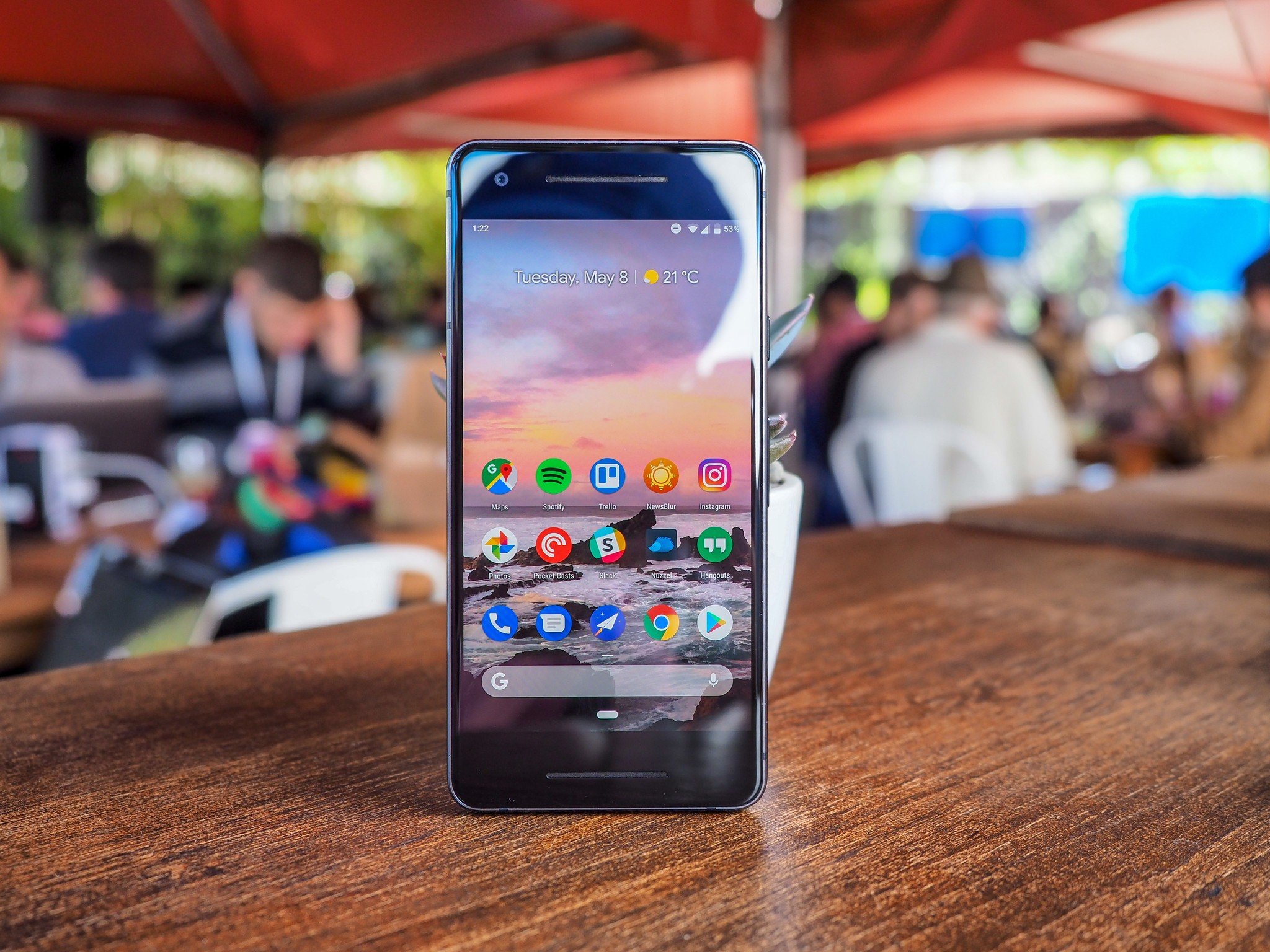
Imagine if, in June of last year, Apple had released the first iOS 11 beta with the option to swipe up on the bottom of the iPhone 7 series to go home. Continue engaging your imagination to consider that Apple's iPhone X, once it shipped, opened the iOS multitasking menu with a default swipe up, requiring a second shorter swipe to finally land on the home screen.
People would have lost their minds.
That's because iOS has held a core belief that the home button, or now the home gesture, should do exactly that: it should go home. The button and subsequent gesture inform Apple's prime directive around the iPhone: that its users should always be able to reset the interaction and return home.
Article continues belowOf course, throughout the years Apple has expanded and complicated that core belief — double-tapping the home button opened the multitasking window, and when 3D Touch was introduced in 2016, larger iPhone models could hard-press on the edge of the screen to quickly switch between apps. Complication begets confusion, so Apple, with the iPhone X, decided to reset everything all over again.
The iPhone X's gestures are certainly not free of complication — swiping down from the right side of the notch to access quick settings is incredibly inconvenient — but they achieve the recreation of Apple's prime user experience directive: the easiest gesture returns home.
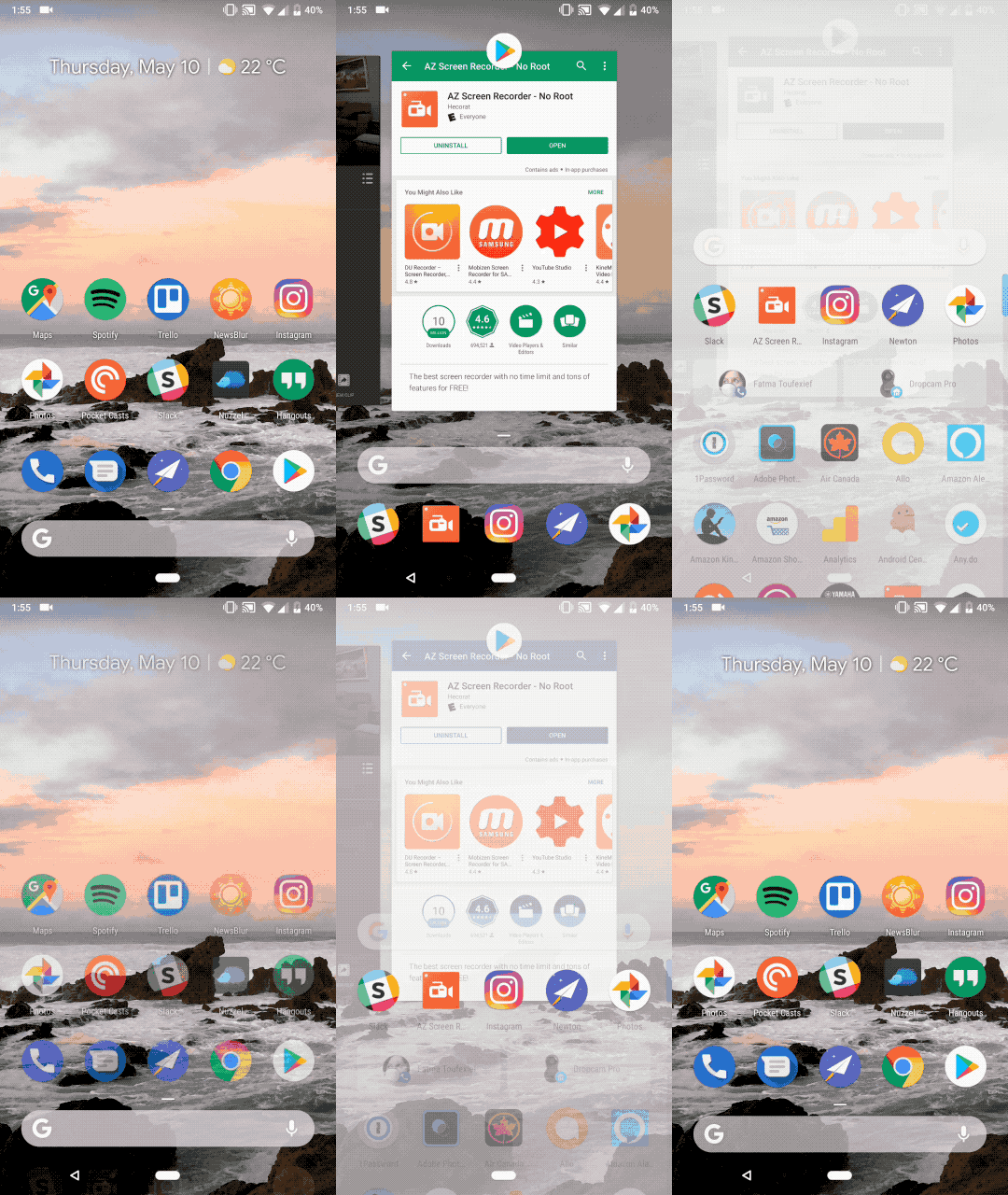
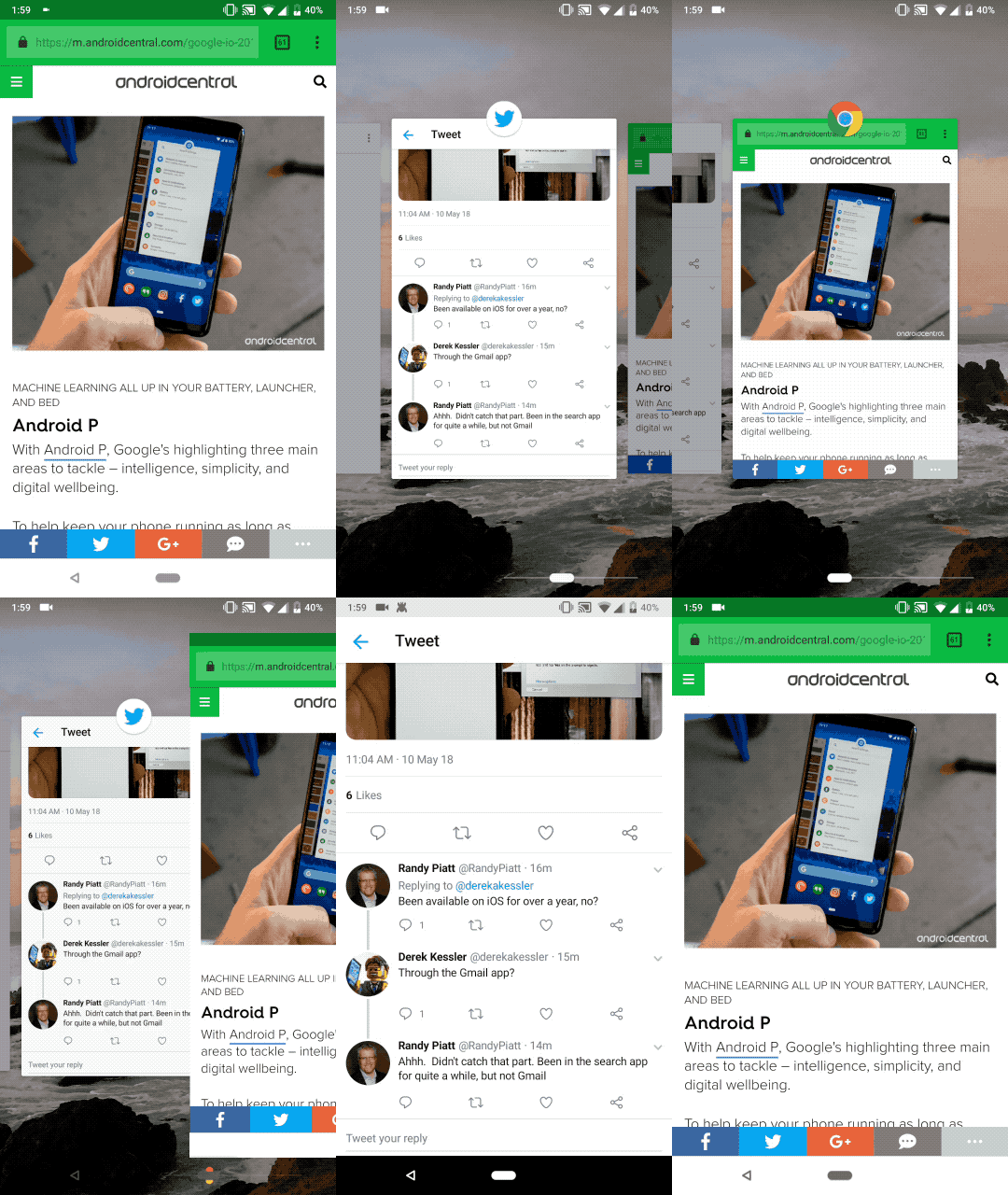
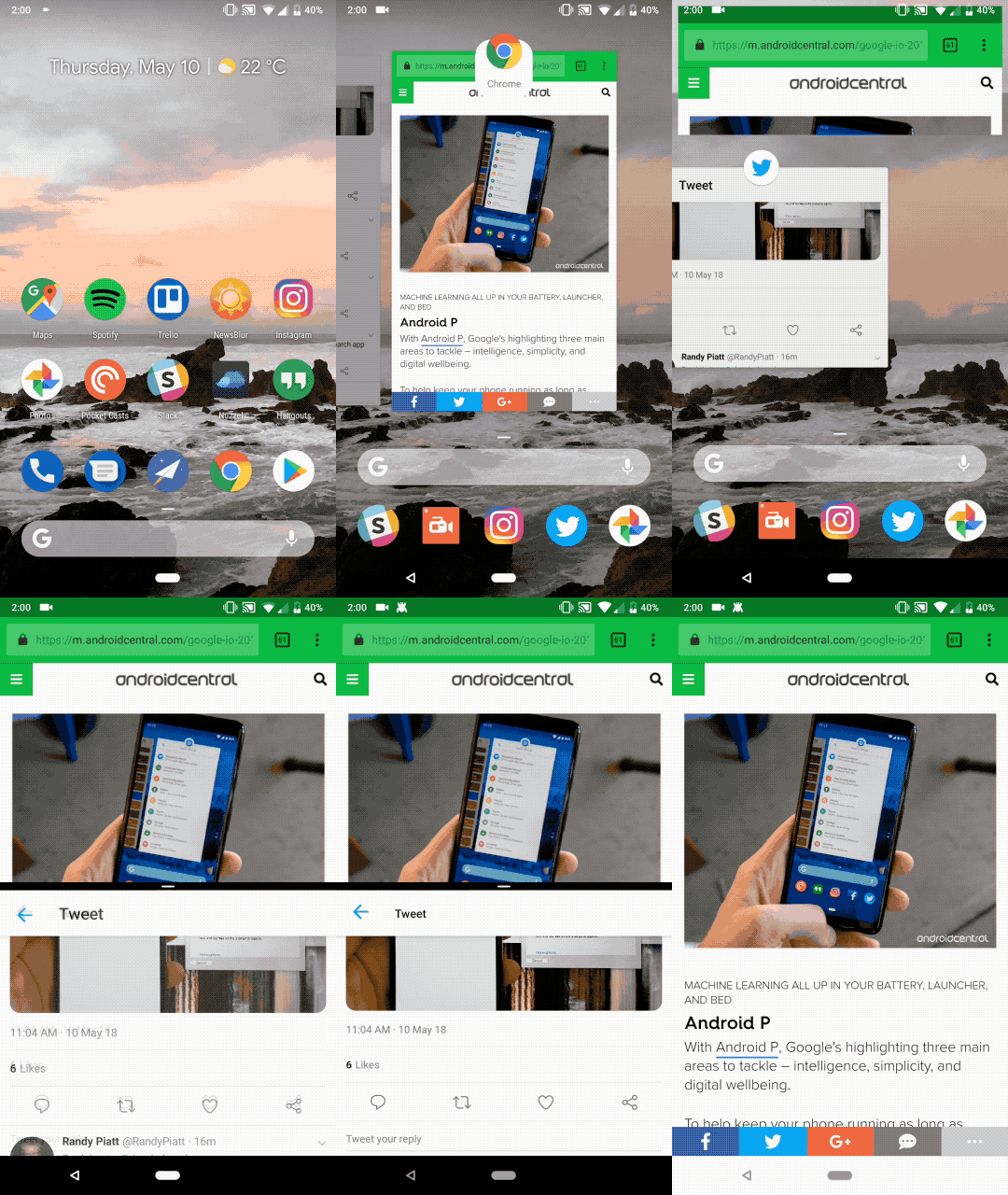
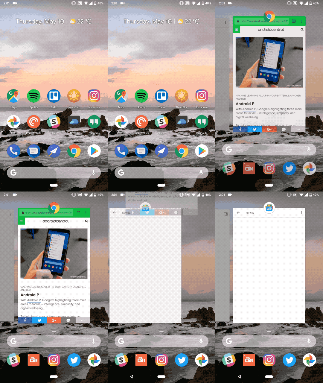
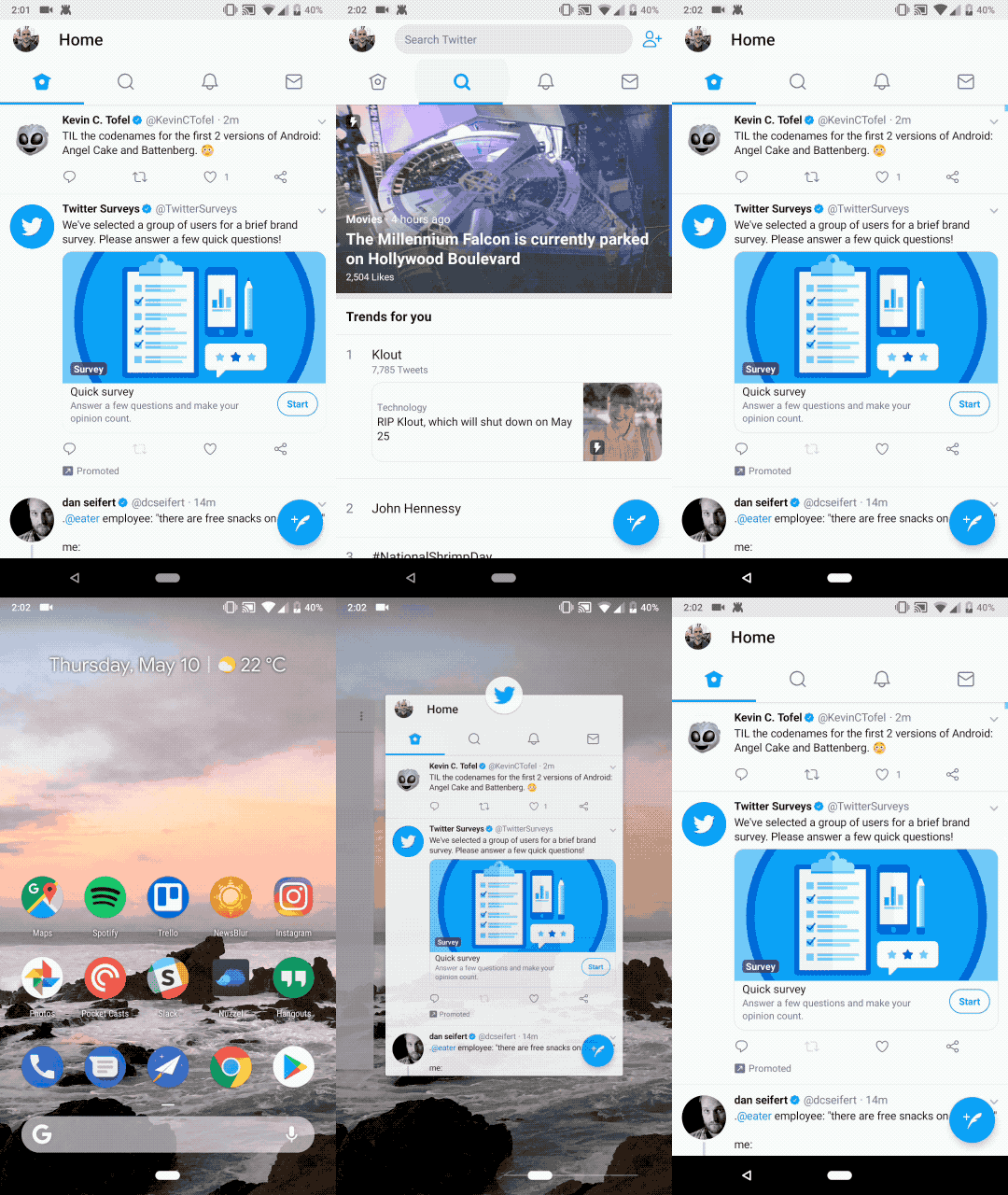
I bring this up because when Google introduced its new pill-shaped gesture area on Android P's first public beta, it was immediately apparent that Google was not aiming to recreate the simplicity, or even the convenience, of its decade-old three-button navigation scheme. Swiping up does not, in fact, go to the home screen but to the multitasking menu. Swiping up again, and only from that in-between state, reaches the app drawer. Indeed, reaching the home screen requires tapping the pill, something that's not at all obvious from its shape, or from precedent set by Apple and the rest of the industry.
Google doesn't need to copy Apple's gestures, or parrot webOS or BlackBerry 10, to be considered successful at this.
Now, I'm not suggesting that Google reproduce Apple's gestures — it would be impossible to limit Android's navigation scheme to Apple's limited set of gestures because Android has been saddled (or, more accurately, saddled itself) with a back button, that legacy bit of code that spared app developers from having to build a consistent method for returning to the previous screen. But Google took the opportunity, in switching to a gesture-based navigation modality, to empower its users to quickly switch between apps as quickly as possible.
Get the latest news from Android Central, your trusted companion in the world of Android
For frenetic phone users (like me), this is a clear benefit, since there are two ways to access the multitasking menu and instantly cycle between apps. But such a dichotomy — tapping on the pill to go home and either swiping up or to the right to multitask — adds a layer of cognitive dissonance that won't disappear (though it will abate) with frequent use.
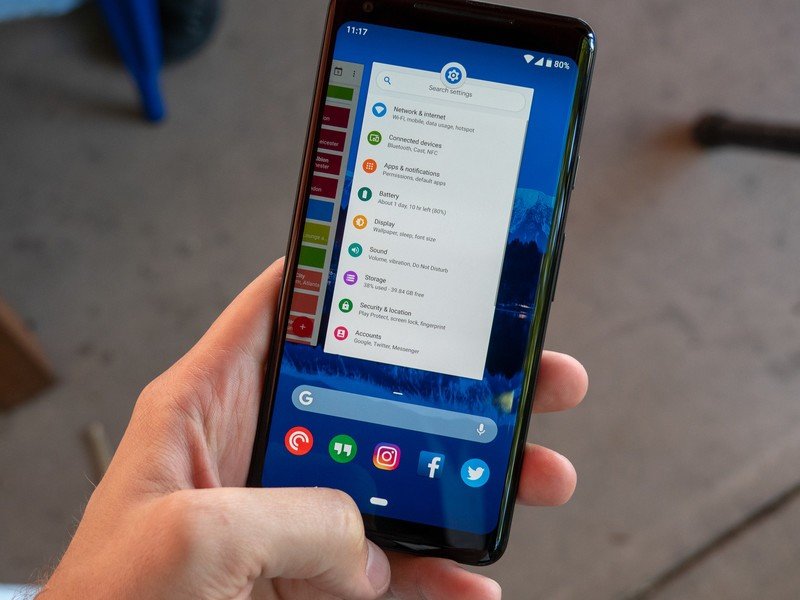
I am keenly aware that our first interaction with Google's redesigned navigation scheme comes as an opt-in toggle inside a developer beta, and that this is all subject to change — significantly. Indeed, Dave Burke, the head of Android's vast engineering team, admitted that he's already using a version of Android P with numerous usability upgrades over what was rolled out to developers and early adopters this week.
The change is all about simplification, but in the short-term, there will be growing pains.
Things will improve, and likely for the better, based both on user feedback and Google's own internal guiding light, but it's clear that a line has been drawn, and the company intends to pursue gestures to eventually replace navigation on all Android devices, not just its Pixels. And that's a good thing.
In an article with CNET, Burke said the move to gestures was actually about simplifying the current scheme, mainly because the multitasking button — that bland-looking square to the right of the home key — continues to confuse many Android users. (It doesn't help that Android's biggest mover, Samsung, designs its own navigation keys, and they're... not great.) "Android have those three buttons at the bottom: Home, back and something else. And it's a little too much, a little too complicated. I think of it as like walking into a room with three doors and it's like, 'which door do I go in?'" he told CNET's Jessica Dolcourt.
And then there's the back button, which will always be there in some form, Burke admits. Whether it will always dangle to the left of the pill like a sore remains to be seen — some have suggested Google replace the back button with a unique gesture — but Android's app legacy will require its existence in some form for years to come.
A few other tenets of the gesture-based navigation feel incomplete right now, such as the three-step process to launch multi-window mode, and the tuning of the snap gesture to switch between open windows. But I have faith those, along with the fundamentals of this design, will be fixed by the time Android P is released publicly later this summer.
What I'm less sure about is whether this combination of taps and swipes is the right move for Android in the long run, especially since it will take years, and plenty of insufferable experimentation by Google's Android partners, to once again establish what resembles a consistent navigation standard.
Even today, we have companies like OnePlus, Huawei, and Motorola telling customers that to reclaim essential screen space they can master an esoteric set of finger wags that encourage platform lock-in and undermine Google's own carefully-considered approach to Android design. But if Google can't get it right, how can we expect the same of its less-capable counterparts?
Either way, gestures aren't going anywhere, so if you're raging against this virtual machine, try to get used to it. It only gets better from here.

Daniel Bader was a former Android Central Editor-in-Chief and Executive Editor for iMore and Windows Central.
