Google bar on the web taking on unified styling, borrowing from mobile

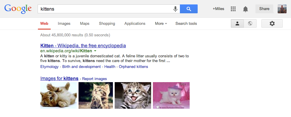
In an effort to unify its design across the web and mobile, Google is taking on a bit of a redesign of the well-known "Google bar" at the top of many Google web properties. Gone is the (rather ugly) black bar that has propagated across its pages, replaced by a simple new button and slightly different display of your Google+ profile.
That button, which looks like a grid of boxes and follows the same design as Android and Chrome OS, is a one-click access to every Google app you interact with. Youtube, Search, Gmail, Drive, Google Play and more are all displayed in a drop-down box called the "app launcher" that quickly lets you switch between Google properties.
The changes are subtle but should help bring a more cohesive feel across apps on your mobile devices and their web components on your desktop — the black bar on the web simply felt out of place before. The new design is expected to roll out to everyone in the next few weeks.
Source: Google Search Blog
Get the latest news from Android Central, your trusted companion in the world of Android

Andrew was an Executive Editor, U.S. at Android Central between 2012 and 2020.
