Jot is a simple, lightweight note-taking widget for Android that recently had a user interface overhaul. It is an absolutely pared-down set of widgets that very simply provide fast, clear access to a notepad from the home screen. You aren’t going to find a ton of fancy features here, but you will get fast, easy access to plain text.
Style

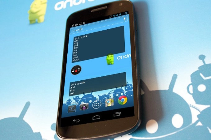
Jot takes minimalism to an extreme. There are three home screen widgets total. Two of them (one 4 x 2, one 4 x 1) show your latest Jot, and the other is a single icon that brings up the Jot pad. Tapping any of them brings up a text box and the keyboard so you can start jotting away. There’s also a button to clear what’s there, but beyond that it’s extremely bare bones.
Though the font used for notes is nice enough, it would be nice to have something just a little bit more stylish - maybe the one the app uses in its buttons to stay consistent, but stand apart from other home screen widgets and apps. The widget border is sharp and clean with rounded corners, but there’s a greyed out button in the menu for Theme, which suggests we might see some new styles soon. The widgets could probably stand to be just a bit bigger, if only to eke out a few more lines in a single view. As is, the big widget handles 10 lines of text, and the small one has four, but neither has a scroll bar without tapping on the widget first.

Function

Beyond taking plain text notes, Jot’s only real feature of note is the ability to share out to whatever apps you have tied into the system-wide menu. Unfortunately, that’s not a two way-street. If there’s a section from an e-mail that you’d like to Jot, the app won’t pop up in the share menu. Instead, you’ll have to laboriously copy and and paste it into the widget. First-world problems, I know.
That said, there are still quite a few features that could be fed in while still keeping Jot nicely sparse. For example, being able to save multiple Jots at any given time would be helpful. Maybe a subtle tab system along one side of the widget would help there.
My only minor quibble about usability is that tapping on the widget doesn’t immediately bring up the keyboard, requiring a second tap on the box that’s summoned before you can start editing or adding text. For an app that should be priding itself on being fast and simple, that one extra tap counts for a lot.
Pros
- Distraction-free layout
Cons
- Feature-weak
Bottom line
There’s something to be said for an app that tries really hard to keep it simple. Most developers would try to cram in rich text formatting, automatic backing up to Evernote, and all sorts of other stuff, but a lot of folks are fans of keeping it simple. Serious scribblers are more likely to pick up something like ColorNote, but if you put higher value on classy minimalism, Jot is a good way to go.

